A Three.JS WebXR UI. Enabling easy UI creation for immersive-vr sessions.
To show a text panel use
Make sure to import CanvasUI
import { CanvasUI } from '../../jsm/CanvasUI.js'
Your file structure needs both three.module.js and CanvasKeyboard.js to be accessible. The repo has the file structure like the Three.js library with the Three.JS build in the build folder and extra content in the examples folder. The CanvasUI examples are in the examples/CanvasUI. The class files are in examples/jsm.
To create a simple text panel use
const ui = new CanvasUI(  );
ui.mesh.position.set(0, -0.5, -1);
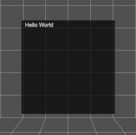
ui.updateElement("body", "Hello World" );

scene.add(ui.mesh);
A CanvasUI mesh is simply a Plane that is 1 x 1 units. In a VR world this means it is 1 metre square. It has a CanvasTexture applied, by default this is 512 pixels square. An Arial font is applied and the size of the font is 30 pixels. There is 20 pixels of padding. The font color is white and the background color is black and the canvas will have 6 pixel radius rounded corners.
An online version is available here
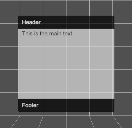
In general CanvasUI is designed to have a content object and a config object. Let's try an example with multiple elements.
const config = {
	header:{
		type: "text",
		position:{ top:0 },
		paddingTop: 30,
		height: 70
	},
	main:{
		type: "text",
		position:{ top:70 },
		height: 372, // default height is 512 so this is 512 - header height:70 - footer height:70
		backgroundColor: "#bbb",
		fontColor: "#000"
	},
	footer:{
		type: "text",
		position:{ bottom:0 },
		paddingTop: 30,
		height: 70
	}
}
const content = {
	header: "Header",
	main: "This is the main text",
	footer: "Footer"
}
const ui = new CanvasUI( content, config );
Each element has a section in the config and the content objects. Notice that these are all of type text. We can set the position using x, y, left, top, right and bottom. The values are in relation to a default texture that is 512 pixels square. Colors are defined like css values. If an attribute is missing it will be inherited from the body which has these defaults.
defaultconfig = {
	panelSize: { width: 1, height: 1},
	width: 512,
	height: 512,
	opacity: 0.7,
	body:{
		fontFamily:'Arial',
		fontSize:30,
		padding:20,
		backgroundColor: '#000',
		fontColor:'#fff',
		borderRadius: 6
	}
}
An online version is available here
So far we've only added text elements to the UI. In this example we'll add buttons. Buttons work by detecting the movement and trigger button on your VR controllers. To ensure that they work correctly, add this to the renderers animation loop.
if ( renderer.xr.isPresenting ) ui.update();
The CanvasUI class detects your controllers but does not display them. To ensure a visual representation of the controllers. Use the usual code. For example.
const controllerModelFactory = new XRControllerModelFactory();

// controller
controller = renderer.xr.getController( 0 );
scene.add( controller );

controllerGrip = renderer.xr.getControllerGrip( 0 );
controllerGrip.add( controllerModelFactory.createControllerModel( controllerGrip ) );
scene.add( controllerGrip );

// controller
controller1 = renderer.xr.getController( 1 );
scene.add( controller1 );

controllerGrip1 = renderer.xr.getControllerGrip( 1 );
controllerGrip1.add( controllerModelFactory.createControllerModel( controllerGrip1 ) );
scene.add( controllerGrip1 );

//
const geometry = new THREE.BufferGeometry().setFromPoints( [ new THREE.Vector3( 0, 0, 0 ), new THREE.Vector3( 0, 0, -1 ) ] );

const line = new THREE.Line( geometry );
line.name = 'line';
line.scale.z = 10;

controller.add( line.clone() );
controller1.add( line.clone() );
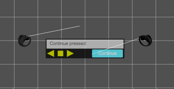
Here is a simple example of using buttons
//Make sure ui is a global scope variable
let ui;
...

function onPrev(){
	const msg = "Prev pressed";
	console.log(msg);
	ui.updateElement( "info", msg );
}

function onStop(){
	const msg = "Stop pressed";
	console.log(msg);
	ui.updateElement( "info", msg );
}

function onNext(){
	const msg = "Next pressed";
	console.log(msg);
	ui.updateElement( "info", msg );
}

function onContinue(){
	const msg = "Continue pressed";
	console.log(msg);
	ui.updateElement( "info", msg );
}

const config = {
	panelSize: { width: 2, height: 0.5 },
	height: 128,
	info: { type: "text", position:{ left: 6, top: 6 }, width: 500, height: 58, backgroundColor: "#aaa", fontColor: "#000" },
	prev: { type: "button", position:{ top: 64, left: 0 }, width: 64, fontColor: "#bb0", hover: "#ff0", onSelect: onPrev },
	stop: { type: "button", position:{ top: 64, left: 64 }, width: 64, fontColor: "#bb0", hover: "#ff0", onSelect: onStop },
	next: { type: "button", position:{ top: 64, left: 128 }, width: 64, fontColor: "#bb0", hover: "#ff0", onSelect: onNext },
	continue: { type: "button", position:{ top: 70, right: 10 }, width: 200, height: 52, fontColor: "#fff", backgroundColor: "#1bf", hover: "#3df", onSelect: onContinue },
	renderer
}
const content = {
	info: "",
	prev: "<path>M 10 32 L 54 10 L 54 54 Z</path>",
	stop: "<path>M 50 15 L 15 15 L 15 50 L 50 50 Z<path>",
	next: "<path>M 54 32 L 10 10 L 10 54 Z</path>",
	continue: "Continue"
}
ui = new CanvasUI( content, config );
Notice here that we define the panelSize, which is in world units, metres for a VR session. We also set the panel height to 128 pixels. Width will default to 512. The width and height must be powers of 2. Panelsize can be anything but if the aspect ratio of panelSize.width/panelSize.height is different to width/height then the text will be stretched. Notice here that if the content of a button starts with then an svg path will be filled with the backgroundColor. Notice also in the config for a button the hover attribute is the background color to use when the controller ray is over the button.
When buttons are used always pass the renderer in the config object. This ensures that CanvasUI can add events to the controllers.
An online version is available here
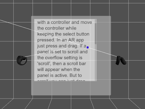
If a section of text cannot fit in the space available then you can allow it to scroll. Because this needs to use VR controllers, you need to follow the same rules as for buttons.
- Add
rendererto the config object passed to the CanvasUI constructor. - Create a visualisation of the xr controllers in the usual way. See the buttons section for an example.
- Add
ui.update()to the render loop.
The most important attribute of a text type, to enable scrolling, is to use overflow: scroll. The default is to simply hide the text that is beyond the limits of the text element area. If you want to see a blue dot where the controller ray hits the scrolling canvas, then also pass scene in the config object.
const config = {
	renderer,
	scene,
	body: { backgroundColor: "#666" },
	txt: { type: "text", overflow: "scroll", position: { left: 20, top: 20 }, width: 460, height: 400, backgroundColor: "#fff", fontColor: "#000" }
}
const content = {
	txt: "This is an example of a scrolling panel. Select it with a controller and move the controller while keeping the select button pressed. In an AR app just press and drag. If a panel is set to scroll and the overflow setting is 'scroll', then a scroll bar will appear when the panel is active. But to scroll you can just drag anywhere on the panel. This is an example of a scrolling panel. Select it with a controller and move the controller while keeping the select button pressed. In an AR app just press and drag. If a panel is set to scroll and the overflow setting is 'scroll', then a scroll bar will appear when the panel is active. But to scroll you can just drag anywhere on the panel."
}
ui = new CanvasUI( content, config );
An online version is available here
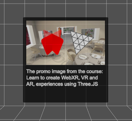
You can display an image on the UI panel using CanvasUI. It is easily added using a img type.
const config = {
	image: { type: "img", position: { left: 20, top: 20 }, width: 472 },
	info: { type: "text", position: { top: 300 } }
}
const content = {
	image: "../../assets/promo.jpg",
	info: "The promo image from the course: Learn to create WebXR, VR and AR, experiences using Three.JS"
}
ui = new CanvasUI( content, config );
Notice that the config defines the positioning and size. Here only the width is specified, the height will be calculated from the image, to maintain the correct aspect ratio. If you want the image stretched then directly entering a height value will force this. The content for the image is the path to the image, either an absolute path or relative. The element name in the config and the content can be anything you choose, it does not have to be 'image'
An online version is available here
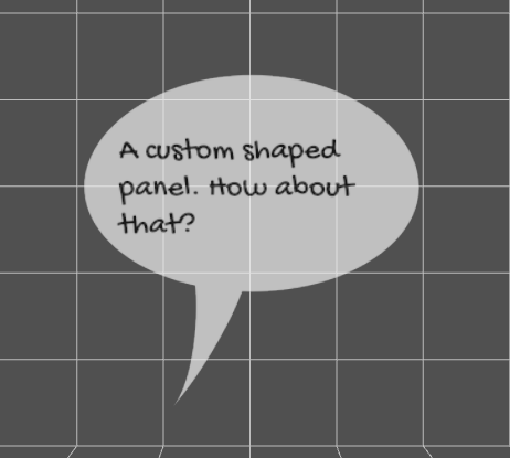
The default shape for a UI panel is a square or rounded rectangle. But you can define a shape using an svg path.
const css = {
	body: { clipPath: "M 258.3888 5.4432 C 126.9744 5.4432 20.4432 81.8424 20.4432 164.4624 C 20.4432 229.1976 86.3448 284.2128 178.1016 304.8192 C 183.5448 357.696 173.2416 444.204 146.8032 476.6688 C 186.6552 431.9568 229.2288 356.5296 244.7808 313.3728 C 249.252 313.3728 253.9176 313.7616 258.3888 313.7616 C 389.8032 313.7616 496.14 246.888 496.14 164.4624 S 389.8032 5.4432 258.3888 5.4432 Z", backgroundColor: "#ddd", fontColor: "#000", fontFamily: "Gochi Hand" },
	speech: { type: "text", position: { left: 50, top: 80 }, fontSize: 45, fontColor: "#000", width: 400, height: 250 }
}
const content = {
	speech: "A custom shaped panel. How about that?"
}
const ui = new CanvasUI( content, css );
You can generate the code for a path using this online tool.
Notice that this example uses a custom Google Font. Loaded in the index.html page using
<link href="https://fonts.googleapis.com/css2?family=Gochi+Hand&display=swap" rel="stylesheet">. Yes all web fonts will work with CanvasUI.
An online version is available here
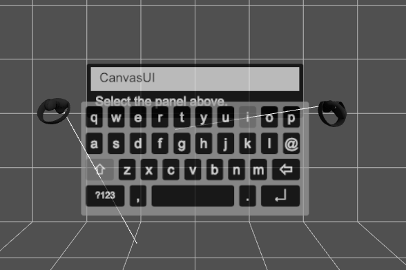
CanvasUI supports a dynamic keyboard. Specify a config type as input-text and on select a keyboard will be shown. In common with any button type it has the usual requirements.
- Add
rendererto the config object passed to the CanvasUI constructor. - Create a visualisation of the xr controllers in the usual way. See the buttons section for an example.
- Add
ui.update()to the render loop.
Input text has callbacks for onChanged and onEnter. Here is an example.
function onChanged( txt ){
	console.log( `message changed: ${txt}`);
}

function onEnter( txt ){
	console.log(`message enter: ${txt}`);
}

const config = {
	renderer: this.renderer,
	panelSize: { width: 1.6, height: 0.4 },
	height: 128,
	message: { type: "input-text", position: { left: 10, top: 8 }, height: 56, width: 492, backgroundColor: "#ccc", fontColor: "#000", onChanged, onEnter },
	label: { type: "text", position: { top: 64 }}
}
const content = {
	message: "",
	label: "Select the panel above."
}
ui = new CanvasUI( content, config );
An online version is available here
