Welcome 🎉! Thanks for your interest in starting fresh with Grommet, we are thrilled to have you on board.
We are going to leverage and install the awesome create-react-app. We will call it CRA from now on.
npm install create-react-app -g
create-react-app my-app
cd my-app
CRA will automatically install dependencies for you. It uses Yarn behind the scenes. If you prefer to use NPM, you can delete the yarn.lock file and run npm install manually.
rm -rf yarn.lock
rm -rf node_modules
npm install
Start the development server.
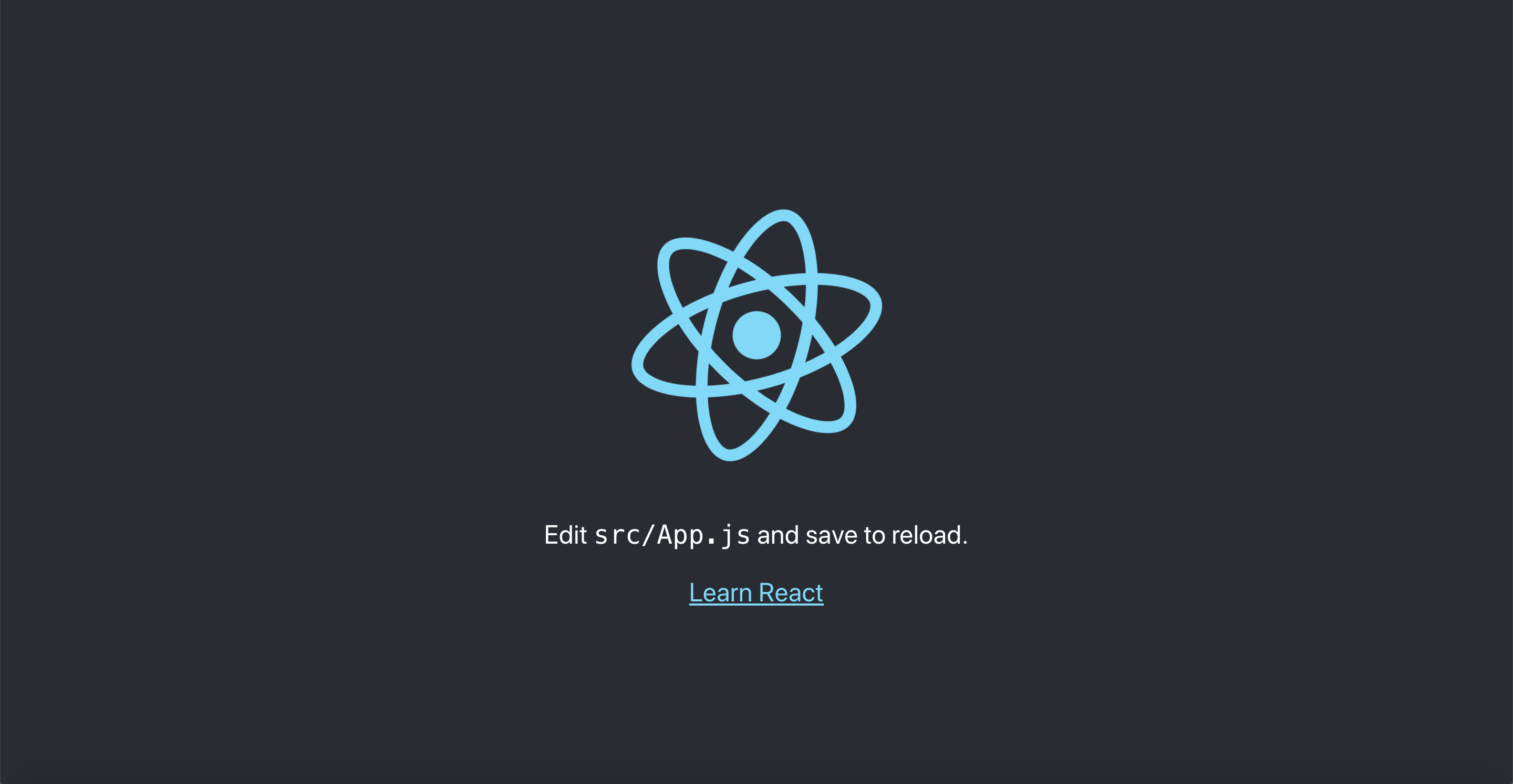
npm startYou should see the CRA landing page. They keep updating it, but it will look something like this:
We like a clean house. Let's first remove the modules and components we are not going to be using for this exercise.
Remove these files:
src/App.csssrc/App.test.jssrc/index.csssrc/logo.svg
Inside src/index.js, remove the import of index.css.
import ReactDOM from 'react-dom';
- import './index.css';
import App from './App';
Inside src/App.js, remove the logo and the import of app.css
import React, { Component } from 'react';
- import logo from './logo.svg';
- import './App.css';

class App extends Component {
  render() {
    return (
      <div className="App">
        <header className="App-header">
-         <img src={logo} className="App-logo" alt="logo" />
          <p>
            Edit <code>src/App.js</code> and save to reload.
          </p>
          <a
            className="App-link"
            href="https://reactjs.org"
            target="_blank"
            rel="noopener noreferrer"
          >
            Learn React
          </a>
        </header>
      </div>
    );
  }
}

export default App;
You should see a beautiful, mostly black and white (accessible), landing page 😄.
src/App.js is the only module in this example (to keep things simple). All the steps from here on will just assume you are inside src/App.js.
To add grommet you first need to install our packages
npm install grommet grommet-icons styled-components --saveYou can now add the import of the Grommet component.
import React, { Component } from 'react';
+ import { Grommet } from 'grommet';
Typically, you should include Grommet only once as one of your top-level nodes.
Let's replace the main div with Grommet.
- <div className="App">
+ <Grommet plain>
  <header className="App-header">
    <p>
      Edit <code>src/App.js</code> and save to reload.
    </p>
    <a
      className="App-link"
      href="https://reactjs.org"
      target="_blank"
      rel="noopener noreferrer"
    >
      Learn React
    </a>
  </header>
+ </Grommet>
- </div>
You will notice no visible change resulted from including Grommet. Everything in Grommet is self-contained with very minimal global settings.
You might be asking, 'Why do you include it if nothing is changing?'
The answer is simple: Although not strictly required,
we recommend you add Grommet from day one, so that you can customize it
in the future by using a theme.
Let's now remove plain from Grommet and add a custom font-family, font-size, and line-height.
Below the import statements, let's add an initial theme declaration:
const theme = {
  global: {
    font: {
      family: 'Roboto',
      size: '18px',
      height: '20px',
    },
  },
};
And modify the Grommet tag with our new theme:
<Grommet theme={theme}>This theme will propagate to all components under this given Grommet instance.
FYI. To access Roboto you need to include the font-face. Let's update public/index.html to include the font and fix some browser defaults.
<!DOCTYPE html>
<html lang="en">
  <head>
    ...
+   <link rel="stylesheet" href="https://fonts.googleapis.com/css?family=Roboto:300,400,500" />
    <title>React App</title>
+   <style type="text/css">
+     body {
+       margin: 0;
+     }
+   </style>
  </head>
Look at your updated landing page, and you should see that the font-size and font-family are properly applied.
Good job, you just completed an important step in your Grommet journey.
Box is an abstraction over Flexbox, and it is very likely you will be using it very frequently in your Grommet app.
To use Box we first need to import it:
- import { Grommet } from 'grommet';
+ import { Box, Grommet } from 'grommet';
We like to keep our imports in alphabetical order 😄.
Let's create an AppBar component and replace the header tag with it.
+const AppBar = (props) => (
+  <Box
+    tag='header'
+    direction='row'
+    align='center'
+    justify='between'
+    background='brand'
+    pad={{ left: 'medium', right: 'small', vertical: 'small' }}
+    elevation='medium'
+    style={{ zIndex: '1' }}
+    {...props}
+  />
+);

class App extends Component {
  render() {
    return (
      <Grommet theme={theme}>
-       <header className="App-header">
-         <p>
-          Edit <code>src/App.js</code> and save to reload.
-         </p>
-         <a
-           className="App-link"
-           href="https://reactjs.org"
-           target="_blank"
-           rel="noopener noreferrer"
-         >
-           Learn React
-         </a>
-       </header>
+       <AppBar>
+         Hello Grommet!
+       </AppBar>
      </Grommet>
    );
  }
}
AppBar is just a Box with row direction. Children are justified between (a space will be added in between them). We add an elevation to simulate the same box-shadow from the original example.
Look at your browser again. You should see the AppBar with the brand background and some elevation.
With Grommet it is very easy to apply custom brand colors. The place to change colors is in the theme object as you might have already guessed.
const theme = {
  global: {
+   colors: {
+     brand: '#228BE6',
+   },
    font: {
      family: 'Roboto',
      size: '18px',
      height: '20px',
    },
  },
};
The AppBar now has a different color. You can create colors with any name; brand was just an example.
Another great Grommet feature is the ability to easily declare context-aware colors which automatically adapt to light and dark themes. That is, any color can have two variations: dark and light. For example, use a light text color in a dark background,
and vice-versa. We have created this codesandbox with more details on color usage.
Let's add some children to the AppBar to make it more realistic.
Let import Button, Heading, and Notification icon.
- import { Box, Grommet } from 'grommet';
+ import { Box, Button, Heading, Grommet } from 'grommet';
+ import { Notification } from 'grommet-icons';
Update AppBar children to the following:
  <AppBar>
-    Hello Grommet!
+   <Heading level='3' margin='none'>My App</Heading>
+   <Button icon={<Notification />} onClick={() => {}} />
</AppBar>Now that we have an AppBar let's augment the dashboard with a body. We will have a main left panel and a sidebar.
-<Grommet theme={theme}>
+<Grommet theme={theme} full>
+ <Box fill>
    <AppBar>
      <Heading level='3' margin='none'>My App</Heading>
      <Button icon={<Notification />} onClick={() => {}} />
    </AppBar>
+   <Box direction='row' flex overflow={{ horizontal: 'hidden' }}>
+     <Box flex align='center' justify='center'>
+       app body
+     </Box>
+     <Box
+       width='medium'
+       background='light-2'
+       elevation='small'
+       align='center'
+       justify='center'
+     >
+       sidebar
+     </Box>
+   </Box>
+ </Box>
</Grommet>
We are extending Grommet to take the full viewport height and width. We add a Box to fill all the available space so that we have a flexbox container to rely on. The body is a Box with row direction. The flex prop instructs the Box to expand into the remaining available space (AppBar is taking some of the height in the container). The overflow prop ensures that both the main panel and sidebar fit within the width of the viewport, instead of having to scroll horizontally. The sidebar box has a medium width with a light-2 background.
Everything is so static here. Let's add some state. We are going to hide the sidebar initially and show it only when we click the notifications icon inside the AppBar.
class App extends Component {
+ state = {
+   showSidebar: false,
+ }
  render() {
+   const { showSidebar } = this.state;
    return (
      <Grommet theme={theme} full>
        <Box fill>
          <AppBar>
            <Heading level='3' margin='none'>My App</Heading>
-           <Button icon={<Notification />} onClick={() => {}} />
+           <Button
+             icon={<Notification />}
+             onClick={() => this.setState(prevState => ({ showSidebar: !prevState.showSidebar }))}
+           />
          </AppBar>
          <Box direction='row' flex overflow={{ horizontal: 'hidden' }}>
            <Box flex align='center' justify='center'>
              app body
            </Box>
-           <Box
-             width='medium'
-             background='light-2'
-             elevation='small'
-             align='center'
-             justify='center'
-           >
-             sidebar
-           </Box>
+           {showSidebar && (
+             <Box
+               width='medium'
+               background='light-2'
+               elevation='small'
+               align='center'
+               justify='center'
+             >
+               sidebar
+             </Box>
+           )}
         </Box>
        </Box>
      </Grommet>
    );
  }
}
We are just leveraging React state by creating a showSidebar flag initially set to false.
Once we click in the notification button, we toggle the showSidebar state. The button then serves to open and
close the sidebar.
Currently, the sidebar suddenly appears and disappears. Let's make it smoother by using the Collapsible component.
- import { Box, Button, Heading, Grommet } from 'grommet';
+ import { Box, Button, Collapsible, Heading, Grommet } from 'grommet';
Let's put the sidebar as a children of collapsible.
-{showSidebar && (
+ <Collapsible direction="horizontal" open={showSidebar}>
    <Box
+     flex
      width='medium'
      background='light-2'
      elevation='small'
      align='center'
      justify='center'
    >
      sidebar
    </Box>
+ </Collapsible>
-)}
Now the sidebar animates in and out. Without the added flex prop, the Box would no longer expand vertically to fill the available space.
If you open this page in a mobile device it will look terrible. You can verify this by reducing the browser window to approximate a mobile screensize. Relax, we will make it better by using ResponsiveContext.
As usual, importing first:
- import { Box, Button, Collapsible, Heading, Grommet } from 'grommet';
+import {
+ Box,
+ Button,
+ Collapsible,
+ Heading,
+ Grommet,
+ ResponsiveContext,
+} from 'grommet';
Let's make this a little easier to read for you and your future co-workers by breaking the long import statement down to one component per line. You may want to consider using prettier to auto format for you (Tip: you may want to change prettier config default to prettier.singleQuote: true).
ResponsiveContext uses react context api behind the scenes. Let's wrap the ResponsiveContext.Consumer inside Grommet.
<Grommet theme={theme} full>
+ <ResponsiveContext.Consumer>
+   {size => (
      <Box fill>
        <AppBar>
          <Heading level='3' margin='none'>My App</Heading>
          <Button
            icon={<Notification />}
            onClick={() => this.setState(prevState => ({ showSidebar: !prevState.showSidebar }))}
          />
        </AppBar>
        <Box direction='row' flex overflow={{ horizontal: 'hidden' }}>
          <Box flex align='center' justify='center'>
            app body
          </Box>
-         <Collapsible direction="horizontal" open={showSidebar}>
+         {size !== 'small' && (
+           <Collapsible direction="horizontal" open={showSidebar}>
              <Box
                flex
                width='medium'
                background='light-2'
                elevation='small'
                align='center'
                justify='center'
              >
                sidebar
              </Box>
            </Collapsible>
+         )}
        </Box>
      </Box>
+   )}
+ </ResponsiveContext.Consumer>
</Grommet>
If you open your browser and start resizing your window you will see that the sidebar disappears. What a great fix, right? We understand that you may be upset right now, but we promise to fix this in the next section.
Layer is one of our favorite components; it is very powerful as it handles accessibility and responsiveness.
We will use it in our example when size is small so that the sidebar takes the entire screen.
Please import the Layer first:
+import {
+ Box,
+ Button,
+ Collapsible,
+ Heading,
+ Grommet,
+ Layer,
+ ResponsiveContext,
+} from 'grommet';
We now can change the logic to swap between Collapsible and Layer.
- {size !== 'small' && (
+ {(!showSidebar || size !== 'small') ? (
    <Collapsible direction="horizontal" open={showSidebar}>
      <Box
        flex
        width='medium'
        background='light-2'
        elevation='small'
        align='center'
        justify='center'
      >
        sidebar
      </Box>
    </Collapsible>
+ ): (
+   <Layer>
+     <Box
+       fill
+       background='light-2'
+       align='center'
+       justify='center'
+     >
+       sidebar
+     </Box>
+   </Layer>
  )}
You can resize your browser now, and you will see that the sidebar takes over in mobile. But there is no way to close it, however that's easy to fix.
Import the FormClose icon:
- import { Notification } from 'grommet-icons';
+ import { FormClose, Notification } from 'grommet-icons';
Let's add that to our Layer.
<Layer>
+ <Box
+   background='light-2'
+   tag='header'
+   justify='end'
+   align='center'
+   direction='row'
+ >
+   <Button
+     icon={<FormClose />}
+     onClick={() => this.setState({ showSidebar: false })}
+   />
+ </Box>
  <Box
    fill
    background='light-2'
    align='center'
    justify='center'
  >
    sidebar
  </Box>
</Layer>
Well, let's celebrate because now we have a responsive Grommet app, thanks for hanging with us until now.
We will keep updating this starter page with more steps. The latest completed version of this exercise is available in this repo in the master branch.
Grommet can co-exist with other frameworks. We will never add global styles that will affect your existing components. Although the reverse is not true. By helping other teams migrate to Grommet, we have identified a common problem: global CSS modifiers affecting Grommet components. Whenever you see something weird, try to reproduce it outside your application environment.
If you are able to reproduce it, be nice, file an issue. If you cannot reproduce it, inspect your elements, and you will probably find some global CSS applying unexpected overly opinionated changes to our components. As always, you can join our Slack and share your pain with us.
Finally, here are some additional pointers to keep you engaged:
- Using Grommet in an existing app tutorial
- Grommet Storybook - a lot of examples on how to use our components. Most of them are not real app scenarios though. They are there to illustrate our different props.
- Grommet Sandbox - more friendly when you want to edit and play with the examples, also does not have real app scenarios.
- Grommet Vending - a sample app done in v2.
- Grommet Controls - higher level grommet components maintained by one of our external contributors Atanas Stoyanov.
- Grommet Site - site for v2 implemented in grommet v2, of course.