Welcome 🎉! Thanks for your interest in using Grommet in your existing application. This repository is a step-by-step guide on how to successfully integrate Grommet in your workflow.
Clone or fork this example in your local machine.
git clone https://github.com/grommet/grommet-starter-existing-app.git my-app
cd my-app
Install dependencies and start the development server.
yarn install
yarn start
You should see a Material UI example pricing page.
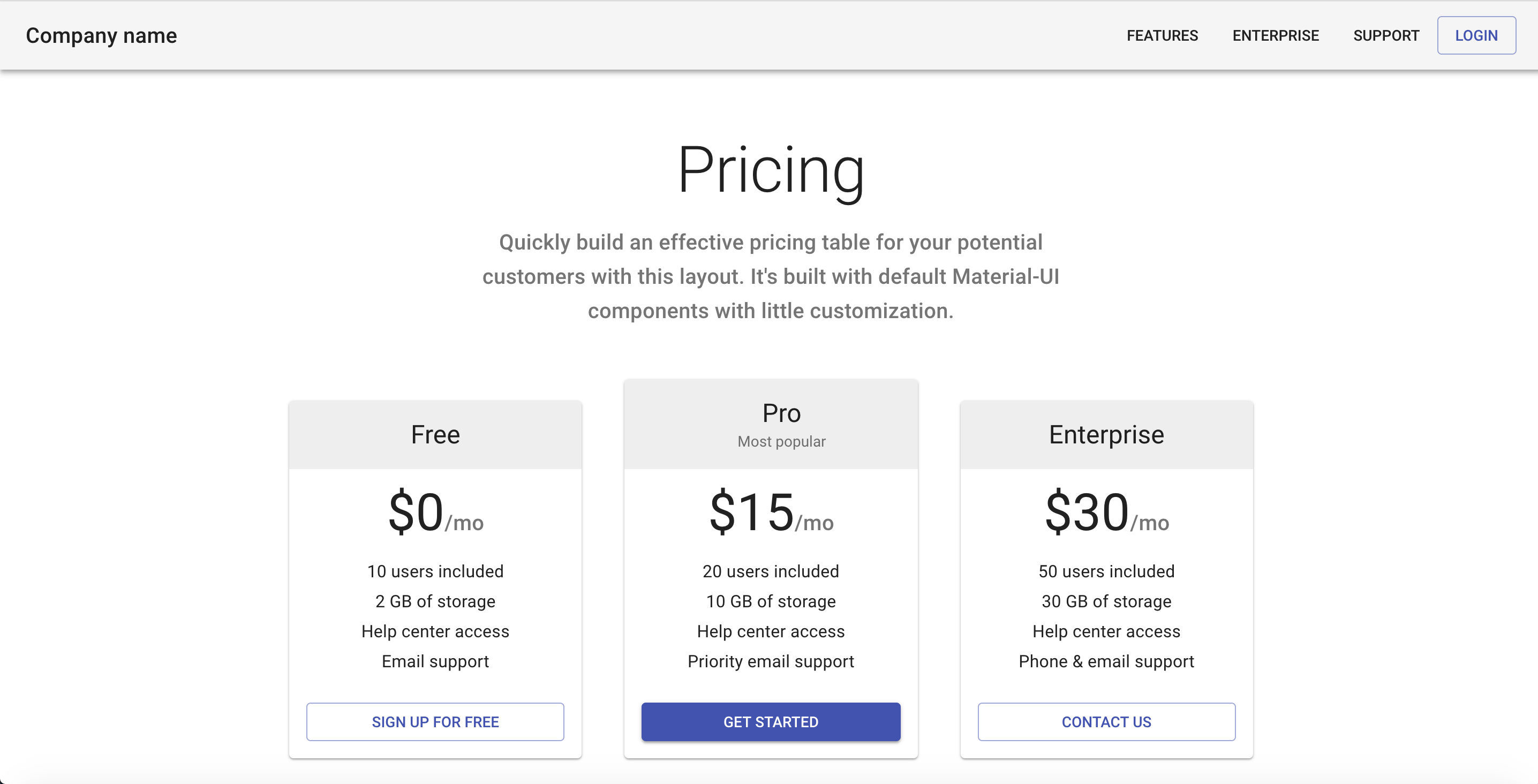
This is the application we are going to use as a reference to add Grommet in.
src/pages/index.js is the only module in this example (to keep things simple). All the steps from here on will just assume you are inside src/page/index.js.
To add grommet you first need to install our packages
yarn add grommet styled-components polished --saveYou can now add the import of the Grommet component.
import { withStyles } from '@material-ui/core/styles';
+ import { Grommet } from 'grommet';
Typically, you should include Grommet only once as one of your top-level nodes.
Let's replace React.Fragment with Grommet inside src/pages/index.js.
- <React.Fragment>
+ <Grommet plain>
  <CssBaseline />
  ...
- </React.Fragment>
+ </Grommet>
Nothing should change by including Grommet with plain prop.
Everything in Grommet is self-contained with very minimal global settings.
You should be asking why you are including it if nothing is changing.
The answer for this question is simple. Although not strictly required,
we recommend you add Grommet from day one, so that you can customize it
in the future by using the theme.
Let's now remove plain from Grommet and add a custom font-family, font-size, and line-height.
const theme = {
  global: {
    font: {
      family: 'Roboto',
      size: '14px',
      height: '20px',
    },
  },
};

<Grommet theme={theme}>
This theme will propagate to all components under this given Grommet instance.
Keep in mind that this change would not affect most of the text inside this example since Material UI
is setting the styles for their typography. We intentially added a p tag where you can see
this change in action.
Box is an abstraction over Flexbox and it is very likely you will be using it all over the place in your Grommet app.
To use Box we first need to import it:
- import { Grommet } from 'grommet';
+ import { Box, Grommet } from 'grommet';
We like to keep our imports in alphabetical order 😄.
Let's replace AppBar and Toolbar with Grommet Boxes.
+const AppBar = (props) => (
+  <Box
+    tag='header'
+    direction='row'
+    align='center'
+    justify='between'
+    background='light-2'
+    pad={{ vertical: 'small', horizontal: 'medium' }}
+    elevation='medium'
+    {...props}
+  />
+);

-<AppBar position="static" color="default" className={classes.appBar}>
- <Toolbar>
+<AppBar>
- <Typography variant="h6" color="inherit" noWrap className={classes.toolbarTitle}>
+ <Typography variant="h6" color="inherit" noWrap>
    Company name
  </Typography>
+ <Box direction='row'>
    <Button>Features</Button>
    <Button>Enterprise</Button>
    <Button>Support</Button>
    <Button color="primary" variant="outlined">
      Login
    </Button>
+ </Box>
- </Toolbar>
</AppBar>
You are now in full control over AppBar since the component lives
in your application. AppBar is just a Box with row direction that has two children.
These elements are justified between (a space will be added in between them) so that the title is on the left and the buttons are on the right. We add an elevation to simulate the same box-shadow from the original example.
You can now start noticing a few differences in the header size, elevation, and colors. By default grommet comes with a 24px base spacing unit scale. So small is 12px and medium is 24px. It seems that small in Material UI is 14px. Let's change our theme object to align better with Material UI.
const theme = {
  global: {
+   colors: {
+     'light-2': '#f5f5f5',
+     'text': {
+       light: 'rgba(0, 0, 0, 0.87)',
+     },
+   },
+   edgeSize: {
+     small: '14px',
+   },
+   elevation: {
+     light: {
+       medium: '0px 2px 4px -1px rgba(0, 0, 0, 0.2), 0px 4px 5px 0px rgba(0, 0, 0, 0.14), 0px 1px 10px 0px rgba(0, 0, 0, 0.12)',
+     },
+   },
    font: {
      family: 'Roboto',
      size: '14px',
      height: '20px',
    },
  },
};
We now have a 1:1 parity with the original example.
Notice that we started to add custom colors in our theme. You can create colors with any name, light-2 was just an example.
Another great feature that is available to you is to use one color that has two variations: dark and light.
This is very useful when you want to apply a different color depending on your context. For example, use a light text color in a dark background, and vice-versa.
We have created this codesandbox with more details on color usage.
You can also add new edgeSize and elevation names, for example:
const anotherTheme = {
  global: {
    edgeSize: {
      smallish: "14px",
    },
    elevation: {
      depth5: "0 0 1px 0 rgba(0,0,0,0.10), 0 2px 4px 0 rgba(0,0,0,0.10)",
    },
  },
};

<Grommet theme={anotherTheme}>
  <Box margin={{ top: "smallish" }} elevation="depth5">
    Hello Grommet!
  </Box>
</Grommet>;
We can now start cleaning up a few unused variables:
- import AppBar from '@material-ui/core/AppBar';
import Button from '@material-ui/core/Button';
import Card from '@material-ui/core/Card';
import CardActions from '@material-ui/core/CardActions';
import CardContent from '@material-ui/core/CardContent';
import CardHeader from '@material-ui/core/CardHeader';
import CssBaseline from '@material-ui/core/CssBaseline';
import Grid from '@material-ui/core/Grid';
- import Toolbar from '@material-ui/core/Toolbar';

const styles = theme => ({
  '@global': {
    body: {
      backgroundColor: theme.palette.common.white,
    },
  },
- appBar: {
-   position: 'relative',
- },
- toolbarTitle: {
-   flex: 1,
- },
  ...
}Now let's try to replace a Material UI button with the Grommet button.
As usual, let's first import the component.
- import { Grommet } from 'grommet';
+ import { Box, Button as GrommetButton, Grommet } from 'grommet';
Inside the AppBar let's replace the Login button.
<Box direction='row'>
  <Button>Features</Button>
  <Button>Enterprise</Button>
  <Button>Support</Button>
- <Button color="primary" variant="outlined">
-   Login
- </Button>
+ <GrommetButton color="primary" label='Login' />
</Box>
You will see that color primary is being transferred to the browser. Since we don't have that color in our theme, we just assume you want to use that directly. But this is wrong. In fact, the look and feel of the button is quite different. Where we fix this?
If you guessed the theme object, you are learning my friend.
We will need the polished package for this example. Also, we will need normalizeColor from grommet.
import { Box, Button as GrommetButton, Grommet } from 'grommet';
+ import { normalizeColor } from 'grommet/utils';
+ import { rgba } from 'polished';
Let's fix the button theme to match the other ones. You can find the entire Button theme spec at our site.
const theme = {
  global: {
    colors: {
      'light-2': '#f5f5f5',
      'text': {
        'light': 'rgba(0, 0, 0, 0.87)',
      },
      'primary': '#303f9f',
    },
    edgeSize: {
      small: '14px',
    },
    elevation: {
      light: {
        medium: '0px 2px 4px -1px rgba(0, 0, 0, 0.2), 0px 4px 5px 0px rgba(0, 0, 0, 0.14), 0px 1px 10px 0px rgba(0, 0, 0, 0.12)',
      },
    },
    font: {
      size: '14px',
      height: '20px',
    },
  },
+ button: {
+   border: {
+     width: '1px',
+     radius: '4px',
+   },
+   padding: {
+     vertical: '8px',
+     horizontal: '16px',
+   },
+   extend: props => `
+     text-transform: uppercase;
+     font-size: 0.875rem;
+     font-weight: 500;
+     line-height: normal;
+
+    ${!props.primary && `
+      border-color: ${rgba(normalizeColor(props.colorValue, props.theme), 0.5)};
+      color: ${normalizeColor(props.colorValue, props.theme)};
+      :hover {
+         box-shadow: none;
+         background-color: ${rgba(normalizeColor(props.colorValue, props.theme), 0.08)};
+       }
+     `}
+   `,
+ },
};
There is a lot going on here. Let's digest it. The button theme entry has a handful set of pre-defined variables. But it is pretty much impossible for us to map all the possible variations you may want in your button or any other component really. The common ones (border, padding, ...) are present, but you can always use the extend to customize things further. This entry is present in all components in grommet.
The extend can receive a string or a function. A string will apply the given styles to all component instances. A function will receive the props of the given component and then you can make dynamic decisions on which styles to apply given the state of the component.
The Material UI button text is always uppercase and have a different font-size than ours. Also, the hover interactions are different. Material UI uses an alpha channel based on the color prop to add some hover interactions. We are using polished to be able to pass any color and let them convert it to rgb accordingly. We are also using normalizeColor to transform primary into #303f9f.
You may have noticed that colorValue is being used instead of color, the actual prop name. This happens because styled-components honors and passes down all valid DOM attributes, and color is one of them. The problem is that we don't want color to be added to the DOM, we only use it for styling reasons. To avoid this "leaking" problem we added the Value suffix. This is a convention in Grommet for all other valid DOM attributes used.
Using extend at this level is a very advanced use case of Grommet. But if you are integrating to an existing app we assume that you want to have the same look and feel as before.
Join our Slack if you have any questions about theming, we promise we are friendly.
We will keep updating this starter page with more steps. The latest completed version of this exercise is available in this repo as the latest branch.
Grommet can co-exist with other frameworks. We will never add global styles that will affect your existing components. Although the reverse is not true. By helping other teams migrate to Grommet, we have identified a common problem: global CSS modifiers affecting Grommet components. Whenever you see something weird, try to reproduce it outside your application environment.
If you are able to reproduce it, be nice, file an issue. If you cannot reproduce it, inspect your elements, and you will probably find some global CSS applying unexpected overly opinionated changes to our components. As always, you can join our Slack and share your pain with us.
Finally, here are some additional pointers to keep you engaged:
- Starting Grommet from scratch tutorial
- Grommet Storybook - a lot of examples on how to use our components. Most of them are not real app scenarios though. They are there to illustrate our different props.
- Grommet Sandbox - more friendly when you want to edit and play with the examples, also does not have real app scenarios.
- Grommet Site - site for v2 implemented in grommet v2, of course.