This project is a submission to Visual Analytics Science and Technology (VAST) Challenge 2019 (Mini Challege 1).
Live website: https://vast2019.maxnadul.com
Project submission package: Summary Presentation, Answer
The majority of codebase can be found in nuxt directory.
The IEEE Visual Analytics Science and Technology (VAST) Challenge is an annual contest with the goal of advancing the field of visual analytics through competition. The VAST Challenge is designed to help researchers understand how their software would be used in a novel analytic task and determine if their data transformations, visualizations, and interactions would be beneficial for particular analytic tasks. VAST Challenge problems provide researchers with realistic tasks and data sets for evaluating their software, as well as an opportunity to advance the field by solving more complex problems. Source
Data transformation and analysis: R (bsts, tidyverse, coda, bayestestR, doFuture, zoo), mapshaper, Python (PyMC3)
Visualization: Vega, VSUP, Tableau, ggplot2
Web application: Vue, Nuxt, Vuex, Element UI
Deployment & Hosting: Netlify, Tableau Public
Cloud services: Google Compute Engine, Google Cloud Storage
Version control system (VCS): Git, GitHub
Integrated development environment (IDE): VS Code, RStudio, Jupyter on Colaboratory
Prototyping & Image editing: Sketch
Data sonification: TwoTone
Note: This scenario and all the people, places, groups, technologies, contained therein are fictitious. Any resemblance to real people, places, groups, or technologies is purely coincidental.
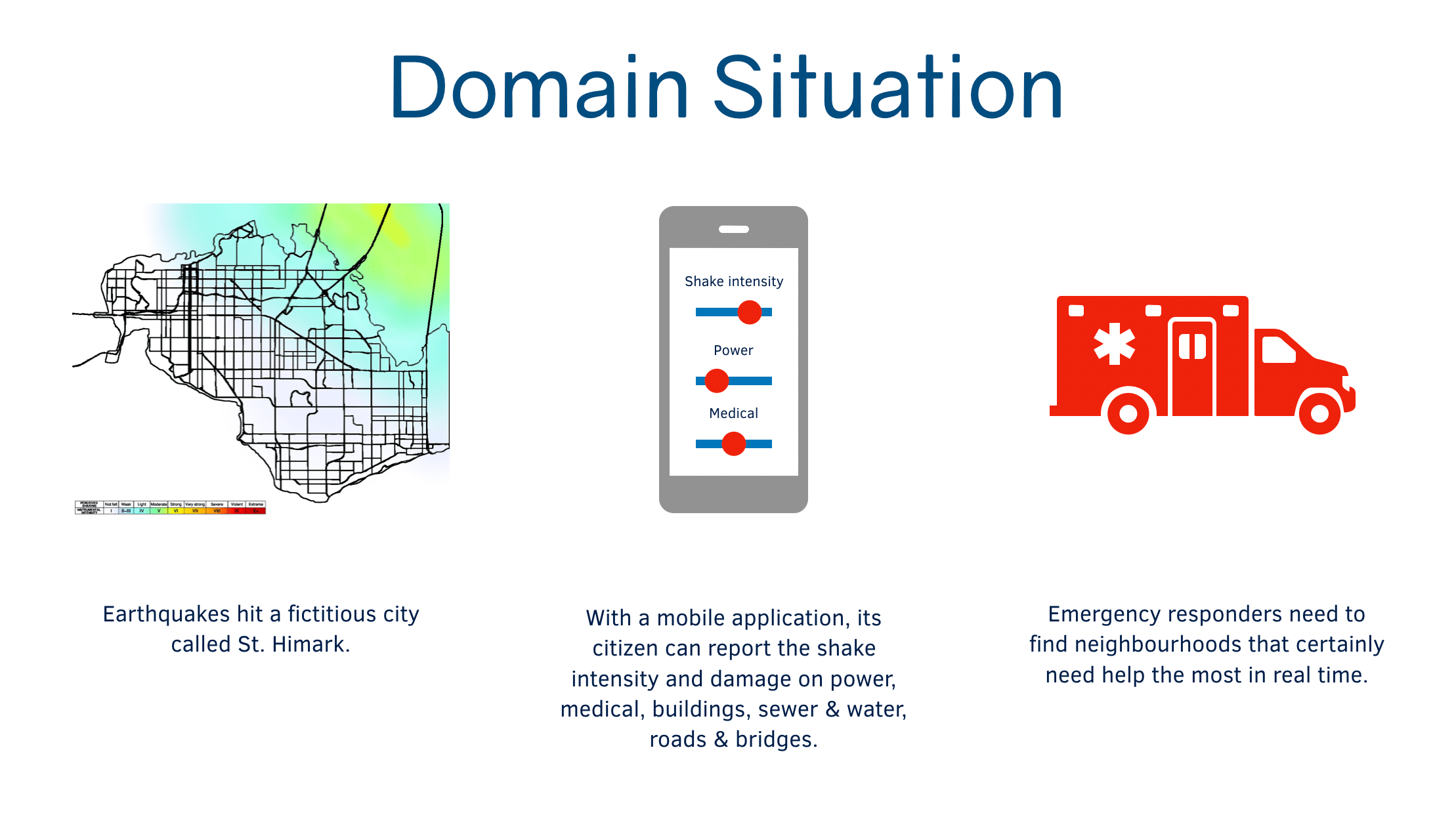
St. Himark is a vibrant community located in the Oceanus Sea. Home to the world-renowned St. Himark Museum, beautiful beaches, and the Wilson Forest Nature Preserve, St. Himark is one of the region’s best cities for raising a family and provides employment across a number of industries including the Always Safe Nuclear Power Plant. Well, all that was true before the disastrous earthquake that hits the area during the course of this year’s challenge. Mayor Jordan, city officials, and emergency services are overwhelmed and are desperate for assistance in understanding the true situation on the ground and how best to deploy the limited resources available to this relatively small community.
St. Himark has been hit by an earthquake, leaving officials scrambling to determine the extent of the damage and dispatch limited resources to the areas in most need. They quickly receive seismic readings and use those for an initial deployment but realize they need more information to make sure they have a realistic understanding of the true conditions throughout the city.
In a prescient move of community engagement, the city had released a new damage reporting mobile application shortly before the earthquake. This app allows citizens to provide more timely information to the city to help them understand damage and prioritize their response. In this mini-challenge, use app responses in conjunction with shake maps of the earthquake strength to identify areas of concern and advise emergency planners.
With emergency services stretched thin, officials are relying on citizens to provide them with much needed information about the effects of the quake to help focus recovery efforts.
By combining seismic readings of the quake, responses from the app, and background knowledge of the city, help the city triage their efforts for rescue and recovery.
The data for MC1 includes one (CSV) file spanning the entire length of the event, containing (categorical) individual reports of shaking/damage by neighborhood over time. Reports are made by citizens at any time, however, they are only recorded in 5-minute batches/increments due to the server configuration. Furthermore, delays in the receipt of reports may occur during power outages. mc1-reports-data.csv fields: - time: timestamp of incoming report/record, in the format YYYY-MM-DD hh:mm:ss - location: id of neighborhood where person reporting is feeling the shaking and/or seeing the damage - {shake_intensity, sewer_and_water, power, roads_and_bridges, medical, buildings}: reported categorical value of how violent the shaking was/how bad the damage was (0 - lowest, 10 - highest; missing data allowed)
Also included are two shakemap (PNG) files which indicate where the corresponding earthquakes' epicenters originate as well as how much shaking can be felt across the city.
- Emergency responders have damage intensity reports from citizen over time. They need to find neighbourhoods that certainly need help the most in real time.
- Crowdsourced data may vary markedly, especially when the reports are based on subjective measurements. Therefore, the emergency responders should be informed about the uncertainty in the reports.
- Situations and incoming reports are dynamic. Is the uncertainty dynamic too?
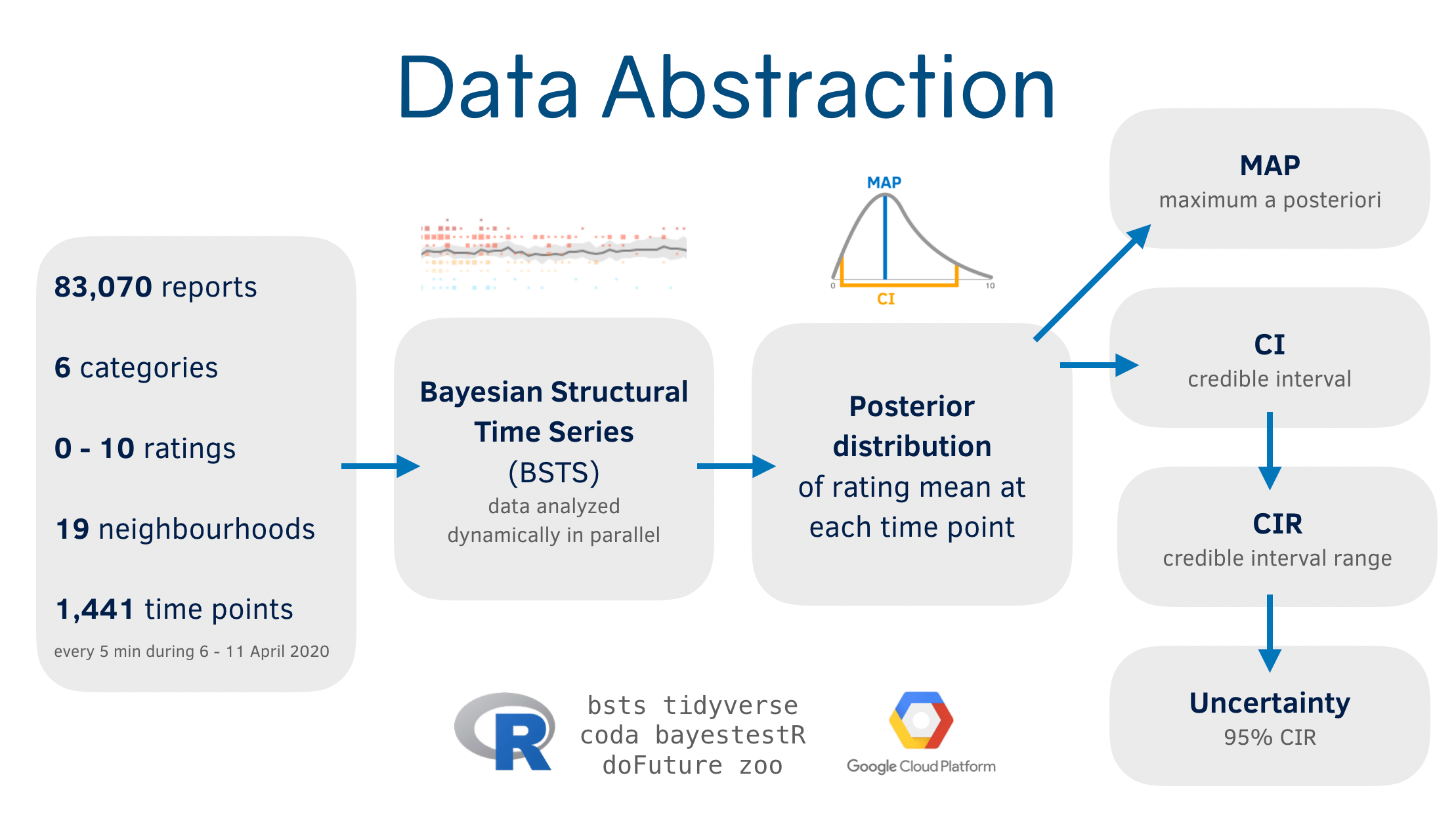
The reported ratings are modelled by Bayesian structural time series (BSTS) with a local level state [Scott2013]. The model yields a posterior probability distribution of the mean of rating at each given time point in the time series. The mode of the posterior probability distribution is defined as a maximum a posteriori (MAP) probability estimate. The highest posterior density interval specifies a credible interval (CI). To put it simply, a MAP is the most likely value of the actual mean, and a CI shows the subjective probability of the most likely interval of the mean.
According to Bayes’ theorem, the posterior distribution is proportional to the prior times the likelihood. We ran BSTS on the data once we have at least 5 data points from a category of a neighbourhood. The prior was simply set by a normal distribution with a mean of the first data point and an SD of 0.1 of the SD of all data points, which was the default setting. While this prior setting yielded reasonable output, we might have adjusted the priors with our beliefs, such as the known shake intensity and ongoing construction work that might affect the reports. The likelihood here is the probability of having data we observed, or the evidence given the model. The more the evidence we have, the certain the posterior is. Once a posterior distribution is obtained, it is then used as a prior distribution at the next time point recursively.
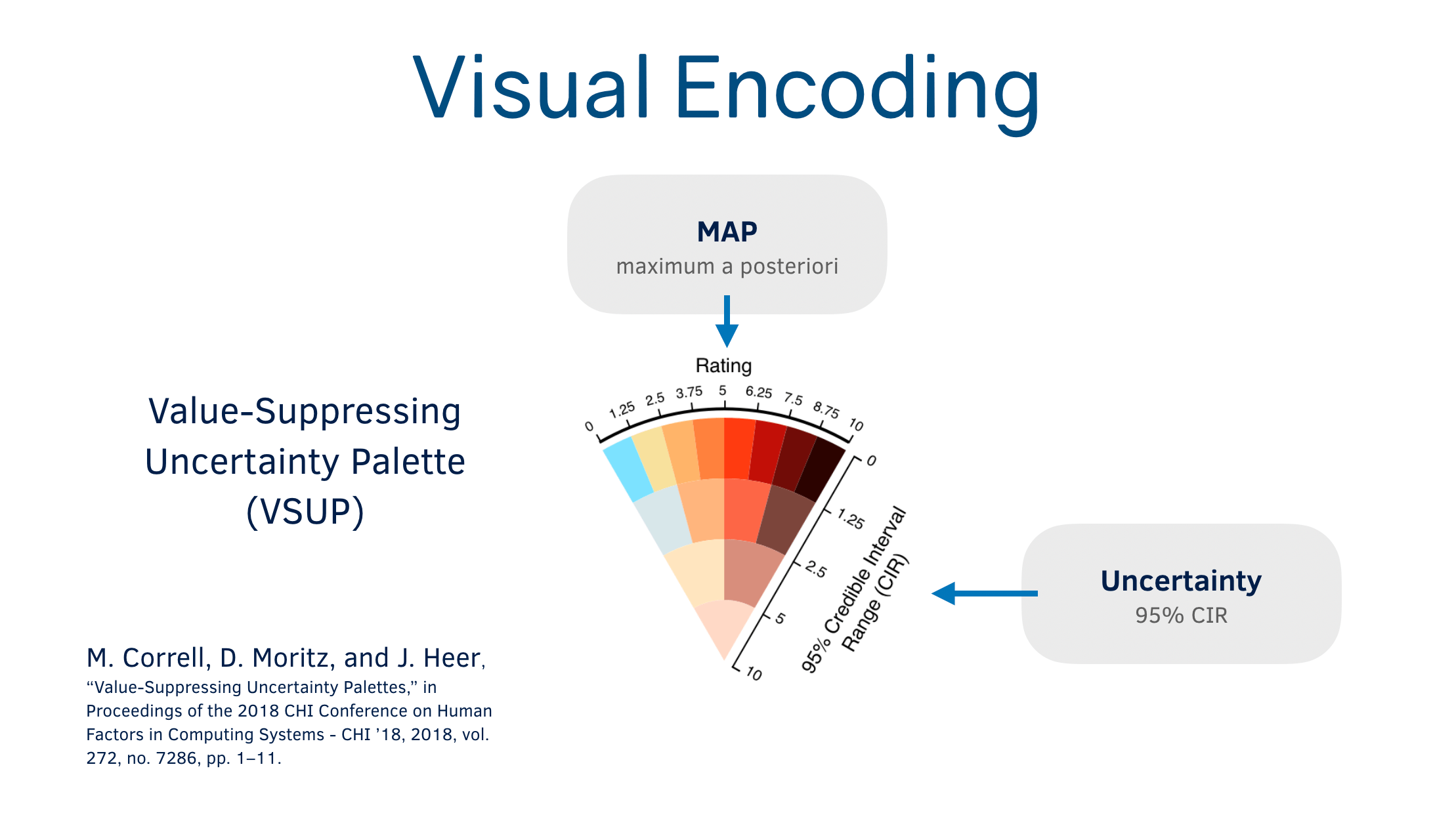
We defined uncertainty by 95% credible intervals range (CIR). The 95% threshold was set arbitrarily, yet we obtained reasonable representations. A CI lower bound starts at 0. However, an upper bound can be over 10, which is beyond the rating we have, so we capped it at 10 when we calculated CIR. We had 3 and 4 tiers of CIR depending on the VSUP palettes. The cut-off thresholds of CIR were set by the extent of each colour in each tier. For example, the most certain tier in the four-tier VSUP palette has 8 colours. Each colour then spans the rating range of 1.25 (10 divided by 8). As a result, CIR also ranges from 0 to 1.25. The following tier has 4 colours, spanning 2.5 ratings. Hence, the next cut-off threshold is 2.5. CIRs of 1.25, 2.5 and 5 are close to Q1, Q2 and Q3 of CIR.
The main tasks of the visualization include discovery, summarization and comparison.
On this dashboard, the values and uncertainties of the MAPs are encoded with colours from the value-suppressing uncertainty palettes (VSUPs) [Correll2018].
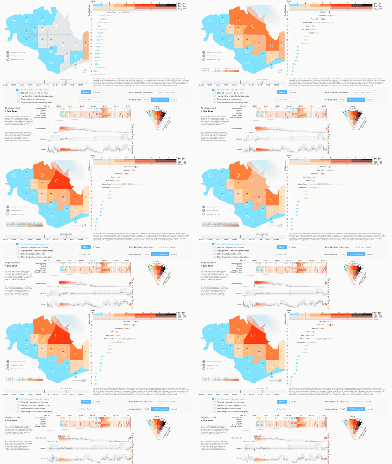
There are four visual representations.
-
Error Bar Chart: The MAPs and 95%, 80% & 50% CIs are visualized, respectively, as the circle marks and the graded error bars on the horizontal rating scale. The circle mark is coloured with either a three-tier 7-colour VSUP, an extended four-tier 15-colour VSUP or a normal 4 discrete colours. The four-tier 15-colour VSUP is recommended for trained personnel to gather detailed information. The circle mark has three visual variants that indicate the recentness of the data.
-
Map with Choropleth and Circle Marks: The same circle mark from Error Bar Chart is placed spatially on the map. The neighbourhoods can be filled with either of the three colour palettes.
-
Heat Map: Each unit displays the maximum value of hourly aggregated MAP and its respective 95% CIRs.
-
Line Charts: They show the progression of MAP values and certainties over time. They are linked to Heat Map, which follows overview first, zoom and filter, then details-on-demand [Shneiderman1996].
All representations are assembled together. They are in sync and interacting with one another.
The CIR can be visually quantified from the horizontal width of the graded error bar, or the vertical width of the grey area in Line Charts.
Despite the effectiveness of the length channel in accurately presenting the quantitative information, the length channel has limited scalability. Instead of length, the colour channel is used extensively on this dashboard. The colours from the value-suppressing uncertainty palettes (VSUPs) encode both the values and uncertainties of the MAPs. That is, the VSUP compresses two data attributes into one visual channel. This has at least three main benefits to this dashboard.
-
Compared to two channels, a single channel demands less cognitive load from the viewer. They no longer need to mentally gauge the credibility of the values, which also facilitates comparisons between spatial locations or between temporal points.
-
The more certain a value is, the more vibrant its colour is. Colour vibrance is a pre-attentive visual attribute that draws attention. This is beneficial for detecting damaged locations with high certainties.
-
As represented by a single channel, the colour can combine with other channels to compose scalable visualization, such as positions in Heat Map.
To perform data analysis, aggregation and transformation, we used R with several libraries, as mentioned above (scripts available here). The analysis is computationally intensive, involving Markov chain Monte Carlo sampling. Hence, to reduce the loading time, we ran this analysis parallelly prior to the visualization creation and used the processed results for the visualization.
All visual elements and interactions are rendered and handled by Vega [Satyanarayan2016] with our specification JSON files (available here). Vega performs data parsing that may take lengthy time to initialize the visualization. Streaming live data may shorten the initialization.
Data aggregation was done in R. Vega could also perform such task on the client browser, but the task is too computationally intensive.
-
Correll M, Moritz D, Heer J (2018), “Value-Suppressing Uncertainty Palettes,” in Proceedings of the 2018 CHI Conference on Human Factors in Computing Systems - CHI ’18, vol. 272, no. 7286, pp. 1–11, doi:10.1145/3173574.3174216.
-
Munzner T (2009), “A Nested Process Model for Visualization Design and Validation,” IEEE Trans. Vis. Comput. Graph., vol. 15, no. 6, pp. 921–928, doi:10.1109/TVCG.2009.111.
-
Munzner T (2014), Visualization Analysis & Design. Boca Raton, FL: CRC Press.
-
Satyanarayan A, Russell R, Hoffswell J, Heer J (2016), “Reactive Vega: A Streaming Dataflow Architecture for Declarative Interactive Visualization,” IEEE Trans. Vis. Comput. Graph., vol. 22, no. 1, pp. 659–668, doi:10.1109/TVCG.2015.2467091.
-
Scott S L, Varian H R (2013), “Predicting the Present with Bayesian Structural Time Series,” SSRN Electron. J., pp. 1–21, doi:10.2139/ssrn.2304426.
-
Shneiderman B (1996), “The eyes have it: a task by data type taxonomy for information visualizations,” in Proceedings 1996 IEEE Symposium on Visual Languages, pp. 336–343, doi:10.1109/VL.1996.545307.


