Gurita is a command line tool for analysing and visualising tabular data in CSV or TSV format.
At its core Gurita provides a suite of commands, each of which carries out a common data analytics or plotting task.
A unique and powerful feature of Gurita is that commands to be chained together into flexible analysis pipelines. See the advanced example below.
It is designed to be fast and convenient, and is particularly suited to data exploration tasks. Input files with large numbers of rows (> millions) are readily supported.
Gurita commands are highly customisable, however sensible defaults are applied. Therefore simple tasks are easy to express and complex tasks are possible.
Gurita is implemented in Python and makes extensive use of the Pandas, Seaborn, and Scikit-learn libraries for data processing and plot generation.
Please consult the Gurita Documentation for detailed information about installation and usage.
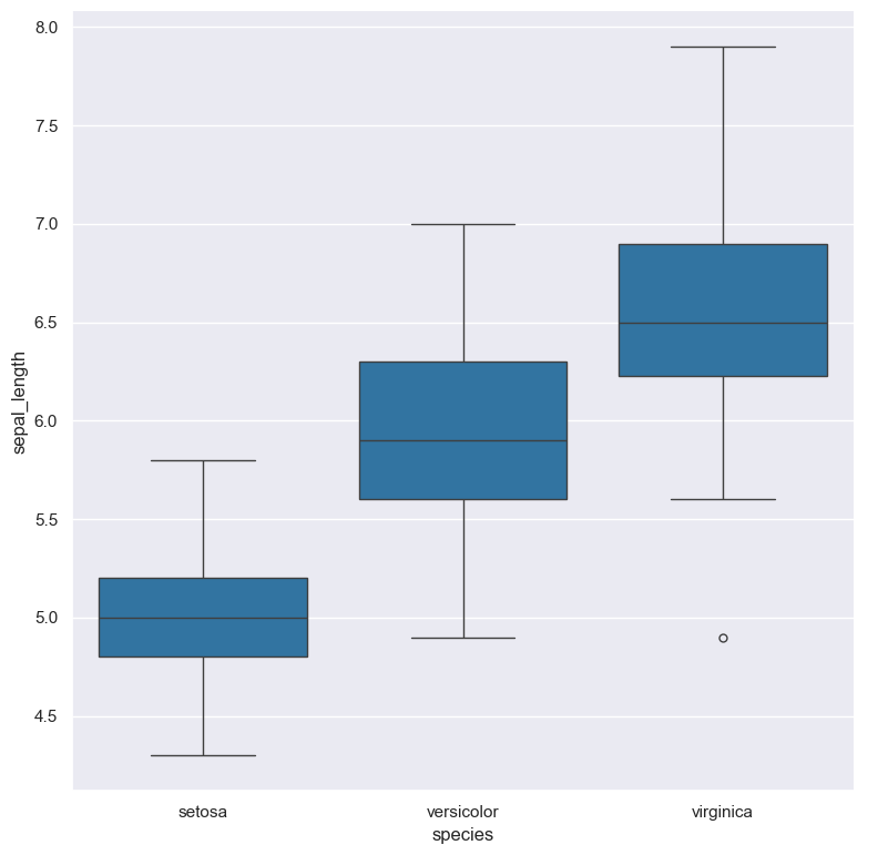
Box plot of sepal_length for each species in the classic iris dataset:
cat iris.csv | gurita box -x species -y sepal_lengthThe following example illustrates Gurita's ability to chain commands together.
Commands in a chain are separated by the plus sign (+) and data flows from left to right in the chain.
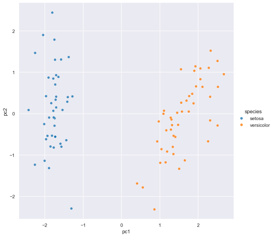
cat iris.csv | gurita filter 'species != "virginica"' \
                      + sample 0.9 \
                      + pca \
                      + scatter -x pc1 -y pc2 --hue species
In this example there are 4 commands that are executed in the following order:
- The
filtercommand selects all rows wherespeciesis not equal tovirginica. - The filtered rows are then passed to the
samplecommand which randomly selects 90% of the remaining rows. - The sampled rows are then passed to the
pcacommand which performs principal component analysis (PCA) as a data reduction step, yielding two extra columns in the data calledpc1andpc2. - Finally the pca-transformed data is passed to the
scattercommand which generates a scatter plot ofpc1andpc2(the first two principal components).
This program is released as open source software under the terms of MIT License.


