A modular heatmap library for R-base graphics
There are many excellent fully featured heatmap/plot libraries. While those may be excellent for data exploration (notably, pheatmap), they often produce images which are difficult to get to "publication quality". Figure quality is essential for demonstration of your data and this is no more relevant than with heatmaps, which can be notorious for being inscruitably dense.
This package is meant to address a couple of what I see as a couple common problems which are hard to fix in other tools:
- Color control poorly tuned to the data type (zero-centered data vs magnitude data).
- Unlabeled annotations, usually relying on matching games with indistinct colors.
- No flexiblity in the orientation, or manner of annotated attributes (sides, different formats).
- No tiers of organization, usually relying on clustering/not clustering as the only form of ordering.
- Arbitrary plotting spaces are commonly used for many packages relating to ggplot. For those that want to use R-base graphics tools, they are usually tough to mix.
Installing can be done simply using devtools.
install.packages("devtools") #Installing from CRAN if you don't have devtools

devtools::install_github("nateyjay/layermap")
require(layermap)
These are:
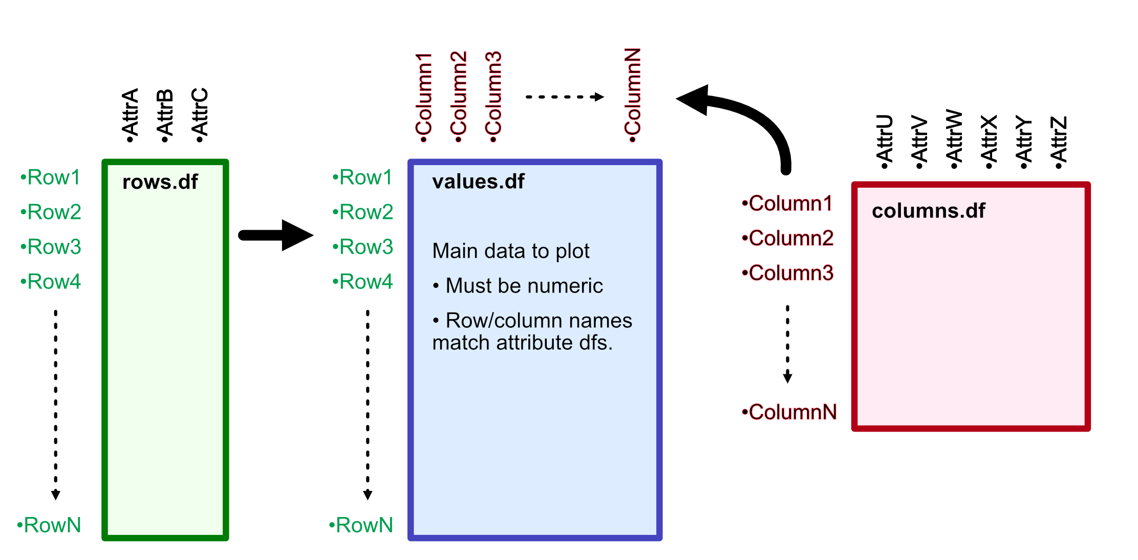
value.df- a matrix or dataframe which contains only numerical data. This makes up the "heat" portion of the plot, with rownames and colnames as essential keys to connect to attribute tables.row.df- a dataframe which contains all of the attributes for the rows of the plot. Rows of this dataframe correspond to the rows of thevalue.df. This can include an arbitrary number of columns, which make up the attributes. Usually, these are categorical data but it's not required in case your dataframe has other superfluous columns in it.column.df- Just like therow.df, except matching the columns of the plot. Rows of this dataframe correspond to the columns of thevalue.df
You can easily test the assumptions for naming like this:
## setequal() can tell if they have the same values (order is unimportant)
setequal(rownames(row.df), rownames(value.df))
[1] TRUE
setequal(rownames(column.df), colnames(value.df))
[1] TRUE

## reordering the value.df based on names can also do this.
value.df[row.names(row.df), row.names(column.df)] ## should return no errors.
Note: row.df and column.df are not required, but are almost certainly necessary to annotate the plot with layers (where the magic lives).
This function is modular, so it relies on multiple commands to build a complete plot. The main command is layermap(), which will produce the unannotated plot. The output of this will be saved and passed into subsequent commands to add layers to the annotation.
lp <- layermap(lp, value.df=value.df, column.df=column.df, row.df=row.df, column_groups=c("groupA"))

lp <- lp_group(lp, side=3, gname='groupA')
lp <- lp_dend(lp, side=2, lwd=2)
lp <- lp_annotate(lp, side=1, aname='anotherColumn')
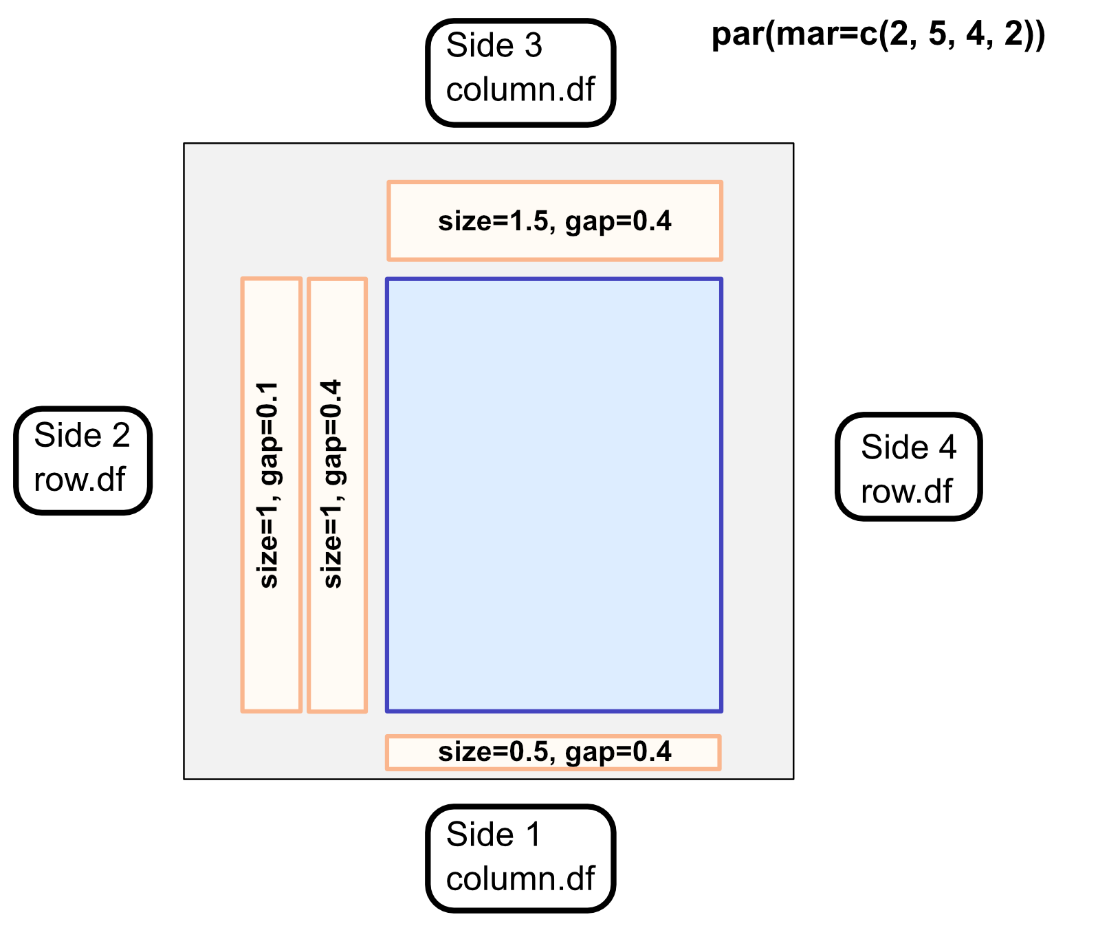
Layer-functions add a layer feature next to the plot, with the side corresponding to r-plotting sides:
(1-bottom, 2-left, 3-top, 4-right)
Sides make it important to give the correct attribute names for the sides:
(sides 1,3 ~ column.df, sides 2,4 ~ row.df)
The general plotting area and layers are spatially defined in terms of the margin lines. In terms of R base graphics, the plotting area is where the colored "heats" are shown, while the margins include the layers.
Margin sizes can be changed using par(mar), as always. Example: par(mar=c(2,3,3,10))
Layer dimensions are decided by predominantly 2 attributes: the size of the layer and the gap between this layer and the prior, both in terms of lines. The defaults are size=4 and gap=0.4, meaning that most layers will be 1.5x the size of the gap.
Proportion in export is always difficult to work out. Since layer dimensions are based on margins, if you change the plotting area the layers will be dramatically affected. This means, that you will need to replot all the layers. A recommended workflow using R-studio is to reform the plotting window and margin sizes until they meet they look good and then export that same plotting window size. svglite is an excellent package for exporting vector graphics.
Example for plotting window size:
#once you find a good window, you can save using svglite to save

svglite("output_plot.svg", par()$din[1], par()$din[2]) #uses the inch dimensions of the current plotting window.

#par("mar") call here
#layermap plotting code here

dev.off()
ADsvg("output_plot.svg") # an optional function that helps with software compatibility (affinity designer)
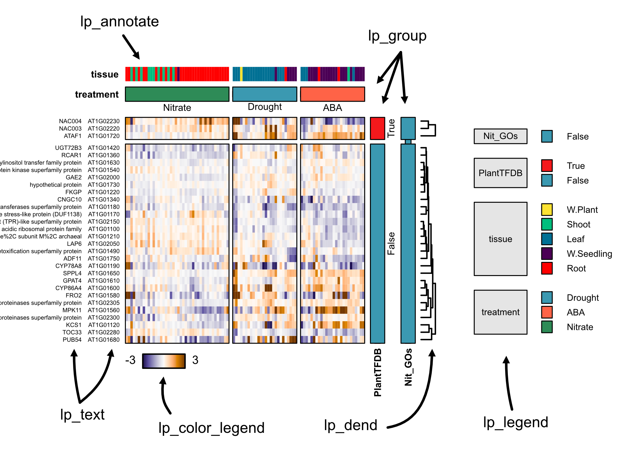
Sometimes, you want to show heatmaps where some attributes are grouped together and won't inter-mingle with other groups upon clustering. This is a core-feature of layermap, and allows the user to highlight multiple layers of groups in the data for each axis.
Groups are derived from attribute columns in the row.df and column.df. As these affect the actual plotting order and dimensions of the heatmap, these must be specified in the initial invocation of layermap() using the following options:
row_groupsand/orcol_groups- vectors of which columns for the respective dataframes should be grouped. These values must be found in the attributes columns of those dataframes.group_gap- the distance (in proportion of plotting area) by which groups should be separated. Default = 0.02.
Group layers can be added using the lp_group() function. Multiple group layers may be plotted, if multiple group attributes were specified.
Several other layer functions allow building a custom plot.
lp_dend() adds a dendrogram for sides that have been hierarchically clustered. This accepts many line-related options from r-base plotting.
lp_annotate() adds colored category annotations. These are unlabeled and generally useful to see how clustering relates to categories.
lp_text() adds text labels to an axis. Useful to show gene names, symbols (or both!). A r-base character related options.
Colors will automatically be provided from default hcl.colors palettes. For all layers, colors can be specified as a named vector, with the names corresponding to attribute conditions. This can be easily made with setNames():
color_vector = setNames(colors, conditions)
Any unnamed colors will be substituted from palettes.
column.df <- read.delim("test/columns.txt")
column.df$treatment <- factor(column.df$treatment, levels=c("Nitrate", "Drought", "ABA"))

row.df <- read.delim("test/rows.txt")
value.df <- read.delim("test/values.txt")

par(mar=c(5,7,5,10))
lp = layermap(value.df, zero_centered_colors = T,
                  column.df=column.df, row.df=row.df,
                  column_groups=c('treatment'), row_groups=c("PlantTFDB", 'Nit_GOs'),
              cluster_cols=T,
              group_gap = 0.02)

lp = lp_group(lp, 3, 'treatment', labels=T, label_just = 'left',
                    col=setNames(c('seagreen','tomato'), c('Nitrate','ABA')),
                    show_bounding_box = F)


lp = lp_annotate(lp, 3, 'tissue', label_just = 'left',
                       col=setNames('red', 'Root'))

lp = lp_group(lp, 4, 'PlantTFDB', labels=T, label_just = 'left')
lp = lp_group(lp, 4, 'Nit_GOs', labels=F, label_just = 'left')

lp = lp_names(lp, 2, cex=0.5)
lp = lp_names(lp, 2, 'symbol', cex=0.5)
lp = lp_dend(lp, 4, lwd=1.5, gap=0.4)

lp = lp_color_legend(lp, 1)
-
Make a simple install guide.
-
Complete help documents within R.
-
Complete more reproducible examples.
-
Improve catagorical legend plotting.
-
Make legend for color gradients. Urgent
-
Compatibility function for AD2.
-
Color scale layer in addition to annotate.
-
manual setting of zlim for input.
Not so sure theses have all been asked, but here we address some problems encountered by users (and hopefully solutions)
Linux systems sometimes manage their R packages by the system package manager (apt in Ubuntu). This means you probably need to install it on the command line with a command like: sudo apt-get install r-cran-devtools
For more, see: https://stackoverflow.com/questions/48469005/install-devtools-package-in-ubuntu-vm


