There is a new, very interesting offer in Germany for a dynamic power contract. The company is called aWATTar and offers an HOURLY tariff which is based on the EPEX Spot Day-Ahead price. I don't have a smart meter yet and only know my yearly power consumption. So I wasn't able to use the Lohnt sich aWATTar? project.
I wanted to be able to get some rough idea about the expected costs of aWATTar HOURLY and therefore I created this visualization script.
The source of this data is the official (German) aWATTar API. Please note that this price is without VAT. So you will need to add 19% in order to get the actual prices for customers.
All data is only collected once and then cached.
For convenience, this repository comes with the pre-downloaded data from 2013-12-22 until 2021-09-24.
In order to get the latest daily data, please run ./awattar-statistics.py update first.
This will download and append the missing data to the file historical-data.txt.
Then run ./awattar-statistics.py calculate which will create all the files and visualizations.
This will take a few minutes of generation.
This script outputs a few CSV files which you can use for further processing, for instance Libreoffice Calc or Excel. The following three outputs are created:
- daily prices (
data/daily/2020-04-22.txt): prices per hour, format is{hour};{price}. Please note that there might be 25 or 23 hours on days where daylight saving changes, i.e. there might be no hour02or two hours02aand02b. - monthly minimum, average, median and maximum prices (
data/monthly/2020-08-*.txt): Those files contain the hourly minimum, average, median or maximum prices for the whole month. - yearly minimum, average, median and maximum prices (
data/yearly/2020-*.txt): Those files contain the hourly minimum, average, median or maximum prices for the whole year.
There are three types of visualizations:
- daily charts (
plot/daily/2020-04-22.png): bar chart for a single day - monthly percentile charts (
out/plot/monthly/2020-08.png): percentile chart for a month - yearly percentile charts (
out/plot/yearly/2020.png): percentile chart for a complete year
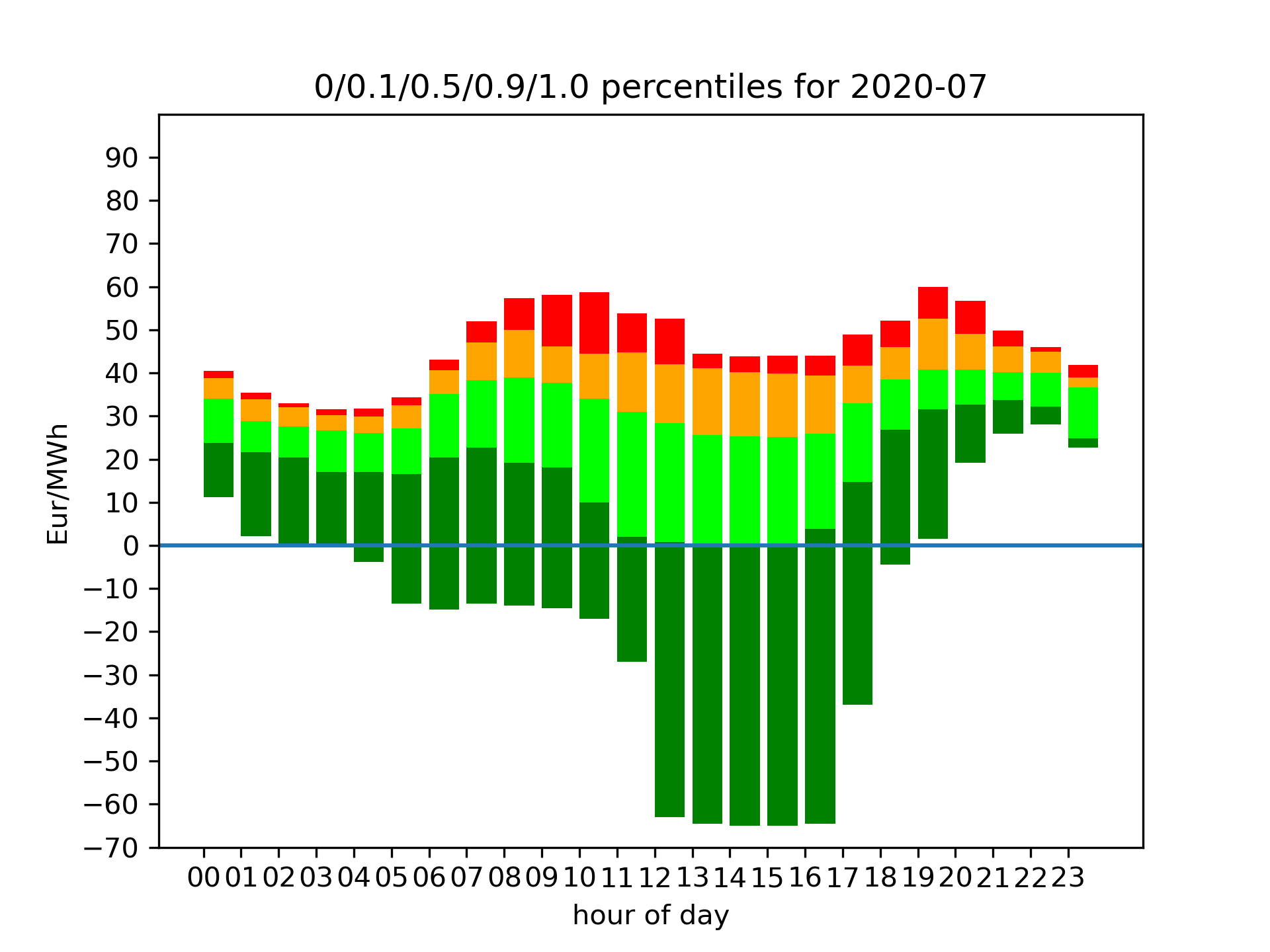
I find the monthly percentile charts the most interesting. Those look like the following:
 This graph shows the percentiles for each hour:
- The minimum 12:00-13:00 price in July 2020 was -6ct per kWh.
- 10% of the days, the 12:00-13:00 price was below zero, 90% it was above.
- The median price for 12:00-13:00 was a little below 3ct per kWh. 50% of the days, the price between 12:00 and 13:00 was therefore below 3ct per kWh and the other half of the days, the price was above.
- The maximum price between 12:00 and 13:00 in July 2020 was around 5.5ct per kWh.
If you want to have another visualization, please feel free to open an issue or - if you can - a pull request.