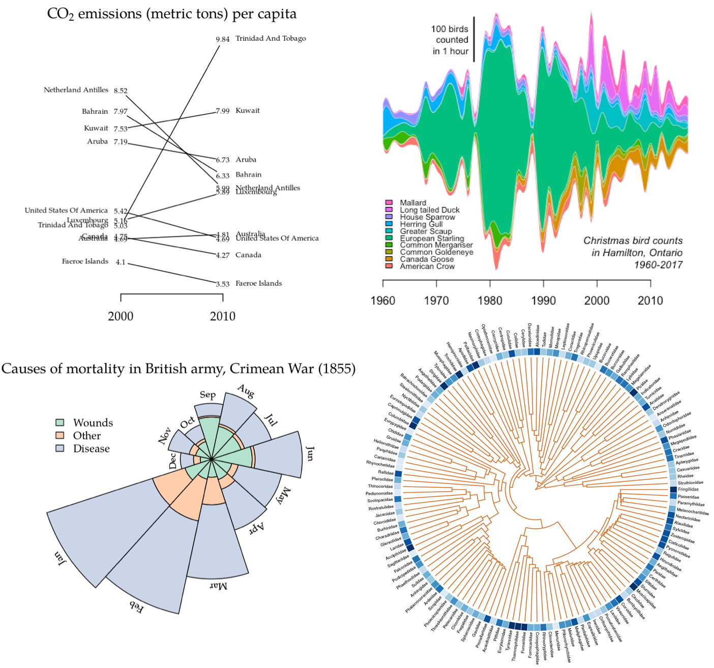
ggplot2 is a popular R graphics
package that is becoming synonymous with data visualization in R. The
community of developers working within the ggplot2 framework have
implemented some rather nice
extensions as well. However, it
is almost always possible for a visualization produced in ggplot2 to
also be generated using the base graphics package in R. Long-time users
of R who are accustomed to building plots with the latter may find the
syntax of ggplot2 counter-intuitive and awkward.
The overall purpose of ggfree is to make it easier to generate plots
in the style of ggplot2 and its
extensions, without ever actually using any ggplot2 code.
-
ggfreerequires the packageape, which you can install by running the commandinstall.packages('ape')within R. -
The simplest way to install
ggfreeis to download this package and then install it on the command line. You can use the GitHub web interface to download the latest version of this package as a ZIP archive, by clicking on the green Code button and then selecting the Download ZIP option on the contextual menu that appears. If you have thegitversion control program installed on your computer, then you can navigate to the desired location in your filesystem and run the command:git clone https://github.com/ArtPoon/ggfreeIn either case, navigate to the
ggfreedirectory in your Terminal app and run the command:art@Wernstrom ggfree % R CMD INSTALL . * installing to library ‘/Library/Frameworks/R.framework/Versions/4.0/Resources/library’
-
You can also use the
devtoolspackage to installggfreewithin R. If you already havedevtoolsinstalled in your R environment, then you can simply run:# install.packages('devtools') # if you haven't already installed devtools require(devtools) devtools::install_github("ArtPoon/ggfree")
However,
devtoolsis a large R package with many dependencies, so I don’t recommend this method if you haven’t already installed it.
In general, a slopegraph is a method for visually comparing a paired set
of observations. To illustrate the use of slopegraphs, I’ve adapted a
carbon dioxide emissions data set similar to the one used by @clauswilke
to demonstrate slopegraphs in Fundamentals of Data Visualization. This
data sets is packaged with ggfree:
require(ggfree)
#> Loading required package: ggfree
#> Loading required package: ape
#>
#> Attaching package: 'ggfree'
#> The following object is masked from 'package:ape':
#>
#>     unroot
co2.emissions
#>                          per.cap.2000 per.cap.2010
#> Netherland Antilles              8.52         5.99
#> Bahrain                          7.97         6.33
#> Kuwait                           7.53         7.99
#> Aruba                            7.19         6.73
#> United States Of America         5.42         4.69
#> Luxembourg                       5.16         5.89
#> Trinidad And Tobago              5.03         9.84
#> Canada                           4.75         4.27
#> Australia                        4.69         4.81
#> Faeroe Islands                   4.10         3.53
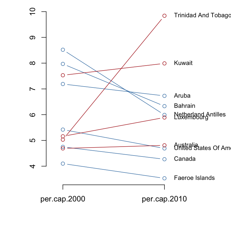
There are two styles of slopegraphs that are implemented in ggfree.
For the first style (where the argument type is left at its default
value 'b'), a vertical axis provides reference for the numerical
values:
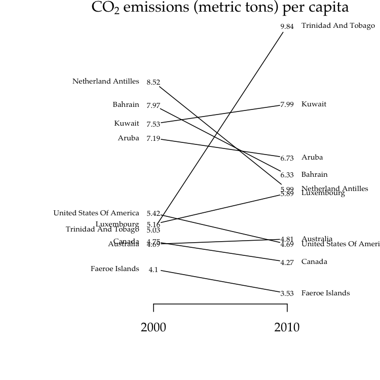
slopegraph(co2.emissions, colorize=T)For the second style (setting type='t'), we substitute the raw
numerical values for data points, which makes the vertical axis
unnecessary:
par(family='Palatino')  # use a fancier font

# the actual code here
slopegraph(co2.emissions, type='t', cex.text=0.6, names.arg=c(2000, 2010))

# make a nice title
title(expression(text=paste('CO'[2], ' emissions (metric tons) per capita')),
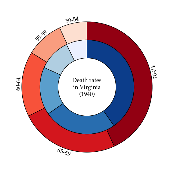
cex=0.7)A ring- or donut-plot is simply a piechart with a hole in it. Piecharts have been criticized for being potentially misleading because it is difficult to compare the areas of two different sectors by eye. However, they are intuitive and compact visual devices, and multiple plots can be drawn in varying sizes to encode additional information, such as sample size. The additional advantages of ringplots is that information can be embedded in the middle of the plot as text, and multiple ringplots can be nested within each other to display hierarchical frequency data (these are sometimes known as “sunburst” plots).
To generate a ring-plot in ggfree, you need to pass a vector of
numeric values and specify the inner and outer radii:
# prepare colour palettes
require(RColorBrewer)
#> Loading required package: RColorBrewer
pal1 <- brewer.pal(5, 'Blues')
pal2 <- brewer.pal(5, 'Reds')

# calling ringplot without x, y args makes new plot
ringplot(VADeaths[,1], r0=0.4, r1=0.65, col=pal1)

# called with x, y args adds ring to existing plot;
# setting use.names to TRUE adds labels
ringplot(VADeaths[,2], x=0, y=0, r0=0.65, r1=0.9, col=pal2,
use.names=T, offset=0.05, srt=90)

# write a label in the middle
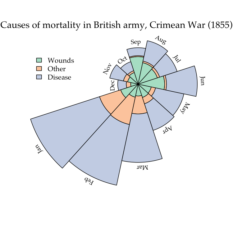
text(x=0, y=0, adj=0.5, label='Death rates\nin Virginia\n(1940)', cex=0.8)A polar area chart is similar to a ringplot, except that the sectors corresponding to different levels of a factor are drawn at regular angles from the centre. Instead, the frequencies of the respective levels are visualized by scaling the area of the annular sector (donut slice).
To illustrate, we’re going to reproduce the classic plot by Florence Nightingale:
pal <- brewer.pal(3, 'Pastel2')

# load the Florence Nightingale data set (note, need to install HistData)
require(HistData)
#> Loading required package: HistData
ng <- subset(Nightingale, Year==1855, c('Wounds.rate', 'Other.rate', 'Disease.rate'))
row.names(ng) <- Nightingale$Month[Nightingale$Year==1855]

par(mar=rep(0,4))
# the actual plotting function
polarplot(as.matrix(ng), x=0.2, y=0.3, theta=1.1*pi, col=pal,
use.names=T)

# add some nice labels
title('Causes of mortality in British army, Crimean War (1855)',
      font.main=1, family='Palatino', line=-3)
legend(x=-0.8, y=0.6, legend=c('Wounds', 'Other', 'Disease'), bty='n',
       fill=pal, cex=0.9)
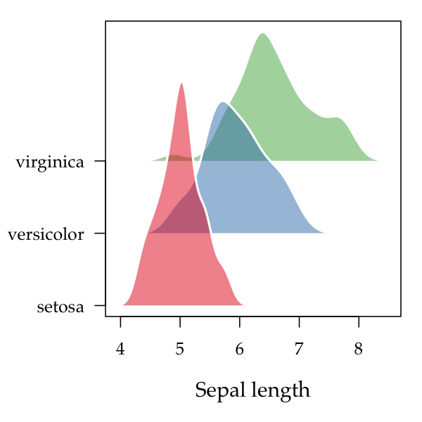
Ridgeplots are basically stacked kernel densities. Displacing each density curve a small amount along the vertical axis can make it easier to distinguish one curve from another. The end result can also resemble a topographical map, which is likely the etymology of the name for this type of plot.
In this example, we’re going to make use of the add.alpha function in
ggfree:common that adds transparency to colour specifications in R:
par(mar=c(5,5,1,1))
pal <- add.alpha(brewer.pal(3, 'Set1'), 0.5)
ridgeplot(split(iris$Sepal.Length, iris$Species), step=0.4, col='white',
          fill=pal, lwd=2, xlab='Sepal length', cex.lab=1.2)
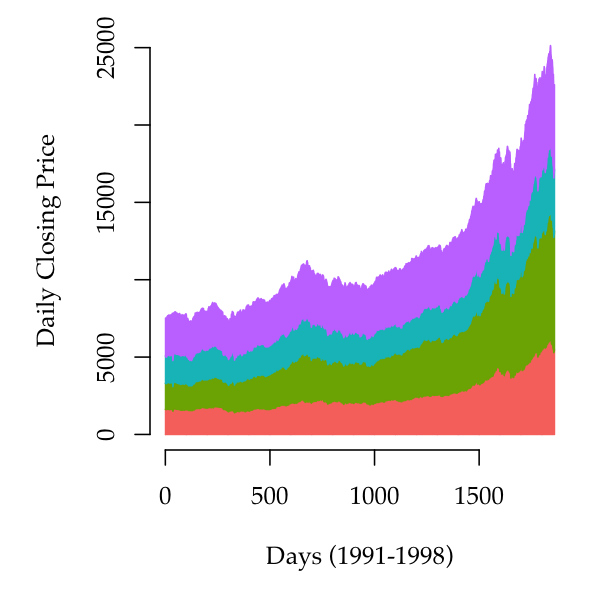
Stacked area plots are
similar to stacked barplots (obtained by calling barplot with a
matrix), but drawing polygons that span the horizontal range of the plot
instead of separate rectangles.
This example uses base R dataset that comprises the daily closing prices of major stock markets in Europe:
stackplot(EuStockMarkets, xlab='Days (1991-1998)',
          ylab='Daily Closing Price', bty='n')
A useful aesthetic device is to separate the baseline from the horizontal axis such that the areas flow both below and above a central axis.
For a detailed description of drawing trees with ggfree, I’ve written
a vignette on under the package directory:
vignettes/ggfree-trees.md.
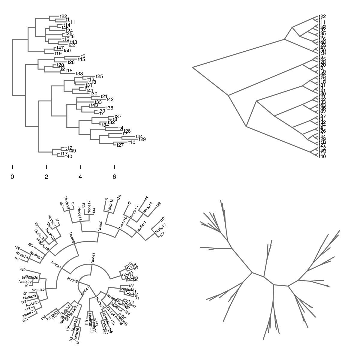
Here is a demonstration of the basic tree drawing functionality using
the same random tree employed by the ggtree package:
set.seed(1999); phy <- rtree(50)

par(mfrow=c(2,2))
# default rectangular layout with "time" axis
plot(tree.layout(phy)); axis(side=1)
# slanted layout with unscaled branches
plot(tree.layout(phy, type='s', unscaled=T))
# radial layout with node labels
plot(tree.layout(phy, type='o'), label='b', cex.lab=0.6)
# equal-angle (unrooted) layout without labels
plot(tree.layout(phy, type='u'), label='n')So what’s the point? Now that we have the layout data, we have the freedom to add any customization we can think of to the tree visualization.
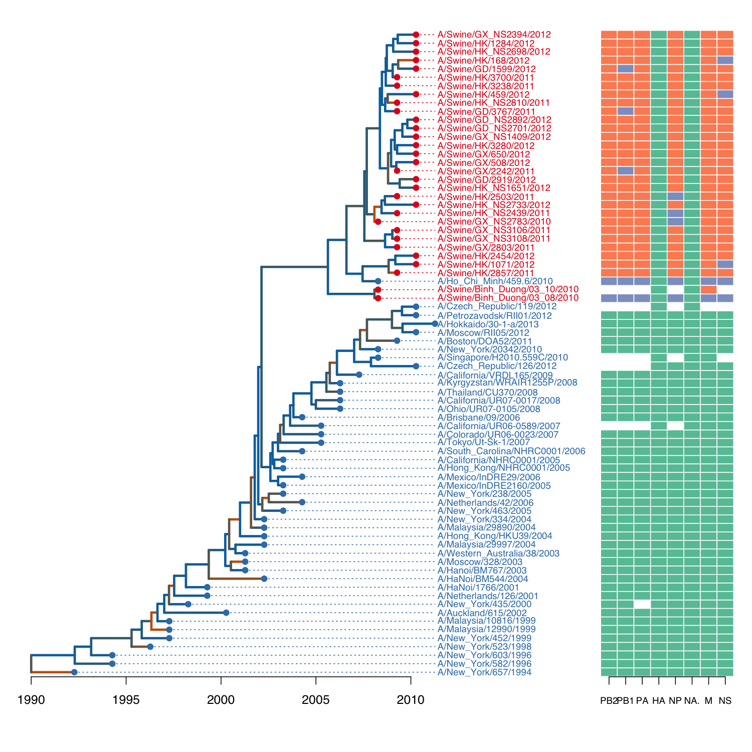
Here is the source code to reproduce one of the example figures from the
ggtree application note:
# some pre-processing to add dN/dS data to tree, see vignette
L <- tree.layout(flu, 'r')
plot(L, cex=0.6, type='n', mar=c(3,1,0,20), label='n')

# map dN/dS values to colours
pal <- colorRampPalette(c('#0072B2', '#D55E00'))(20)
breaks <- c(seq(0, 1.5, length.out=19), 1000)
col <- pal[as.integer(cut(L$edges$dnds, breaks=breaks))]

# draw labels
host <- ifelse(grepl('Swine', L$nodes$label), '#E41A1C', '#377EB8')
text(L, align=TRUE, cex=0.75, col=host)

# draw tree
lines(L, col=col, lwd=3)
axis(side=1, at=seq(0, 20, 5), labels=seq(1990, 2010, 5), line=-2)

# draw points on tips
points(L, pch=20, col=host, cex=ifelse(L$nodes$n.tips==0, 1.5, 0))

# map colors from edges to nodes
index <- L$edges$child[L$edges$isTip]
draw.guidelines(L, col=host[index])

# load genotype data (example from ggtree)
path <- system.file("extdata/Genotype.txt", package="ggfree")
geno <- read.table(path, header=T, sep='\t', na.strings='')
geno <- geno[match(flu$tip.label, row.names(geno)), ]

# draw boxes
require(RColorBrewer)
col <- brewer.pal(3, 'Set2')
image(L, geno[index, ], xlim=c(30, 37), col=col, cex.axis=0.75, line=-2)
Note that most of the functions being used here are generic S3 methods
in base R (namely, plot, text, lines, points and image).
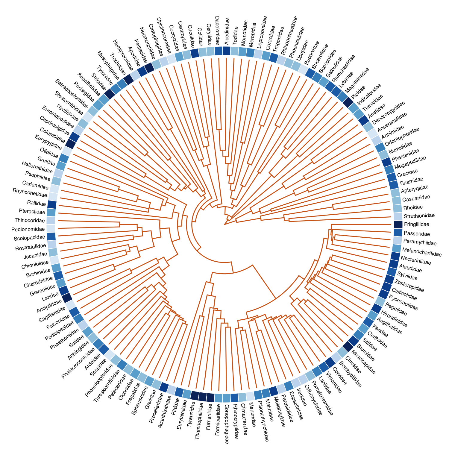
Here is code for decorating a phylogeny of bird families with the numbers of species:
data(bird.families)

# taxonomic info from BirdLife International
path <- system.file("extdata/birdlife.csv", package='ggfree')
birds <- read.csv(path, row.names=1)

# some entries are missing
missing <- data.frame(
  Family=c("Dendrocygnidae", "Bucorvidae", "Rhinopomastidae", "Dacelonidae", "Cerylidae", "Centropidae", "Coccyzidae", "Crotophagidae", "Neomorphidae", "Batrachostomidae", "Eurostopodidae", "Chionididae", "Eopsaltriidae"),
  Count=c(8, 2, 3, 70, 9, 10, 13, 4, 6, 5, 3, 2, 44)
)
birds <- rbind(birds, missing)

# map information to tree
index <- match(bird.families$tip.label, birds$Family)

require(RColorBrewer)
pal <- brewer.pal(9, 'Blues')[2:9]
bins <- as.integer(cut(log(birds$Count[index]), breaks=8))

# draw the tree, offsetting the labels for our image
L <- tree.layout(bird.families, type='o')
plot(L, cex.lab=0.7, offset=2, mar=rep(5,4), col='chocolate')
image(L, z=as.matrix(bins), xlim=c(28.5,30), col=pal)- @aronekuld’s beeswarm provides a nice implementation of dot plots where overlapping points are displaced away from the vertical axis so they can be seen individually.
