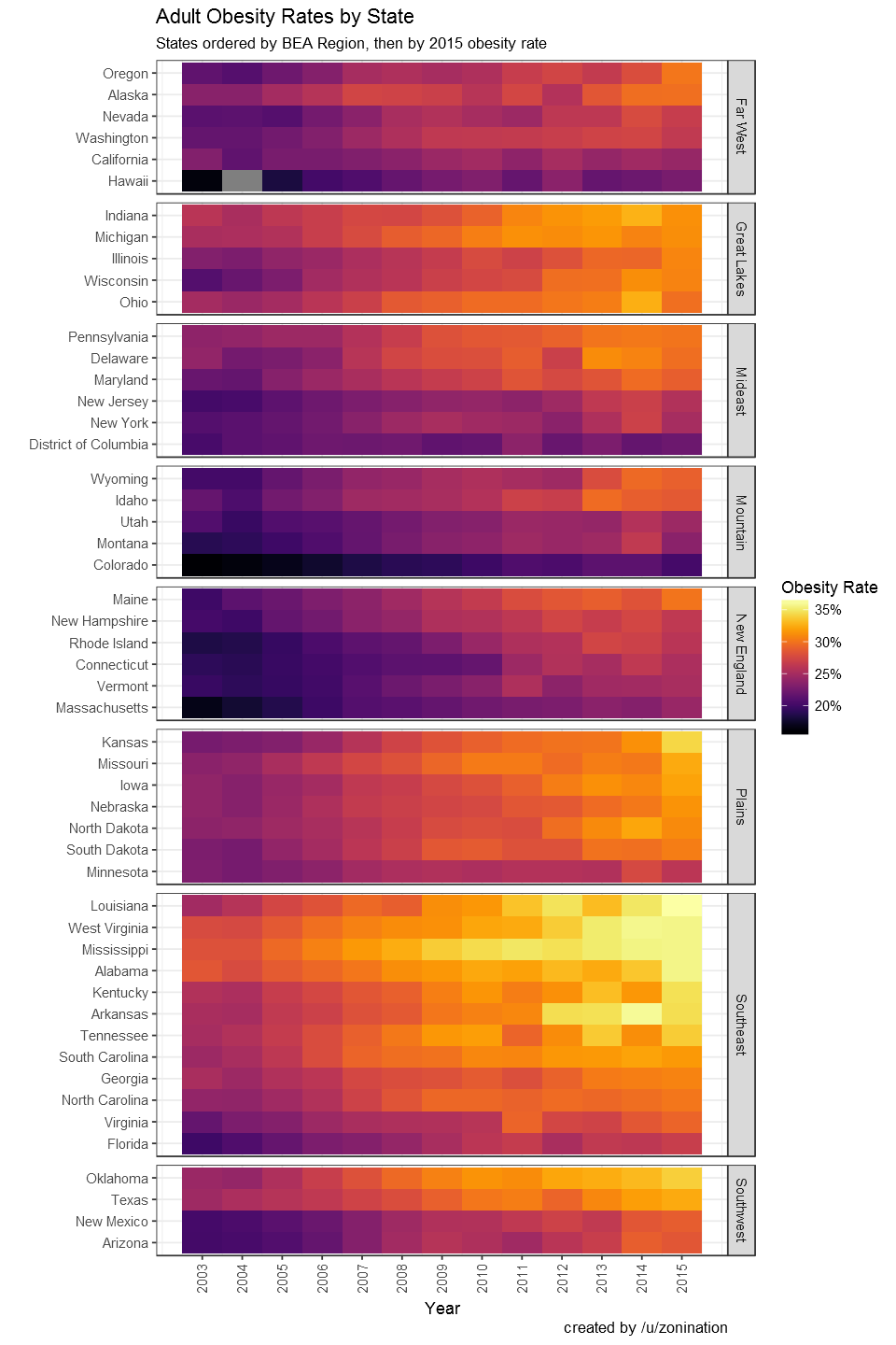
After taking a look at this page, I wondered what a heatmap would look like if it were made in a way similar to this project.
A heatmap would be a somewhat better display of the original data, allowing people to visualize the rates without the clutter of a line plot, and without the task of having to click the timeline multiple times to visualize trends spatially.
Obesity Data:
- Obesity data: http://stateofobesity.org/adult-obesity/
Other Data:
- BEA Regions: http://www.bea.gov/regional/docs/regions.cfm
- Census Regions (not pictured above): https://www2.census.gov/geo/docs/maps-data/maps/reg_div.txt
Tools used:
- R with ggplot2