During five year period from 2015 to 2019 were collected data about World Happiness. The features that were choosen to reflect on Nationes happines around the world are Economy, Health, Family, Goverment corruption etc.
Data were first cleaned and all datasets were combined together in order to create larger dataset. Unfortunately there's no uniform columns accross all datasets. In order to preserve as much as possible data I have combined those datasets from years that have 'Family column' and those without. This proved to be wrong regardless 'Family column', since this column was influenced by the year in which data were collected more than it was case with others columns.

Correlation between columns have been represented by the heatmap.

It is obvious that on Nationes happiness biggest impact have financial security that steams from high GDP or strong Economy, Health and a little less Freedom, while Trust (Goverment Corruption) and Generosity have less than 0.5 coefficient of correlation with Happines Score.
Since data used in this notebook are collected during 5 years I was interested how countries are ranked in different years?
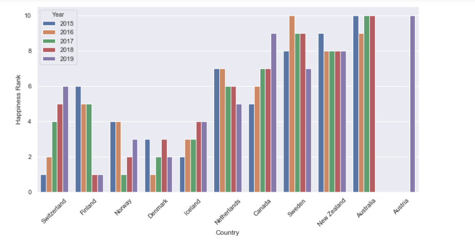
From previous graph it's obvious that best performed through obserbavle years is Denmark. Denmark holds one of the first three position, year by year. Well done Denmark.
Now let's see what is going on around less happiest nationes.
 This graph show us how many times cearten country was amoung 10 least happy countries during five year period. Rwanda and Syria hold one of the last teen position through all years.
Data from bottom of the set are more diverse comparing with start, that is whay we have more countries amoung the teen last positioned in differwnt years.

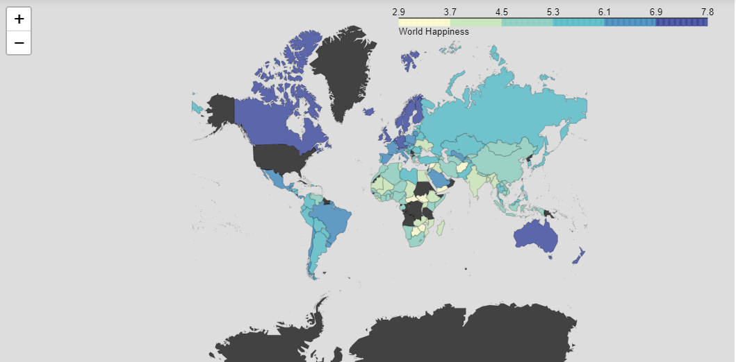
Finaly we have them all on world map as well.
Thank you, that would be all. Complete work about this representaion You can find in a notebook.