


#Guide
###Usage
- Basic Usage
- Boom Buttons
- Button Place Alignments
- Boom Types
- Ease Types
- Frames, Duration and Delay
- Background Dim
- Auto Hide
- Cancelable
- NoBackground
- Draggable
- Rotate Degree
- Shadow and Background Color
- Dimensions
- Boom or Reboom It Programmatically
- Delegate
#Pod Use BMB by:
- Pod:
pod "VHBoomMenuButton", "~> 1.0.2" - Or copy the source code of the BMB to your project.
#Note
- From my BMB in Android version.
- I'm a new guy in iOS, so if there is any bug or enhancement, just put it in issues or mail(Nightonke@outlook.com)
- Structure of BMB:

BMB is seperated into 3 sub-parts and 1 main part, for managing the animations, pieces on the BMB and the Boom-button on the screen. So if you wanna fork then add more boom-buttons to BMB, let's name it A, just:- create a ABuilder in BoomButton extends VHBoomButtonBuilder
- create a AButton in BoomButton extends VHBoomButton
- create a APiece in Piece extends VHBoomPiece
- add your piece-place and button-place logic in VHPiecePlaceManager and VHButtonPlaceManager

#Usage ##Basic Usage Let's check a very simple usage with just 3 buttons.
//
//  ViewController.m
//  VHBoomMenuButtonTest
//
//  Created by 黄伟平 on 16/8/7.
//  Copyright © 2016年 黄伟平. All rights reserved.
//

#import "ViewController.h"
#import "VHBoomMenuButton.h"

#define UIColorFromRGB(rgbValue) [UIColor colorWithRed:((float)((rgbValue & 0xFF0000) >> 16)) / 255.0 green:((float)((rgbValue & 0xFF00) >> 8)) / 255.0 blue:((float)(rgbValue & 0xFF)) / 255.0 alpha:1.0]

@interface ViewController ()

@end

@implementation ViewController

- (void)loadView
{
    CGRect screenFrame         = [[UIScreen mainScreen] bounds];
    self.view                  = [[UIView alloc] initWithFrame:screenFrame];
    self.view.backgroundColor  = [UIColor whiteColor];
    self.view.autoresizingMask = UIViewAutoresizingFlexibleHeight | UIViewAutoresizingFlexibleWidth;

    // 1. Put bmb in your VC
    CGFloat bmbRadius          = 60;
    VHBoomMenuButton *bmb      = [[VHBoomMenuButton alloc] initWithFrame:CGRectMake(screenFrame.size.width - 20 - bmbRadius,
                                                                                    screenFrame.size.height - 20 - bmbRadius,
                                                                                    bmbRadius,
                                                                                    bmbRadius)];

    // 2. Select the button type you want
    bmb.buttonEnum             = VHButtonSimpleCircle;

    // 3. Tell BMB how to place the button on itself(before BOOM)
    bmb.piecePlaceEnum         = VHPiecePlace_DOT_3_1;

    // 4. Tell BMB how to place the button on screen(after BOOM)
    bmb.buttonPlaceEnum        = VHButtonPlace_SC_3_3;

    // 5. Add some buttons by builder
    [bmb addSimpleCircleButtonBuilderBlock:^(VHSimpleCircleButtonBuilder *builder) {
        builder.imageNormal        = @"bat";
        builder.buttonNormalColor  = UIColorFromRGB(0xD32F2F);
        builder.buttonPressedColor = UIColorFromRGB(0xF44336);
    }];

    [bmb addSimpleCircleButtonBuilderBlock:^(VHSimpleCircleButtonBuilder *builder) {
        builder.imageNormal        = @"bear";
        builder.buttonNormalColor  = UIColorFromRGB(0xD32F2F);
        builder.buttonPressedColor = UIColorFromRGB(0xF44336);
    }];

    [bmb addSimpleCircleButtonBuilderBlock:^(VHSimpleCircleButtonBuilder *builder) {
        builder.imageNormal        = @"bee";
        builder.buttonNormalColor  = UIColorFromRGB(0xD32F2F);
        builder.buttonPressedColor = UIColorFromRGB(0xF44336);
    }];

    [self.view addSubview:bmb];
}

@end
All you need to do is just select some properties then add your buttons.
But, WARNING! You must keep the number of piecePlaceEnum, the number of buttonPlaceEnum, the number of builders you add to be the same. The name of piecePlaceEnum is VHPiecePlace_XXX_N_M, where XXX is name, N is number and M is different types. Similarly, the name of buttonPlaceEnum is VHButtonPlace_YYY_N_M. You must keep the first N equals to the second one. But you needn't keep the two M same. (Just like the code above: VHPiecePlace_DOT_3_1 and VHButtonPlace_SC_3_3)
##Boom Buttons
###Simple Circle Button

This is the most simple button type here. Set button type for your BMB: bmb.buttonEnum = VHButtonSimpleCircle
####Piece Place Type
Set piece-place type for your BMB: bmb.piecePlaceEnum = VHPiecePlace_DOT_3_1. For number 1 to 9, BMB supports the following place type: (1 <= M <= number of images)
| Number of Button | VHPiecePlaceEnum | Images |
|---|---|---|
| 1 | VHPiecePlace_DOT_1 |  |
| 2 | VHPiecePlace_DOT_2_M |   |
| 3 | VHPiecePlace_DOT_3_M |     |
| 4 | VHPiecePlace_DOT_4_M |   |
| 5 | VHPiecePlace_DOT_5_M |     |
| 6 | VHPiecePlace_DOT_6_M |       |
| 7 | VHPiecePlace_DOT_7_M |       |
| 8 | VHPiecePlace_DOT_8_M |        |
| 9 | VHPiecePlace_DOT_9_M |    |
Set button-place type for your BMB: bmb.buttonPlaceEnum = VHButtonPlace_SC_3_3.
Click VHButtonPlaceEnum to check what kind of button-place-type now BMB supports. Just need to know that in VHButtonPlace_SC_N_M, N is the number of button.


####Properties For each simple circle button, you can set its properties by set builder's properties. The properties are:
[bmb addSimpleCircleButtonBuilderBlock:^(VHSimpleCircleButtonBuilder *builder) {
    builder.shadowOffset          = CGSizeMake(5, 5);            // Shadow offset
    builder.shadowOpacity         = 0;                           // Shadow opactity
    builder.shadowColor           = [UIColor redColor];          // Shadow color
    builder.imageNormal           = @"bat";                      // Image of button normally
    builder.imagePressed          = @"bear";                     // Image of button when button is clicked
    builder.buttonNormalColor     = UIColorFromRGB(0xD32F2F);    // Color of button normally
    builder.buttonPressedColor    = UIColorFromRGB(0xF44336);    // Color of button when the button is clicked
    builder.imageNormalTintColor  = UIColorFromRGB(0xD32F2F);    // Tint color of image normally
    builder.imagePressedTintColor = UIColorFromRGB(0xffffff);    // Tint color of image when button is clicked
    builder.imageFrame            = CGRectMake(10, 10, 60, 60);  // Frame of image
    builder.buttonRadius          = 50;                          // Radius of button
    builder.shadowRadius          = 55;                          // Radius of shadow
}];
Notice that you don't have to set all the properties here. Check the default properties that are used when you don't set them.
###Text Inside Circle Button

This is a circle button with a text in it. Set button type for your BMB: bmb.buttonEnum = VHButtonTextInsideCircle
####Piece Place Type Same as simple circle button.
Same as simple circle button.
####Properties
[bmb addTextInsideCircleButtonBuilderBlock:^(VHTextInsideCircleButtonBuilder *builder) {
    builder.shadowOffset          = CGSizeMake(5, 5);              // Shadow offset
    builder.shadowOpacity         = 0;                             // Shadow opactity
    builder.shadowColor           = [UIColor redColor];            // Shadow color
    builder.imageNormal           = @"bat";                        // Image of button normally
    builder.imagePressed          = @"bear";                       // Image of button when button is clicked
    builder.buttonNormalColor     = UIColorFromRGB(0xD32F2F);      // Color of button normally
    builder.buttonPressedColor    = UIColorFromRGB(0xF44336);      // Color of button when the button is clicked
    builder.imageNormalTintColor  = UIColorFromRGB(0x000000);      // Tint color of image normally
    builder.imagePressedTintColor = UIColorFromRGB(0xffffff);      // Tint color of image when button is clicked
    builder.imageFrame            = CGRectMake(10, 10, 80, 80);    // Frame of image
    builder.buttonRadius          = 50;                            // Radius of button
    builder.shadowRadius          = 55;                            // Radius of shadow
    builder.textNormalColor       = UIColorFromRGB(0xffffff);      // Color of text normally
    builder.textPressedColor      = UIColorFromRGB(0x000000);      // Color of text when the button is clicked
    builder.textFrame             = CGRectMake(0, 10, 100, 20);    // Frame of text
    builder.textContent           = @"BAT HERE!";                  // Text
    builder.font                  = [UIFont systemFontOfSize:18];  // Font
    builder.lineBreakMode         = NSLineBreakByClipping;         // Line break mode
    builder.lines                 = 0;                             // Lines
    builder.rotateImage           = YES;                           // Whether rotate the image
    builder.rotateText            = YES;                           // Whether rotate the text
}];
###Text Outside Circle Button

Text outside circle button, as its name, is a circle button with a text outside it. Set button type for your BMB: bmb.buttonEnum = VHButtonTextOutsideCircle
####Piece Place Type Same in simple circle button.
Same in simple circle button. But notice that there are still some different when the buttons are show on the screen, because text-outside-circle-button is not a circle but a rectangle.
####Properties
[bmb addTextOutsideCircleButtonBuilderBlock:^(VHTextOutsideCircleButtonBuilder *builder) {
    builder.shadowOffset          = CGSizeMake(5, 5);              // Shadow offset
    builder.textShadowOffset      = CGSizeMake(2, 2);              // Shadow offset of text
    builder.shadowOpacity         = 0;                             // Shadow opactity
    builder.shadowColor           = [UIColor redColor];            // Shadow color
    builder.textShadowColor       = UIColorFromARGB(0xffff0000);   // Shadow color of text
    builder.imageNormal           = @"bat";                        // Image of button normally
    builder.imagePressed          = @"bear";                       // Image of button when button is clicked
    builder.buttonNormalColor     = UIColorFromRGB(0xD32F2F);      // Color of button normally
    builder.buttonPressedColor    = UIColorFromRGB(0xF44336);      // Color of button when the button is clicked
    builder.imageNormalTintColor  = UIColorFromRGB(0x000000);      // Tint color of image normally
    builder.imagePressedTintColor = UIColorFromRGB(0xffffff);      // Tint color of image when button is clicked
    builder.imageFrame            = CGRectMake(15, 15, 60, 60);    // Frame of image
    builder.textFrame             = CGRectMake(0, 90, 90, 20);     // Frame of text
    builder.buttonWidth           = 90;                            // Width of button
    builder.buttonHeight          = 120;                           // Height of button
    builder.textNormalColor       = UIColorFromRGB(0xffffff);      // Color of text normally
    builder.textPressedColor      = UIColorFromRGB(0x000000);      // Color of text when the button is clicked
    builder.textContent           = @"BAT HERE!";                  // Text
    builder.lineBreakMode         = NSLineBreakByClipping;         // Line break mode
    builder.lines                 = 0;                             // Lines
    builder.rotateImage           = YES;                           // Whether rotate the image
    builder.rotateText            = YES;                           // Whether rotate the text
    builder.shadowText            = YES;                           // Whether show the shadow of text
}];
###Ham Buttom

Ham button is a rectangle button which can contains image, title and sub title. Of course you can just choose what you want in ham button just like the "Cancel" button above. Set button type for your BMB: bmb.buttonEnum = VHButtonTextOutsideCircle
####Piece Place Type Ham button's piece-place-types are just N lines horizontally lay down. So I will not put the images here.
VHPiecePlace_HAM_1
VHPiecePlace_HAM_2
VHPiecePlace_HAM_3
VHPiecePlace_HAM_4
VHPiecePlace_HAM_5
Ham button's button-place-types are just N lines horizontally lay on the screen. Please check the gif at the beginning of README.
VHButtonPlace_HAM_1
VHButtonPlace_HAM_2
VHButtonPlace_HAM_3
VHButtonPlace_HAM_4
VHButtonPlace_HAM_5
####Properties
[bmb addHamButtonBuilderBlock:^(VHHamButtonBuilder *builder) {
    builder.shadowOffset          = CGSizeMake(5, 5);              // Shadow offset
    builder.shadowOpacity         = 0.5;                           // Shadow opactity
    builder.shadowColor           = [UIColor blueColor];           // Shadow color
    builder.imageNormal           = @"bat";                        // Image of button normally
    builder.imagePressed          = @"bear";                       // Image of button when button is clicked
    builder.buttonNormalColor     = UIColorFromRGB(0xD32F2F);      // Color of button normally
    builder.buttonPressedColor    = UIColorFromRGB(0xF44336);      // Color of button when the button is clicked
    builder.imageNormalTintColor  = UIColorFromRGB(0x0000ff);      // Tint color of image normally
    builder.imagePressedTintColor = UIColorFromRGB(0x00ff00);      // Tint color of image when button is clicked
    builder.imageFrame            = CGRectMake(10, 0, 60, 60);     // Frame of image
    builder.titleFrame            = CGRectMake(120, 30, 120, 30);  // Frame of title
    builder.subTitleFrame         = CGRectMake(120, 0, 120, 30);   // Frame of sub title
    builder.shadowWidth           = 300;                           // Width of shadow
    builder.shadowHeight          = 80;                            // Height of shadow
    builder.shadowCornerRadius    = 0;                             // Corner radius of shadow
    builder.buttonWidth           = 300;                           // Width of button
    builder.buttonHeight          = 80;                            // Height of button
    builder.buttonCornerRadius    = 0;                             // Corner radius of button
    builder.titleContent          = @"Title Here";                 // Title
    builder.titleNormalColor      = UIColorFromRGB(0x0000ff);      // Color of title normally
    builder.titlePressedColor     = UIColorFromRGB(0x00ffff);      // Color of title when the button is pressed
    builder.titleFont             = [UIFont systemFontOfSize:30];  // Font of title
    builder.titleLineBreakMode    = NSLineBreakByClipping;         // Line break mode of title
    builder.titlelines            = 0;                             // Lines of title
    builder.titleAlignment        = NSTextAlignmentCenter;         // Text alignment of title
    builder.subTitleContent       = @"Sub title here";             // Sub title
    builder.subTitleNormalColor   = UIColorFromRGB(0x0000ff);      // Color of sub title normally
    builder.subTitlePressedColor  = UIColorFromRGB(0x00ffff);      // Color of sub title when the button is pressed
    builder.subTitleFont          = [UIFont systemFontOfSize:8];   // Font of sub title
    builder.subTitleLineBreakMode = NSLineBreakByClipping;         // Line break mode of sub title
    builder.subTitlelines         = 0;                             // Lines of sub title
    builder.subTitleAlignment     = NSTextAlignmentCenter;         // Text alignment of sub title
    builder.rotateImage           = YES;                           // Whether rotate the image
    builder.containImage          = YES;                           // Whether contains image
}];
Once again, you don't have to set all the properties here. Check the default properties that are used when you don't set them.
####Last Ham Button Margin More Top
You can set the last button's margin-top-property larger to make it as a "Cancel" button:


Just set the below properties of BMB to toggle last-ham-button-margin-more-top or set its value:
bmb.lastHamButtonMarginMoreTop = YES;
bmb.lastHamButtonTopMargin     = 50;
###Common Button Place Types
####VHButtonPlace_Horizontal
VHButtonPlace_Horizontal is a common button-place-type for any button. It just simple horizontally puts all the buttons on a horizontal-line. You can use this in iPad, because iPad is wide enough for it.

####VHButtonPlace_Vertical
Just like VHButtonPlace_Horizontal:

##Button Place Alignments
If you don't want to put your buttons on the center of screen, just like the image above, you can use VHButtonPlaceAlignmentEnum to adjust the alignment:
bmb.buttonPlaceAlignmentEnum = VHButtonPlaceAlignmentBottom;


##Boom Types
Check VHBoomEnum to use different boom-types to make BMB more cute by bmb.boomEnum = VHBoomParabola_3;.


VHBoomStraightLine is just a straight line. And VHBoomRandom is combination of the all the other boom-types.
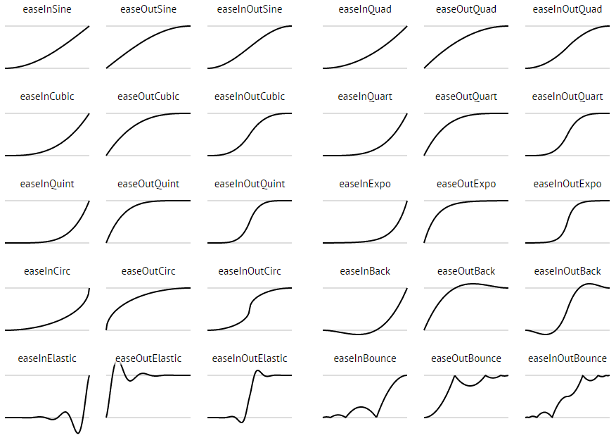
##Ease Types To make BMB more cute, you can use VHEaseEnum to set the 6 properties below:
bmb.showMoveEaseEnum   = VHEaseOutCirc;
bmb.showScaleEaseEnum  = VHEaseOutCirc;
bmb.showRotateEaseEnum = VHEaseOutCubic;
bmb.hideMoveEaseEnum   = VHEaseInBack;
bmb.hideScaleEaseEnum  = VHEaseInCirc;
bmb.hideRotateEaseEnum = VHEaseInCubic;
All ease types:
##Frames, Duration and Delay
bmb.frames   = 30;
bmb.duration = 3;
bmb.delay    = 1;
Frames property is useful to control the frames of animation, which can help to make your application performance well.
Duration means the duration of each animation of button.
Delay means the delay between each button.
So, the total time of animation is (N - 1) * delay + duration, where N is the number of buttons.
##Background Dim
Use bmb.dimColor = [UIColor blueColor]; to set the background color when BMB is BOOM.
##Auto Hide
Use bmb.autoHide = NO; to set whether the BMB will reboom when one of the buttons was clicked.
##Cancelable
Use bmb.cancelable = NO; to set whether the BMB can be hided by clicking the background.
##NoBackground
Use bmb.noBackground = YES; to remove the background of BMB. Is that useful? Yep, you will not use BMB in NavigationBar with a background, right?
##Draggable
Use bmb.draggable = YES; to make BMB draggable.
##Rotate Degree
Use bmb.rotationDegree = M_PI * 10; to set the rotation degree of views that are able to rotate in the animations.
##Shadow and Background Color
bmb.shadowOffset       = CGSizeMake(0, 10);
bmb.shadowColor        = [UIColor redColor];
bmb.shadowOpacity      = 1;
bmb.shadowRadius       = 40;
bmb.buttonNormalColor  = [UIColor redColor];
bmb.buttonPressedColor = [UIColor blueColor];
Set the shadow and background color of BMB by the above properties.
##Dimensions
bmb.dotRadius              = 3;   // The radius of dot on the BMB
bmb.hamWidth               = 30;  // The width of piece-ham on the BMB
bmb.hamHeight              = 4;   // The height of piece-ham on the BMB
bmb.pieceHorizontalMargin  = 3;   // The horizontal margin between pieces
bmb.pieceVerticalMargin    = 5;   // The vertical margin between pieces
bmb.pieceInclinedMargin    = 3;   // The inclined margin between pieces
bmb.buttonHorizontalMargin = 10;  // The horizontal margin between buttons
bmb.buttonVerticalMargin   = 10;  // The vertical margin between buttons
bmb.buttonInclinedMargin   = 10;  // The inclined margin between buttons
bmb.buttonBottomMargin     = 10;  // The vertical margin between the most-bottom button and the border of screen
bmb.buttonTopMargin        = 10;  // The vertical margin between the most-top button and the border of screen
bmb.buttonLeftMargin       = 10;  // The horizontal margin between the most-left button and the border of screen
bmb.buttonRightMargin      = 10;  // The horizontal margin between the most-right button and the border of screen
##Boom or Reboom It Programmatically
[bmb boom];
[bmb reboom];
##Delegate
Implement the delegate VHBoomDelegate. The choose the method you want:
/**
 *  When one of the sub button was clicked.
 *
 *  @param index Index of the clicked sub button.
 */
- (void)onBoomClicked:(int)index
{

}

/**
 *  When the background was clicked.
 */
- (void)onBoomBackgroundClicked
{

}

/**
 *  The reboom animation is going to start.
 */
- (void)onBoomWillHide
{

}

/**
 *  The reboom animation is finished.
 */
- (void)onBoomDidHide
{

}

/**
 *  The boom animation is going to start.
 */
- (void)onBoomWillShow
{

}

/**
 *  The boom animation is finished.
 */
- (void)onBoomDidShow
{

}
#Versions ###1.0.2 The first version, my first iOS library.
#License
Copyright 2016 Nightonke

Licensed under the Apache License, Version 2.0 (the "License");
you may not use this file except in compliance with the License.
You may obtain a copy of the License at

   http://www.apache.org/licenses/LICENSE-2.0

Unless required by applicable law or agreed to in writing, software
distributed under the License is distributed on an "AS IS" BASIS,
WITHOUT WARRANTIES OR CONDITIONS OF ANY KIND, either express or implied.
See the License for the specific language governing permissions and
limitations under the License.