The purpose of this report is to outline the use of visualization concepts and techniques in transforming data into a meaningful interactive visualization, as required by the objective of the project assigned to our group. Our project was implemented through data exploration with Python and Plotly, and visualization/story using Tableau software. We made sure to frame it using the data visualization techniques and concepts explored during the course. Our goal was to create a visualization that matched our professional/academic interests while meeting the project requirements. The users of this dashboard get different types of interactivities, such as filtering by regions/states, time, and sites, as well as parameters for the previous and present years.
LINK: https://public.tableau.com/app/profile/shanjida.roman1458/viz/DefectsAnalysisDashboardv2/Dashboard
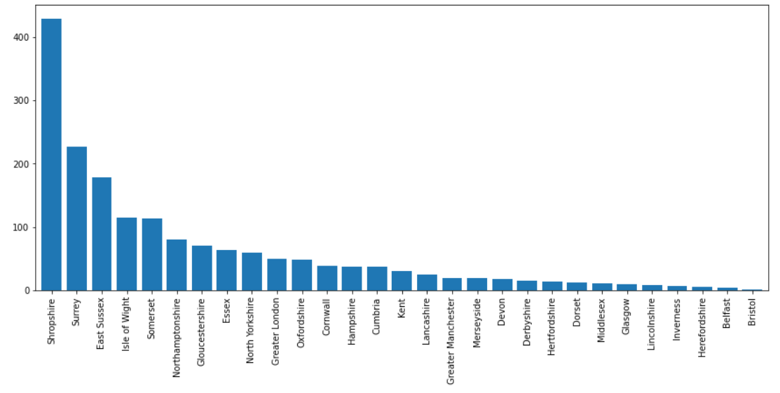
Through our data visualization project, we were able to gain insights into the distribution of defects and penalties in the UK and identify patterns and trends in the data. One key finding was that the north and east regions of the UK had a higher rate of penalties per defect compared to other regions. This suggests that there may be underlying factors contributing to this trend, such as differences in regulations or enforcement.
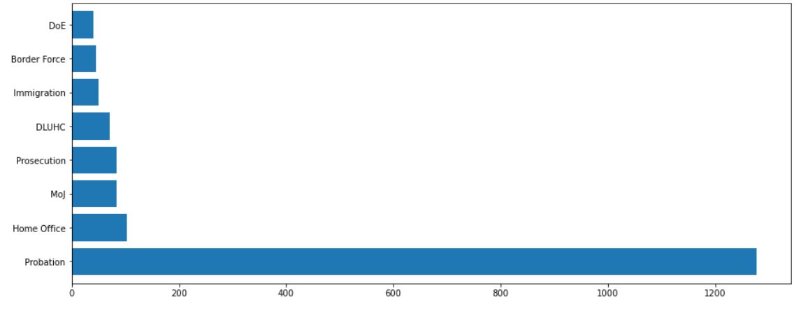
We also discovered that the Probation in Operational Business Unit part had the highest number of defects and penalties, followed by the Home Office and Moj. This highlights the need for further investigation and improvements in these areas to reduce the number of defects and associated penalties. Also, we found that the number of defects decreased steadily throughout 2022, from 246 in January to 98 in December.
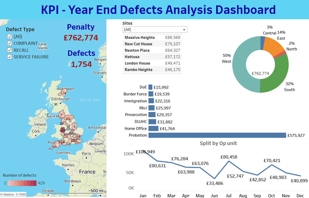
Finally, we identified a region that has a high number of defect records, indicating a need for increased attention and remediation efforts in this area. The total amount of the penalties for the government was £762,744 in 2022 with 1,754 records. Overall, our data visualization project provided valuable insights into the distribution of defects and penalties in the UK and highlighted areas for improvement and attention. By utilizing effective data visualization techniques and tools such as Tableau, we were able to transform complex data into meaningful insights and support informed decision-making.