Framework agnostic multi select dropdown component.
import { Dropdown, staticDataBindHandler, debounce } from 'path/to/dropdown';
import data from './data.js';
// Create dropdown with configuration options.
const dropdown = new Dropdown({
targetElementSelector: '.dropdown-target',
keyPorpertyIndetifier: 'id',
valuePropertyIdentifier: 'product',
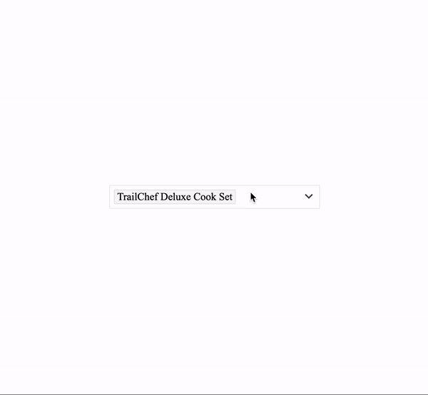
selected: new Map([['10', 'TrailChef Deluxe Cook Set']]),
})
.onDataBind(staticDataBindHandler(data)) // Static data bind handler can be used to directly bind static data sources.
.onSelectionChange((selected) => {
// This event is triggered when option select state change.
// This event handler is triggered with all selected options map.
})
.onOptionSelectionChange(( { key, value, selected } ) => {
// This event is triggered when option select state change.
// This event handler is triggered with each selection changed items state.
})
.redner(); // Render dropdown component.
// Dispose method can be used to safely remove and cleanup dropdown reference.
dropdown.dispose();{
/**
* Current HTMLDocument reference.
* Expicitly passsed for testability.
* @type {HTMLDocument}
*/
document: window.document,
/**
* Target element CSS selector.
* Dropdown component will render in this target element.
* @type {string}
*/
targetElementSelector: 'body',
/**
* Default message to display when no options are selected.
* @type {string}
*/
defaultSelectText: 'Select Options...',
/**
* Message displayed when options list is empty.
* @type {string}
*/
noDataMessage: 'Data not available.',
/**
* Options list menu width.
* @type {string}
*/
optionsMenuWidth: '200px',
/**
* Options list menu height.
* @type {string}
*/
optionsMenuHeight: '200px',
/**
* Dropdown bound data key property identifier.
* Corresponding value is used to uniquely identify dropdown options.
* @type {string}
*/
keyPorpertyIndetifier: 'key',
/**
* Dropdown bound data value property identifier.
* Corresponding value is used as the display text of dropdown options.
* @type {string}
*/
valuePropertyIdentifier: 'value',
/**
* Starting point of data source.
* Mainly exposed for future usage of fetch data on scroll functionality.
* @type {number}
*/
offset: 0,
/**
* Data limit to fetch form offset value.
* @type {number}
*/
limit: Infinity,
/**
* Default selected options.
* Use key and value as indicated in keyPorpertyIndetifier and valuePropertyIdentifier properties.
* @type {Map}
*/
selected: new Map(),
/**
* Open dropdown options menu on initial load.
* @type {boolean}
*/
openOnLoad: false,
/**
* Filter event debounce delay in milliseconds.
* @type {number}
*/
filterDebounceDelay: 400,
/**
* Filter query text.
* @type {string}
*/
query: ''
}Host project root in any HTTP server and view demo/index.html
This component only support evergreen browsers without compiling down to target ES version and applying polyfills. Bable + Rollup can be used to achieve this.
For optimum performance:
<script type="module" src="es-modules-version.js"></script>
<script nomodule src="compiled-version-with-polyfills.js"></script>- Comprehensive unit test suite.
- Cross-browser compatibility.
- Selected options remove support in the selection view.
- Lazy loading dropdown options on scroll.
- Comprehensive accessibility support with keyboard navigation.
- Multi theme compatibility.
- Proper packaging/bunding support and publish.
- Dropdown options layout template support.
- Refine public API.