Build React Native views blazingly fast.
Disclaimer: Stacks is not yet another full design system.
Max Stoiber has recently written an interesting article about why margin is considered harmful. There are three main disadvantages of using margin:
- margin breaks component encapsulation
- margin makes reusability harder
- margin conflicts with how designers think
I fully agree with this point of view. To me, it's obvious that handling margins across the entire project is simply difficult and might be not scalable. For web projects, a design system called Braid has developer-friendly API for building layouts. However, a similar library was missing for React Native based projects. Therefore, Stacks has been created and it adopts Braid Layouts API with subtle differences.
yarn add @mobily/stacksor with npm
npm install @mobily/stacks --saveTo use Stacks properly you need to pass a default spacing value to StacksProvider at the top of your react tree.
import { StacksProvider } from '@mobily/stacks'

const App = () => {
  return (
    <StacksProvider spacing={4}>
      …
    </StacksProvider>
  )
}
In short, the spacing value unit here is a logical pixel, the same as you've been using before for either margin or padding. Stacks will automatically multiply the default spacing value by value of space (padding as well) passed to the components, for instance:
<StacksProvider spacing={4}>…</StacksProvider>

<Stack space={2}>…</Stack>
// ⬆️ 4 * 2 = 8 logical pixels

<Box padding={3}>…</Box>
// ⬆️ 4 * 3 = 12 logical pixels
Consistent and clear!
Another required thing, you always have to pass style property to your components if you want to use them properly within Stacks components.
import { View, ViewProps } from 'react-native'
import { styles } from './styles'
// ⬆️ your custom styles

interface Props {
  …
  style?: ViewProps['style']
}

export const Placeholder = (props: Props) => {
  const { …, style } = props

  return (
    <View style={[styles.root, style]}>
      …
    </View>
  )
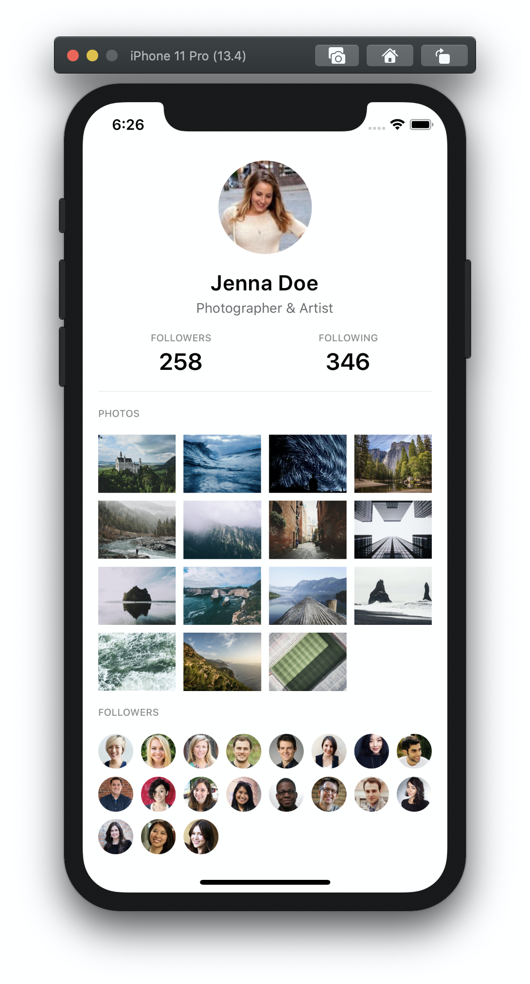
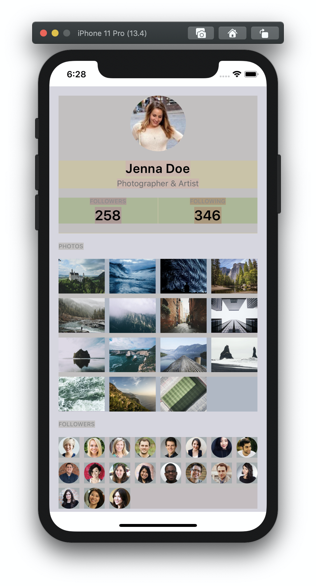
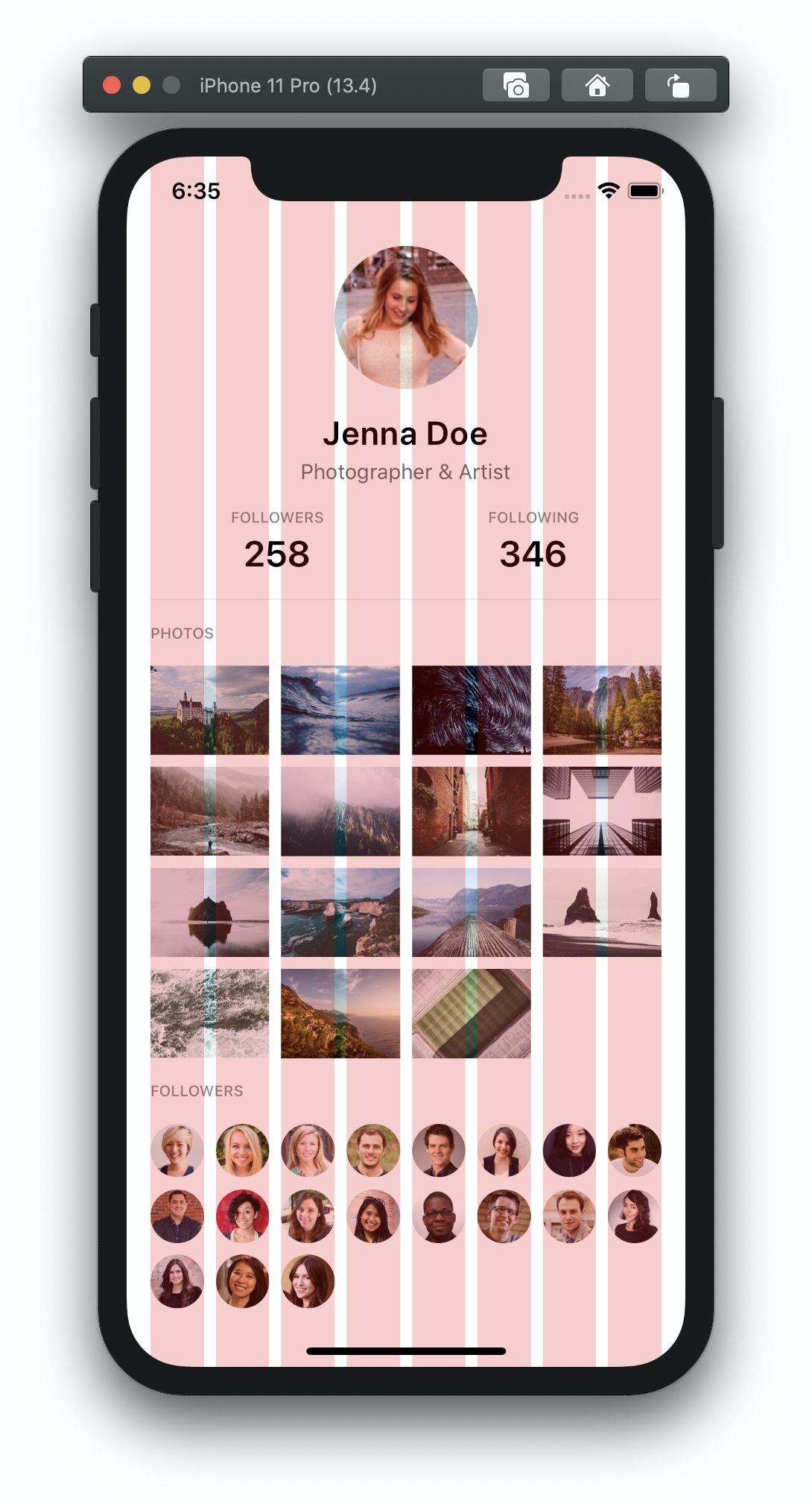
}The following example shows how simple is building screens without using neither margin nor padding properties in your style sheets objects. For debugging purposes, you may want to turn the debug mode on (pass the debug property to the provider) or use the customizable Grid component.
| Debug mode | Grid component | |
|---|---|---|
 |
 |
 |
import React from 'react'
import { ScrollView, Text } from 'react-native'
import { Stack, Box, Columns, Column, Tiles } from '@mobily/stacks'
// import components, styles, etc.
const Profile = () => {
return (
<ScrollView>
<Box padding={4}>
<Stack space={4}>
<Stack space={4} align="center">
<Avatar source="…" size={96} />
<Stack space={1} align="center">
<Title>Jenna Doe</Title>
<Description>Photographer & Artist</Description>
</Stack>
<Columns>
<Column>
<Stack space={1} align="center">
<Text>Followers</Text>
<Counter>258</Counter>
</Stack>
</Column>
<Column>
<Stack space={1} align="center">
<Text>Following</Text>
<Counter>346</Counter>
</Stack>
</Column>
</Columns>
<Divider />
</Stack>
<Text>Photos</Text>
<Tiles columns={4} space={2}>
<Photo source="…" />
<Photo source="…" />
<Photo source="…" />
</Tiles>
<Text>Followers</Text>
<Tiles columns={8} space={2}>
<Avatar source="…" />
<Avatar source="…" />
<Avatar source="…" />
</Tiles>
</Stack>
</Box>
</ScrollView>
)
}Stacks, similarly to Braid supports the responsive props format which allows you to specify an array of values for different screen sizes. Therefore, if you need to customize the spacing, number of columns, or alignments per screen size, then the responsive props are for you.
type ResponsiveProp<T> = T | Readonly<[T, T]> | Readonly<[T, T, T]>There are three available breakpoints: mobile (default, Stacks components are mobile-first), tablet and desktop.
type Breakpoint = 'mobile' | 'tablet' | 'desktop'You can define custom breakpoints in the provider.
import { StacksProvider } from '@mobily/stacks'

const App = () => {
  return (
    <StacksProvider spacing={4} breakpoints={{ tablet: 768, desktop: 992 }}>
      …
    </StacksProvider>
  )
}
For example, if you wanted small spacing on mobile but medium spacing from tablet upwards:
<Stack space={[1, 4]}>
  …
</Stack>
If you wanted top alignment on mobile and center on tablet upwards.
<Columns space={1} alignY={['top', 'center']}>
  <Column>
    …
  </Column>
  <Column>
    …
  </Column>
</Columns>
If you would like the columns to stack vertically on smaller screens, you can provide the collapseBelow prop.
<Columns space={1} collapseBelow="tablet">
  <Column>
    …
  </Column>
  <Column>
    …
  </Column>
</Columns>Full documentation is available here.
Kudos to @panr for giving this project a name!
Marcin Dziewulski 💻 📖 |
The MIT License.
See LICENSE


