Since coronavirus (COVID-19) become such a global issue, the way how to forecast it can be essential. For answering this question, it requires us to make use of the ample historical data and processing tools. ASEAN(The Association of Southeast Asian Nations) boasts one of World's most vibrant economies, the fruit of decades of industrial growth and political stability. To counter the virus, ASEAN members already pledged to share information about its spread along with best practices to combat it. In this project, we are going to analyze from the public shared datasets for providing objective forecasts. At the same time, suggesting the planning and decision making for ASEAN.
Project administration: ZHANG, XIAO 17204147
Conceptualization: CHEN JIAYUE 17217261
Data cleansing: ROSHNI MAGAINRAN WIH190021/17206541/1
Visualization: Nur Anis Nabila bt Mohd Salim WIE180031/17154983/1
Modeling and Shiny apps: LI KONG 17216250 / ZHANG, XIAO 17204147
library(dplyr)
setwd("C:/Users/Roshni/Downloads/")
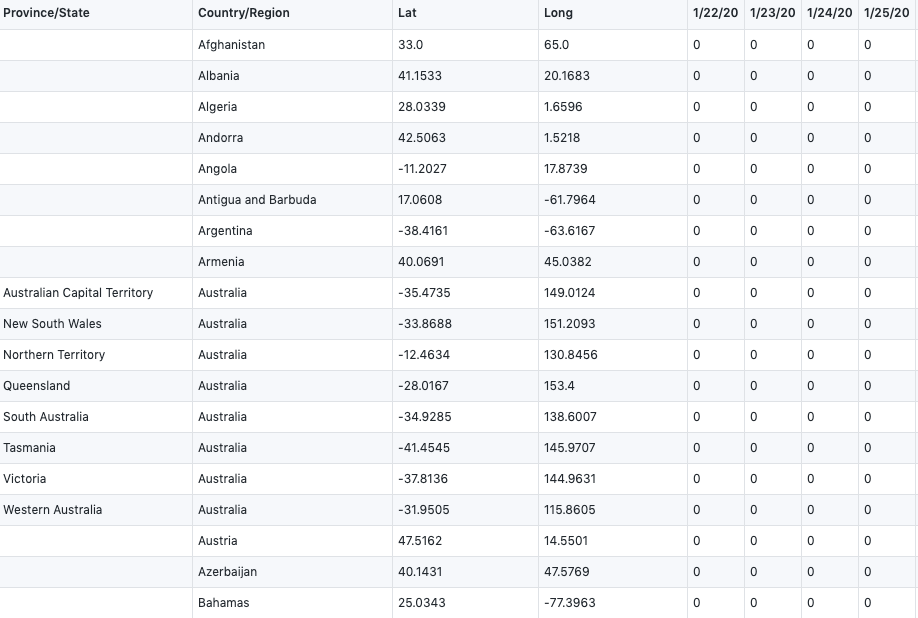
confirmed_global <- read.csv("time_series_covid19_confirmed_global.csv", header=TRUE,stringsAsFactors = FALSE,check.names = F)
We get our two raw datasets from : CSSE at Johns Hopkins University
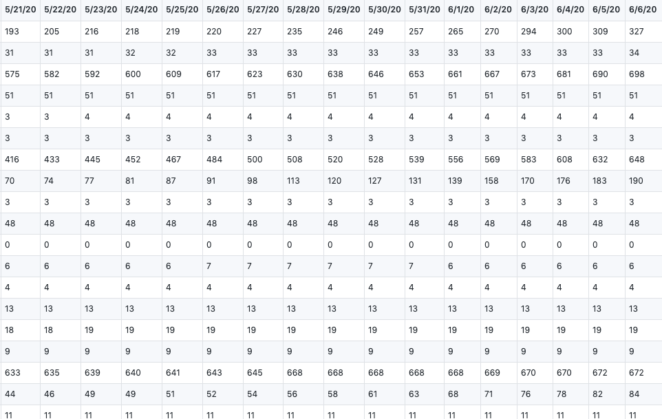
They showed the total number of global confirmed cases and death cases, which records from 1/22/20 to 6/6/20.
time_series_covid19_confirmed_global.csv
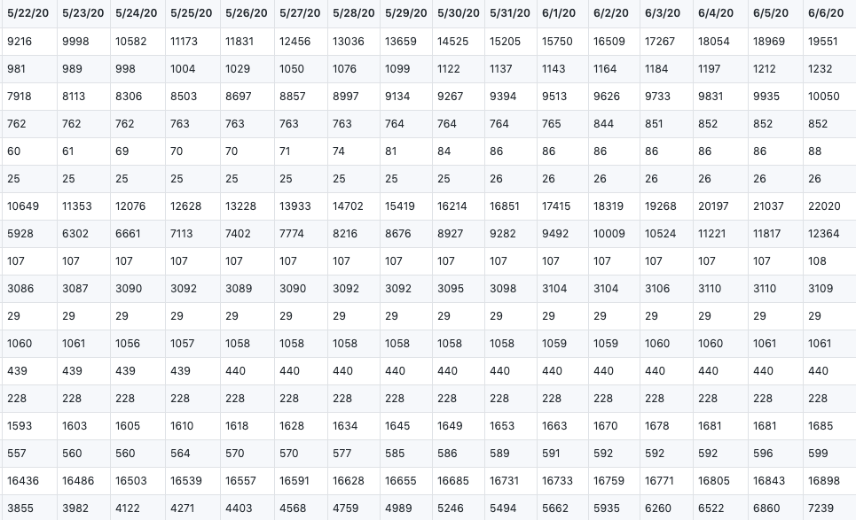
time_series_covid19_deaths_global.csv
#removing unwanted columns
confirmed_global_chosen<- data.frame(confirmed_global[,2:141], check.names = FALSE)
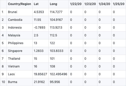
confirmed_global_chosen<-confirmed_global_chosen[grep("Malaysia|Brunei|Cambodia|Laos|Philippines|Singapore|Thailand|Vietnam|Indonesia|Burma", confirmed_global_chosen$`Country/Region`),]
#renumbering the rows
row.names(confirmed_global_chosen) <- 1:nrow(confirmed_global)
#tabulation of data
View(confirmed_global_chosen)
#write into a csv
write.csv(confirmed_global_chosen,file="confirmed_global_chosen.csv")
In this part, we did our data cleansing, we filter the data we have no interest in, only focused on ASEAN member countries.
#deaths global
deaths_global <- read.csv("time_series_covid19_deaths_global.csv",header=TRUE,stringsAsFactors = FALSE,check.names=F)

#removing unwanted columns
deaths_global_chosen<- data.frame(deaths_global[,2:141], check.names = FALSE)
deaths_global_chosen<-deaths_global_chosen[grep("Malaysia|Brunei|Cambodia|Laos|Philippines|Singapore|Thailand|Vietnam|Indonesia|Burma", deaths_global_chosen$`Country/Region`),]
#renumbering rows
row.names(deaths_global_chosen) <- 1:nrow(deaths_global_chosen)
#tabulation of data
View(deaths_global_chosen)
#write into a csv
write.csv(deaths_global_chosen,file="deaths_global_chosen.csv")
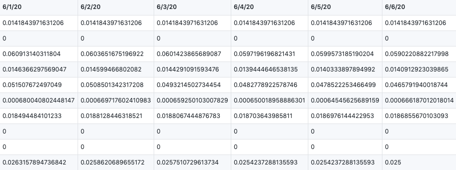
In this way, we can calculate the Case Fatality Rate by confiremed cases dividing death cases. Here is our result.
#Case Fatality Rate Table
case_fatality_final <- deaths_global_chosen

case_fatality_rates <- (deaths_global_chosen[1:10,4:140]/confirmed_global_chosen[1:10,4:140] )

case_fatality <- dplyr::bind_cols(case_fatality_final[,1:3],case_fatality_rates,)
case_fatality[is.na(case_fatality)] <- 0
View(case_fatality)
write.csv(case_fatality,file="case_fatality.csv")In here we do the periodical visualization.
library(ggplot2)
fatal<-read.csv("./case_fatality.csv")
summary(fatal)
str(fatal)
p1<-ggplot(data = fatal, mapping = aes(x = X1.22.20, y=X1.31.20,size=6))  +ggtitle("Fatal rate between early and end of January") +geom_point(aes(color = Country.Region))
p2<-ggplot(data = fatal, mapping = aes(x = X2.1.20, y=X2.29.20,size=6))  +ggtitle("Fatal rate between early and end of February") +geom_point(aes(color = Country.Region))
p3<-ggplot(data = fatal, mapping = aes(x = X3.1.20, y=X3.31.20,size=6)) +ggtitle("Fatal rate between early and end of March") +geom_point(aes(color = Country.Region))
p4<-ggplot(data = fatal, mapping = aes(x = X4.1.20, y=X4.30.20,size=6)) +ggtitle("Fatal rate between early and end of April") +geom_point(aes(color = Country.Region))
p5<-ggplot(data = fatal, mapping = aes(x = X5.1.20, y=X5.31.20,size=6)) +ggtitle("Fatal rate between early and end of May") +geom_point(aes(color = Country.Region))
p6<-ggplot(data = fatal, mapping = aes(x = X6.2.20, y=X6.6.20,size=6)) +ggtitle("Fatal rate between early and end of June") +geom_point(aes(color = Country.Region))
#title style
p1+ theme(plot.title = element_text(color="red", size=14, face="bold.italic",hjust = 0.5))
p2+ theme(plot.title = element_text(color="red", size=14, face="bold.italic",hjust = 0.5))
p3+ theme(plot.title = element_text(color="red", size=14, face="bold.italic",hjust = 0.5))
p4+ theme(plot.title = element_text(color="red", size=14, face="bold.italic",hjust = 0.5))
p5+ theme(plot.title = element_text(color="red", size=14, face="bold.italic",hjust = 0.5))
p6+ theme(plot.title = element_text(color="red", size=14, face="bold.italic",hjust = 0.5))
Here is the periodical outputs.
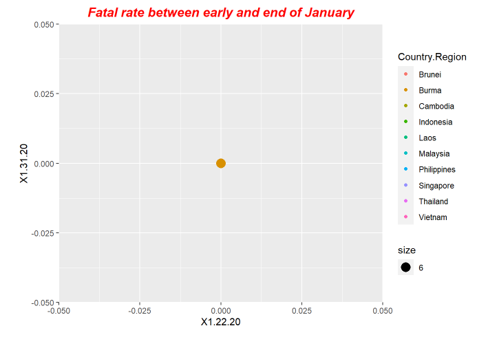
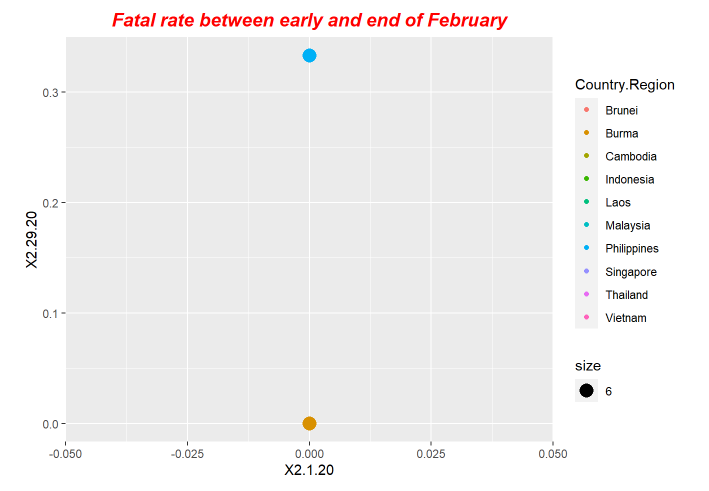
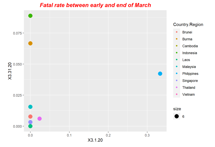
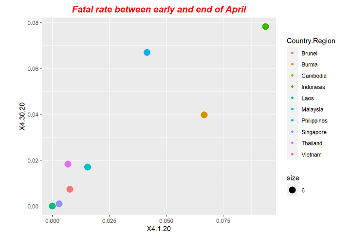
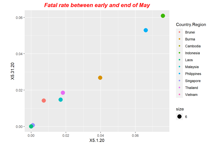
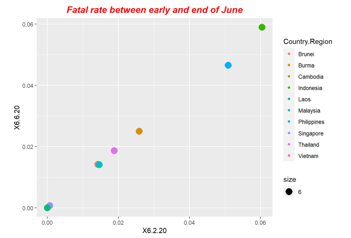
For our exploration, we use LSTM model to do forecastings. The forecasting results is based on the previous ending date the one-day after.

#Importing libraries
library(keras)
library(tensorflow)
Sys.setenv(RETICULATE_PYTHON="/home/lk/Software/anaconda3/envs/tensorflow/bin/python3.6")
use_condaenv("tensorflow",conda ='/home/lk/Software/anaconda3/envs/tensorflow' )
library(data.table)
library(ggplot2)
# ---------------------------Covid-19 cfr Cases----------------------------------------------------------

#Reading the structures table from cfr.csv which was created above
cfr <- read.csv("./cfr.csv")

#Transpose the cfr data to analyze the linear model
cfr <- transpose(cfr)

write.table(cfr, "./cfr.txt", sep=" ", col.names=FALSE, quote=FALSE, row.names=FALSE)
#Reading the structures table from cfr which was created above
cfr <- read.table("./cfr.txt", header = TRUE, na.strings = " ")

country_name = names(cfr)

#scale data
normalize <- function(train, test, feature_range = c(0, 1)) {
  x <- train
  fr_min <- feature_range[1]
  fr_max <- feature_range[2]
  std_train <- ((x - min(x) ) / (max(x) - min(x)  ))
  std_test <- ((test - min(x) ) / (max(x) - min(x)  ))

  scaled_train <- std_train *(fr_max -fr_min) + fr_min
  scaled_test <-std_test *(fr_max -fr_min) + fr_min

  return( list(scaled_train = as.vector(scaled_train), scaled_test = as.vector(scaled_test) ,scaler= c(min =min(x), max = max(x))) )
}

#inverse-transform
inverter  <-  function(scaled, scaler, feature_range = c(0, 1)){
  min <- scaler[1]
  max <- scaler[2]
  n <- length(scaled)
  mins <- feature_range[1]
  maxs <- feature_range[2]
  inverted_dfs <- numeric(n)

  for( i in 1:n){
    X <- (scaled[i]- mins)/(maxs - mins)
    rawValues <- X *(max - min) + min
    inverted_dfs[i] <- rawValues
  }
  return(inverted_dfs)
}

#create a lagged dataset, i.e to be supervised learning
lags <- function(x, k){
  lagged <- c(rep(NA, k), x[1:(length(x)-k)])
  DF <- as.data.frame(cbind(lagged, x))
  colnames(DF) <- c(paste0('x-', k), 'x')
  DF[is.na(DF)] <- 0
  return(DF)
}


A <- matrix(nrow=10,ncol=28)
num <- 1
for (name in country_name) {


  Series <-  cfr[name] # your time series
  Series <- data.matrix(Series)
  Series <- as.numeric(Series)

  #transform data to stationarity
  diffed <- diff(Series, differences = 1)


  supervised <- lags(diffed, 1)

  #split into train and test sets
  N <- nrow(supervised)
  n <- round(N *0.8, digits = 0)
  train <- supervised[1:n, ]
  test <- supervised[(n+1):N,  ]


  Scaled <- normalize(train, test, c(-1, 1))

  y_train <- Scaled$scaled_train[, 2]
  x_train <- Scaled$scaled_train[, 1]

  y_test <- Scaled$scaled_test[,2]
  x_test <- Scaled$scaled_test[,1]

  #hyperparameter
  epochs <- 300
  batch_size = 1

  #Reshape the input to 3-dim
  dim(x_train) <- c(length(x_train), 1, 1)

  #fit the model
  model <- keras_model_sequential()
  model %>% layer_lstm(units = 5, batch_input_shape = c(batch_size, 1, 1), stateful= TRUE) %>% layer_dense(1)

  model %>% compile(
    loss = 'mean_squared_error',
    optimizer = optimizer_adam()
  )

  summary(model)


  model %>% fit(x=x_train, y=y_train, batch_size=batch_size,
                  epochs=epochs, verbose=1, validation_split = 0.2,
                  shuffle=FALSE, callbacks = list(
      # callback_model_checkpoint("checkpoints.h5"),
      callback_early_stopping(monitor = "val_loss", patience = 20))
      )


  # model %>% load_model_weights_hdf5(filepath = './checkpoints.h5')

  #Reshape the input to 3-dim
  L = length(x_test)
  dim(x_test) = c(length(x_test), 1, 1)

  scaler = Scaled$scaler

  # yhat <-  model %>% predict(x_test, batch_size=batch_size)
  # yhat <- inverter(yhat, scaler, c(-1,1))


  predictions = numeric(L)
  for(i in 1:L){
    X = x_test[i , , ]
    dim(X) = c(1,1,1)
    #forecast
    yhat = model %>% predict(X, batch_size=batch_size)

    #invert scaling
    yhat = inverter(yhat, scaler,  c(-1, 1))

    #invert differencing
    yhat  = yhat + Series[(n+i)]

    #save prediction
    predictions[i] <- yhat
    A[num,i] <- yhat

  }
  num <- num+1
}
B <- as.data.frame(A)
B <- transpose(B)

# Latitude and longitude
pre <- read.csv("./pre.csv", row.names = FALSE)
pre <- transpose(pre)

pre <- pre[nrow(pre),]
# Latitude and longitude
df <- read.csv(textConnection(
  "Name,Lat,Long
  Brunel,21.9162,95.9560
  Brunei,4.5353,114.7277
  Cambodia,12.5657,104.9910
  Indonesia,0.7893,113.9213
  Laos,19.8563,102.4955
  Malaysia,4.2105,101.9758
  Philippines,12.8797,121.7740
  Singapore,1.3521,103.8198
  Thailand,15.8700,100.9925
  Vietnam,14.0583,108.2772"
))

vis_data <-cbind(df,pre)
names(vis_data) <-c("Name","Lat","Long","cfr")

vis_data[is.na(vis_data)] <- 0

#Writing the data table in csv file
write.csv(vis_data, "./pre.csv", sep=",", col.names=TRUE, quote=FALSE, row.names=FALSE)
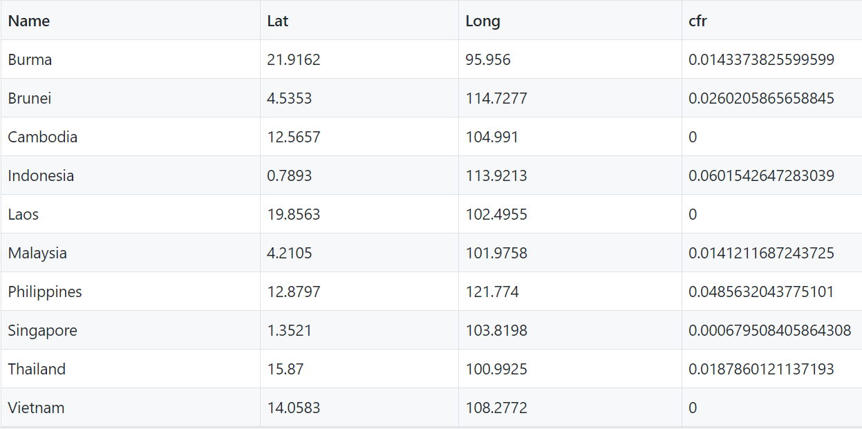
And here are the results.
pre.csv
Here is the Shiny Apps we lauch.
Covid-19 forecasting on ASEAN countries Shiny App
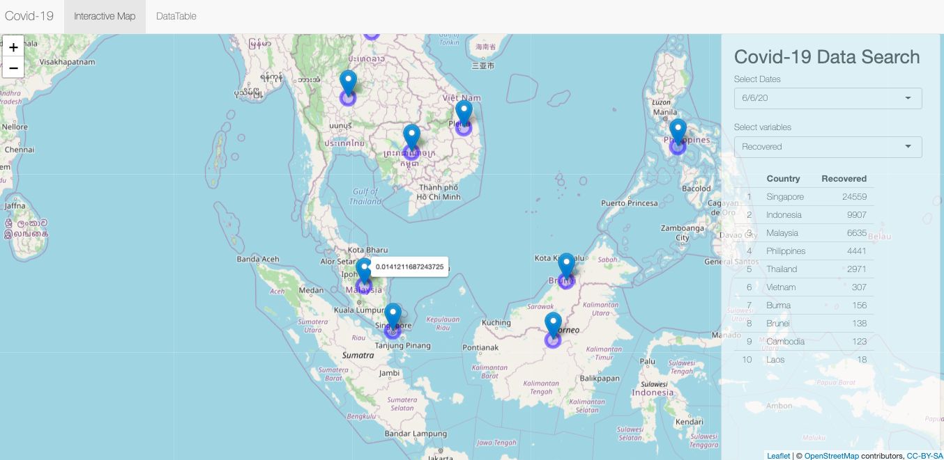
This is the partial codes.
library(shiny)
library(leaflet)
library(htmltools)
library(DT)
library(jsonlite)
library(dplyr)
library(RColorBrewer)
library(scales)
library(lattice)
library(ggplot2)
library(rsconnect)
library(rlang)
library(ggrepel)

vis_data <- read.csv("pre.csv")
analyticsData<-read.csv("csv_for_inquire.csv")
va <- names(analyticsData)
vars <-va[-1:-2]
Date<-analyticsData$Date

# Define UI for application that draws a histogram
ui <- navbarPage("Covid-19", id="nav",
                 tabPanel("Interactive Map",
                          div(class="outer",
                              tags$head
                              (
                                # Include our custom CSS
                                includeCSS("styles.css")
                              ),
                              # If not using custom CSS, set height of leafletOutput to a number instead of percent
                              leafletOutput("map", width="100%", height="100%"),
                              # Shiny versions prior to 0.11 should use class = "modal" instead.
                              absolutePanel(id = "controls", class = "panel panel-default", fixed = TRUE,
                                            draggable = FALSE, top = 55, left = "auto", right = 10, bottom = "auto",
                                            width = 350, height = "100%",
                                            h2("Covid-19 Data Search"),
                                            selectInput("typeofDate", "Select Dates", Date),
                                            selectInput("typeofvariable", "Select variables", vars),
                                            tableOutput("data")
                              )
                          )
                 ),
                 # tab 'DataSearch'
                 tabPanel("DataTable",DTOutput(outputId = "table"))
)


server <- function(input, output, session) {
  #Get query date
  target_date = reactive({
    input$typeofDate
  })

  #Get query type
  target_quo = reactive ({
    parse_quosure(input$typeofvariable)
  })

  #Query fixed-type variables by date and then sort
  dftable<-reactive({
    analytics=filter(analyticsData,Date== target_date())
    arrange(analytics,desc(!!target_quo()))
  })

  output$map <- renderLeaflet({
    leaflet(vis_data) %>% addTiles() %>% addCircleMarkers() %>% addMarkers(~Long, ~Lat, label = ~htmlEscape(cfr))
  })


  output$data <- renderTable({
    head((dftable()[, c("Country", input$typeofvariable), drop = FALSE]) ,10)}, rownames = TRUE)

  #
  output$table <- DT::renderDataTable({
    DT::datatable(analyticsData)
  })
}

shinyApp(ui, server)The countries like Indonesia and Philippines may have very high CFR values in the future, ASEAN should engage to better invest in the construction of related medical infrastructure to improve medical conditions.
https://ornlcda.github.io/icons2018/presentations/comparison_reynolds.pdf
https://www.datanovia.com/en/blog/ggplot-title-subtitle-and-caption/#center-the-title-position
http://www.sthda.com/english/articles/32-r-graphics-essentials/128-plot-time-series-data-using-ggplot/
