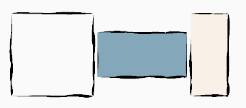
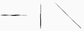
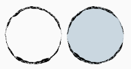
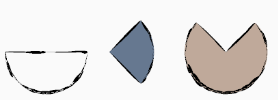
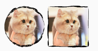
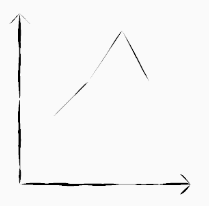
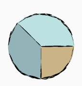
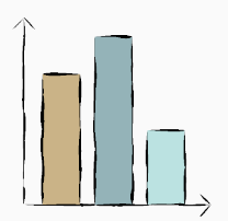
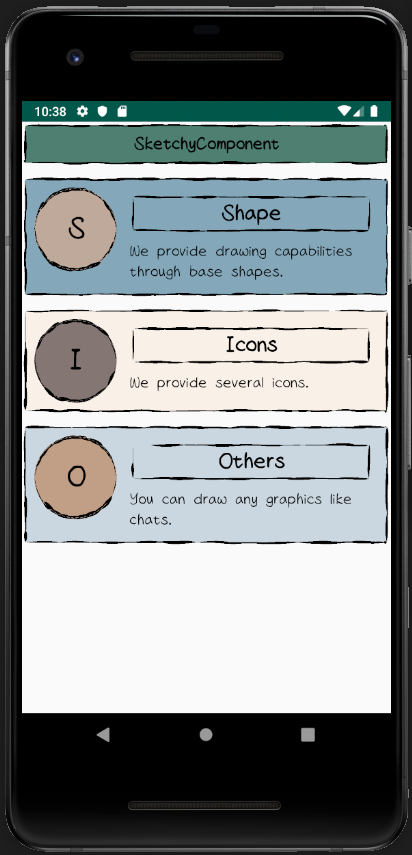
SketchyComponent is a set of sketchy style components.
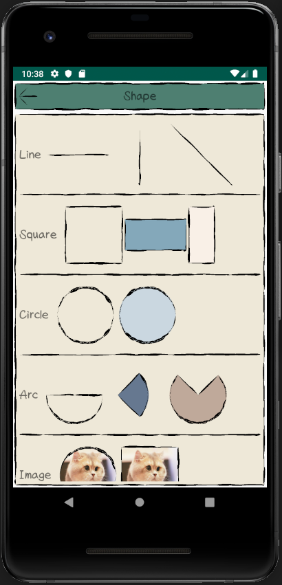
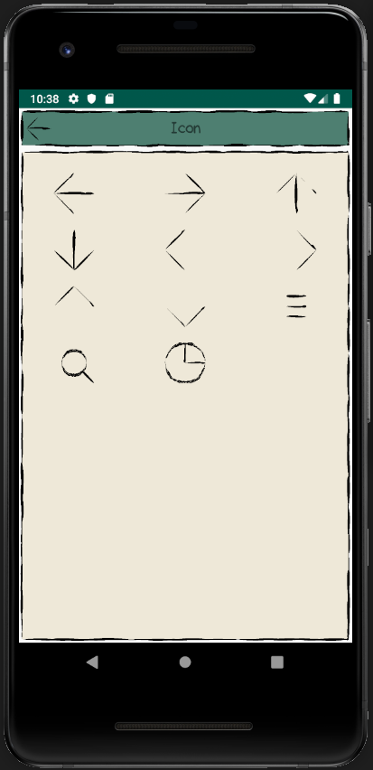
We provide basic sketchy shapes and some icons.
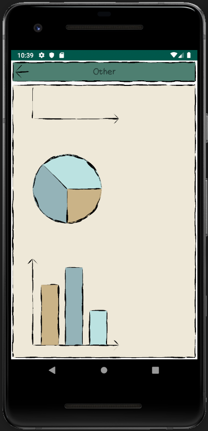
Here are some examples:
- add
jcenterto repositories
repositories {
    jcenter()
}
- add
sketchyto dependencies
implementation 'com.zylab:sketchy:0.1.3'
// 1. new SkDrawable
val skSquareDrawable = SkSquareDrawable().apply {
    // 2. set props
    fillColor = resources.getColor(android.R.color.holo_orange_dark)
}
// 3. set the background of View
text.background = skSquareDrawable0.1.3
Complete basic functions.
Represents a point in the drawing.
- Props
x: Double
y: Double
Represents a first order Bezier curve.
- Props
startPoint: SkPoint
controlPoint: SkPoint
endPoint: SkPoint
The base class of other SkDrawables.
- Props
width: Double
height: Double
borderColor: Int
fillColor: Int
bgColor: Int
- props
startPoint: SkPoint (The default value is (0, 0))
squareWidth: Double (The default value is the width of drawable)
squireHeight: Double (The default value is the height of drawable)
- Props
startPoint: SkPoint (The default value is (0, 0))
endPoint: SkPoint (The default value is (0, Drawable width))
- Props
center: SkPoint (The default value is (width of drawable / 2, height of drawable / 2))
radius: Double (The default value is min(width of drawable / 2, height of drawable / 2))
- Props
center: SkPoint
radius: Double
startAngle: Double
sweepAngle: Double
linkCenter: Boolean (Whether if line to center)
- 属性
img: Drawable
style: Int (STYLE_CIRCLE and STYLE_SQUARE)
- Props
style: Int (STYLE, STYLE1)
direction: Int (UP, DOWN, LEFT, RIGHT)
We also provide custom capabilities by some basic shapes. So You can draw something you want using these shapes.
Here are some examples.
All basic shapes inherit from SkShape. There are two important functions -- SkShape#parse() and SkShape#draw(canvas: Canvas).
SkShape#parse used to generate paths of graphics.
SkShape#draw used to draw paths to canvas. It will call parse if paths are not generated.
Take SkLine as an example:
// 1. new SkLine
val line = SkLine()
// 2. set props
line.startPoint = SkPoint(0.0, 0.0)
line.endPoint = SkPoint(100.0, 100.0)
// 3. draw to canvas
line.draw(canvas)
The base class of shapes.
- Props
borderColor: Int
fillColor: Int
bgColor: Int
- Props
startPoint: SkPoint
width: Double
height: Double
- Props
startPoint: SkPoint
endPoint: SkPoint
- Props
center: SkPoint
radius: Double
- Props
center: SkPoint
radius: Double
startAngle: Double
sweepAngle: Double
linkCenter: Boolean
- Props
center: SkPoint
radius: Double
img: Drawable
- Props
startPoint: SkPoint
width: Double
height: Double
img: Drawable
Any questions or suggestions, welcome to feedback:
Email:zy5a59@outlook.com
Wechat:zy_lab

