NOTE there have been some fairly major, and potentially buggy changes in 1.16.0. Please test it out and report feedback. We will troubleshoot asap.
React native drawer, configurable to achieve material design style, slack style, parallax, and more. Works in both iOS and Android.


Android: Android support has been added in v1.3.0!
npm install react-native-drawer
import Drawer from 'react-native-drawer'

class Application extends Component {
  closeControlPanel = () => {
    this.drawer.close()
  };
  openControlPanel = () => {
    this.drawer.open()
  };
  render () {
    return (
      <Drawer
        ref="drawer"
        content={<ControlPanel />}
        >
        <MainView />
      </Drawer>
    )
  }
})//Parallax Effect (slack style)
<Drawer
type="static"
content={<ControlPanel />}
openDrawerOffset={100}
styles={{main: {shadowColor: "#000000", shadowOpacity: 0.4, shadowRadius: 3}}}
tweenHandler={Drawer.tweenPresets.parallax}
>
<Main />
</Drawer>
//Material Design Style Drawer
<Drawer
type="overlay"
content={<ControlPanel />}
tapToClose={true}
openDrawerOffset={0.2} // 20% gap on the right side of drawer
panCloseMask={0.2}
closedDrawerOffset={-3}
styles={{
drawer: {shadowColor: '#000000', shadowOpacity: 0.8, shadowRadius: 3},
main: {paddingLeft: 3}
}}
tweenHandler={(ratio) => ({
main: { opacity:(2-ratio)/2 }
})}
>
<Main />
</Drawer>This module supports a wide range of drawer styles, and hence has a lot of props.
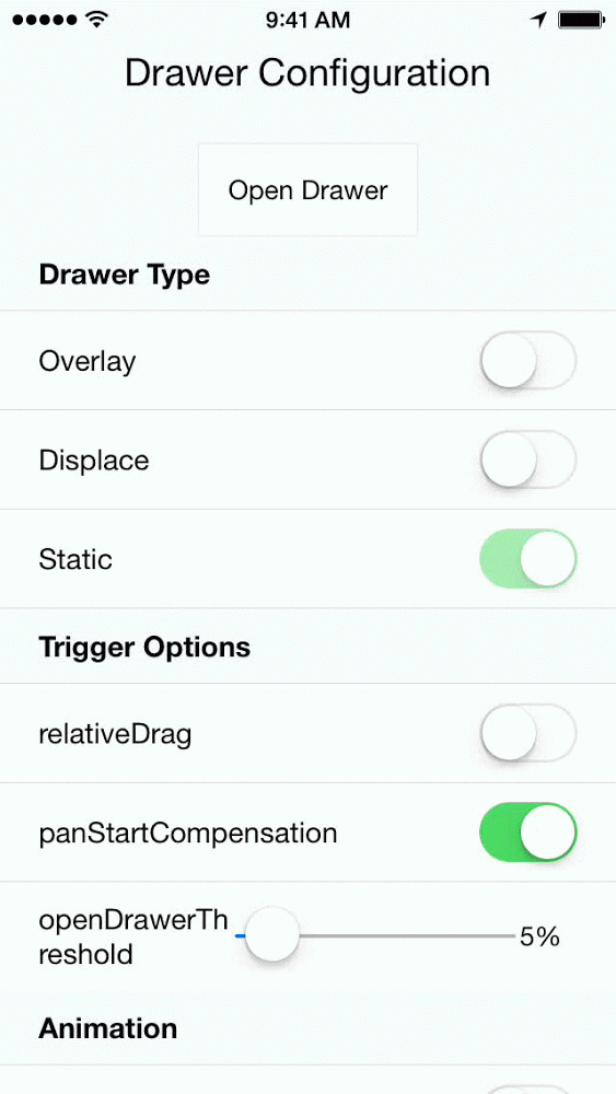
content(React.Component)null- Menu componenttype(String: displace:overlay:static)displace- Type of drawer.openDrawerOffset(Number)0- Can either be a integer (pixel value) or decimal (ratio of screen width). Defines the right hand margin when the drawer is open.closedDrawerOffset(Number)0- Same as openDrawerOffset, except defines left hand margin when drawer is closed.disabled(Boolean)false- If true the drawer can not be opened and will not respond to pans.
tweenHandler(Function)null- Takes in the pan ratio (decimal 0 to 1) that represents the tween percent. Returns and object of native props to be set on the constituent views { drawer: {/native props/}, main: {/native props/} }tweenDuration(Integer)250- The duration of the open/close animation.
onOpen(Function) - Will be called immediately after the drawer has entered the open state.onClose(Function) - Will be called immediately after the drawer has entered the closed state.
captureGestures(Boolean)false- If true, will capture all gestures inside of the pan mask. Meaning child buttons and scroll views will not trigger.acceptDoubleTap(Boolean)false- Toggle drawer when double tap occurs within pan mask?acceptTap(Boolean)false- Toggle drawer when any tap occurs within pan mask?acceptPan(Boolean)true- Allow for drawer pan (on touch drag). Set to false to effectively disable the drawer while still allowing programmatic control.tapToClose(Boolean)false- Same as acceptTap, except only for close.negotiatePan(Boolean)false- If true, attempts to handle only horizontal swipes, making it play well with a childScrollView.
openDrawerThreshold(Number).25- Ratio of screen width that must be travelled to trigger a drawer open/closepanOpenMask(Number).05- Ratio of screen width that is valid for the start of a pan open action.panCloseMask(Number).25- Ratio of screen width that is valid for the start of a pan close action.initializeOpen(Boolean)false- Initialize with drawer open?side(String left|right)left- which side the drawer should be on.
Subject to change or deletion
onOpenStart(Boolean) callback fired at the start of an open animationonCloseStart(Boolean) callback fired at the start of a close animationtweenEasing(String)linear- A easing type supported by tween-functionsrelativeDrag(Boolean)true- true -> open/close calculation based on pan dx : false -> calculation based on absolute pan position (i.e. touch location)panStartCompensation(Boolean)false- Should the drawer catch up to the finger drag position?
You can achieve pretty much any animation you want using the tween handler with the transformMatrix property. E.G.
tweenHandler={(ratio) => {
  var r0 = -ratio/6
  var r1 = 1-ratio/6
  var t = [
             r1,  r0,  0,  0,
             -r0, r1,  0,  0,
             0,   0,   1,  0,
             0,   0,   0,  1,
          ]
  return {
    main: {
      style: {
        transformMatrix: t,
        opacity: 1 - ratio/2,
      },
    }
  }
}}
Will result in a skewed fade out animation.
warning: Frame rate, and perceived smoothness will vary based on the complexity and speed of the animation. It will likely require some tweaking and compromise to get the animation just right.
Two options:
- Using the Drawer Ref:
onPress={() => {this.drawer.open()}}- Using Context
contextTypes = {drawer: React.PropTypes.object}
// later...
this.context.drawer.open()git clone https://github.com/rt2zz/react-native-drawer.gitcd react-native-drawer/examples/RNDrawerDemo && npm install- Open ``./examples/RNDrawerDemo/RNDrawerDemo.xcodeproject` in xcode
command+r(in xcode)
Component was adapted from and inspired by @khanghoang's RNSideMenu AND @kureevalexey's react-native-side-menu