


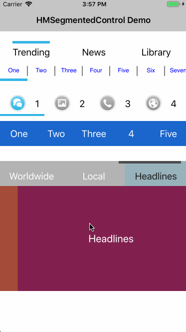
A drop-in replacement for UISegmentedControl mimicking the style of the segmented control used in Google Currents and various other Google products. 支持指示器跟随ScrollView滑动
- 指示器跟随ScrollView滑动
- Supports both text and images
- Support horizontal scrolling
- Supports advanced title styling with text attributes for font, color, kerning, shadow, etc.
- Supports selection indicator both on top and bottom
- Supports blocks
- Works with ARC and iOS >= 7
The code below will create a segmented control with the default looks:
HMSegmentedControl *segmentedControl = [[HMSegmentedControl alloc] initWithSectionTitles:@[@"One", @"Two", @"Three"]];
segmentedControl.frame = CGRectMake(10, 10, 300, 60);
[segmentedControl addTarget:self action:@selector(segmentedControlChangedValue:) forControlEvents:UIControlEventValueChanged];
[self.view addSubview:segmentedControl];

// 需要设置滚动页面的ScrollView,指示器才能同步滑动
[segmentedControl setPageScrollView:scrollView];
Included is a demo project showing how to fully customise the control.
If you are using HMSegmentedControl in your app or know of an app that uses it, please add it to this list.
HMSegmentedControl is licensed under the terms of the MIT License. Please see the LICENSE file for full details.
If this code was helpful, I would love to hear from you.