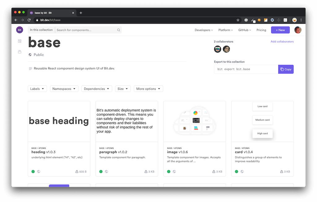
The reusable set of infra-level React components used to build Bit.dev.
All components in this frontend codebase were contained and exposed using Bit as a set of independently-usable components. See the base collection on bit.dev to explore and integrate any component into your project.
- Install independent components with npm/yarn.
- Use
bit importto source and edit components locally for quick editing and integration. - Try any component hands-on in a live playground.
Wait.. what?
The entire bit.dev platform and website isn't built as one monolithic application. Instead, it's built from components maintained in different codebases which are separately developed, then exposed and integrated together using Bit.
Take a look our homepage.
You will notice that it's built from components that live in different front-end codebases:
- "Demo" marketing components.
- base-ui components.
- Container application (private).
- etc
We use Bit to contain and expose components from any codebase as a set of APIs in bit.dev that can be integrated into different pages and applications. For example:
- Exposed ["Demo" marketing components] on bit.dev.
- Exposed base-ui components on bit.dev.
All shared styles, colors, sizes, fonts, and css variables, belong here.
Theme-provider applies all of these styles at the root of your app, and different apps may implement their own unique theme.
Hard coded context values, like storage-url and enums. In case of change, this central location could update all other components.
Components controlling the position of elements in the document. (Grid, breakpoints, etc)
Generic building blocks for any front end application.
These components are 'vanilla', meaning they should not contain content (like texts or icons) and no specific styles. This is because different designs could look entirely different, so any styles in the base component could lead to a 'CSS Specificity War'. So, add the bare minimum of css here and keep these components purely logical!
Pure logic components and helpers. (no visual components)
This is the main configuration file of your bit workspace. Here you can modify the workspace name and icon as well as default directory and scope. It is where dependencies are found when you install anything. It is also where you register aspects, bit extensions as well as apply the environments for your components. This workspace has been setup so that all components use the React env. However you can create other components and apply other envs to them such as node, html, angular and aspect envs.
This is an auto-generated file and includes the mapping of your components. There is one component included here. In order to remove this component you can run the following command.
A folder (unless the --empty flag was used) containing demo components are included in this workspace. These components are used to demonstrate the different features of Bit. If you would like to remove these components you can run the following command.
bit remove "ui/*" --delete filesThis removes the components from the bitmap as well as removes the files.
- Clone the repository
- Install bit
- Run
bit importto sync components. - Start hacking!


