Toggle Confirm plugin for Vueform
Plugin for Vueform to add a confirm dialog to ToggleElement upon toggling.
Prerequisites
Installation
- Install the plugin
npm install vueform-plugin-toggle-confirm- Add the plugin in
vueform.config.js
// vueform.config.js

import ToggleConfirmPlugin from 'vueform-plugin-toggle-confirm'

export default {
  // ...
  plugins: [
    ToggleConfirmPlugin,
  ]
}
Usage
<template>
<Vueform>
<ToggleElement
name="toggle"
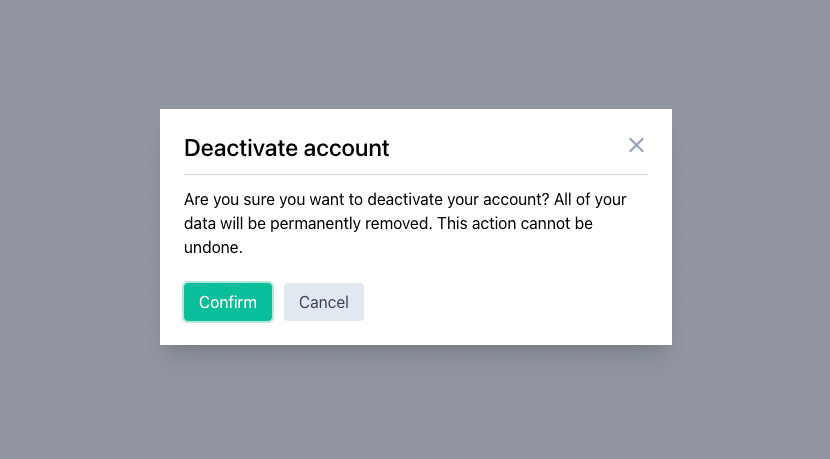
confirm-on-text="You are about to enable this option! Do you want to continue?"
confirm-off-text="Are you sure you want to disable this option?"
confirm-title="Confirmation"
/>
</Vueform>
</template>Options
| Name | {Type} Default | Description |
|---|---|---|
| confirmText | {string} undefined |
The text in the modal when toggle is being set to On or Off (mutually exclusive with confirmOnText and confirmOffText). |
| confirmOnText | {string} undefined |
The text in the modal when toggle is being set to On. |
| confirmOffText | {string} undefined |
The text in the modal when toggle is being set to Off. |
| confirmTitle | {string} undefined |
The title in the modal when toggle is being set to On or Off (mutually exclusive with confirmOnTitle and confirmOffTitle). |
| confirmOnTitle | {string} undefined |
The title in the modal when toggle is being set to On. |
| confirmOffTitle | {string} undefined |
The title in the modal when toggle is being set to Off. |
| confirmLabel | {string} Confirm |
Text of the confirm button in the modal. |
| cancelLabel | {string} Cancel |
Text of the cancel button in the modal. |
Classes
Classes can be changed using the built-in Vueform class management with ConfirmModal key, eg.:
<ToggleElement
  ...
  :replace-classes="{
    ConfirmModal: {
      'vf-toggle-confirm-modal-overlay' : 'my-overlay-class',
      'vf-toggle-confirm-modal-wrapper' : 'my-wrapper-class',
      // ...
    }
  }"
/>
CSS Vars
You can customize the following CSS vars dedicated for this plugin:
*, :root, :before, :after {
  /* Overlay */
  --vf-toggle-confirm-modal-overlay-bg: rgb(107 114 128 / .75);
  --vf-toggle-confirm-modal-overlay-z: 999;

  /* Modal */
  --vf-toggle-confirm-modal-py: 1.5rem;
  --vf-toggle-confirm-modal-px: 1.5rem;
  --vf-toggle-confirm-modal-mx: 1rem;
  --vf-toggle-confirm-modal-radius: 0px;
  --vf-toggle-confirm-modal-bg: #FFFFFF;
  --vf-toggle-confirm-modal-min-width: 380px;
  --vf-toggle-confirm-modal-max-width: 512px;
  --vf-toggle-confirm-modal-min-height: 120px;
  --vf-toggle-confirm-modal-shadow: 0 20px 25px -5px #0000001a, 0 8px 10px -6px #0000001a;

  /* Title */
  --vf-toggle-confirm-modal-title-color: inherit;
  --vf-toggle-confirm-modal-title-font-size: 24px;
  --vf-toggle-confirm-modal-title-line-height: 1.2;
  --vf-toggle-confirm-modal-title-font-weight: 500;
  --vf-toggle-confirm-modal-title-pb: 0.75rem;
  --vf-toggle-confirm-modal-title-mb: 0.75rem;
  --vf-toggle-confirm-modal-title-border-width: 0px;
  --vf-toggle-confirm-modal-title-border-color: var(--vf-gray-300);

  /* Content */
  --vf-toggle-confirm-modal-color: inherit;
  --vf-toggle-confirm-modal-font-size: 1rem;

  /* Buttons */
  --vf-toggle-confirm-modal-buttons-pt: 1.5rem;
  --vf-toggle-confirm-modal-buttons-gap: 0.75rem;

  /* Close */
  --vf-toggle-confirm-modal-close-width: 1.5rem;
  --vf-toggle-confirm-modal-close-height: 1.5rem;
  --vf-toggle-confirm-modal-close-color: var(--vf-gray-400);
  --vf-toggle-confirm-modal-close-color-hover: var(--vf-gray-500);
  --vf-toggle-confirm-modal-close-icon: url('data:image/svg+xml,<svg xmlns="http://www.w3.org/2000/svg" viewBox="0 0 320 512"><path d="M193.94 256L296.5 153.44l21.15-21.15c3.12-3.12 3.12-8.19 0-11.31l-22.63-22.63c-3.12-3.12-8.19-3.12-11.31 0L160 222.06 36.29 98.34c-3.12-3.12-8.19-3.12-11.31 0L2.34 120.97c-3.12 3.12-3.12 8.19 0 11.31L126.06 256 2.34 379.71c-3.12 3.12-3.12 8.19 0 11.31l22.63 22.63c3.12 3.12 8.19 3.12 11.31 0L160 289.94 262.56 392.5l21.15 21.15c3.12 3.12 8.19 3.12 11.31 0l22.63-22.63c3.12-3.12 3.12-8.19 0-11.31L193.94 256z"/></svg>');
}
The plugin also uses the following Vueform default CSS vars:
*, :root, :before, :after {
  --vf-ring-color;
  --vf-font-size;
  --vf-line-height;
  --vf-letter-spacing;
  --vf-py-bt;
  --vf-px-btn;
  --vf-radius-btn;
  --vf-shadow-btn;
  --vf-border-width-btn;
  --vf-ring-widt;
  --vf-ring-color;
  --vf-primary;
  --vf-color-on-primary;
  --vf-border-color-btn;
  --vf-bg-btn-secondary;
  --vf-color-btn-secondary;
  --vf-border-color-btn-secondary;
}