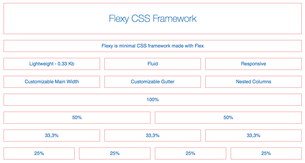
Flexy is minimal CSS framework made with Flex
- Minimal. It is only 0.33 KB minified + gzip.
- Responsive.
- No unnecessary nesting.
- Fluid Column (even multiple times in one row)
- Flexible the main width can be any number or uint ex: 960px, 90% or whatever you like.
https://vladocar.github.io/flexy/
<div class="dp50">50%</div>
<div class="dp50">50%</div>

<div class="dp33">33,3%</div>
<div class="dp33">33,3%</div>
<div class="dp33">33,3%</div>

<div class="dp25">25%</div>
<div class="fluid">Fluid</div>
<div class="dp17">17%</div>
<div class="clear"></div> /* => Use clear when you have fluid column */

/* Multiple Fluid columns in one row */

<div class="fluid">Fluid</div>
<div class="dp25">25%</div>
<div class="dp25">25%</div>
<div class="fluid">Fluid</div>
<div class="clear"></div>You can simply download the library or:
$ npm i @vladocar/flexy
Use flexy-old.css for IE 10/11
This project is licensed under the MIT License