Observable Plot is a JavaScript library for exploratory data visualization.
For use with Webpack, Rollup, or other Node-based bundlers, Plot is typically installed via a package manager such as Yarn or npm.
yarn add @observablehq/plotPlot can then be imported as a namespace:
import * as Plot from "@observablehq/plot";In an Observable notebook, Plot (and optionally D3) can be imported like so:
import {Plot, d3} from "@observablehq/plot"In vanilla HTML, Plot can be imported as an ES module, say from Skypack:
<script type="module">

import * as Plot from "https://cdn.skypack.dev/@observablehq/plot@0.1";

document.body.appendChild(Plot.plot(options));

</script>
Plot is also available as a UMD bundle for legacy browsers.
<script src="https://cdn.jsdelivr.net/npm/d3@6"></script>
<script src="https://cdn.jsdelivr.net/npm/@observablehq/plot@0.1"></script>
<script>

document.body.appendChild(Plot.plot(options));

</script>Renders a new plot given the specified options and returns the corresponding SVG or HTML figure element. All options are optional.
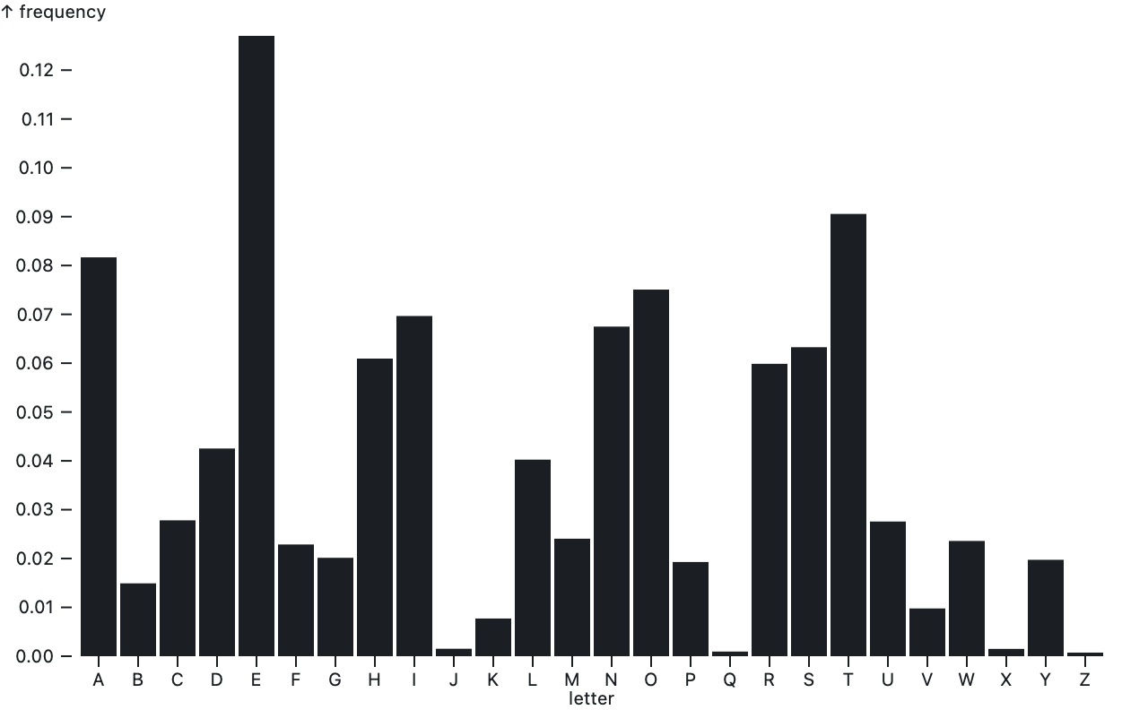
The marks option specifies an array of marks to render. Each mark has its own data and options; see the respective mark type (e.g., bar or dot) for which mark options are supported. Each mark may be a nested array of marks, allowing composition. Marks are drawn in z-order, last on top. For example, here bars for the dataset alphabet are drawn on top of a single rule at y = 0.
Plot.plot({
  marks: [
    Plot.ruleY([0]),
    Plot.barY(alphabet, {x: "letter", y: "frequency"})
  ]
})
When drawing a single mark, you can call mark.plot(options) as shorthand.
Plot.barY(alphabet, {x: "letter", y: "frequency"}).plot()These options determine the overall layout of the plot; all are specified as numbers in pixels:
- marginTop - the top margin
- marginRight - the right margin
- marginBottom - the bottom margin
- marginLeft - the left margin
- width - the outer width of the plot (including margins)
- height - the outer height of the plot (including margins)
The default width is 640. On Observable, the width can be set to the standard width to make responsive plots. The default height is 396 if the plot has a y or fy scale; otherwise it is 90 if the plot has an fx scale, or 60 if it does not. (The default height will be getting smarter for ordinal domains; see #337.)
The default margins depend on the plot’s axes: for example, marginTop and marginBottom are at least 30 if there is a corresponding top or bottom x axis, and marginLeft and marginRight are at least 40 if there is a corresponding left or right y axis. For simplicity’s sake and for consistent layout across plots, margins are not automatically sized to make room for tick labels; instead, shorten your tick labels or increase the margins as needed. (In the future, margins may be specified indirectly via a scale property to make it easier to reorient axes without adjusting margins; see #210.)
The style option allows custom styles to override Plot’s defaults. It may be specified either as a string or an object of properties (e.g., "color: red;" or {color: "red"}). By default, the returned plot has a white background, a max-width of 100%, and the system-ui font. Plot’s marks and axes default to currentColor, meaning that they will inherit the surrounding content’s color. For example, a dark theme:
Plot.plot({
  marks: …,
  style: {
    background: "black",
    color: "white"
  }
})
If a caption is specified, Plot.plot wraps the generated SVG element in an HTML figure element with a figcaption, returning the figure. To specify an HTML caption, consider using the html tagged template literal; otherwise, the specified string represents text that will be escaped as needed.
Plot.plot({
marks: …,
caption: html`Figure 1. This chart has a <i>fancy</i> caption.`
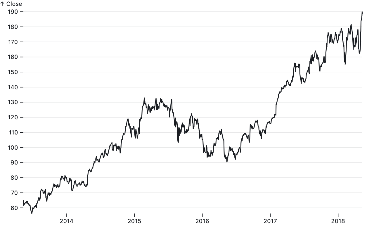
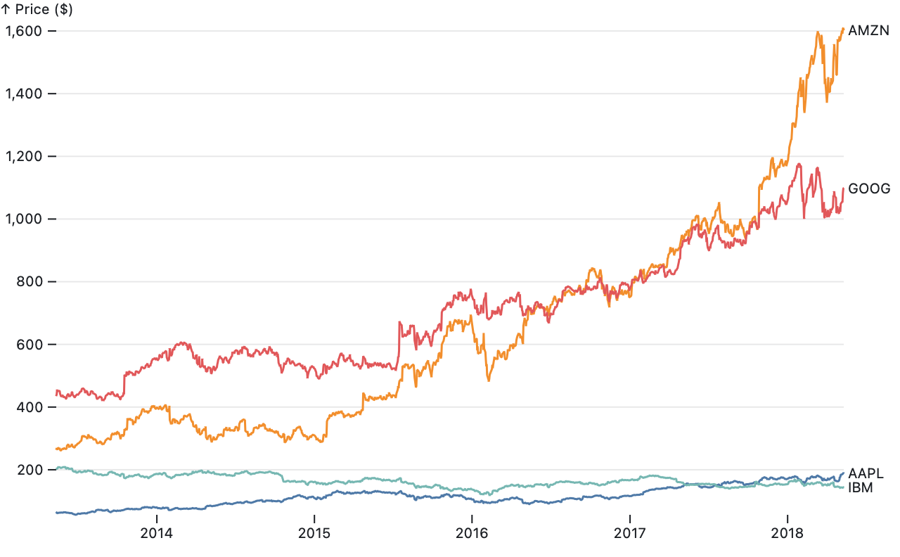
})Plot passes data through scales as needed before rendering marks. A scale maps abstract values such as time or temperature to visual values such as position or color. Within a given plot, marks share scales. For example, if a plot has two Plot.line marks, both share the same x and y scales for a consistent representation of data. (Plot does not currently support dual-axis charts, which are not advised.)
Plot.plot({
  marks: [
    Plot.line(aapl, {x: "Date", y: "Close"}),
    Plot.line(goog, {x: "Date", y: "Close"})
  ]
})
Each scale’s options are specified as a nested options object with the corresponding scale name within the top-level plot options:
- x - horizontal position
- y - vertical position
- r - radius (size)
- color - fill or stroke
- opacity - fill or stroke opacity
For example, to set the domain for the x and y scales:
Plot.plot({
  x: {
    domain: [new Date("1880-01-01"), new Date("2016-11-01")]
  },
  y: {
    domain: [-0.78, 1.35]
  }
})
Plot supports many scale types. Some scale types are for quantitative data — values that can be added or subtracted, such as temperature or time. Other scale types are for ordinal or categorical data — unquantifiable values that can only be ordered, such as t-shirt sizes, or values with no inherent order that can only be tested for equality, such as types of fruit. Some scale types are further intended for specific visual encodings — for example, as position or color.
You can set the scale type explicitly via the scale.type option, but typically the scale type is inferred automatically from data: strings and booleans imply an ordinal scale; dates imply a UTC scale; anything else is linear. Unless they represent text, we recommend explicitly converting strings to more specific types when loading data (e.g., with d3.autoType or Observable’s FileAttachment). For simplicity’s sake, Plot assumes that data is consistently typed; type inference is based solely on the first non-null, non-undefined value. Certain mark types also imply a scale type; for example, the Plot.barY mark implies that the x scale is a band scale.
For quantitative data (i.e. numbers), a mathematical transform may be applied to the data by changing the scale type:
- linear (default) - linear transform (translate and scale)
- pow - power (exponential) transform
- sqrt - square-root transform (pow transform with exponent = 0.5)
- log - logarithmic transform
- symlog - bi-symmetric logarithmic transform per Webber et al.
The appropriate transform depends on the data’s distribution and what you wish to know. A sqrt transform exaggerates differences between small values at the expense of large values; it is a special case of the pow transform which has a configurable scale.exponent (0.5 for sqrt). A log transform is suitable for comparing orders of magnitude and can only be used when the domain does not include zero. The base defaults to 10 and can be specified with the scale.base option; note that this only affects the axis ticks and not the scale’s behavior. A symlog transform is more elaborate, but works well with wide-range values that include zero; it can be configured with the scale.constant option (default 1).
For temporal data (i.e. dates), two variants of a linear scale are also supported:
- utc (default, recommended) - UTC time
- time - local time
UTC is recommended over local time as charts in UTC time are guaranteed to appear consistently to all viewers whereas charts in local time will depend on the viewer’s time zone. Due to limitations in JavaScript’s Date class, Plot does not yet support an explicit time zone other than UTC.
For ordinal data (e.g., strings), use the ordinal scale type or the point or band position scale types. The categorical scale type is also supported; it is equivalent to ordinal except as a color scale, where it provides a different default color scheme. (Since position is inherently ordinal or even quantitative, categorical data must be assigned an effective order when represented as position, and hence categorical and ordinal may be considered synonymous in context.)
You can opt-out of a scale using the identity scale type. This is useful if you wish to specify literal colors or pixel positions within a mark channel rather than relying on the scale to convert abstract values into visual values. For position scales (x and y), an identity scale is still quantitative and may produce an axis, yet unlike a linear scale the domain and range are fixed based on the plot layout.
A scale’s domain (the extent of its inputs, abstract values) and range (the extent of its outputs, visual values) are typically inferred automatically. You can set them explicitly using these options:
- scale.domain - typically [min, max], or an array of ordinal or categorical values
- scale.range - typically [min, max], or an array of ordinal or categorical values
- scale.reverse - reverses the domain, say to flip the chart along x or y
For most quantitative scales, the default domain is the [min, max] of all values associated with the scale. For the radius and opacity scales, the default domain is [0, max] to ensure a meaningful value encoding. For ordinal scales, the default domain is the set of all distinct values associated with the scale in natural ascending order; set the domain explicitly for a different order. If a scale is reversed, it is equivalent to setting the domain as [max, min] instead of [min, max].
The default range depends on the scale: for position scales (x, y, fx, and fy), the default range depends on the plot’s size and margins. For color scales, there are default color schemes for quantitative, ordinal, and categorical data. For opacity, the default range is [0, 1]. And for radius, the default range is designed to produce dots of “reasonable” size assuming a sqrt scale type for accurate area representation: zero maps to zero, the first quartile maps to a radius of three pixels, and other values are extrapolated. This convention for radius ensures that if the scale’s data values are all equal, dots have the default constant radius of three pixels, while if the data varies, dots will tend to be larger.
Quantitative scales can be further customized with additional options:
- scale.clamp - if true, clamp input values to the scale’s domain
- scale.nice - if true (or a tick count), extend the domain to nice round values
- scale.zero - if true, extend the domain to include zero if needed
- scale.percent - if true, transform proportions in [0, 1] to percentages in [0, 100]
Clamping is typically used in conjunction with setting an explicit domain since if the domain is inferred, no values will be outside the domain. Clamping is useful for focusing on a subset of the data while ensuring that extreme values remain visible, but use caution: clamped values may need an annotation to avoid misinterpretation. A top-level nice option is supported as shorthand for setting scale.nice on all scales.
The scale.transform option allows you to apply a function to all values before they are passed through the scale. This is convenient for transforming a scale’s data, say to convert to thousands or between temperature units.
Plot.plot({
  y: {
    label: "↑ Temperature (°F)",
    transform: f => f * 9 / 5 + 32 // convert Celsius to Fahrenheit
  },
  marks: …
})The position scales (x, y, fx, and fy) support additional options:
- scale.inset - inset the default range by the specified amount in pixels
- scale.round - round the output value to the nearest integer (whole pixel)
The scale.inset option can provide “breathing room” to separate marks from axes or the plot’s edge. For example, in a scatterplot with a Plot.dot with the default 3-pixel radius and 1.5-pixel stroke width, an inset of 5 pixels prevents dots from overlapping with the axes. The scale.round option is useful for crisp edges by rounding to the nearest pixel boundary.
In addition to the generic ordinal scale type, which requires an explicit output range value for each input domain value, Plot supports special point and band scale types for encoding ordinal data as position. These scale types accept a [min, max] range similar to quantitiatve scales, and divide this continuous interval into discrete points or bands based on the number of distinct values in the domain (i.e., the domain’s cardinality). If the associated marks have no effective width along the ordinal dimension — such as a dot, rule, or tick — then use a point scale; otherwise, say for a bar, use a band scale. In the image below, the top x-scale is a point scale while the bottom x-scale is a band scale; see Plot: Scales for an interactive version.

Ordinal position scales support additional options, all specified as proportions in [0, 1]:
- scale.padding - how much of the range to reserve to inset first and last point or band
- scale.align - where to distribute points or bands (0 = at start, 0.5 = at middle, 1 = at end)
For a band scale, you can further fine-tune padding:
- scale.paddingInner - how much of the range to reserve to separate adjacent bands
- scale.paddingOuter - how much of the range to reserve to inset first and last band
Plot automatically generates axes for position scales. You can configure these axes with the following options:
- scale.axis - the orientation: top or bottom for x; left or right for y; null to suppress
- scale.ticks - the approximate number of ticks to generate
- scale.tickSize - the size of each tick (in pixels; default 6)
- scale.tickPadding - the separation between the tick and its label (in pixels; default 3)
- scale.tickFormat - how to format tick values as a string (a function or format specifier)
- scale.tickRotate - whether to rotate tick labels (an angle in degrees clockwise; default 0)
- scale.grid - if true, draw grid lines across the plot for each tick
- scale.label - a string to label the axis
- scale.labelAnchor - the label anchor: top, right, bottom, left, or center
- scale.labelOffset - the label position offset (in pixels; default 0, typically for facet axes)
Plot does not currently generate a legend for the color, radius, or opacity scales, but when it does, we expect that some of the above options will also be used to configure legends. Top-level options are also supported as shorthand: grid (for x and y only; see facet.grid), inset, round, align, and padding.
The normal scale types — linear, sqrt, pow, log, symlog, and ordinal — can be used to encode color. In addition, Plot supports special scale types for color:
- sequential - equivalent to linear
- cyclical - equivalent to linear, but defaults to the rainbow scheme
- diverging - like linear, but with a pivot; defaults to the rdbu scheme
- categorical - equivalent to ordinal, but defaults to the tableau10 scheme
Color scales support two additional options:
- scale.scheme - a named color scheme in lieu of a range, such as reds
- scale.interpolate - in conjunction with a range, how to interpolate colors
The following sequential scale schemes are supported for both quantitative and ordinal data:
 blues
blues greens
 greys
greys oranges
 purples
 reds
reds bugn
bugn bupu
bupu gnbu
gnbu orrd
orrd pubu
pubu pubugn
 purd
purd rdpu
rdpu ylgn
ylgn ylgnbu
 ylorbr
 ylorrd
 cividis
 inferno
 magma
magma plasma
 viridis
 cubehelix
 turbo
turbo warm
warm cool
cool
The default color scheme, turbo, was chosen primarily to ensure high-contrast visibility; color schemes such as blues make low-value marks difficult to see against a white background, for better or for worse. If you wish to encode a quantitative value without hue, consider using opacity rather than color (e.g., use Plot.dot’s strokeOpacity instead of stroke).
The following diverging scale schemes are supported:
 brbg
brbg prgn
prgn piyg
piyg puor
puor rdbu
rdbu rdgy
rdgy rdylbu
 rdylgn
 spectral
 burd
burd buylrd
Diverging color scales support a scale.pivot option, which defaults to zero. Values below the pivot will use the lower half of the color scheme (e.g., reds for the rdgy scheme), while values above the pivot will use the upper half (grays for rdgy).
The following cylical color schemes are supported:
 rainbow
 sinebow
The following categorical color schemes are supported:
 accent (8 colors)
 category10 (10 colors)
 dark2 (8 colors)
 paired (12 colors)
 pastel1 (9 colors)
 pastel2 (8 colors)
 set1 (9 colors)
 set2 (8 colors)
 set3 (12 colors)
 tableau10 (10 colors)
The following color interpolators are supported:
- rgb - RGB (red, green, blue)
- hsl - HSL (hue, saturation, lightness)
- lab - CIELAB (a.k.a. “Lab”)
- hcl - CIELChab (a.k.a. “LCh” or “HCL”)
For example, to use CIELChab:
Plot.plot({
  color: {
    range: ["red", "blue"],
    interpolate: "hcl"
  },
  marks: …
})
Or to use gamma-corrected RGB (via d3-interpolate):
Plot.plot({
  color: {
    range: ["red", "blue"],
    interpolate: d3.interpolateRgb.gamma(2.2)
  },
  marks: …
})The facet option enables faceting. When faceting, two additional band scales may be configured:
- fx - the horizontal position, a band scale
- fy - the vertical position, a band scale
Similar to marks, faceting requires specifying data and at least one of two optional channels:
- facet.data - the data to be faceted
- facet.x - the horizontal position; bound to the fx scale, which must be band
- facet.y - the vertical position; bound to the fy scale, which must be band
The facet.x and facet.y channels are strictly ordinal or categorical (i.e., discrete); each distinct channel value defines a facet. Quantitative data must be manually discretized for faceting, say by rounding or binning. Automatic binning for quantitative data may be added in the future. #14
The following facet constant options are also supported:
- facet.marginTop - the top margin
- facet.marginRight - the right margin
- facet.marginBottom - the bottom margin
- facet.marginLeft - the left margin
- facet.grid - if true, draw grid lines for each facet
Marks whose data is strictly equal to (===) the facet data will be filtered within each facet to show the current facet’s subset, whereas other marks will be repeated across facets. You can disable faceting for an individual mark by giving it a shallow copy of the data, say using array.slice.
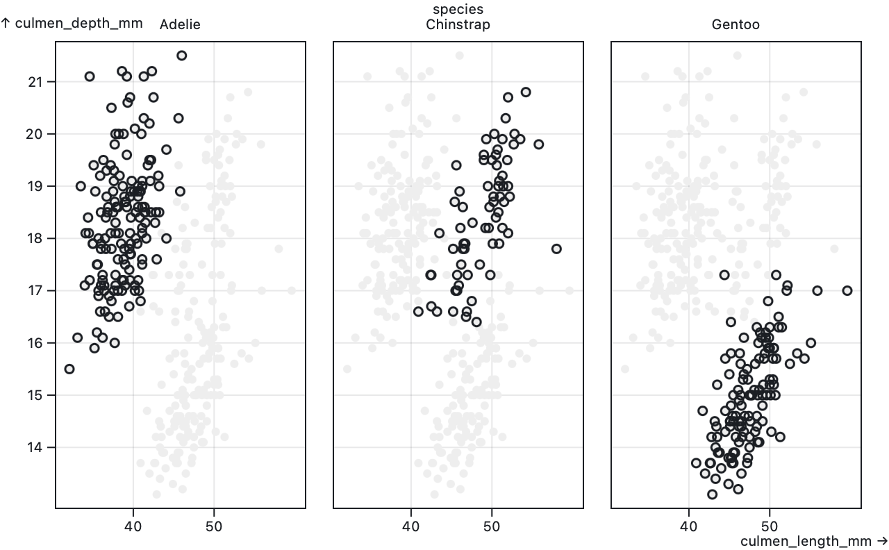
Plot.plot({
  facet: {
    data: penguins,
    x: "sex"
  },
  marks: {
    Plot.frame(), // draws an outline around each facet
    Plot.dot(penguins.slice(), {x: "culmen_length_mm", y: "culmen_depth_mm", fill: "#eee"}), // draws all penguins on each facet
    Plot.dot(penguins, {x: "culmen_length_mm", y: "culmen_depth_mm"}) // draws only the current facet’s subset
  }
})
Marks visualize data as geometric shapes such as bars, dots, and lines. An single mark can generate multiple shapes: for example, passing a Plot.barY to Plot.plot will produce a bar for each element in the associated data. Multiple marks can be layered into plots.
Mark constructors take two arguments: data and options. Together these describe a tabular dataset and how to visualize it. Options that are shared by all of a mark’s generated shapes are known as constants, while options that vary with the mark’s data are known as channels. Channels are typically bound to scales and encode abstract values, such as time or temperature, as visual values, such as position or color.
A mark’s data is most commonly an array of objects representing a tabular dataset, such as the result of loading a CSV file, while a mark’s options bind channels (such as x and y) to columns in the data (such as units and fruit).
sales = [
  {units: 10, fruit: "fig"},
  {units: 20, fruit: "date"},
  {units: 40, fruit: "plum"},
  {units: 30, fruit: "plum"}
]Plot.dot(sales, {x: "units", y: "fruit"}).plot()While a column name such as "units" is the most concise way of specifying channel values, values can also be specified as functions for greater flexibility, say to transform data or derive a new column on the fly. Channel functions are invoked for each datum (d) in the data and return the corresponding channel value. (This is similar to how D3’s selection.attr accepts functions, though note that Plot channel functions should return abstract values, not visual values.)
Plot.dot(sales, {x: d => d.units * 1000, y: d => d.fruit}).plot()Plot also supports columnar data for greater efficiency with bigger datasets; for example, data can be specified as any array of the appropriate length (or any iterable or value compatible with Array.from), and then separate arrays of values can be passed as options.
index = [0, 1, 2, 3]units = [10, 20, 40, 30]fruits = ["fig", "date", "plum", "plum"]Plot.dot(index, {x: units, y: fruits}).plot()Channel values can also be specified as numbers for constant values, say for a fixed baseline with an area.
Plot.area(aapl, {x1: "Date", y1: 0, y2: "Close"}).plot()Missing and invalid data are handled specifically for each mark type and channel. Plot.dot will not generate circles with null, undefined or negative radius, or null or undefined coordinates. Similarly, Plot.line and Plot.area will stop the path before any invalid point and start again at the next valid point, thus creating interruptions rather than interpolating between valid points; Plot.link, Plot.rect will only create shapes where x1, x2, y1 and y2 are not null or undefined. Marks will not generate elements for null or undefined fill or stroke, stroke width, fill or stroke opacity. Titles will only be added if they are non-empty.
All marks support the following style options:
- fill - fill color
- fillOpacity - fill opacity (a number between 0 and 1)
- stroke - stroke color
- strokeWidth - stroke width (in pixels)
- strokeOpacity - stroke opacity (a number between 0 and 1)
- strokeLinejoin - how to join lines (bevel, miter, miter-clip, or round)
- strokeLinecap - how to cap lines (butt, round, or square)
- strokeMiterlimit - to limit the length of miter joins
- strokeDasharray - a comma-separated list of dash lengths (in pixels)
- mixBlendMode - the blend mode (e.g., multiply)
All marks support the following optional channels:
- fill - a fill color; bound to the color scale
- fillOpacity - a fill opacity; bound to the opacity scale
- stroke - a stroke color; bound to the color scale
- strokeOpacity - a stroke opacity; bound to the opacity scale
- title - a tooltip (a string of text, possibly with newlines)
The fill, fillOpacity, stroke, and strokeOpacity options can be specified as either channels or constants. When the fill or stroke is specified as a function or array, it is interpreted as a channel; when the fill or stroke is specified as a string, it is interpreted as a constant if a valid CSS color and otherwise it is interpreted as a column name for a channel. Similarly when the fill or stroke opacity is specified as a number, it is interpreted as a constant; otherwise it is interpeted as a channel. When the radius is specified as a number, it is interpreted as a constant; otherwise it is interpreted as a channel.
The rectangular marks (bar, cell, and rect) support insets and rounded corner constant options:
- insetTop - inset the top edge
- insetRight - inset the right edge
- insetBottom - inset the bottom edge
- insetLeft - inset the left edge
- rx - the x-radius for rounded corners
- ry - the y-radius for rounded corners
Insets are specified in pixels. Corner radii are specified in either pixels or percentages (strings). Both default to zero. Insets are typically used to ensure a one-pixel gap between adjacent bars; note that the bin transform provides default insets, and that the band scale padding defaults to 0.1, which also provides separation.
Source · Examples · Draws regions formed by a baseline (x1, y1) and a topline (x2, y2) as in an area chart. Often the baseline represents y = 0. While not required, typically the x and y scales are both quantitative.
The following channels are required:
- x1 - the horizontal position of the baseline; bound to the x scale
- y1 - the vertical position of the baseline; bound to the y scale
In addition to the standard mark options, the following optional channels are supported:
- x2 - the horizontal position of the topline; bound to the x scale
- y2 - the vertical position of the topline; bound to the y scale
- z - a categorical value to group data into series
If x2 is not specified, it defaults to x1. If y2 is not specified, it defaults to y1. These defaults facilitate sharing x or y coordinates between the baseline and topline. See also the implicit stack transform and shorthand x and y options supported by Plot.areaY and Plot.areaX.
By default, the data is assumed to represent a single series (a single value that varies over time, e.g.). If the z channel is specified, data is grouped by z to form separate series. Typically z is a categorical value such as a series name. If z is not specified, it defaults to fill if a channel, or stroke if a channel.
The stroke defaults to none. The fill defaults to currentColor if the stroke is none, and to none otherwise. If both the stroke and fill are defined as channels, or if the z channel is also specified, it is possible for the stroke or fill to vary within a series; varying color within a series is not supported, however, so only the first channel value for each series is considered. This limitation also applies to the fillOpacity, strokeOpacity, and title channels.
Points along the baseline and topline are connected in input order. Likewise, if there are multiple series via the z, fill, or stroke channel, the series are drawn in input order such that the last series is drawn on top. Typically, the data is already in sorted order, such as chronological for time series; if sorting is needed, consider a sort transform.
The area mark supports curve options to control interpolation between points. If any of the x1, y1, x2, or y2 values are invalid (undefined, null, or NaN), the baseline and topline will be interrupted, resulting in a break that divides the area shape into multiple segments. (See d3-shape’s area.defined for more.) If an area segment consists of only a single point, it may appear invisible unless rendered with rounded or square line caps. In addition, some curves such as cardinal-open only render a visible segment if it contains multiple points.
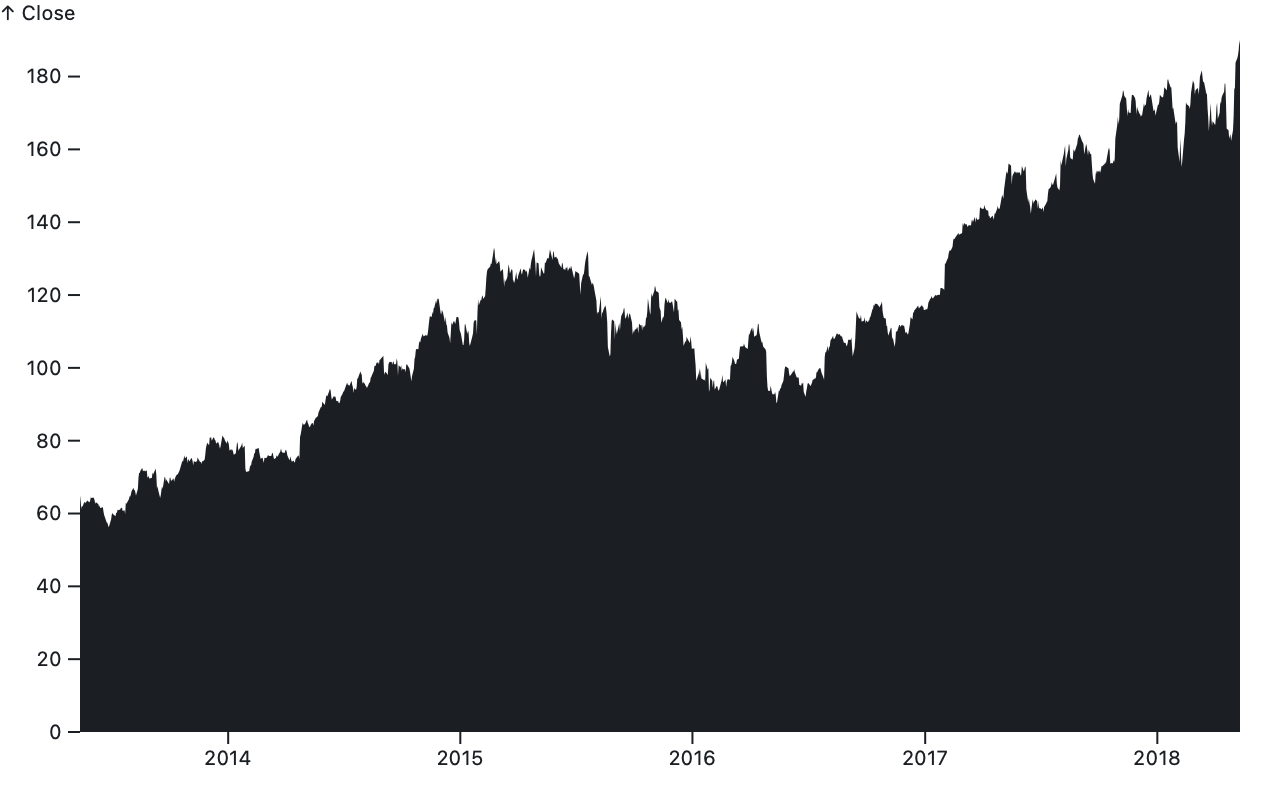
Plot.area(aapl, {x1: "Date", y1: 0, y2: "Close"})Returns a new area with the given data and options. Plot.area is rarely used directly; it is only needed when the baseline and topline have neither common x nor y values. Plot.areaY is used in the common horizontal orientation where the baseline and topline share x values, while Plot.areaX is used in the vertical orientation where the baseline and topline share y values.
Plot.areaX(aapl, {y: "Date", x: "Close"})Returns a new area with the given data and options. This constructor is used when the baseline and topline share y values, as in a time-series area chart where time goes up↑. If neither the x1 nor x2 option is specified, the x option may be specified as shorthand to apply an implicit stackX transform; this is the typical configuration for an area chart with a baseline at x = 0. If the x option is not specified, it defaults to the identity function. The y option specifies the y1 channel; and the y1 and y2 options are ignored.
Plot.areaY(aapl, {x: "Date", y: "Close"})Returns a new area with the given data and options. This constructor is used when the baseline and topline share x values, as in a time-series area chart where time goes right→. If neither the y1 nor y2 option is specified, the y option may be specified as shorthand to apply an implicit stackY transform; this is the typical configuration for an area chart with a baseline at y = 0. If the y option is not specified, it defaults to the identity function. The x option specifies the x1 channel; and the x1 and x2 options are ignored.
Source · Examples · Draws rectangles where x is ordinal and y is quantitative (Plot.barY) or y is ordinal and x is quantitative (Plot.barX). There is usually one ordinal value associated with each bar, such as a name, and two quantitative values defining a lower and upper bound. The lower bound is often not specified explicitly because it defaults to zero as in a conventional bar chart.
For the required channels, see Plot.barX and Plot.barY. The bar mark supports the standard mark options, including insets and rounded corners. The stroke defaults to none. The fill defaults to currentColor if the stroke is none, and to none otherwise.
Plot.barX(alphabet, {y: "letter", x: "frequency"})Returns a new horizontal bar↔︎ with the given data and options. The following channels are required:
- x1 - the starting horizontal position; bound to the x scale
- x2 - the ending horizontal position; bound to the x scale
If neither the x1 nor x2 option is specified, the x option may be specified as shorthand to apply an implicit stackX transform; this is the typical configuration for a horizontal bar chart with bars aligned at x = 0. If the x option is not specified, it defaults to the identity function.
In addition to the standard bar channels, the following optional channels are supported:
- y - the vertical position; bound to the y scale, which must be band
If the y channel is not specified, the bar will span the full vertical extent of the plot (or facet).
Plot.barY(alphabet, {x: "letter", y: "frequency"})Returns a new vertical bar↕︎ with the given data and options. The following channels are required:
- y1 - the starting vertical position; bound to the y scale
- y2 - the ending vertical position; bound to the y scale
If neither the y1 nor y2 option is specified, the y option may be specified as shorthand to apply an implicit stackY transform; this is the typical configuration for a vertical bar chart with bars aligned at y = 0. If the y option is not specified, it defaults to the identity function.
In addition to the standard bar channels, the following optional channels are supported:
- x - the horizontal position; bound to the x scale, which must be band
If the x channel is not specified, the bar will span the full horizontal extent of the plot (or facet).
Source · Examples · Draws rectangles where both x and y are ordinal, typically in conjunction with a fill channel to encode value. Cells are often used in conjunction with a group transform.
In addition to the standard mark options, including insets and rounded corners, the following optional channels are supported:
- x - the horizontal position; bound to the x scale, which must be band
- y - the vertical position; bound to the y scale, which must be band
If the x channel is not specified, the cell will span the full horizontal extent of the plot (or facet). Likewise if the y channel is not specified, the cell will span the full vertical extent of the plot (or facet). Typically either x, y, or both are specified; see Plot.frame if you want a simple frame decoration around the plot.
The stroke defaults to none. The fill defaults to currentColor if the stroke is none, and to none otherwise.
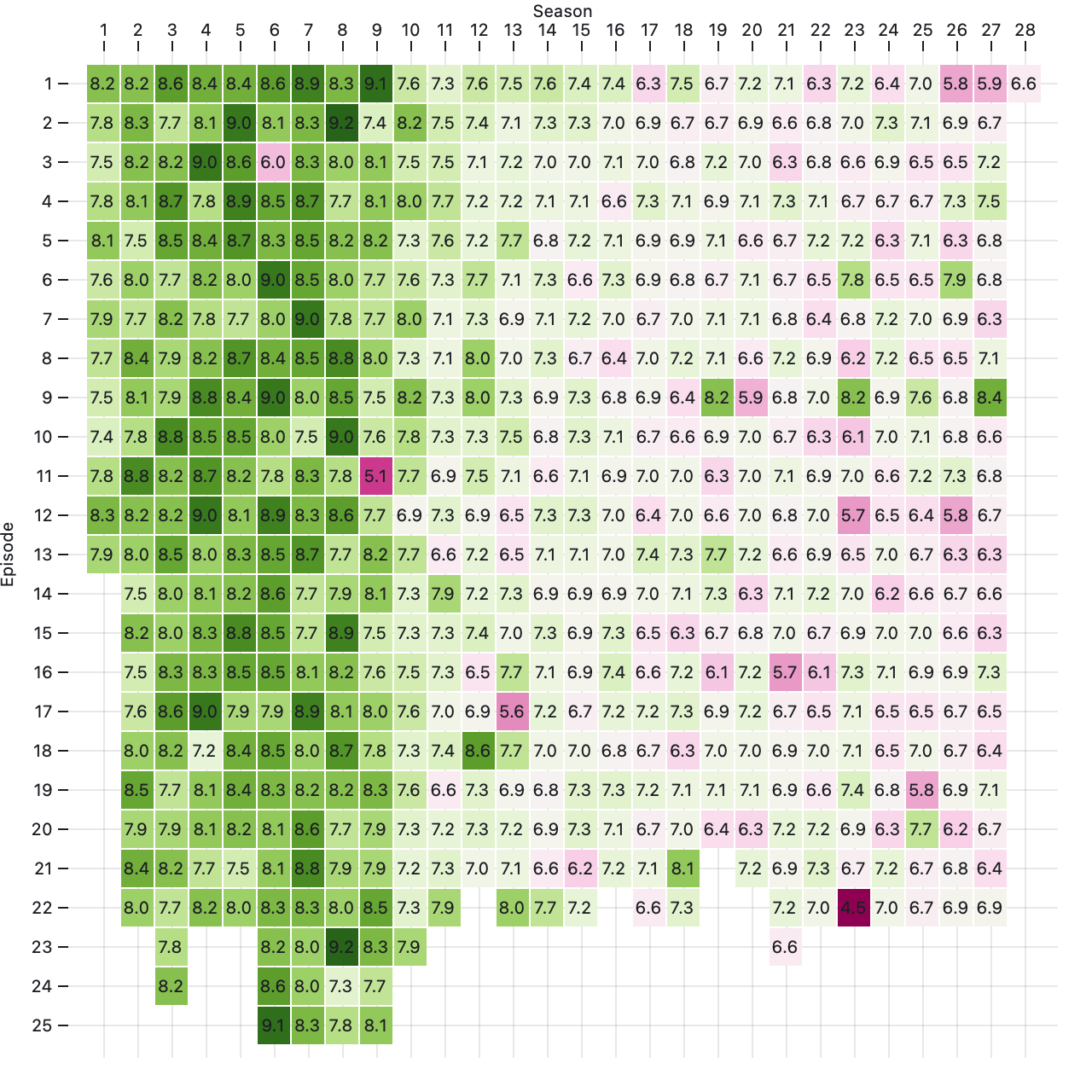
Plot.cell(simpsons, {x: "number_in_season", y: "season", fill: "imdb_rating"})Returns a new cell with the given data and options. If neither the x nor y options are specified, data is assumed to be an array of pairs [[x₀, y₀], [x₁, y₁], [x₂, y₂], …] such that x = [x₀, x₁, x₂, …] and y = [y₀, y₁, y₂, …].
Plot.cellX(simpsons.map(d => d.imdb_rating))Equivalent to Plot.cell, except that if the x option is not specified, it defaults to [0, 1, 2, …], and if the fill option is not specified and stroke is not a channel, the fill defaults to the identity function and assumes that data = [x₀, x₁, x₂, …].
Plot.cellY(simpsons.map(d => d.imdb_rating))Equivalent to Plot.cell, except that if the y option is not specified, it defaults to [0, 1, 2, …], and if the fill option is not specified and stroke is not a channel, the fill defaults to the identity function and assumes that data = [y₀, y₁, y₂, …].
Source · Examples · Draws circles (and in the future, possibly other symbols) as in a scatterplot.
In addition to the standard mark options, the following optional channels are supported:
- x - the horizontal position; bound to the x scale
- y - the vertical position; bound to the y scale
- r - the radius (area); bound to the radius scale, which defaults to sqrt
If the x channel is not specified, dots will be horizontally centered in the plot (or facet). Likewise if the y channel is not specified, dots will vertically centered in the plot (or facet). Typically either x, y, or both are specified.
The r option defaults to three pixels and can be specified as either a channel or constant. When the radius is specified as a number, it is interpreted as a constant; otherwise it is interpreted as a channel. Dots with a nonpositive radius are not drawn. The stroke defaults to none. The fill defaults to currentColor if the stroke is none, and to none otherwise. The strokeWidth defaults to 1.5.
Dots are drawn in input order, with the last data drawn on top. If sorting is needed, say to mitigate overplotting by drawing the smallest dots on top, consider a sort and reverse transform.
Plot.dot(sales, {x: "units", y: "fruit"})Returns a new dot with the given data and options. If neither the x nor y options are specified, data is assumed to be an array of pairs [[x₀, y₀], [x₁, y₁], [x₂, y₂], …] such that x = [x₀, x₁, x₂, …] and y = [y₀, y₁, y₂, …].
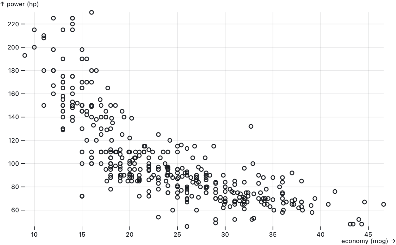
Plot.dotX(cars.map(d => d["economy (mpg)"]))Equivalent to Plot.dot except that if the x option is not specified, it defaults to the identity function and assumes that data = [x₀, x₁, x₂, …].
Plot.dotY(cars.map(d => d["economy (mpg)"]))Equivalent to Plot.dot except that if the y option is not specified, it defaults to the identity function and assumes that data = [y₀, y₁, y₂, …].
Source · Examples · Draws two-dimensional lines as in a line chart.
The following channels are required:
- x - the horizontal position; bound to the x scale
- y - the vertical position; bound to the y scale
In addition to the standard mark options, the following optional channels are supported:
- z - a categorical value to group data into series
By default, the data is assumed to represent a single series (a single value that varies over time, e.g.). If the z channel is specified, data is grouped by z to form separate series. Typically z is a categorical value such as a series name. If z is not specified, it defaults to stroke if a channel, or fill if a channel.
The stroke defaults to currentColor. The fill defaults to none. If both the stroke and fill are defined as channels, or if the z channel is also specified, it is possible for the stroke or fill to vary within a series; varying color within a series is not supported, however, so only the first channel value for each series is considered. This limitation also applies to the fillOpacity, strokeOpacity, and title channels. The strokeWidth defaults to 1.5 and the strokeMiterlimit defaults to 1.
Points along the line are connected in input order. Likewise, if there are multiple series via the z, fill, or stroke channel, the series are drawn in input order such that the last series is drawn on top. Typically, the data is already in sorted order, such as chronological for time series; if sorting is needed, consider a sort transform.
The line mark supports curve options to control interpolation between points. If any of the x or y values are invalid (undefined, null, or NaN), the line will be interrupted, resulting in a break that divides the line shape into multiple segments. (See d3-shape’s line.defined for more.) If a line segment consists of only a single point, it may appear invisible unless rendered with rounded or square line caps. In addition, some curves such as cardinal-open only render a visible segment if it contains multiple points.
Plot.line(aapl, {x: "Date", y: "Close"})Returns a new line with the given data and options. If neither the x nor y options are specified, data is assumed to be an array of pairs [[x₀, y₀], [x₁, y₁], [x₂, y₂], …] such that x = [x₀, x₁, x₂, …] and y = [y₀, y₁, y₂, …].
Plot.lineX(aapl.map(d => d.Close))Equivalent to Plot.line except that if the x option is not specified, it defaults to the identity function and assumes that data = [x₀, x₁, x₂, …]. If the y option is not specified, it defaults to [0, 1, 2, …].
Plot.lineY(aapl.map(d => d.Close))Equivalent to Plot.line except that if the y option is not specified, it defaults to the identity function and assumes that data = [y₀, y₁, y₂, …]. If the x option is not specified, it defaults to [0, 1, 2, …].
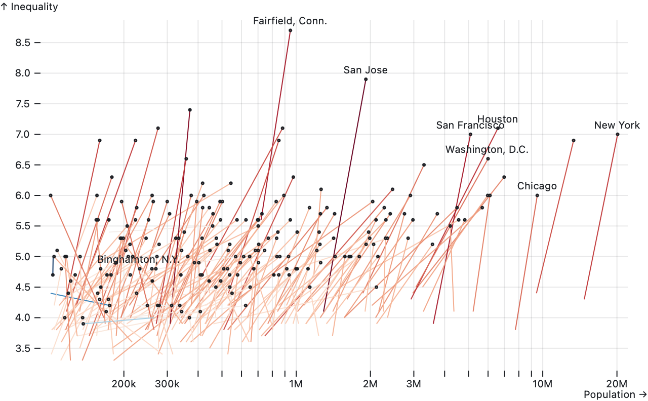
Source · Examples · Draws line segments (or curves) connecting pairs of points.
The following channels are required:
- x1 - the starting horizontal position; bound to the x scale
- y1 - the starting vertical position; bound to the y scale
- x2 - the ending horizontal position; bound to the x scale
- y2 - the ending vertical position; bound to the y scale
The link mark supports the standard mark options. The stroke defaults to currentColor. The fill defaults to none. The strokeWidth and strokeMiterlimit default to one.
The link mark supports curve options to control interpolation between points. Since a link always has two points by definition, only the following curves (or a custom curve) are recommended: linear, step, step-after, step-before, bump-x, or bump-y. Note that the linear curve is incapable of showing a fill since a straight line has zero area.
Plot.link(inequality, {x1: "POP_1980", y1: "R90_10_1980", x2: "POP_2015", y2: "R90_10_2015"})Returns a new link with the given data and options.
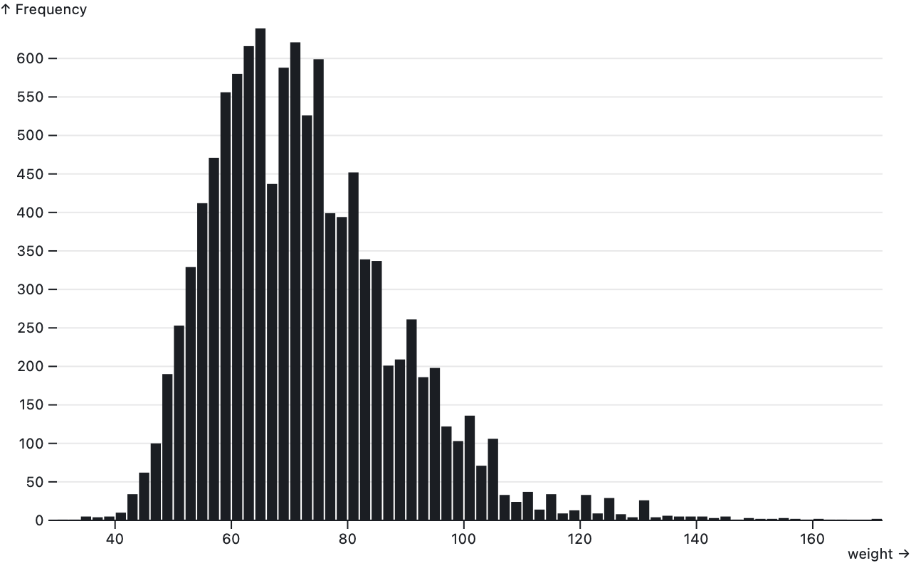
Source · Examples · Draws rectangles where both x and y are quantitative as in a histogram. Both pairs of quantitative values represent lower and upper bounds, and often one of the lower bounds is implicitly zero. If one of the dimensions is ordinal, use a bar instead; if both dimensions are ordinal, use a cell instead. Rects are often used in conjunction with a bin transform.
The following channels are required:
- x1 - the starting horizontal position; bound to the x scale
- y1 - the starting vertical position; bound to the y scale
- x2 - the ending horizontal position; bound to the x scale
- y2 - the ending vertical position; bound to the y scale
The rect mark supports the standard mark options, including insets and rounded corners. The stroke defaults to none. The fill defaults to currentColor if the stroke is none, and to none otherwise.
Plot.rect(athletes, Plot.bin({fill: "count"}, {x: "weight", y: "height"}))Returns a new rect with the given data and options.
Plot.rectX(athletes, Plot.binY({x: "count"}, {y: "weight"}))Equivalent to Plot.rect, except that if neither the x1 nor x2 option is specified, the x option may be specified as shorthand to apply an implicit stackX transform; this is the typical configuration for a histogram with rects aligned at x = 0. If the x option is not specified, it defaults to the identity function.
Plot.rectY(athletes, Plot.binX({y: "count"}, {x: "weight"}))Equivalent to Plot.rect, except that if neither the y1 nor y2 option is specified, the y option may be specified as shorthand to apply an implicit stackY transform; this is the typical configuration for a histogram with rects aligned at y = 0. If the y option is not specified, it defaults to the identity function.
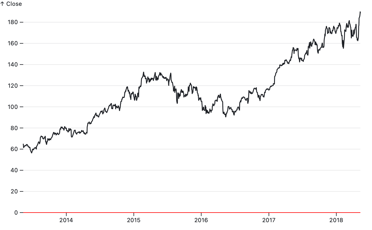
Source · Examples · Draws an orthogonal line at the given horizontal (Plot.ruleX) or vertical (Plot.ruleY) position, either across the entire plot (or facet) or bounded in the opposite dimension. Rules are often used with hard-coded data to annotate special values such as y = 0, though they can also be used to visualize data as in a lollipop chart.
For the required channels, see Plot.ruleX and Plot.ruleY. The rule mark supports the standard mark options, including insets along its secondary dimension. The stroke defaults to currentColor.
Plot.ruleX([0]) // as annotationPlot.ruleX(alphabet, {x: "letter", y: "frequency"}) // like barYReturns a new rule↕︎ with the given data and options. In addition to the standard mark options, the following channels are optional:
- x - the horizontal position; bound to the x scale
- y1 - the starting vertical position; bound to the y scale
- y2 - the ending vertical position; bound to the y scale
If the x option is not specified, it defaults to the identity function and assumes that data = [x₀, x₁, x₂, …]. If a y option is specified, it is shorthand for the y2 option with y1 equal to zero; this is the typical configuration for a vertical lollipop chart with rules aligned at y = 0. If the y1 channel is not specified, the rule will start at the top of the plot (or facet). If the y2 channel is not specified, the rule will end at the bottom of the plot (or facet).
Plot.ruleY([0]) // as annotationPlot.ruleY(alphabet, {y: "letter", x: "frequency"}) // like barXReturns a new rule↔︎ with the given data and options. In addition to the standard mark options, the following channels are optional:
- y - the vertical position; bound to the y scale
- x1 - the starting horizontal position; bound to the x scale
- x2 - the ending horizontal position; bound to the x scale
If the y option is not specified, it defaults to the identity function and assumes that data = [y₀, y₁, y₂, …]. If the x option is specified, it is shorthand for the x2 option with x1 equal to zero; this is the typical configuration for a horizontal lollipop chart with rules aligned at x = 0. If the x1 channel is not specified, the rule will start at the left edge of the plot (or facet). If the x2 channel is not specified, the rule will end at the right edge of the plot (or facet).

Source · Examples · Draws a text label at the specified position.
The following channels are required:
- text - the text contents (a string)
If text is not specified, it defaults to [0, 1, 2, …] so that something is visible by default. Due to the design of SVG, each label is currently limited to one line; in the future we may support multiline text. #327 For embedding numbers and dates into text, consider number.toLocaleString, date.toLocaleString, d3-format, or d3-time-format.
In addition to the standard mark options, the following optional channels are supported:
- x - the horizontal position; bound to the x scale
- y - the vertical position; bound to the y scale
- fontSize - the font size in pixels
- rotate - the rotation in degrees clockwise
The following text-specific constant options are also supported:
- fontFamily - the font name; defaults to system-ui
- fontSize - the font size in pixels; defaults to 10
- fontStyle - the font style; defaults to normal
- fontVariant - the font variant; defaults to normal
- fontWeight - the font weight; defaults to normal
- dx - the horizontal offset; defaults to 0
- dy - the vertical offset; defaults to 0
- rotate - the rotation in degrees clockwise; defaults to 0
The dx and dy options can be specified either as numbers representing pixels or as a string including units. For example, "1em" shifts the text by one em, which is proportional to the fontSize. The fontSize and rotate options can be specified as either channels or constants. When fontSize or rotate is specified as a number, it is interpreted as a constant; otherwise it is interpreted as a channel.
Returns a new text mark with the given data and options. If neither the x nor y options are specified, data is assumed to be an array of pairs [[x₀, y₀], [x₁, y₁], [x₂, y₂], …] such that x = [x₀, x₁, x₂, …] and y = [y₀, y₁, y₂, …].
Equivalent to Plot.text, except x defaults to the identity function and assumes that data = [x₀, x₁, x₂, …].
Equivalent to Plot.text, except y defaults to the identity function and assumes that data = [y₀, y₁, y₂, …].
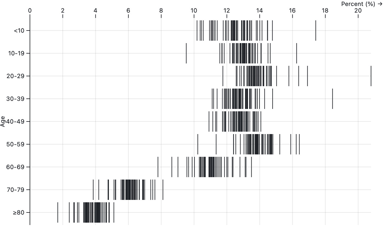
Source · Examples · Draws an orthogonal line at the given horizontal (Plot.tickX) or vertical (Plot.tickY) position, with an optional secondary position dimension along a band scale. (If the secondary dimension is quantitative instead of ordinal, use a rule.) Ticks are often used to visualize distributions as in a “barcode” plot.
For the required channels, see Plot.tickX and Plot.tickY. The tick mark supports the standard mark options, including insets. The stroke defaults to currentColor.
Plot.tickX(stateage, {x: "population", y: "age"})Returns a new tick↕︎ with the given data and options. The following channels are required:
- x - the horizontal position; bound to the x scale
The following optional channels are supported:
- y - the vertical position; bound to the y scale, which must be band
If the y channel is not specified, the tick will span the full vertical extent of the plot (or facet).
Plot.tickY(stateage, {y: "population", x: "age"})Returns a new tick↔︎ with the given data and options. The following channels are required:
- y - the vertical position; bound to the y scale
The following optional channels are supported:
- x - the horizontal position; bound to the x scale, which must be band
If the x channel is not specified, the tick will span the full vertical extent of the plot (or facet).
Decorations are static marks that do not represent data. Currently this includes only Plot.frame, although internally Plot’s axes are implemented as decorations and may in the future be exposed here for more flexible configuration.
Source · Examples · Draws a simple frame around the entire plot (or facet).
The frame mark supports the standard mark options, but does not accept any data or support channels. The default stroke is currentColor, and the default fill is none.
Plot.frame({stroke: "red"})Returns a new frame with the specified options.
Plot’s transforms provide a convenient mechanism for transforming data as part of a plot specification. All marks support the following basic transforms:
- filter - filters data according to the specified accessor or values
- sort - sorts data according to the specified comparator, accessor, or values
- reverse - reverses the sorted (or if not sorted, the input) data order
For example, to draw bars only for letters that commonly form vowels:
Plot.barY(alphabet, {filter: d => /[aeiou]/i.test(d.letter), x: "letter", y: "frequency"})The filter transform is similar to filtering the data with array.filter, except that it will preserve faceting and will not affect inferred scale domains; domains are inferred from the unfiltered channel values.
Plot.barY(alphabet.filter(d => /[aeiou]/i.test(d.letter)), {x: "letter", y: "frequency"})Together the sort and reverse transforms allow control over z-order, which can be important when addressing overplotting. If the sort option is a function but does not take exactly one argument, it is assumed to be a comparator function; otherwise, the sort option is interpreted as a channel value definition and thus may be either as a column name, accessor function, or array of values.
For greater control, you can also implement a custom transform function:
- transform - a function that returns transformed data and index
The basic transforms are composable: the filter transform is applied first, then sort, reverse, and lastly the custom transform, if any. A custom transform is rarely specified directly; instead it is typically specified via one of an option transform.
Plot’s option transforms, listed below, do more than populate the transform function: they derive new mark options and channels. These transforms take a mark’s options object (and possibly transform-specific options as the first argument) and return a new, transformed, options. Option transforms are composable: you can pass an options objects through more than one transform before passing it to a mark. You can also reuse the same transformed options on multiple marks.
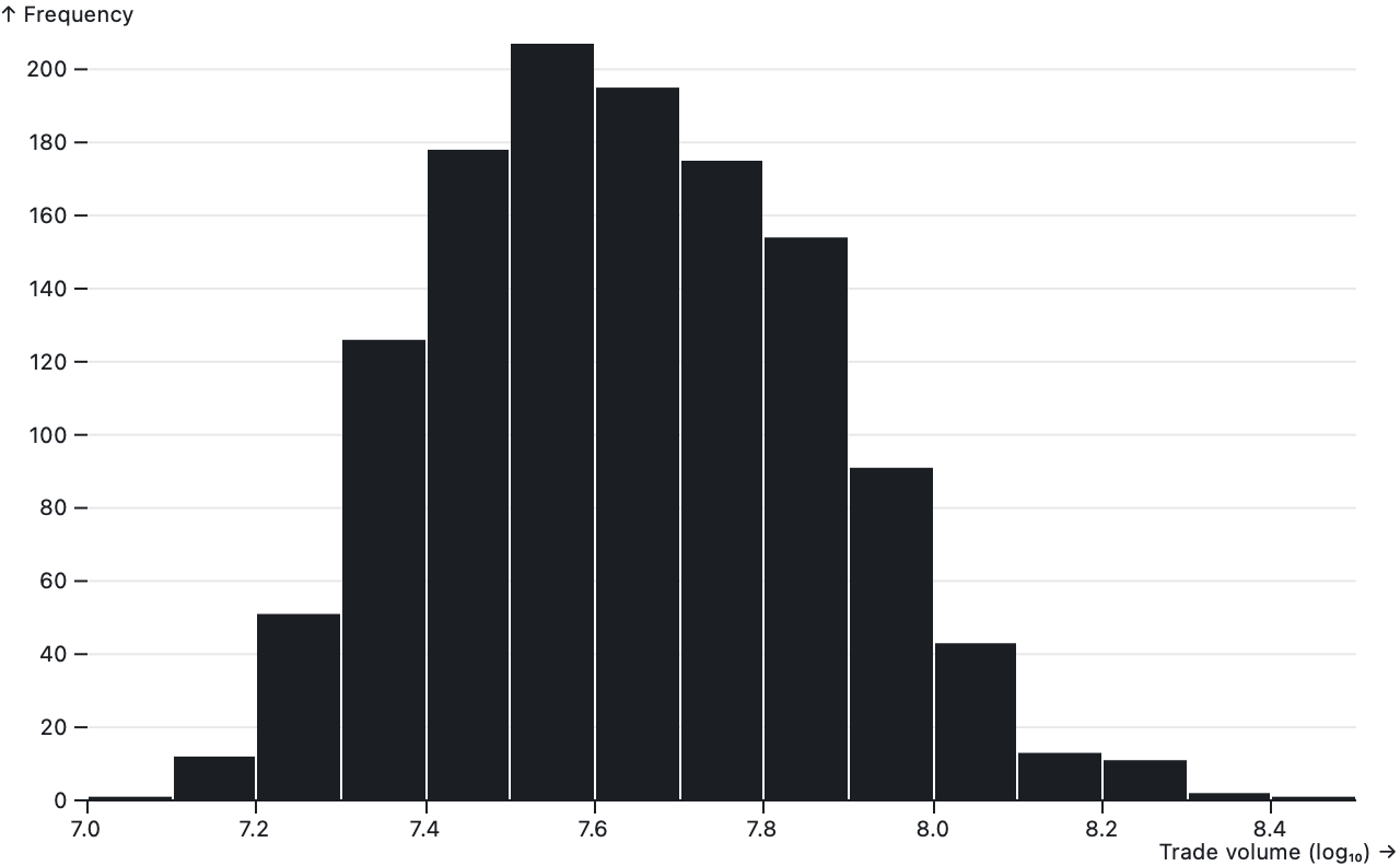
Source · Examples · Aggregates continuous data — quantitative or temporal values such as temperatures or times — into discrete bins and then computes summary statistics for each bin such as a count or sum. The bin transform is like a continuous group transform and is often used to make histograms. There are separate transforms depending on which dimensions need binning: Plot.binX for x; Plot.binY for y; and Plot.bin for both x and y.
Given input data = [d₀, d₁, d₂, …], by default the resulting binned data is an array of arrays where each inner array is a subset of the input data [[d₀₀, d₀₁, …], [d₁₀, d₁₁, …], [d₂₀, d₂₁, …], …]. Each inner array is in input order. The outer array is in ascending order according to the associated dimension (x then y). Empty bins are skipped. By specifying a different aggregation method for the data output, as described below, you can change how the binned data is computed.
While it is possible to compute channel values on the binned data by defining channel values as a function, more commonly channel values are computed directly by the bin transform, either implicitly or explicitly. In addition to data, the following channels are automatically aggregated:
- x1 - the starting horizontal position of the bin
- x2 - the ending horizontal position of the bin
- x - the horizontal center of the bin
- y1 - the starting vertical position of the bin
- y2 - the ending vertical position of the bin
- y - the vertical center of the bin
- z - the first value of the z channel, if any
- fill - the first value of the fill channel, if any
- stroke - the first value of the stroke channel, if any
The x1, x2, and x output channels are only computed by the Plot.binX and Plot.bin transform; similarly the y1, y2, and y output channels are only computed by the Plot.binY and Plot.bin transform. The x and y output channels are lazy: they are only computed if needed by a downstream mark or transform.
You can declare additional channels to aggregate by specifying the channel name and desired aggregation method in the outputs object which is the first argument to the transform. For example, to use Plot.binX to generate a y channel of bin counts as in a frequency histogram:
Plot.binX({y: "count"}, {x: "culmen_length_mm"})The following aggregation methods are supported:
- first - the first value, in input order
- last - the last value, in input order
- count - the number of elements (frequency)
- sum - the sum of values
- proportion - the sum proportional to the overall total (weighted frequency)
- proportion-facet - the sum proportional to the facet total
- min - the minimum value
- max - the maximum value
- mean - the mean value (average)
- median - the median value
- deviation - the standard deviation
- variance - the variance per Welford’s algorithm
- a function to be passed the array of values for each bin
- an object with a reduce method
The reduce method is repeatedly passed the index for each bin (an array of integers) and the corresponding input channel’s array of values; it must then return the corresponding aggregate value for the bin.
Most aggregation methods require binding the output channel to an input channel; for example, if you want the y output channel to be a sum (not merely a count), there should be a corresponding y input channel specifying which values to sum. If there is not, sum will be equivalent to count.
Plot.binX({y: "sum"}, {x: "culmen_length_mm", y: "body_mass_g"})You can control whether a channel is computed before or after binning. If a channel is declared only in options (and it is not a special group-eligible channel such as x, y, z, fill, or stroke), it will be computed after binning and be passed the binned data: each datum is the array of input data corresponding to the current bin.
Plot.binX({y: "count"}, {x: "economy (mpg)", title: bin => bin.map(d => d.name).join("\n")})This is equivalent to declaring the channel only in outputs.
Plot.binX({y: "count", title: bin => bin.map(d => d.name).join("\n")}, {x: "economy (mpg)"})However, if a channel is declared in both outputs and options, then the channel in options is computed before binning and can then be aggregated using any built-in reducer (or a custom reducer function) during the bin transform.
Plot.binX({y: "count", title: names => names.join("\n")}, {x: "economy (mpg)", title: "name"})To control how the quantitative dimensions x and y are divided into bins, the following options are supported:
- thresholds - the threshold values; see below
- domain - values outside the domain will be omitted
- cumulative - if positive, each bin will contain all lesser bins
If the domain option is not specified, it defaults to the minimum and maximum of the corresponding dimension (x or y), possibly niced to match the threshold interval to ensure that the first and last bin have the same width as other bins. If cumulative is negative (-1 by convention), each bin will contain all greater bins rather than all lesser bins, representing the complementary cumulative distribution.
To pass separate binning options for x and y, the x and y input channels can be specified as an object with the options above and a value option to specify the input channel values.
Plot.binX({y: "count"}, {x: {thresholds: 20, value: "culmen_length_mm"}})The thresholds option may be specified as a named method or a variety of other ways:
- freedman-diaconis - the Freedman–Diaconis rule
- scott - Scott’s normal reference rule
- sturges - Sturges’ formula
- a count (hint) representing the desired number of bins
- an array of n threshold values for n + 1 bins
- a time interval (for temporal binning)
- a function that returns an array, count, or time interval
If the thresholds option is not specified, it defaults to scott. If a function, it is passed three arguments: the array of input values, the domain minimum, and the domain maximum. If a number, d3.ticks or d3.utcTicks is used to choose suitable nice thresholds.
The bin transform supports grouping in addition to binning: you can subdivide bins by up to two additional ordinal or categorical dimensions (not including faceting). If any of z, fill, or stroke is a channel, the first of these channels will be used to subdivide bins. Similarly, Plot.binX will group on y if y is not an output channel, and Plot.binY will group on x if x is not an output channel. For example, for a stacked histogram:
Plot.binX({y: "count"}, {x: "body_mass_g", fill: "species"})Lastly, the bin transform changes the default mark insets: rather than defaulting to zero, a pixel is reserved to separate adjacent bins. Plot.binX changes the defaults for insetLeft and insetRight; Plot.binY changes the defaults for insetTop and insetBottom; Plot.bin changes all four.
Plot.rect(athletes, Plot.bin({fillOpacity: "count"}, {x: "weight", y: "height"}))Bins on x and y. Also groups on the first channel of z, fill, or stroke, if any.
Plot.rectY(athletes, Plot.binX({y: "count"}, {x: "weight"}))Bins on x. Also groups on y and the first channel of z, fill, or stroke, if any.
Plot.rectX(athletes, Plot.binY({x: "count"}, {y: "weight"}))Bins on y. Groups on on x and first channel of z, fill, or stroke, if any.
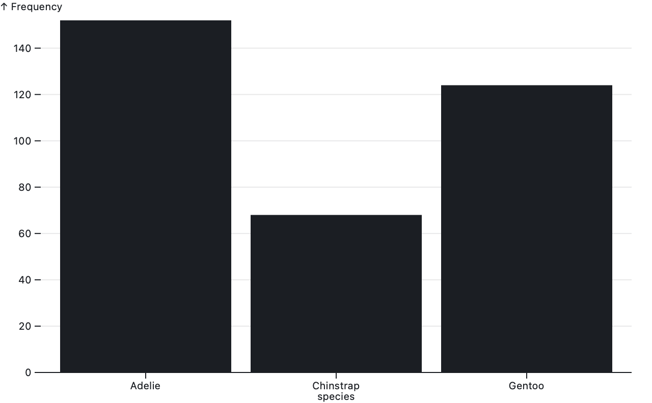
Source · Examples · Aggregates ordinal or categorical data — such as names — into groups and then computes summary statistics for each group such as a count or sum. The group transform is like a discrete bin transform. There are separate transforms depending on which dimensions need grouping: Plot.groupZ for z; Plot.groupX for x and z; Plot.groupY for y and z; and Plot.group for x, y, and z.
Given input data = [d₀, d₁, d₂, …], by default the resulting grouped data is an array of arrays where each inner array is a subset of the input data [[d₀₀, d₀₁, …], [d₁₀, d₁₁, …], [d₂₀, d₂₁, …], …]. Each inner array is in input order. The outer array is in natural ascending order according to the associated dimension (x then y). Empty groups are skipped. By specifying a different aggregation method for the data output, as described below, you can change how the grouped data is computed.
While it is possible to compute channel values on the grouped data by defining channel values as a function, more commonly channel values are computed directly by the group transform, either implicitly or explicitly. In addition to data, the following channels are automatically aggregated:
- x - the horizontal position of the group
- y - the vertical position of the group
- z - the first value of the z channel, if any
- fill - the first value of the fill channel, if any
- stroke - the first value of the stroke channel, if any
The x output channel is only computed by the Plot.groupX and Plot.group transform; similarly the y output channel is only computed by the Plot.groupY and Plot.group transform.
You can declare additional channels to aggregate by specifying the channel name and desired aggregation method in the outputs object which is the first argument to the transform. For example, to use Plot.groupX to generate a y channel of group counts as in a frequency histogram:
Plot.groupX({y: "count"}, {x: "species"})The following aggregation methods are supported:
- first - the first value, in input order
- last - the last value, in input order
- count - the number of elements (frequency)
- sum - the sum of values
- proportion - the sum proportional to the overall total (weighted frequency)
- proportion-facet - the sum proportional to the facet total
- min - the minimum value
- max - the maximum value
- mean - the mean value (average)
- median - the median value
- deviation - the standard deviation
- variance - the variance per Welford’s algorithm
- a function - passed the array of values for each group
- an object with a reduce method - passed the index for each group, and all values
Most aggregation methods require binding the output channel to an input channel; for example, if you want the y output channel to be a sum (not merely a count), there should be a corresponding y input channel specifying which values to sum. If there is not, sum will be equivalent to count.
Plot.groupX({y: "sum"}, {x: "species", y: "body_mass_g"})You can control whether a channel is computed before or after grouping. If a channel is declared only in options (and it is not a special group-eligible channel such as x, y, z, fill, or stroke), it will be computed after grouping and be passed the grouped data: each datum is the array of input data corresponding to the current group.
Plot.groupX({y: "count"}, {x: "species", title: group => group.map(d => d.body_mass_g).join("\n")})This is equivalent to declaring the channel only in outputs.
Plot.groupX({y: "count", title: group => group.map(d => d.body_mass_g).join("\n")}, {x: "species"})However, if a channel is declared in both outputs and options, then the channel in options is computed before grouping and can then be aggregated using any built-in reducer (or a custom reducer function) during the group transform.
Plot.groupX({y: "count", title: masses => masses.join("\n")}, {x: "species", title: "body_mass_g"})If any of z, fill, or stroke is a channel, the first of these channels is considered the z dimension and will be used to subdivide groups.
Plot.group({fill: "count"}, {x: "island", y: "species"})Groups on x, y, and the first channel of z, fill, or stroke, if any.
Plot.groupX({y: "sum"}, {x: "species", y: "body_mass_g"})Groups on x and the first channel of z, fill, or stroke, if any.
Plot.groupY({x: "sum"}, {y: "species", x: "body_mass_g"})Groups on y and the first channel of z, fill, or stroke, if any.
Plot.groupZ({x: "proportion"}, {fill: "species"})Groups on the first channel of z, fill, or stroke, if any. If none of z, fill, or stroke are channels, then all data (within each facet) is placed into a single group.
Source · Examples · Groups data into series and then applies a mapping function to each series’ values, say to normalize them relative to some basis or to apply a moving average.
The map transform derives new output channels from corresponding input channels. The output channels have strictly the same length as the input channels; the map transform does not affect the mark’s data or index. The map transform is akin to running array.map on the input channel’s values with the given function. However, the map transform is series-aware: the data are first grouped into series using the z, fill, or stroke channel in the same fashion as the area and line marks so that series are processed independently.
Like the group and bin transforms, the Plot.map transform takes two arguments: an outputs object that describes the output channels to compute, and an options object that describes the input channels and any additional options. The other map transforms, such as Plot.normalizeX and Plot.windowX, call Plot.map internally.
The following map methods are supported:
- cumsum - a cumulative sum
- a function to be passed an array of values, returning new values
- an object that implements the map method
If a function is used, it must return an array of the same length as the given input. If a map method is used, it is repeatedly passed the index for each series (an array of integers), the corresponding input channel’s array of values, and the output channel’s array of values; it must populate the slots specified by the index in the output array.
The Plot.normalizeX and Plot.normalizeY transforms normalize series values relative to the given basis. For example, if the series values are [y₀, y₁, y₂, …] and the first basis is used, the mapped series values would be [y₀ / y₀, y₁ / y₀, y₂ / y₀, …] as in an index chart. The basis option specifies how to normalize the series values. The following basis methods are supported:
- first - the first value, as in an index chart; the default
- last - the last value
- mean - the mean value (average)
- median - the median value
- sum - the sum of values
- extent - the minimum is mapped to zero, and the maximum to one
- a function to be passed an array of values, returning the desired basis
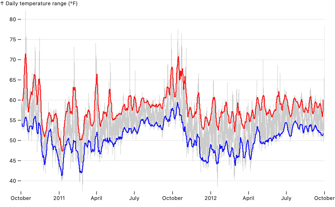
The Plot.windowX and Plot.windowY transforms compute a moving window around each data point and then derive a summary statistic from values in the current window, say to compute rolling averages, rolling minimums, or rolling maximums. These transforms also take additional options:
- k - the window size (the number of elements in the window)
- shift - how to align the window: centered, leading, or trailing
- reduce - the aggregation method (window reducer)
The following window reducers are supported:
- min - the minimum
- max - the maximum
- mean - the mean (average)
- median - the median
- sum - the sum of values
- deviation - the standard deviation
- variance - the variance per Welford’s algorithm
- difference - the difference between the last and first window value
- ratio - the ratio of the last and first window value
Plot.map({y: "cumsum"}, {y: d3.randomNormal()})Groups on the first channel of z, fill, or stroke, if any, and then for each channel declared in the specified outputs object, applies the corresponding map method. Each channel in outputs must have a corresponding input channel in options.
Plot.mapX("cumsum", {x: d3.randomNormal()})Equivalent to Plot.map({x: map, x1: map, x2: map}, options), but ignores any of x, x1, and x2 not present in options.
Plot.mapY("cumsum", {y: d3.randomNormal()})Equivalent to Plot.map({y: map, y1: map, y2: map}, options), but ignores any of y, y1, and y2 not present in options.
Plot.normalizeX({y: "Date", x: "Close", stroke: "Symbol"})Like Plot.mapX, but applies the normalize map method with the given options.
Plot.normalizeY({x: "Date", y: "Close", stroke: "Symbol"})Like Plot.mapY, but applies the normalize map method with the given options.
Plot.windowX({y: "Date", x: "Anomaly", k: 24})Like Plot.mapX, but applies the window map method with the given options.
Plot.windowY({x: "Date", y: "Anomaly", k: 24})Like Plot.mapY, but applies the window map method with the given options.
Source · Examples · Selects a value from each series, say to label a line or annotate extremes.
The select transform derives a filtered mark index; it does not affect the mark’s data or channels. It is similar to the basic filter transform except that provides convenient shorthand for pulling a single value out of each series. The data are grouped into series using the z, fill, or stroke channel in the same fashion as the area and line marks.
Selects the first point of each series according to input order.
Selects the last point of each series according to input order.
Selects the leftmost point of each series.
Selects the lowest point of each series.
Selects the rightmost point of each series.
Selects the highest point of each series.
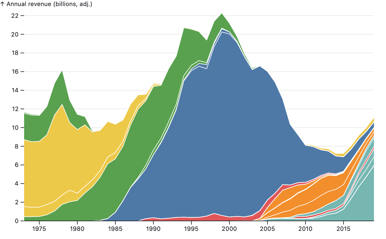
Source · Examples · Transforms a length channel into starting and ending position channels by “stacking” elements that share a given position, such as transforming the y input channel into y1 and y2 output channels after grouping on x as in a stacked area chart. The starting position of each element equals the ending position of the preceding element in the stack.
The Plot.stackY transform groups on x and transforms y into y1 and y2; the Plot.stackX transform groups on y and transforms x into x1 and x2. If y is not specified for Plot.stackY, or if x is not specified for Plot.stackX, it defaults to the constant one, which is useful for constructing simple isotype charts (e.g., stacked dots).
The supported stack options are:
- offset - the offset (or baseline) method
- order - the order in which stacks are layered
- reverse - true to reverse order
The following order methods are supported:
- null - input order (default)
- value - ascending value order (or descending with reverse)
- sum - order series by their total value
- appearance - order series by the position of their maximum value
- inside-out - order the earliest-appearing series on the inside
- an array of z values
The reverse option reverses the effective order. For the value order, Plot.stackY uses the y-value while Plot.stackX uses the x-value. For the appearance order, Plot.stackY uses the x-position of the maximum y-value while Plot.stackX uses the y-position of the maximum x-value. If an array of z values are specified, they should enumerate the z values for all series in the desired order; this array is typically hard-coded or computed with d3.groupSort. Note that the input order (null) and value order can produce crossing paths: unlike the other order methods, they do not guarantee a consistent series order across stacks.
The stack transform supports diverging stacks: negative values are stacked below zero while positive values are stacked above zero. For Plot.stackY, the y1 channel contains the value of lesser magnitude (closer to zero) while the y2 channel contains the value of greater magnitude (farther from zero); the difference between the two corresponds to the input y channel value. For Plot.stackX, the same is true, except for x1, x2, and x respectively.
After all values have been stacked from zero, an optional offset can be applied to translate or scale the stacks. The following offset methods are supported:
- null - a zero baseline (default)
- expand - rescale each stack to fill [0, 1]
- silhouette - align the centers of all stacks
- wiggle - translate stacks to minimize apparent movement
If a given stack has zero total value, the expand offset will not adjust the stack’s position. Both the silhouette and wiggle offsets ensure that the lowest element across stacks starts at zero for better default axes. The wiggle offset is recommended for streamgraphs, and if used, changes the default order to inside-out; see Byron & Wattenberg.
In addition to the y1 and y2 output channels, Plot.stackY computers a y output channel that represents the midpoint of y1 and y2. Plot.stackX does the same for x. This can be used to position a label or a dot in the center of a stacked layer. The x and y output channels are lazy: they are only computed if needed by a downstream mark or transform.
Plot.stackY({x: "year", y: "revenue", z: "format", fill: "group"})Creates new channels y1 and y2, obtained by stacking the original y channel for data points that share a common x (and possibly z) value. A new y channel is also returned, which lazily computes the middle value of y1 and y2. The input y channel defaults to a constant 1, resulting in a count of the data points.
Plot.stackY1({x: "year", y: "revenue", z: "format", fill: "group"})Equivalent to Plot.stackY, except that the y1 channel is returned as the y channel. This can be used, for example, to draw a line at the bottom of each stacked area.
Plot.stackY2({x: "year", y: "revenue", z: "format", fill: "group"})Equivalent to Plot.stackY, except that the y2 channel is returned as the y channel. This can be used, for example, to draw a line at the top of each stacked area.
Plot.stackX({y: "year", x: "revenue", z: "format", fill: "group"})See Plot.stackY, but with x as the input value channel, y as the stack index, x1, x2 and x as the output channels.
Plot.stackX1({y: "year", x: "revenue", z: "format", fill: "group"})Equivalent to Plot.stackX, except that the x1 channel is returned as the x channel. This can be used, for example, to draw a line at the left edge of each stacked area.
Plot.stackX2({y: "year", x: "revenue", z: "format", fill: "group"})Equivalent to Plot.stackX, except that the x2 channel is returned as the x channel. This can be used, for example, to draw a line at the right edge of each stacked area.
A curve defines how to turn a discrete representation of a line as a sequence of points [[x₀, y₀], [x₁, y₁], [x₂, y₂], …] into a continuous path; i.e., how to interpolate between points. Curves are used by the line, area, and link mark, and are implemented by d3-shape.
The supported curve options are:
- curve - the curve method, either a string or a function
- tension - the curve tension (for fine-tuning)
The following named curve methods are supported:
- basis - a cubic basis spline (repeating the end points)
- basis-open - an open cubic basis spline
- basis-closed - a closed cubic basis spline
- bump-x - a Bézier curve with horizontal tangents
- bump-y - a Bézier curve with vertical tangents
- cardinal - a cubic cardinal spline (with one-sided differences at the ends)
- cardinal-open - an open cubic cardinal spline
- cardinal-closed - an closed cubic cardinal spline
- catmull-rom - a cubic Catmull–Rom spline (with one-sided differences at the ends)
- catmull-rom-open - an open cubic Catmull–Rom spline
- catmull-rom-closed - a closed cubic Catmull–Rom spline
- linear - a piecewise linear curve (i.e., straight line segments)
- linear-closed - a closed piecewise linear curve (i.e., straight line segments)
- monotone-x - a cubic spline that preserves monotonicity in x
- monotone-y - a cubic spline that preserves monotonicity in y
- natural - a natural cubic spline
- step - a piecewise constant function where y changes at the midpoint of x
- step-after - a piecewise constant function where y changes after x
- step-before - a piecewise constant function where x changes after y
If curve is a function, it will be invoked with a given context in the same fashion as a D3 curve factory.
The tension option only has an effect on cardinal and Catmull–Rom splines (cardinal, cardinal-open, cardinal-closed, catmull-rom, catmull-rom-open, and catmull-rom-closed). For cardinal splines, it corresponds to tension; for Catmull–Rom splines, alpha.
These helper functions are provided for use as a scale.tickFormat axis option, as the text option for Plot.text, or for general use. See also d3-time-format and JavaScript’s built-in date formatting and number formatting.
Plot.formatIsoDate(new Date("2020-01-01T00:00.000Z")) // "2020-01-01"Given a date, returns the shortest equivalent ISO 8601 UTC string.
Plot.formatWeekday("es-MX", "long")(0) // "domingo"Returns a function that formats a given week day number (from 0 = Sunday to 6 = Saturday) according to the specified locale and format. The locale is a BCP 47 language tag and defaults to U.S. English. The format is a weekday format: either narrow, short, or long; if not specified, it defaults to short.
Plot.formatMonth("es-MX", "long")(0) // "enero"Returns a function that formats a given month number (from 0 = January to 11 = December) according to the specified locale and format. The locale is a BCP 47 language tag and defaults to U.S. English. The format is a month format: either 2-digit, numeric, narrow, short, long; if not specified, it defaults to short.