Slides for a short lecture I gave at DJCAD in 2015, for product & interaction design students who didn’t know much about graphic design and print, but needed to produce some booklets and flyers that looked relatively professional. It wasn’t intended to be a crash course in graphic design, but provides, in 40 minutes, a good foundation of basic and efficient techniques to make your printed design look less amateur.
DIY: The version below has the presenter notes; the PDF version does not. Feel free to reuse ideas from this talk; if you use a lot of them or the whole thing, please credit me, it is under a Creative Commons BY-SA license. My talk was followed by a quick InDesign workshop/refresher; if you’re going to run something similar then I’d highly recommend you also follow with hands-on exercises to apply these techniques. Email me if you'd like the source Keynote file.
I have to thank profusely b* and David Rault’s talk on typographic influences for inspirations and resources to make this talk! If you want to read further on the idea of typography for people who aren’t graphic designers, I suggest Butterick's Practical Typography.
NOTE: the first version of these slides were called “Practical Typography”. This could lead to confusion with Butterick's Practical Typography site and book; the projects are not related in any way. (But I still recommend his work as a great complementary learning resource to this.)
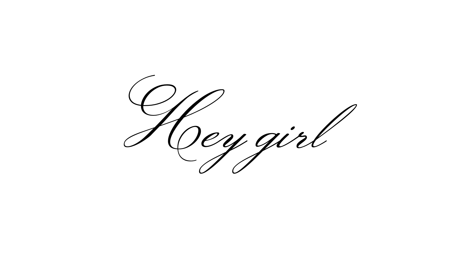
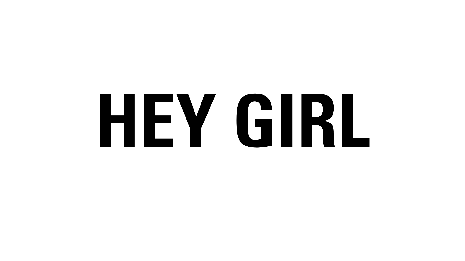
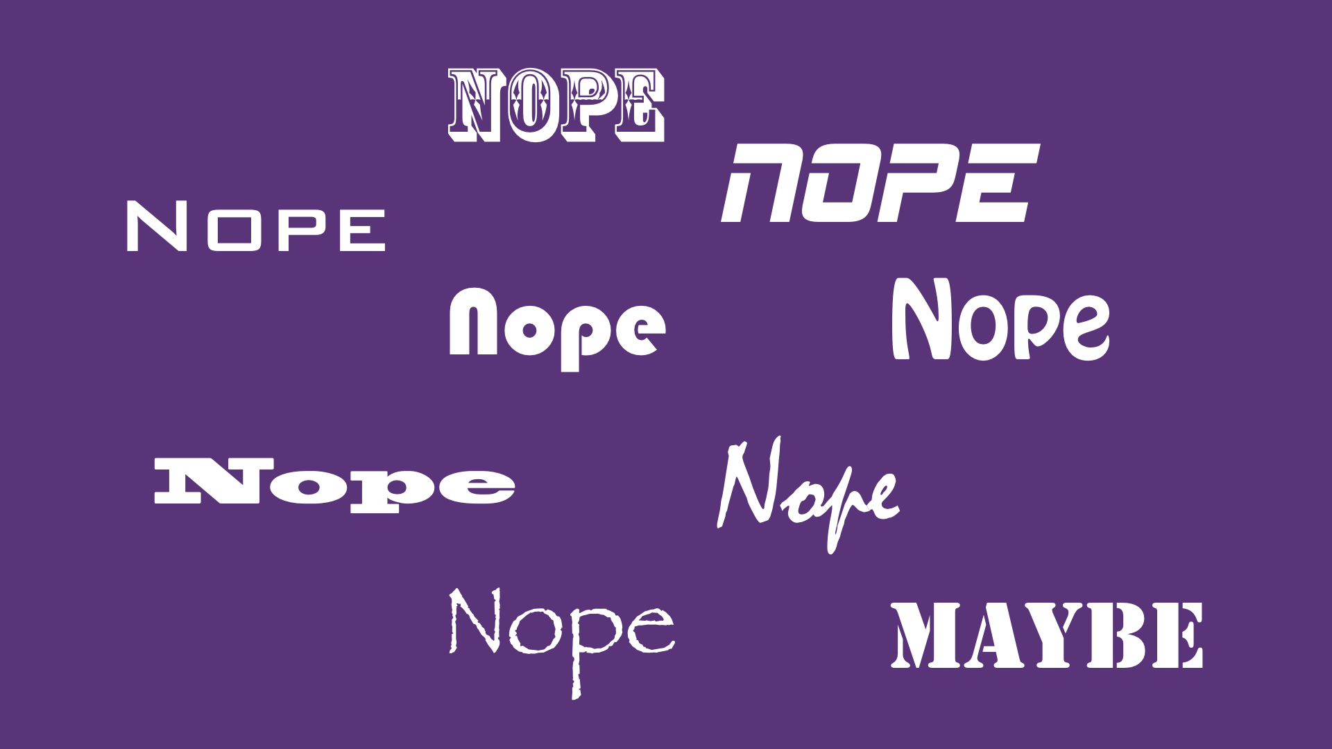
If I say… (spoken casually) hey Name!, (calling, tapping on your watch) hey! name!, (annoyed, looking angry) hey, Name… the way they are pronounced can change the meaning of the same sentence. Here, the 3 examples can mean “nice to meet you!”, “I’m impatient”, or imply that something’s wrong and you need to talk. Only the intonation gives you an idea of the situation, but the words are the same. Differences in intonation, that we’ve all internalised to mean different things verbally, can also exist in the written form. You probably don’t realise it, but people associate emotions and reactions to typefaces; they’re all part of the collective consciousness.
Very soft tone of voice, feels like it’s whispered, because it’s lowercase and sloped
This instantly feels more serious, like stopping someone in the middle of something, like an advertising. It doesn’t feel very natural.
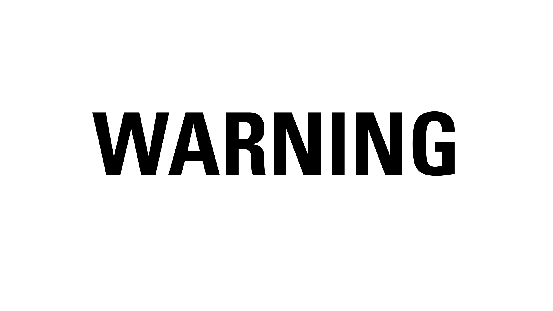
For this word it works much better, it is something important, instantaneous, very squared and straight. Your eyes stop at every letter especially the straight lines (N I N)
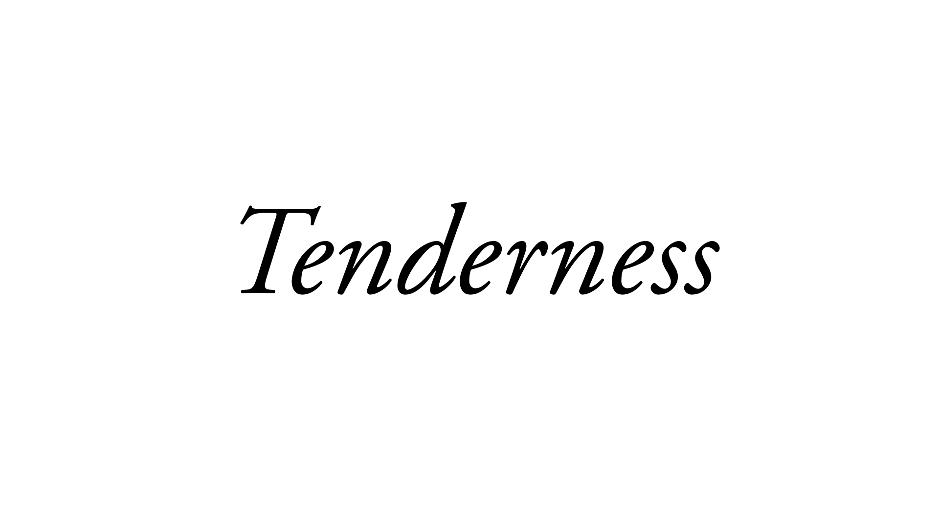
Here again we have the reverse. Something very slow, refined, that matches the word.
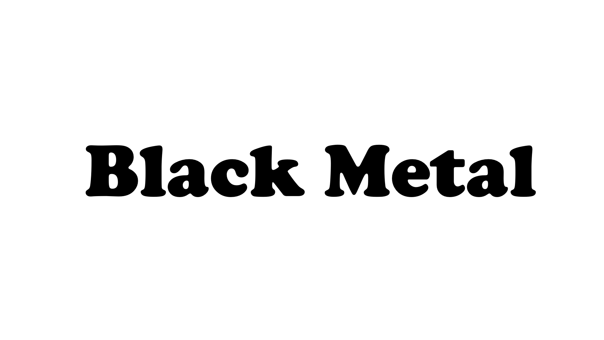
This is Cooper Black, draw in 1929, very beautiful and drawn by hand. It was used a lot in the 70s by certain fashion magazines and part of the hippie culture. In the early 90s Microsoft included it by default in Windows and Office and people started using it a lot for homemade flyers, garage sale posters and it progressively became assimiliated with cheap stuff, things that are low quality, and now is the logo of easyJet
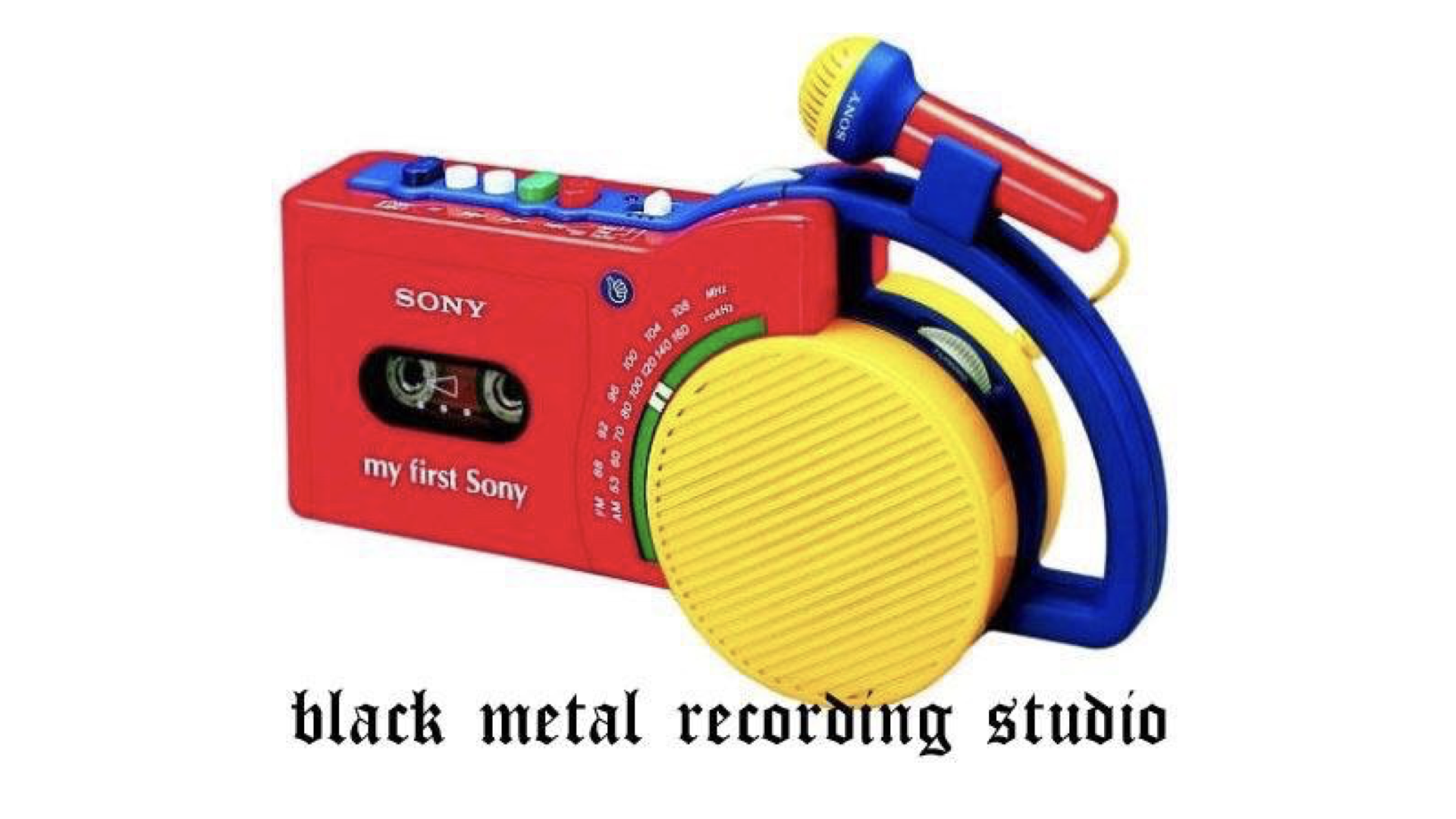
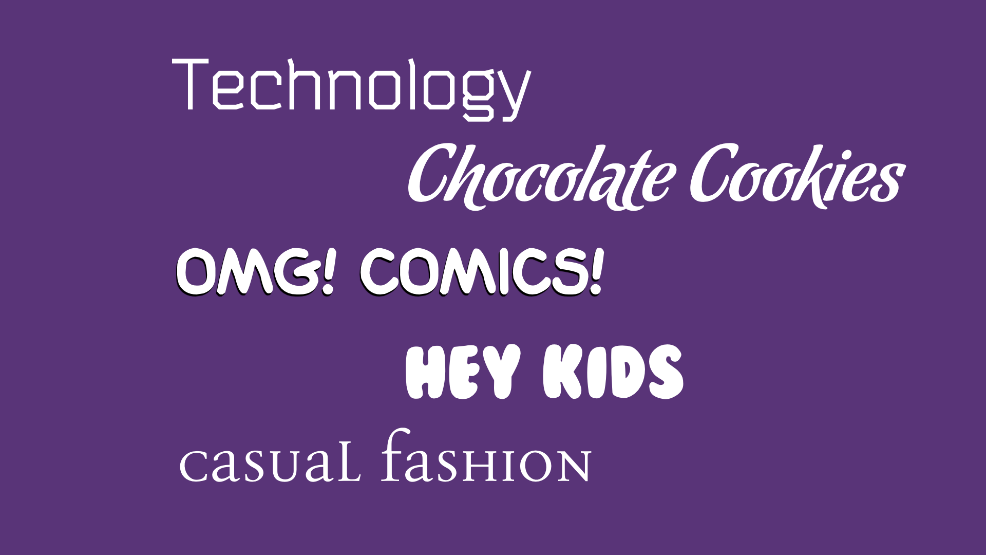
By using a typeface that’s not appropriate you can see that there’s something incoherent or ironic, here you know that black metal isn’t something that’s round, in Care Bear’s happy land, that’s bulky. It almost makes us smile to see that, only by changing the font.
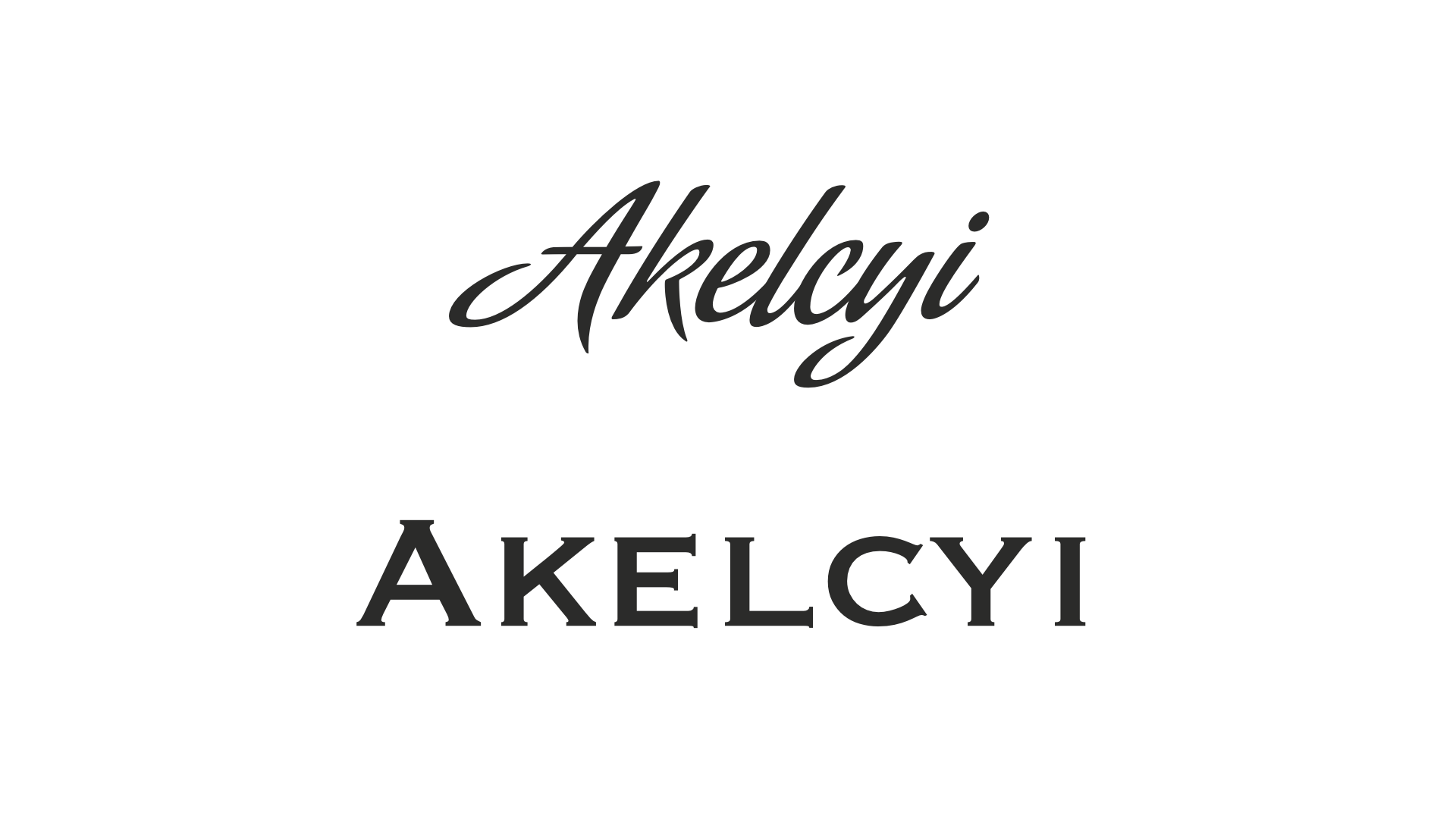
And even with made-up words, we can guess what it means. Bottom one looks like it would be on a plaque for a lawyer, a solicitor, the top one could be used for food
There’s all kinds of associations around us. Think of your local pizza or takeaway flyer; they aren’t well designed by all graphic design’s standards, yet that non-design, this visual language made from bad Photoshop skills has become so engrained in our visual culture, that if we see a flyer too well designed, it suddenly starts to look more upmarket; gourmet, expensive food, and not your “cheap and cheerful” local fish & chips joint.
Carefully gather and analyse patterns in your field (health, luxury, communication) to understand what’s expected from people; it’s hard to break rules without the end result looking awkward. COLLECT things you like, LOOK at how it’s done.
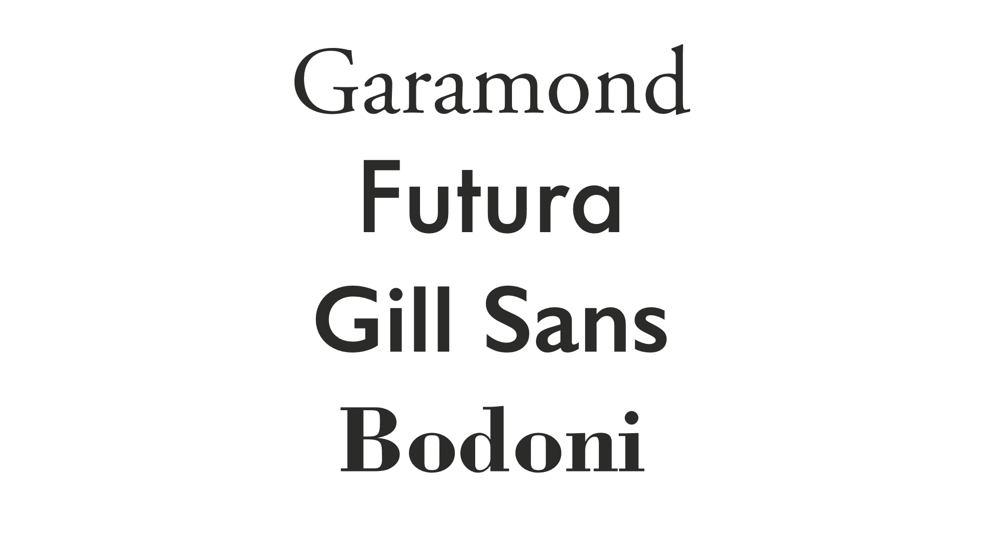
Fonts are generally classified into styles from different periods, they have different associations and different uses. Generally we separate between “with” and “without” serifs (the tiny ends), but even within, there are differences (e.g. Bodoni/Garamond)
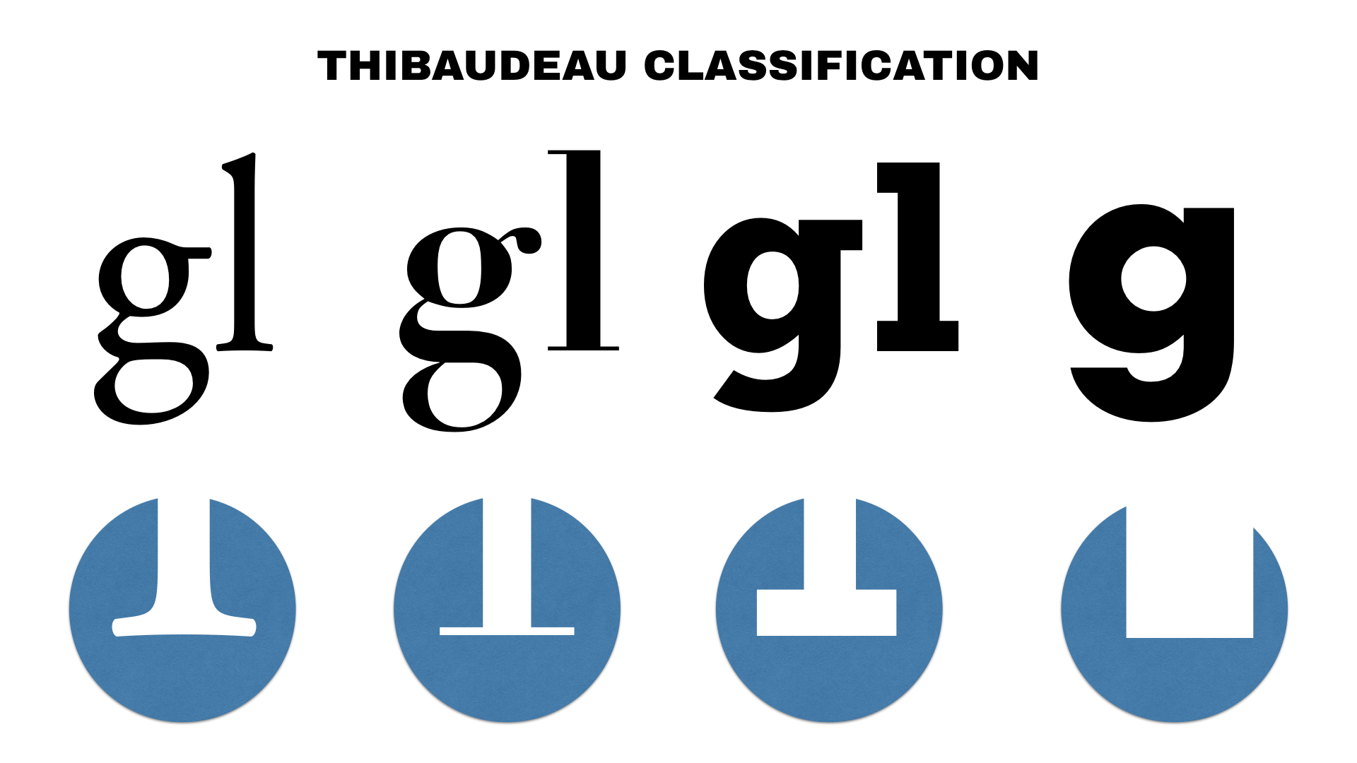
The Thibaudeau classification — made in the 1920s, less precise than Vox-Atypi, but I won’t bore you with details at this level. Look at the shape of serifs, but also how the thickness of the strokes changes around the letter; sometimes it’s even, sometimes, like on lineales and didones, there is more contrast. The second one, a Didone, is often associated with luxury objects (think Vogue magazine, fashion houses logos). Do your research to find the qualities of a font!
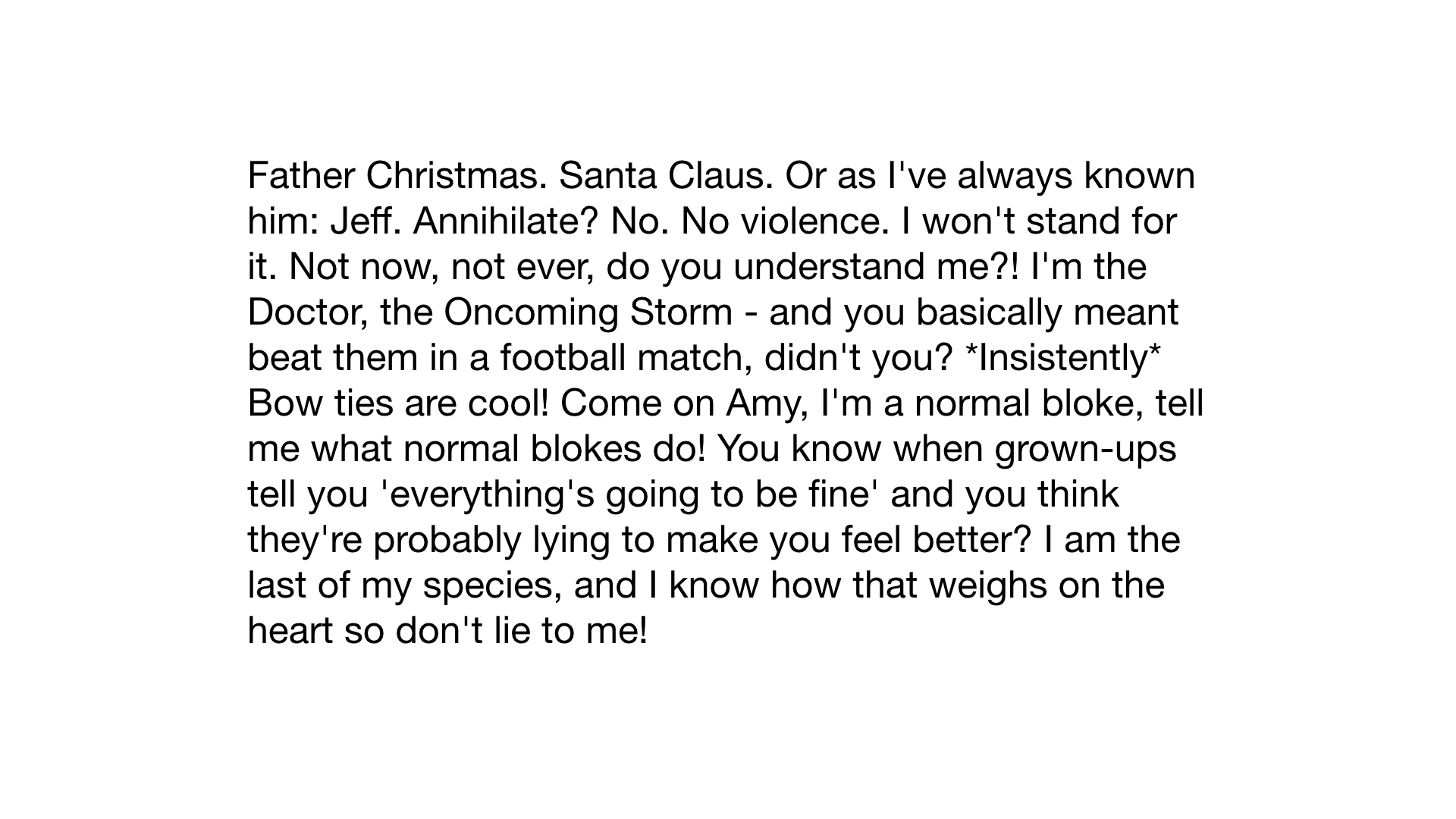
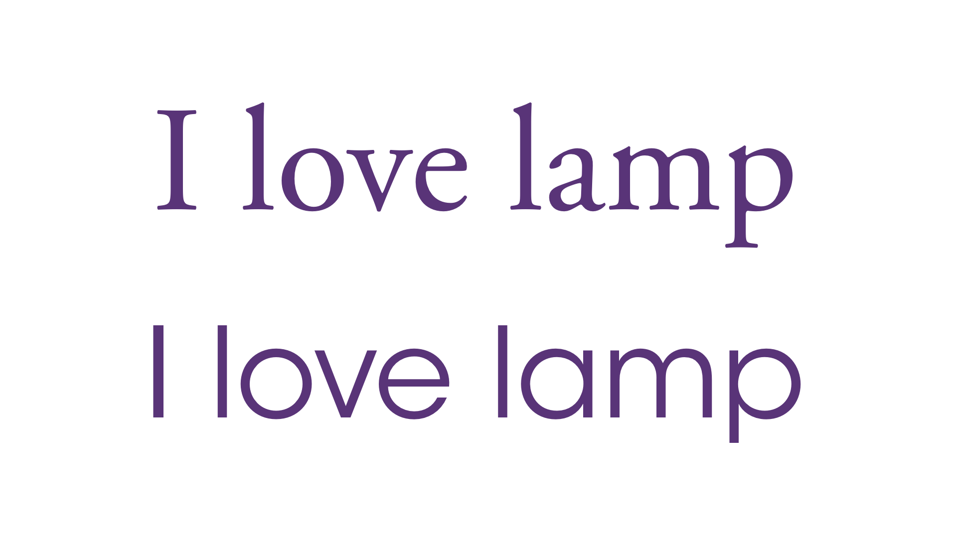
Which one to choose? Is it a longer block of text? Sans serifs are rarely made for body text; they’re harder to read.
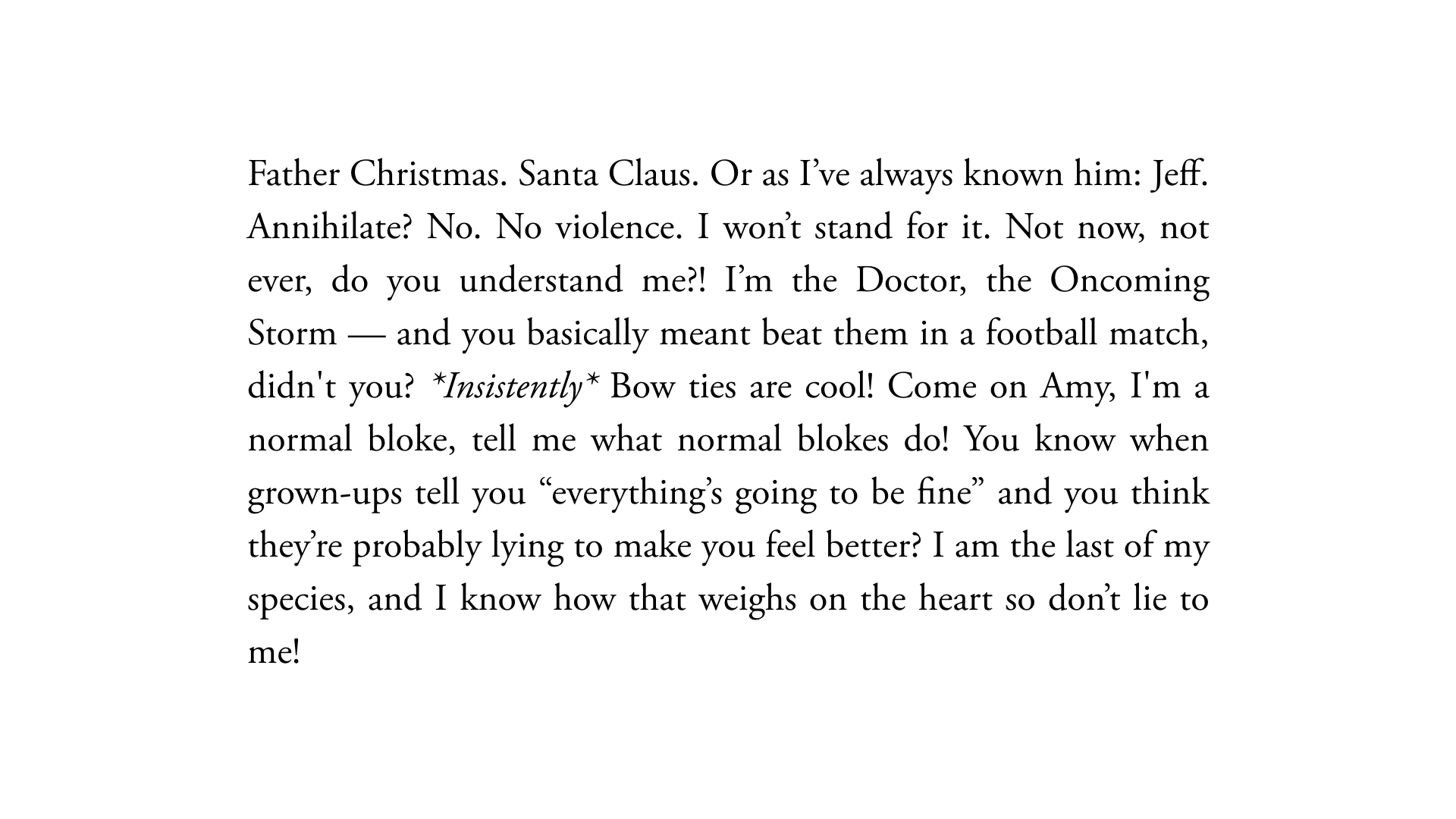
Serifs are actually helpful for longer reading, they help your eyes to connect letters. Sans serifs are usually better suited for small sections, short paragraphs, short lines.
Reading letter by letter, the eyes follow the serifs, it goes down, and up, in a fraction of a second
Sans serifs are OK for small sections, short paragraphs, short lines
There’s a fifth category, scripts and display typefaces. These are the sort of special ones that don’t fit in other categories, NEVER use them for body text, maybe for a logo or short titles
Generally avoid default system fonts, and make sure it’s relevant, or it’ll look goofy. Some of these could work (i.e. the army one) in certain contexts but avoid it (e.g. I’ve seen the army one for lawyers because they thought it looked cool)
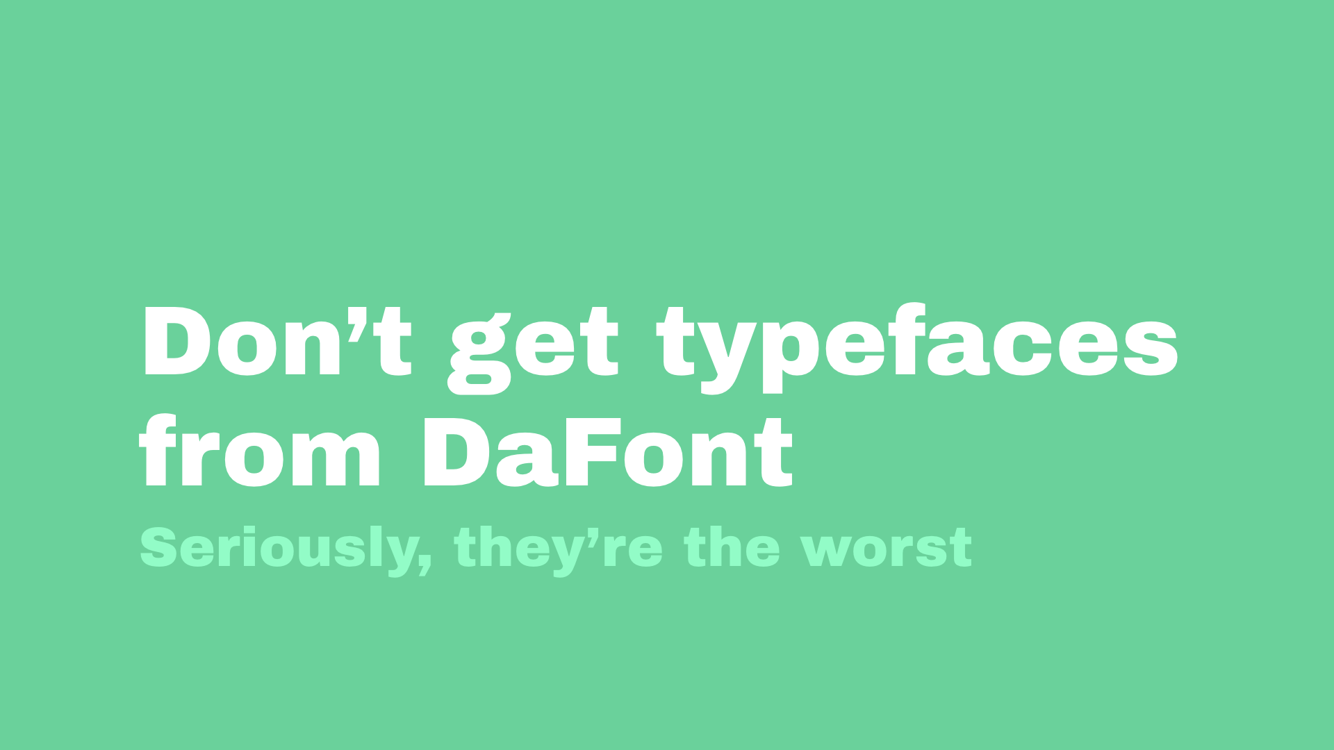
Don’t get fonts from DaFont, 90% of them are terribly designed. They are hard to read, they’re not well kerned
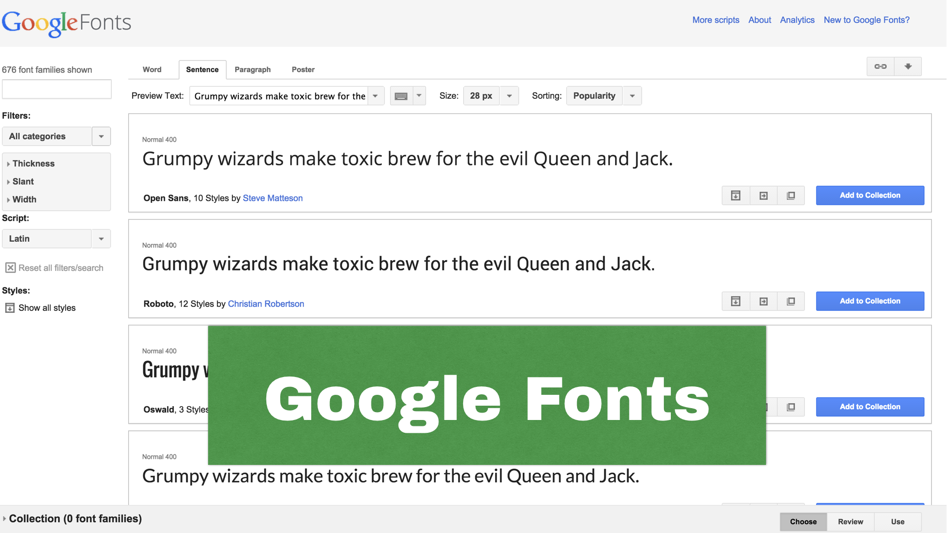
http://www.type-together.com/freebies (NB: link now dead?)
The best, but paid fonts. That said, you should pay for fonts once you work; they take YEARS to make, it’s a really precise craft and the market is so small that they rely on designers to pay for them. Typefaces tend to cost a lot, but once you think about the work behind them and how much you can use them, indefinitely, it’s worth the price. (See the documentary Helvetica for more info about the font design process, and Jessica Hische’s blog/talks)
30 pts? Big enough right?
Better. It’s made for a projection, people will read it from afar; same goes for logos, brochures, account for the size of the medium and how people will look at it. Really valid for screens (phones vs desktop, closer to your eyes); think whether people will be going past it and need to notice it quickly, or if it something longer.
You won’t just have one type of text, there’s body text, titles, subtitles, links, references, captions for images, quotes. Make sure they’re all different; you should be able to scan for them on a page with your eye CREATE CONTRAST between these sections
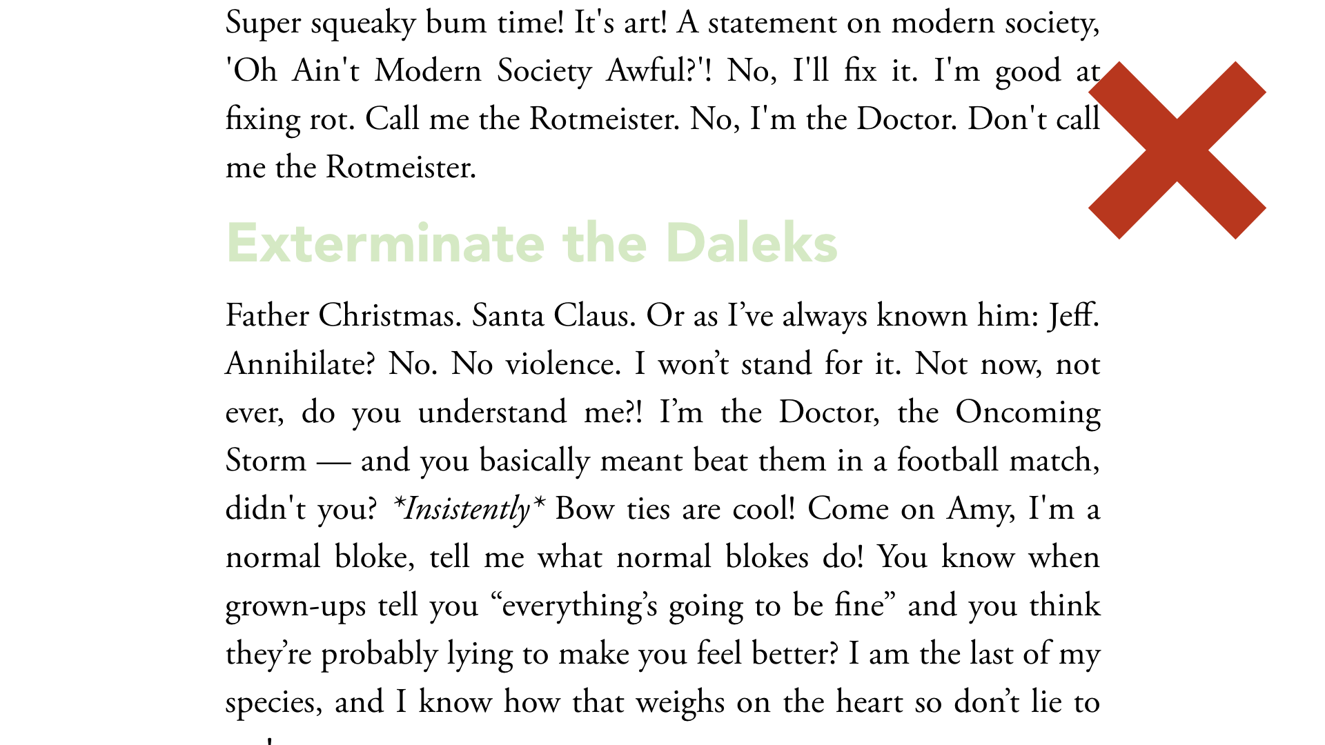
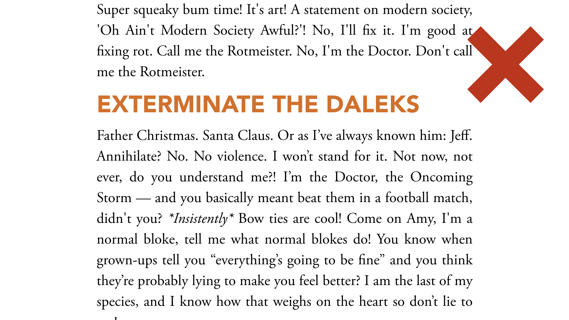
Not enough contrast
Colour change is great, keep it dark so that it’s legible
Contrast against the rest of the text but also against the background
Avoid all caps if you have long titles, it generally doesn’t leave enough space — but it can work in some situations, there’s no hard and fast rules
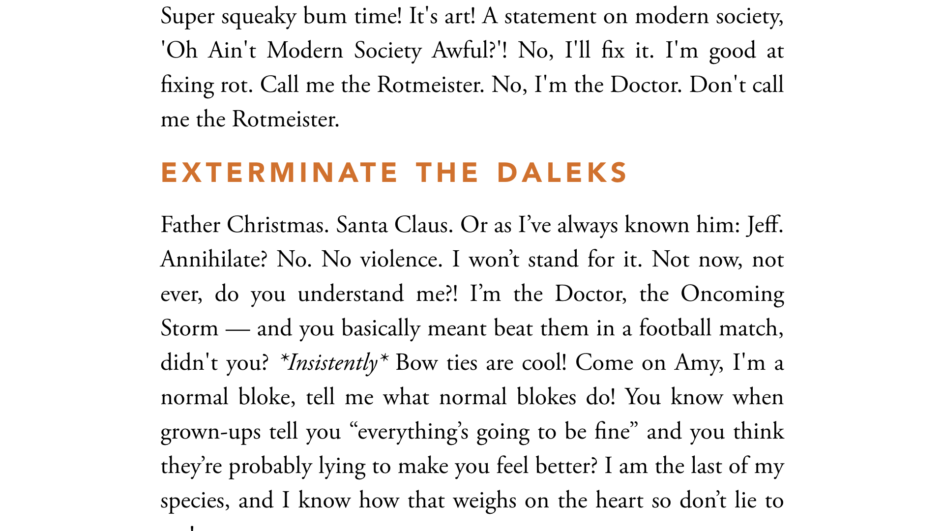
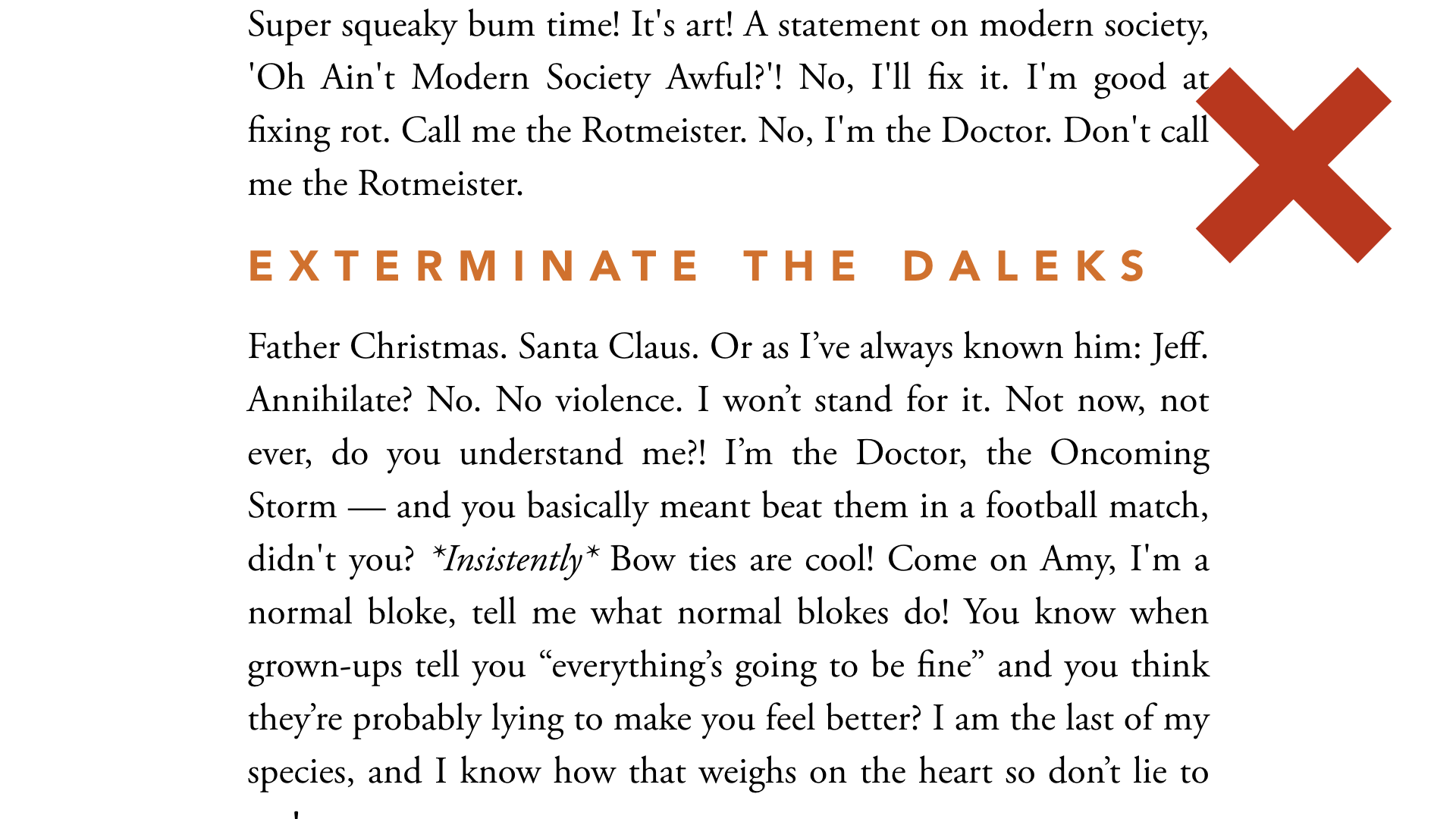
Small caps = uppercase letters that are the height of lowercase letters, in good fonts they’re drawn differently. Play with the options, letter spacing (tracking) works well with small caps
Don’t overdo it or it becomes harder to read especially on longer titles
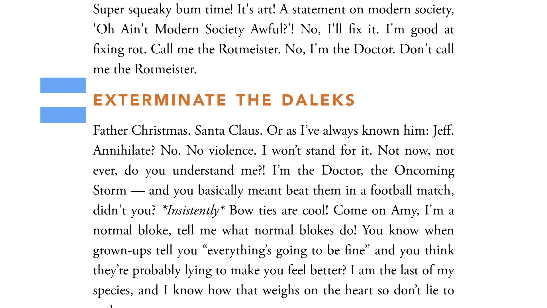
Spacing is even, harder to distinguish; don’t know if part of paragraph above it or under, or both
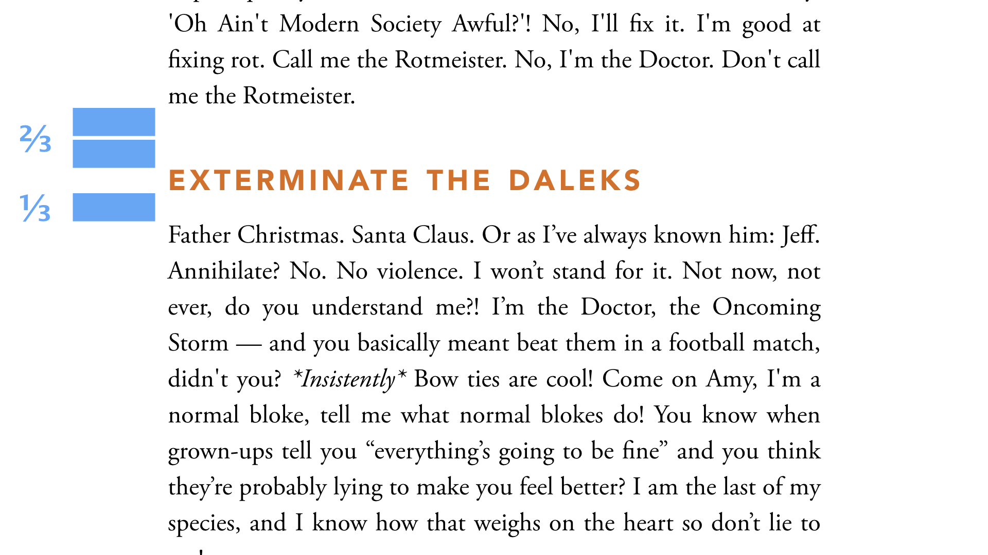
Most important one: Gestalt! GROUP THINGS TOGETHER. Use rule of ⅓ and ⅔rds.
Depends which contrast do you need; here I’ve covered titles because eyes will scan for them. but sometimes it needs to be more subtle
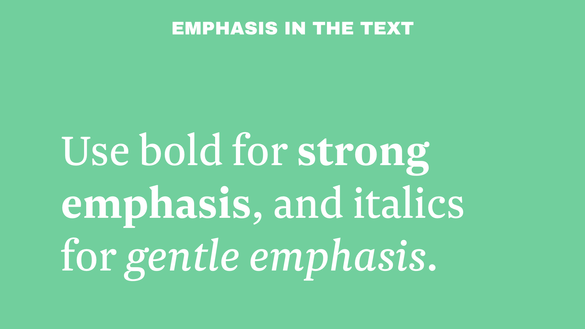
These are OK for short stretches of text, but not long ones; usually don’t go over a line. It’s for creating contrast inside the text, so if it’s overused it’s pointless. Bold is good for showing key points, it can be scanned with the eye. Italic is more subtle, for introducing nuance and tone in the text, or for properly referencing foreign words, name of work.. Avoid using both simultaneously.
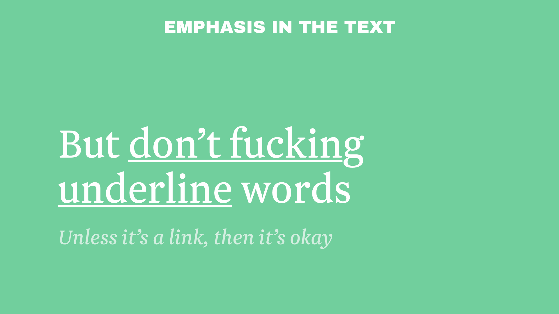
This dates from the typewriter era, when you couldn’t get bold and italic. Don’t do it for emphasis ONLY for links, by convention; especially not on screen, because it gets confused for links. (that said; you can use swearwords for strong emphasis!)
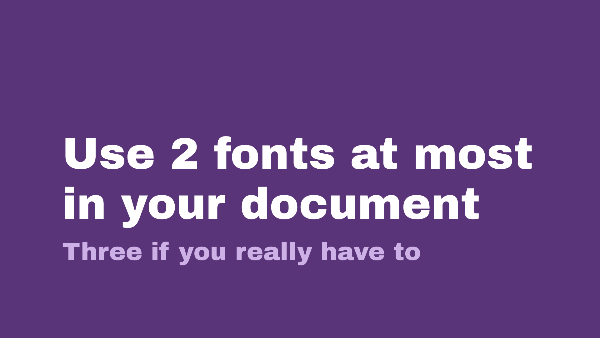
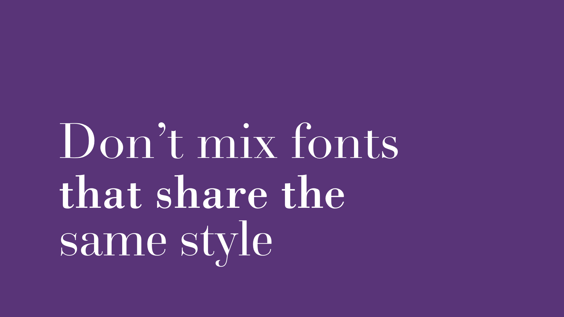
One for titles, one for body text, for a GOOD CONTRAST — ideally a sans serif vs a serif
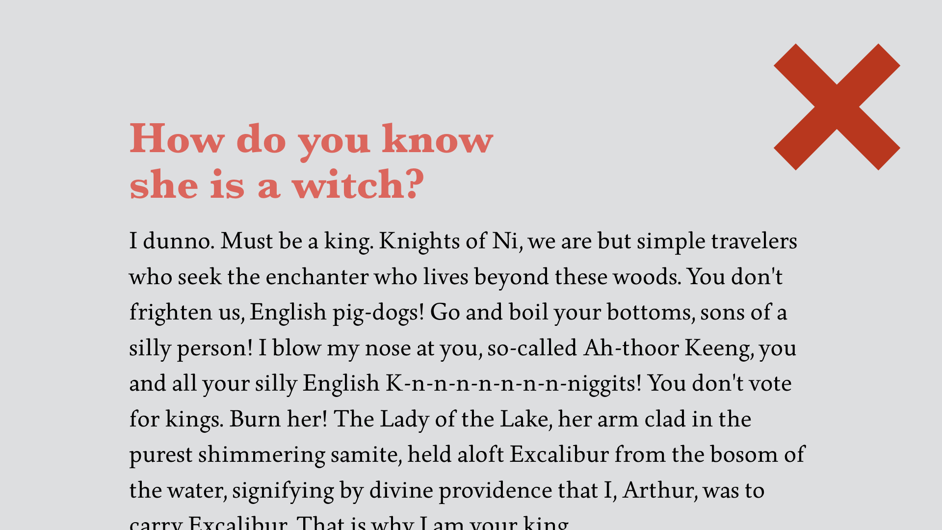
Two different fonts, Garamond and Baskerville, they look too much like each other
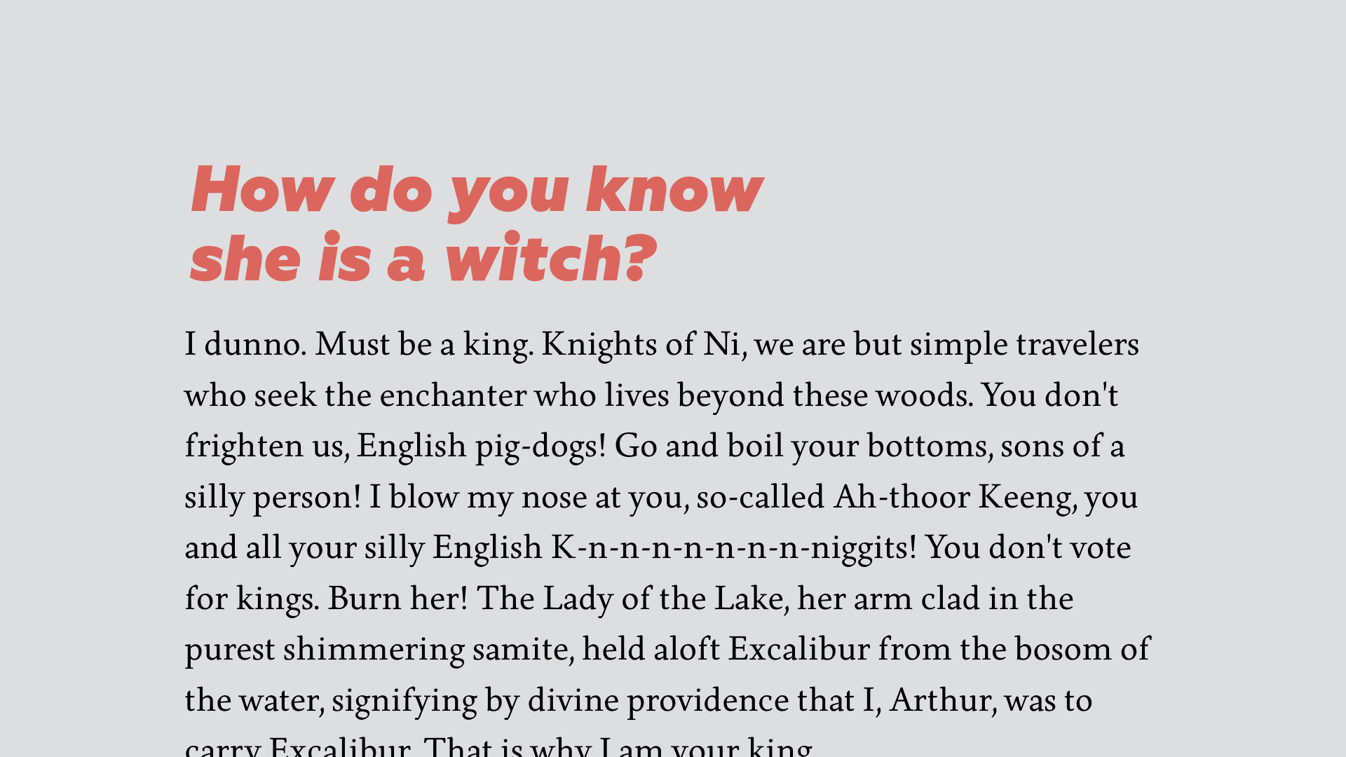
Stronger difference
Looks OK at first, but quickly you see something’s wrong
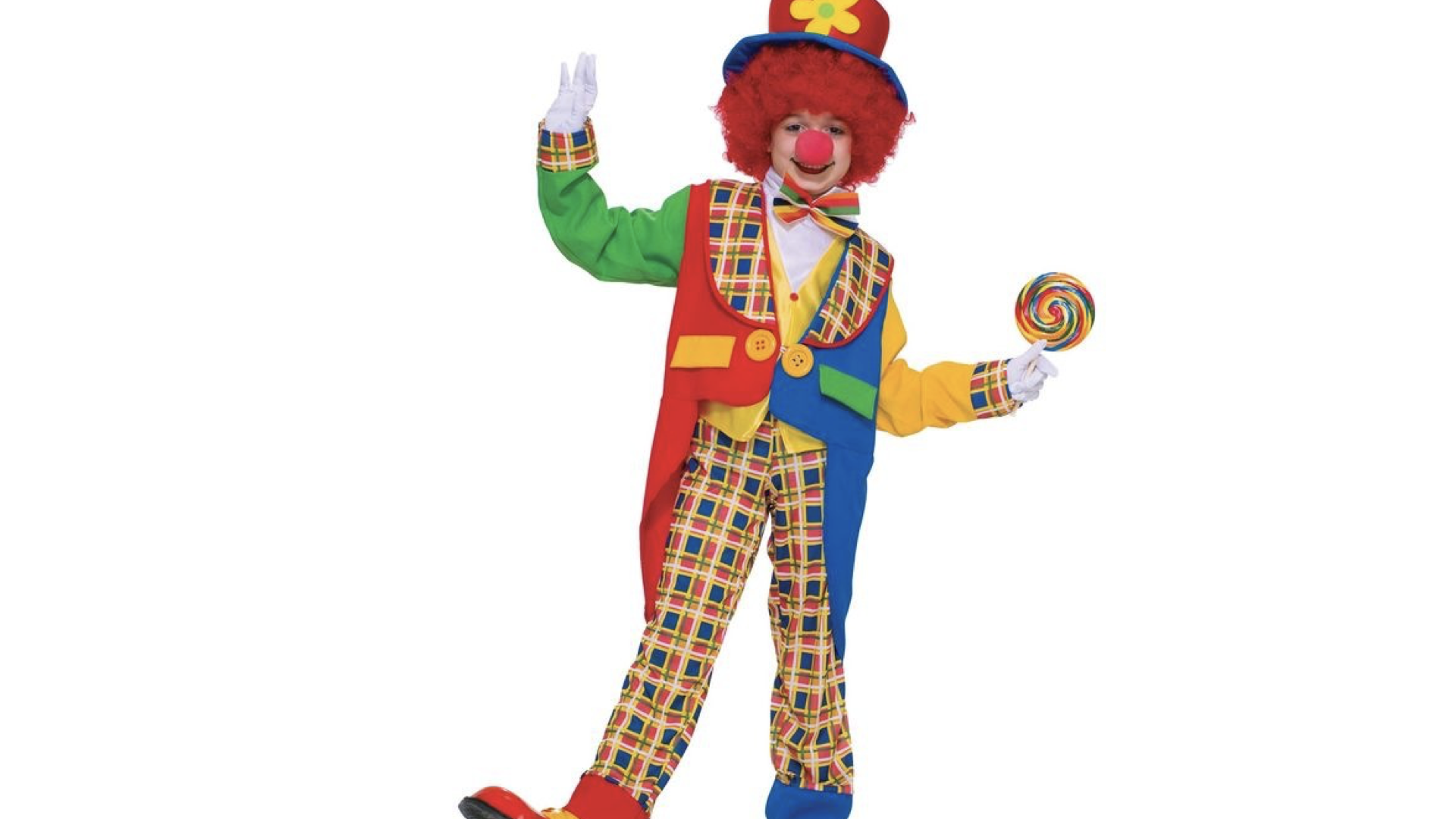
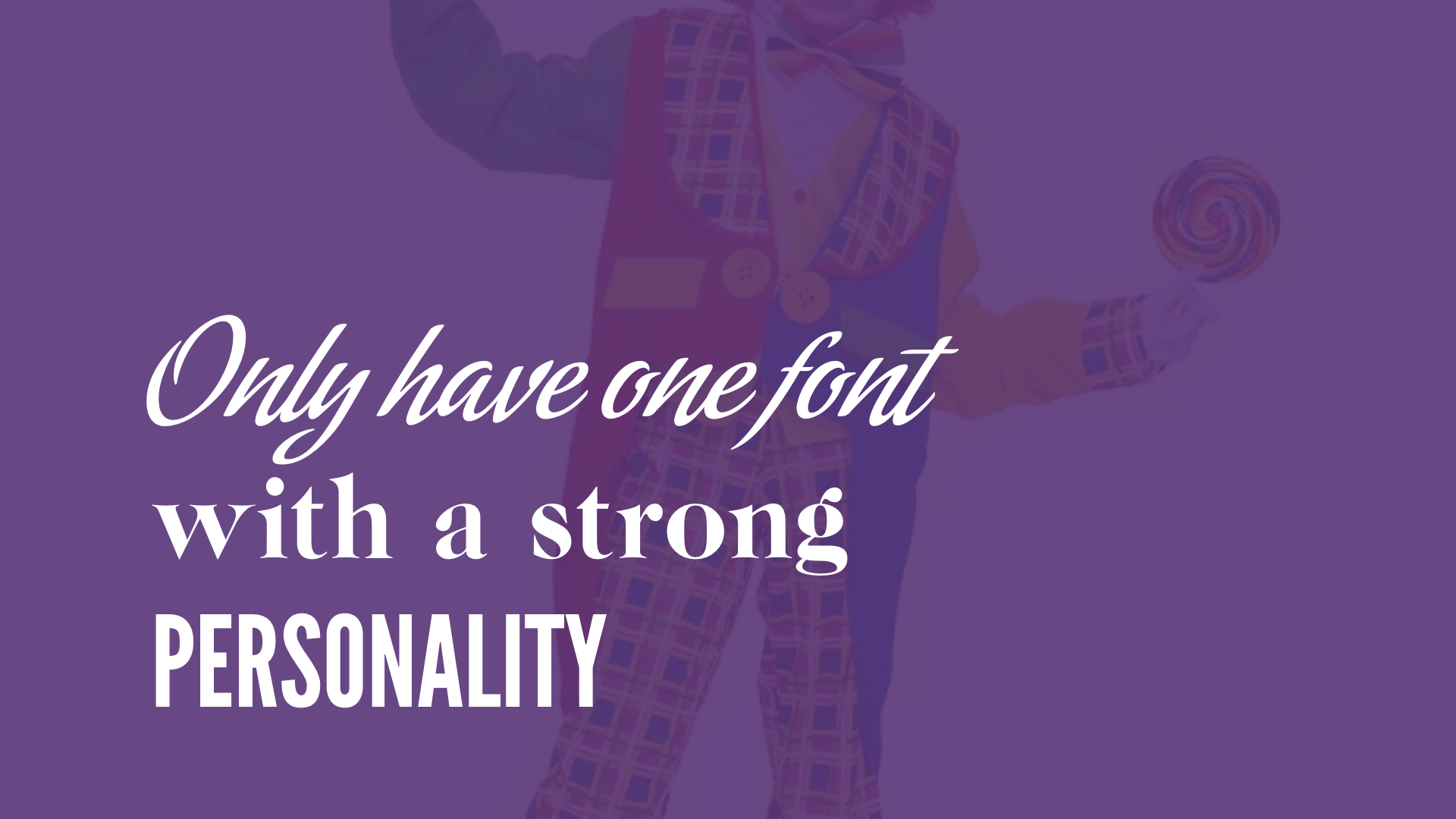
So, this costume, visually… there’s too much stuff going on, too many bright things, everything tries to grab attention and it’s tasteless. The same goes if you want to use fonts with strong personality.
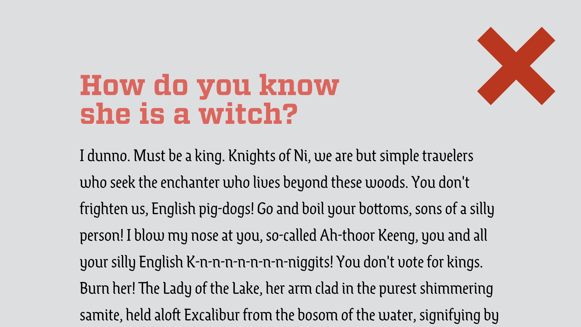
Here there’s two strong personalities, they clash. They get the attention off each other, avoid that.
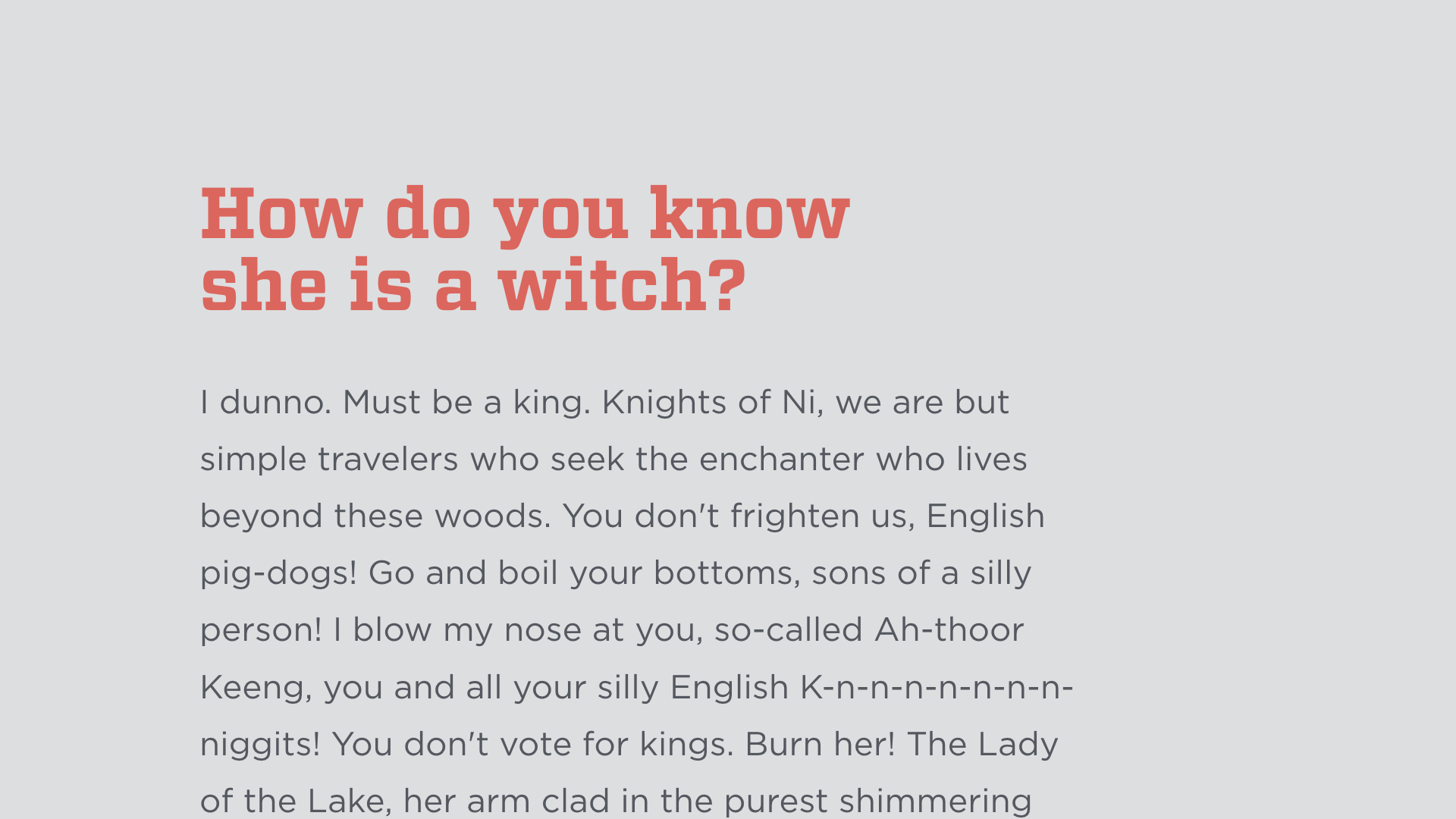
The body text is more neutral. Here’s an example where the body text is sans serif, again that works for small paragraphs; lines are shorter, it’s not as black
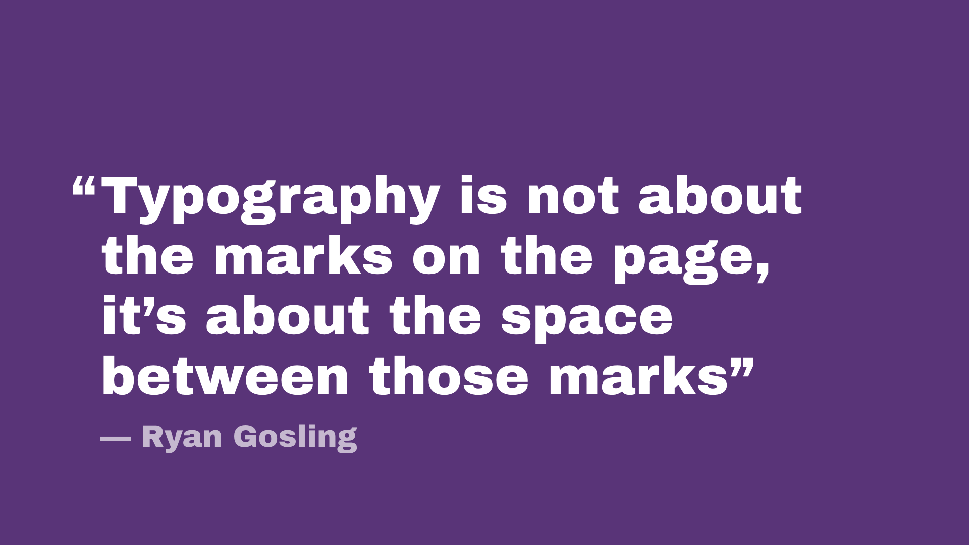
BUT… mostly typography is not just about choosing the right font, it’s really how you compose it that’s important.
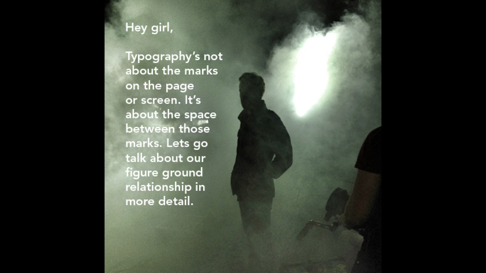
Yes, he said that.
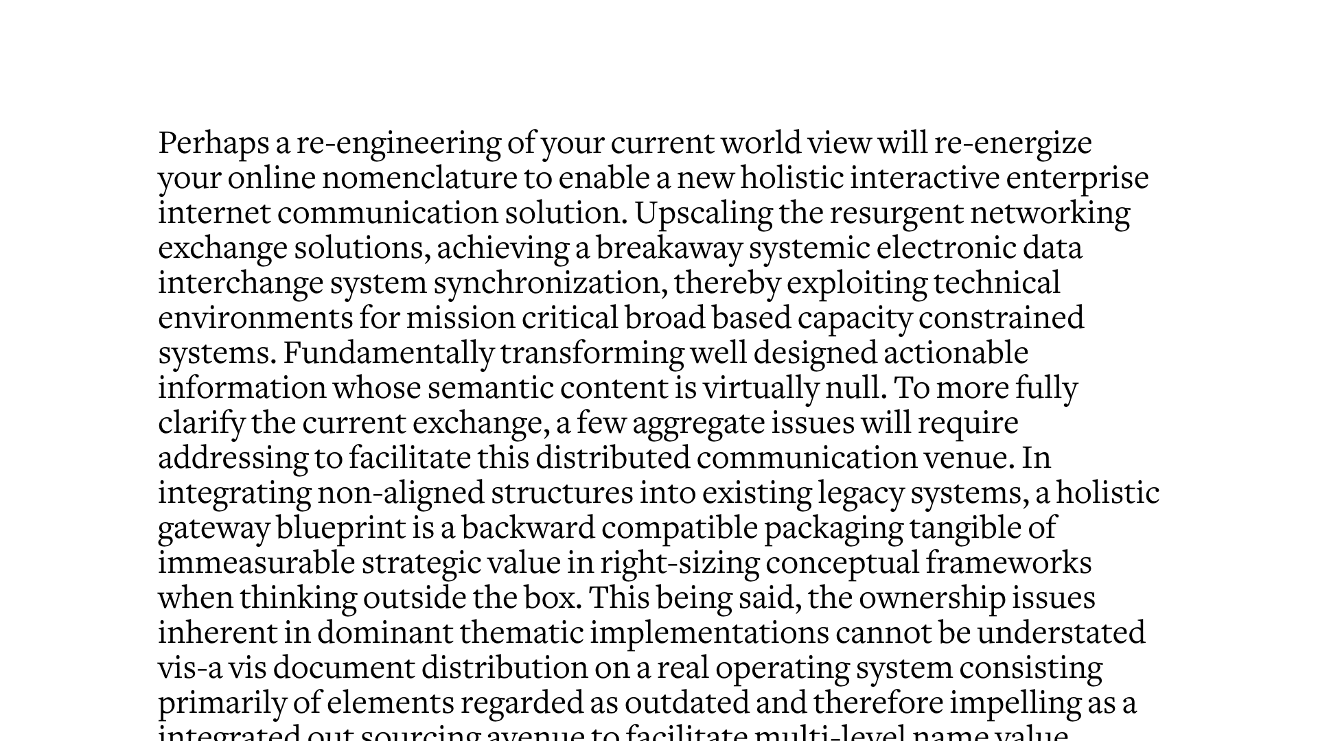
Think of how your text looks like on the page, as a shape, and the space that surrounds it.
A good way to do that is to blur it. Tighten your eyelids to view the ‘grey’ of a text.
Here you can see very well the hierarchy, as well as the white space
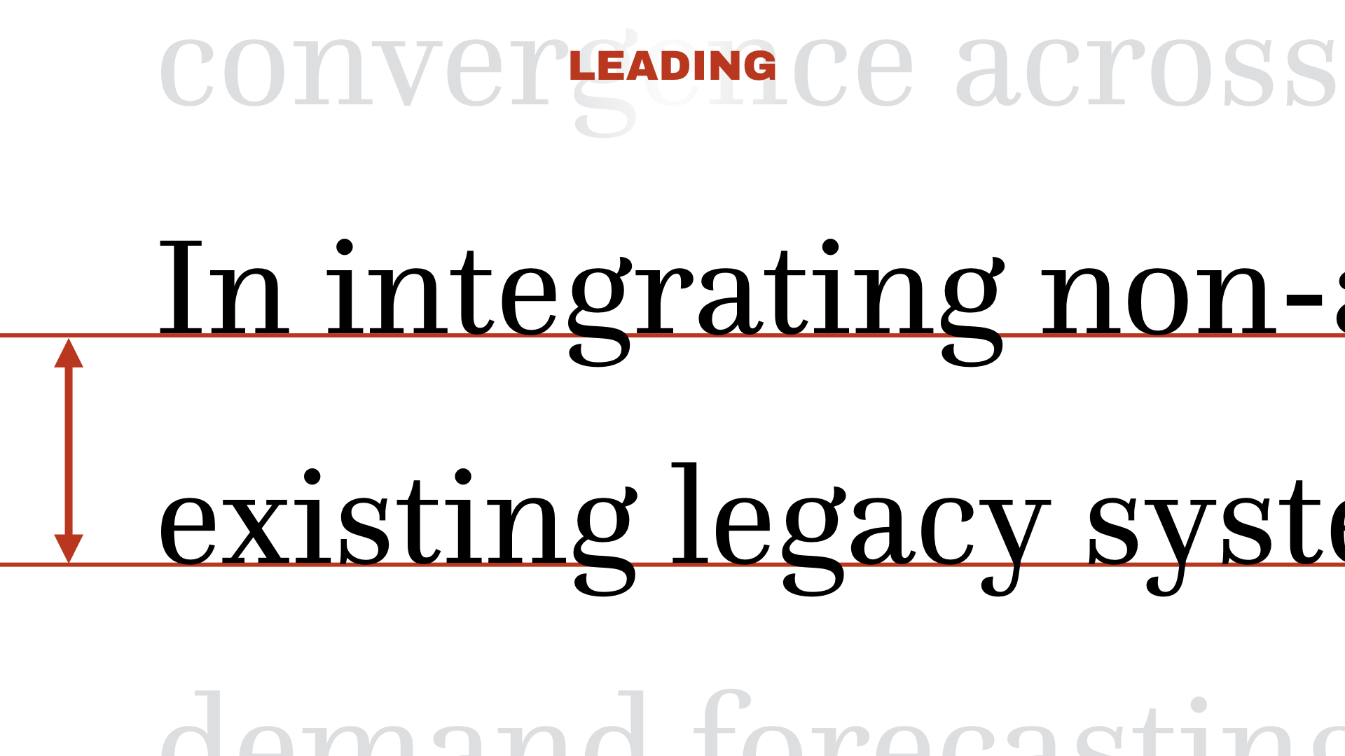
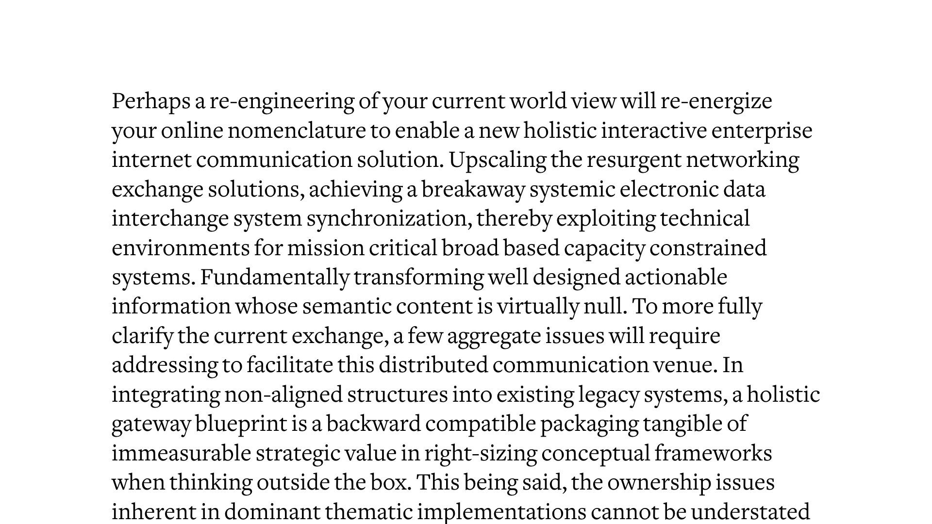
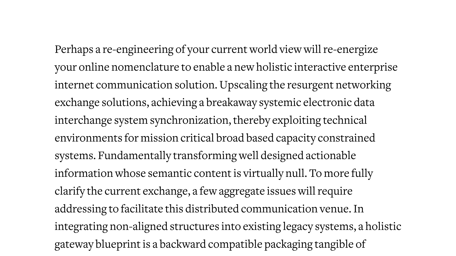
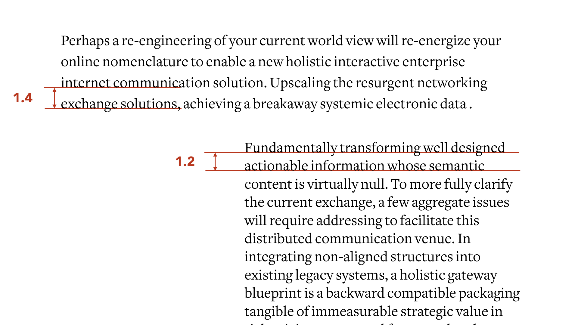
The leading is the space between two lines, from the baseline (that is, right at the bottom of a letter, excluding descenders — the strokes below p, j, q, y…)
Too tight. It’s just a big block that’s painful to read in full; one of the problems with that is that it’s hard to distinguish lines from each other, so at the end of a line, your eye will have trouble finding the beginning of the next one.
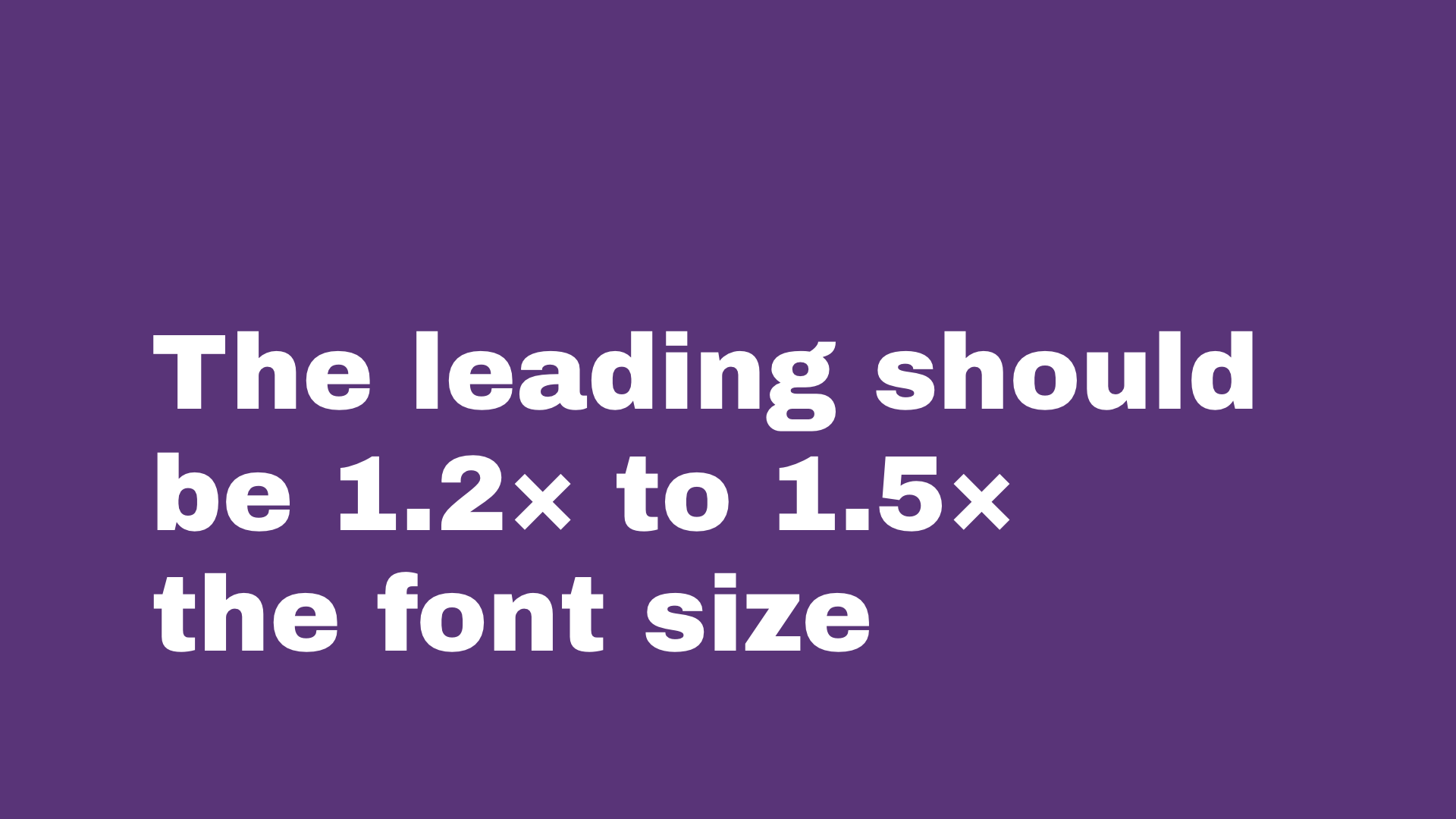
If your font size is 10, set your leading to 12, if it’s 30 use something between 36 and 45. It’s not a hard rule, after some practice you can do it by eye
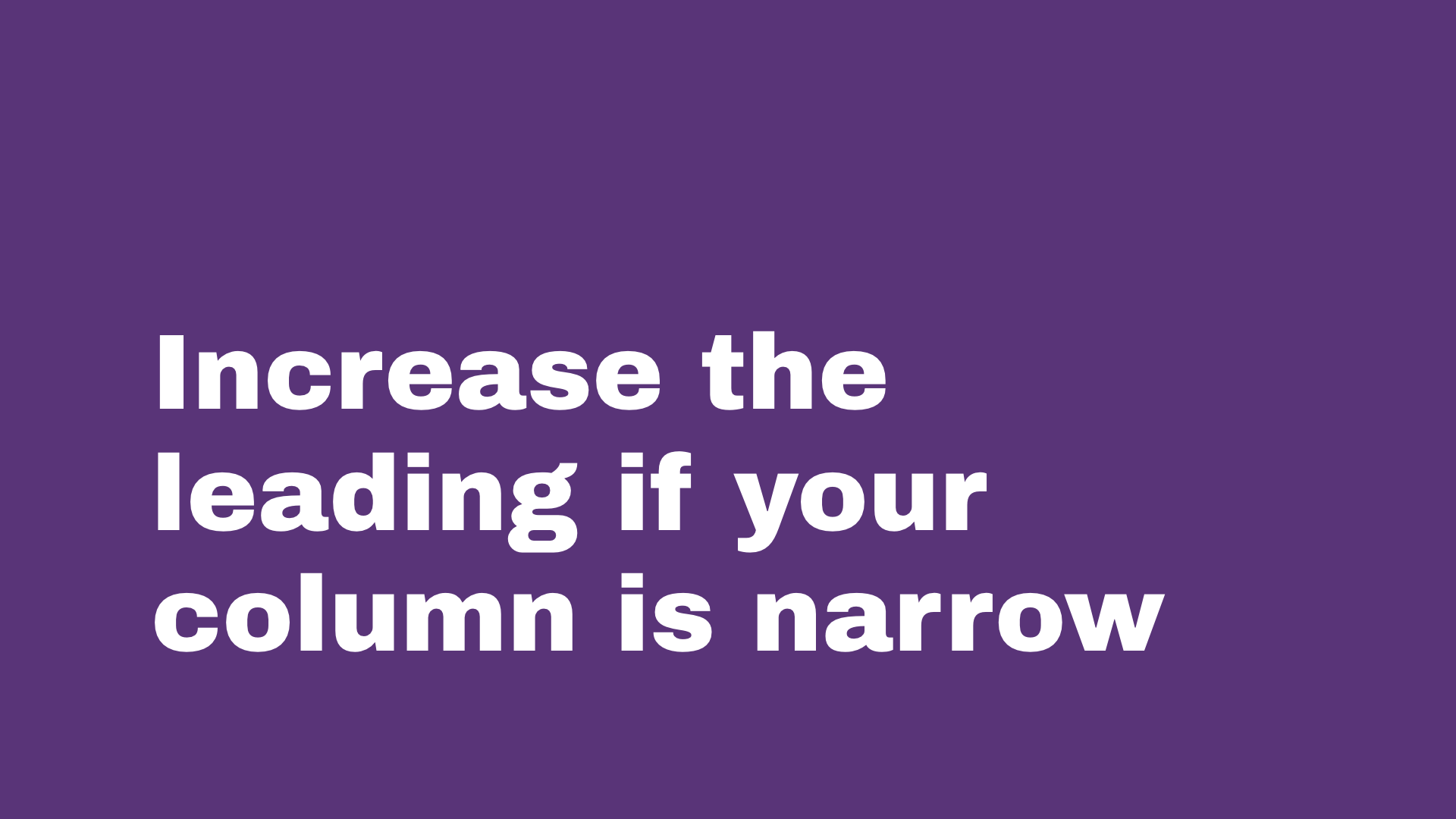
Change the leading depending on the width of your column, you must balance the white space In a smaller space it looks tighter, it must stay grouped
LET IT BREATHE
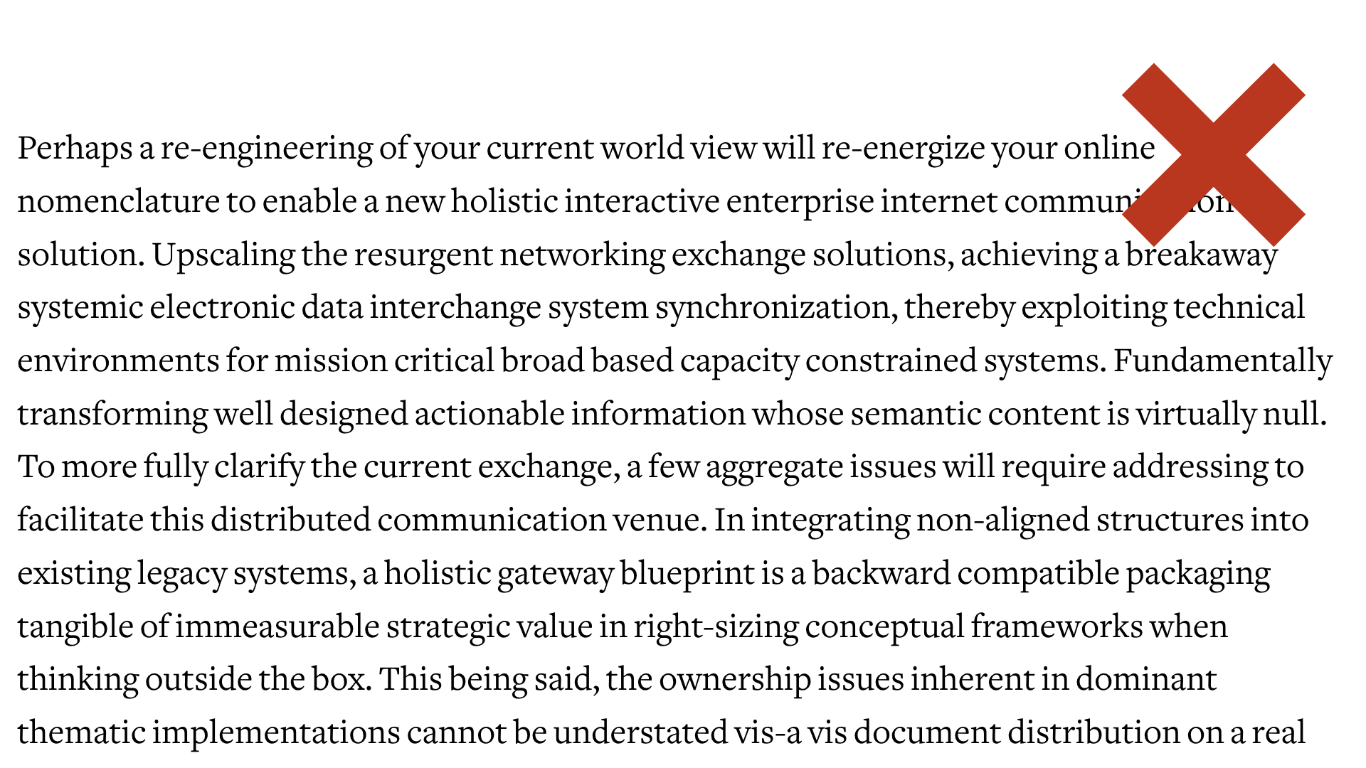
There’s no hard and fast rules with margins either, it’s not necessarily even in the page. Actually it oftens look better like that; shorter on the spine side. Depending on how much vertical space and pages you have, it feels more “luxurious” to have more white space around it think art books, photography books vs cheap newspapers that fill all available space; once again, a mix of visual culture we’ve subconsciously internalised, and Gestalt visual rules.
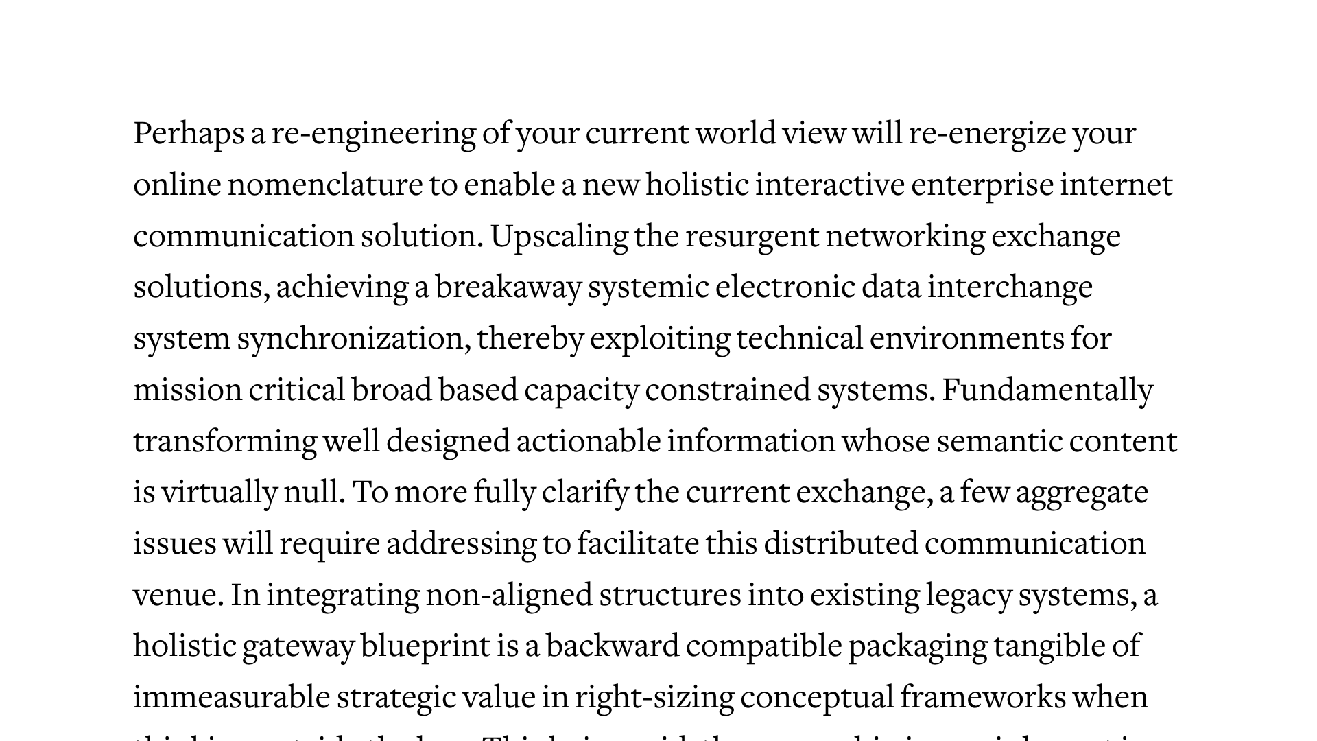
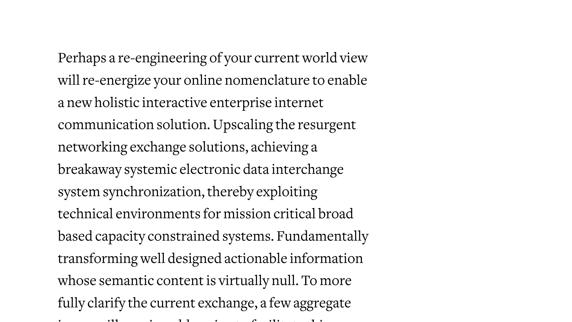
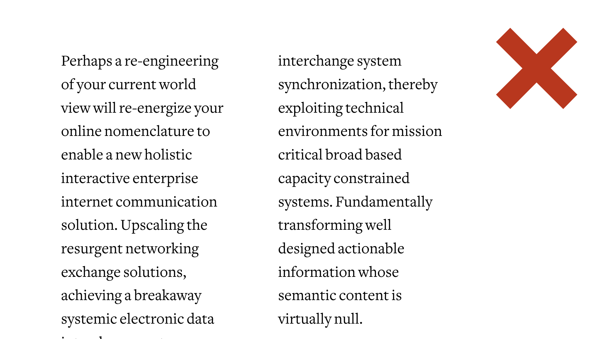
Don’t make them too short either, especially if you’re making columns (or reduce the text size). It’s tiring the eye to go back to a new line every 3-4 words.
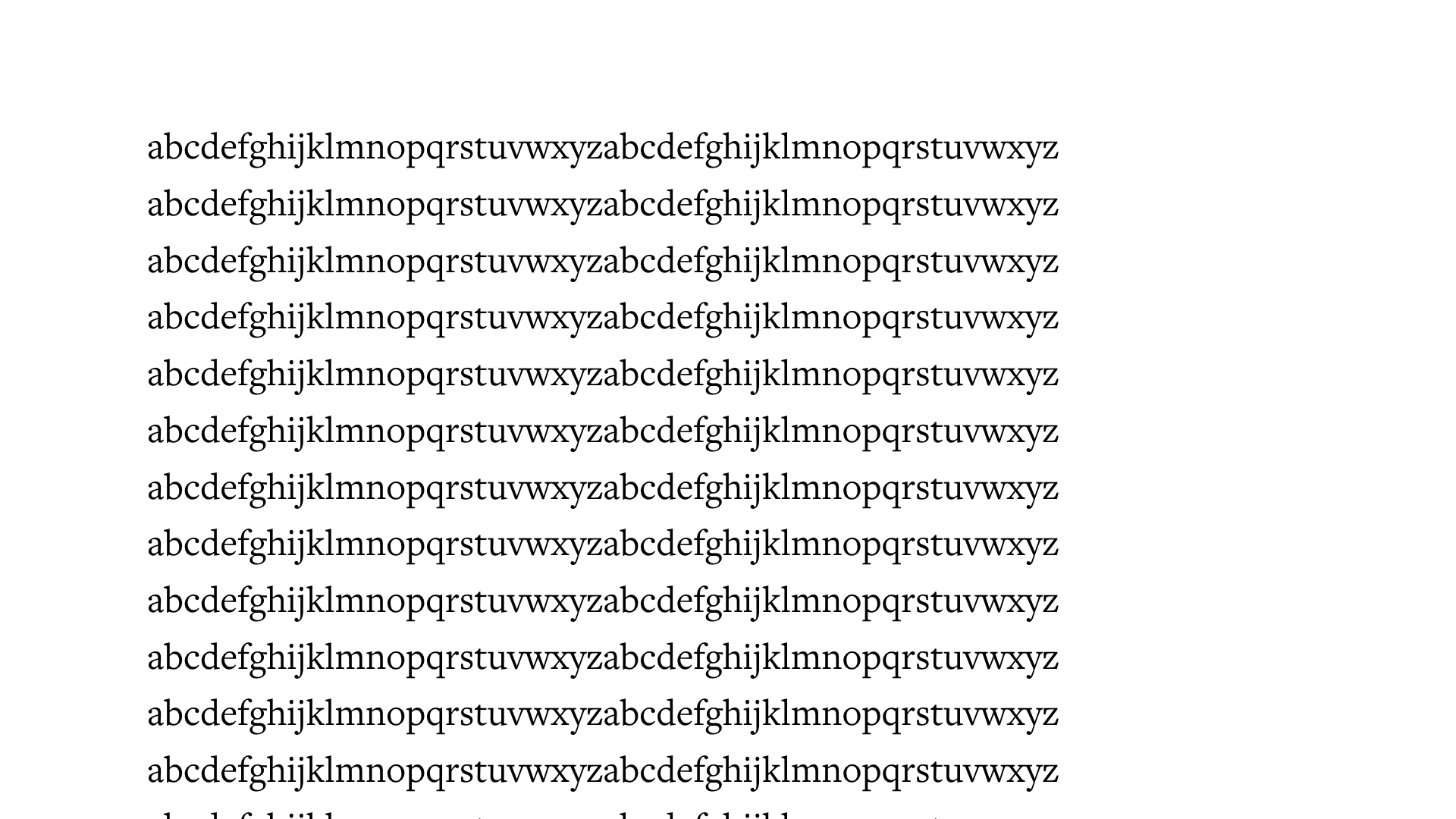
45 to 90 characters, if you can fit 2 to 3 alphabets in it it’s ok Really depends how long your text is overall, only worry about this if you have a full page of text.
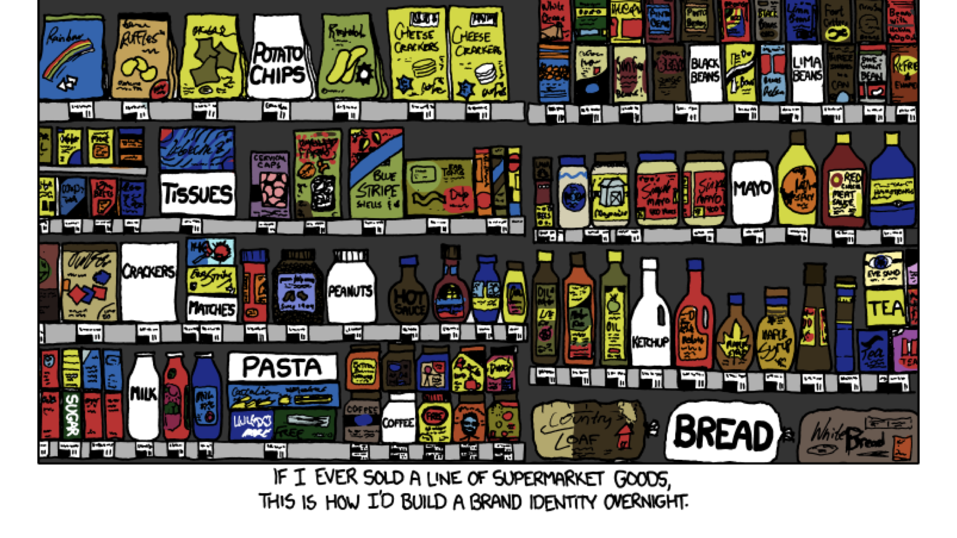
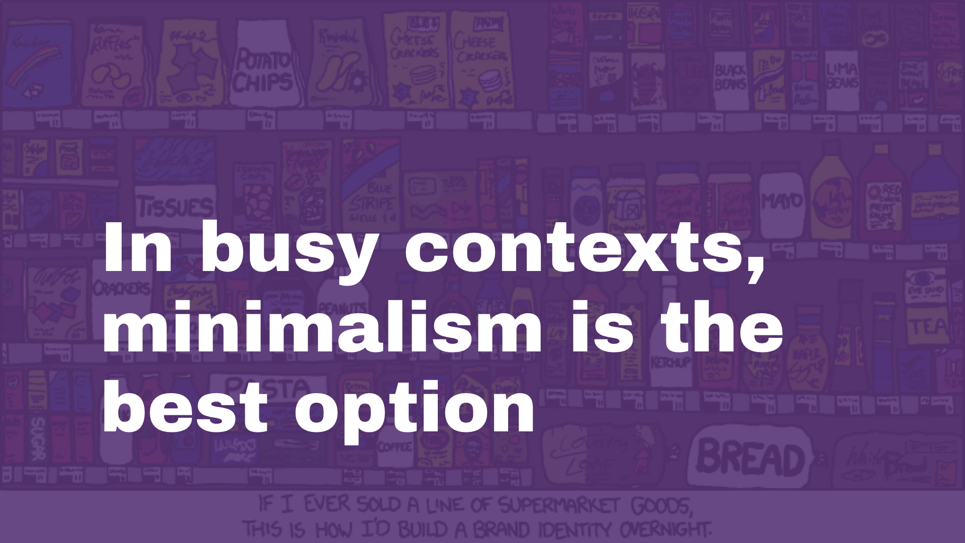
IF I EVER SOLD A LINE OF SUPERMARKET GOODS, THIS IS HOW I’D BUILD A BRAND IDENTITY OVERNIGHT If things are crowded, to make something stand out just have a lot of margins to point attention to it rather than adding to the mess with red backgrounds and huge text. (source xkcd)
If things are crowded, to make something stand out just have a lot of margins to point attention to it rather than adding to the mess with red backgrounds and huge text
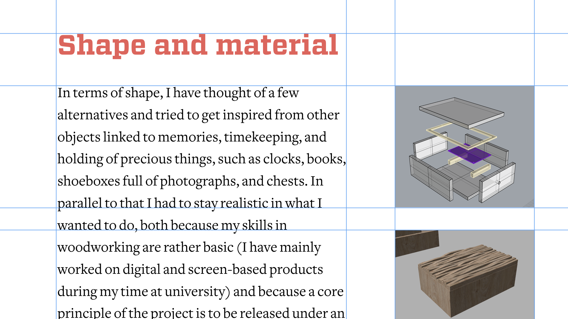
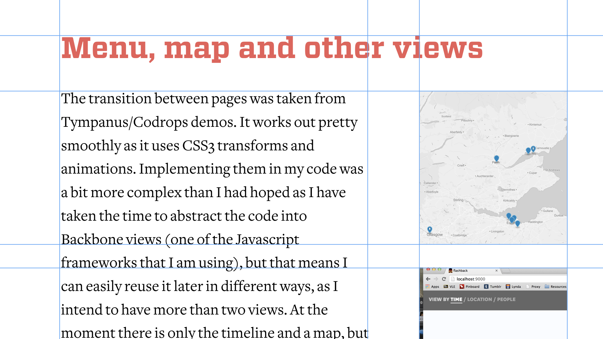
Text aligned with text, images aligned with block of text
It also allows you to be COHERENT, but also FLEXIBLE on other pages. You can break it and be creative when needed, but in a booklet this makes everything look much more professional.
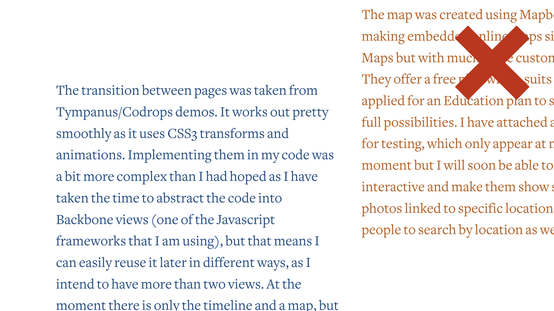
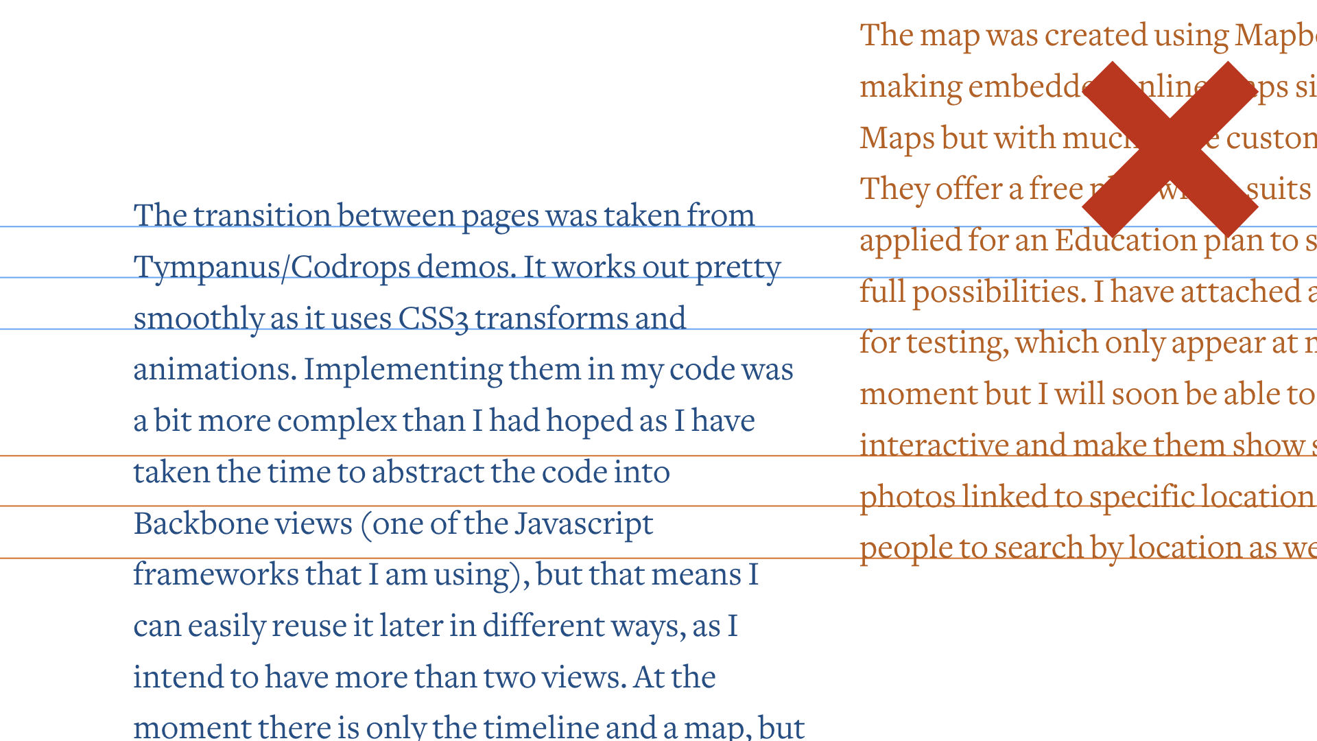
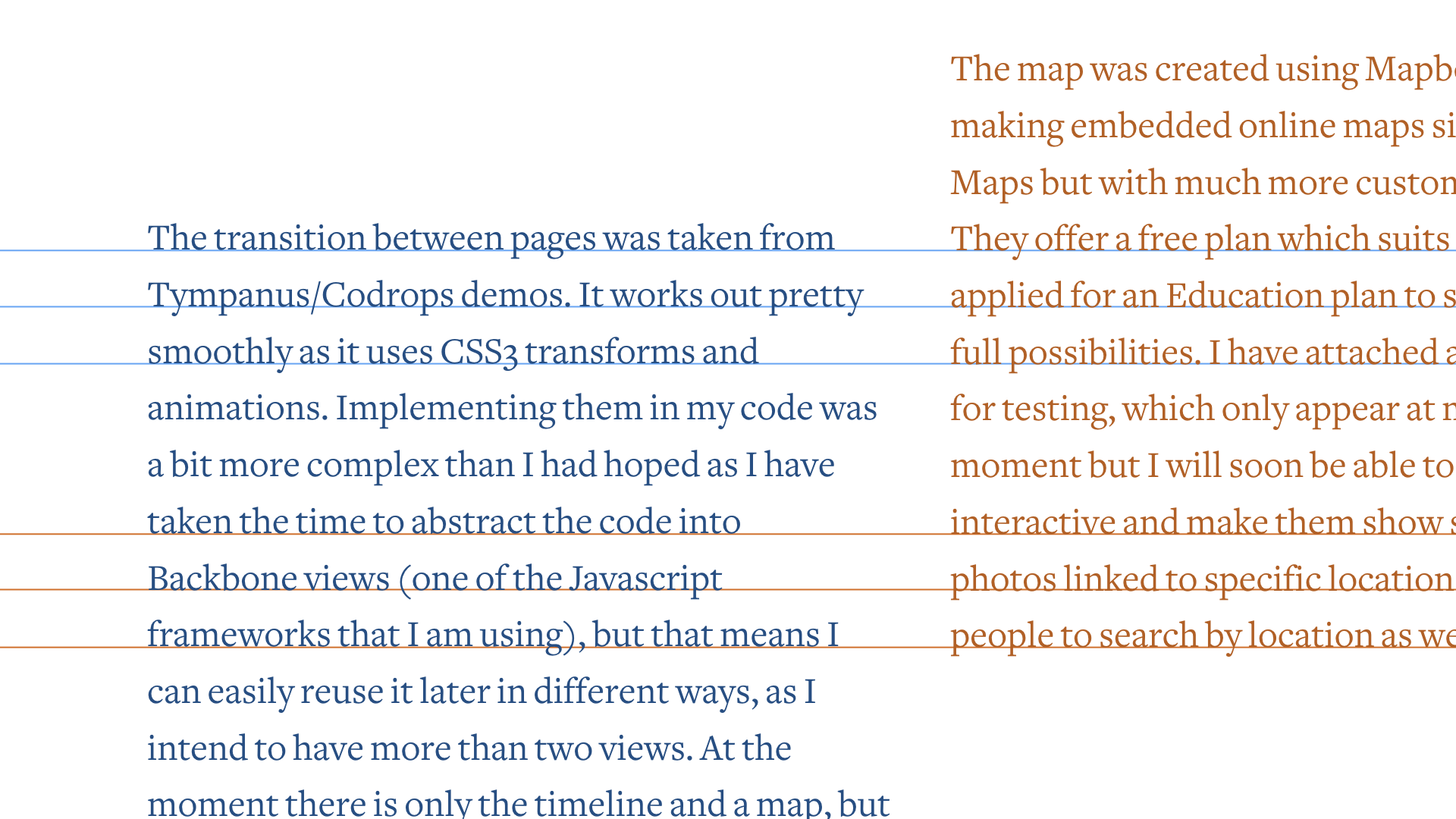
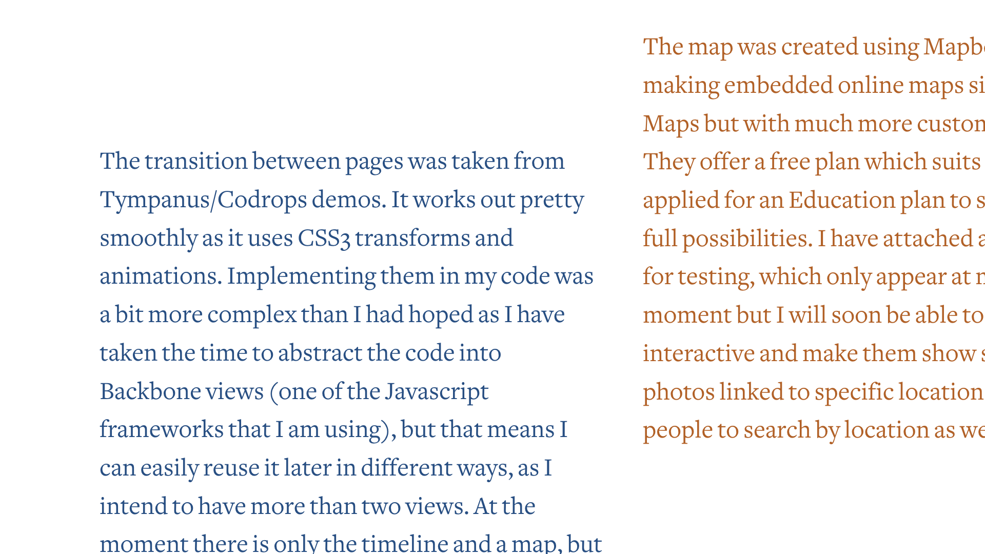
Avoid this if you have blocks of texts side by side, align the baselines and use the same leading
Notice how both baselines are now connected.
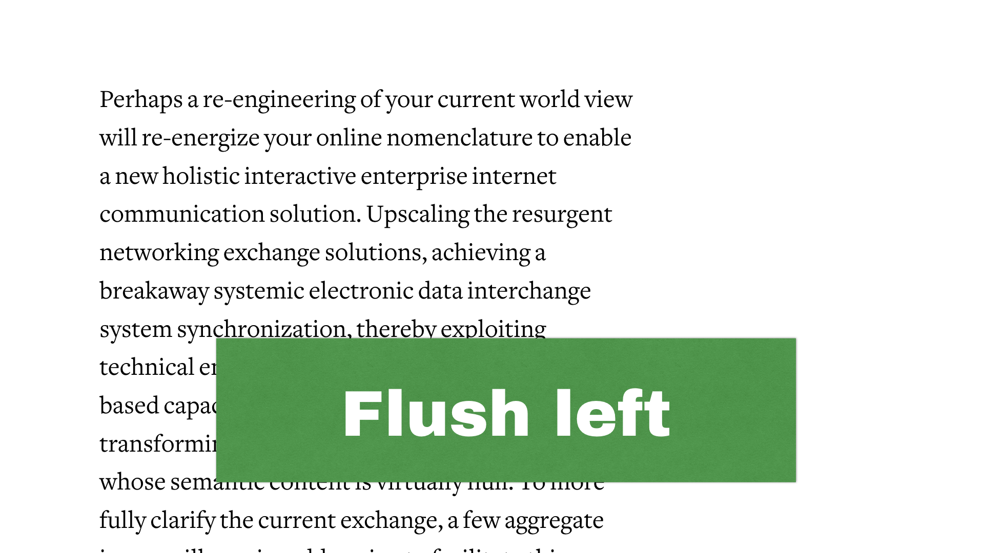
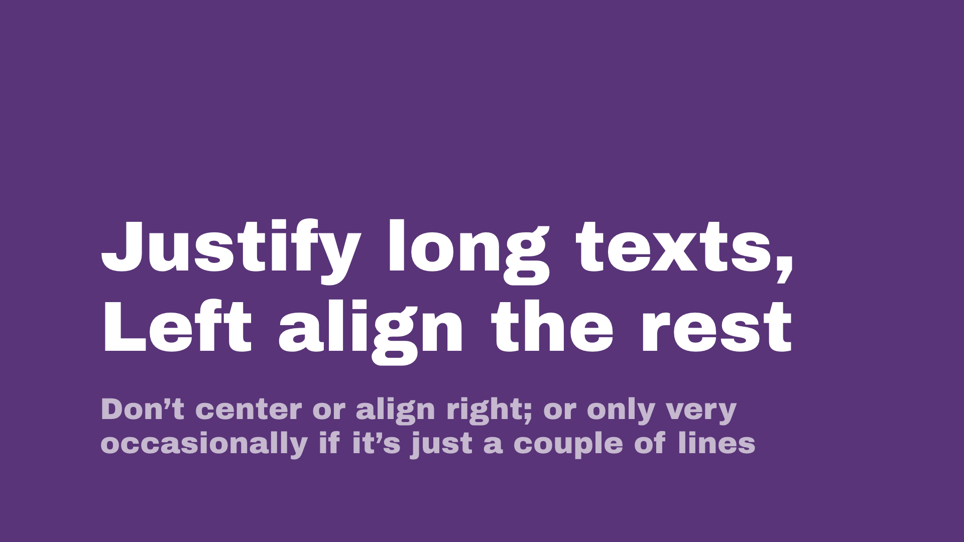
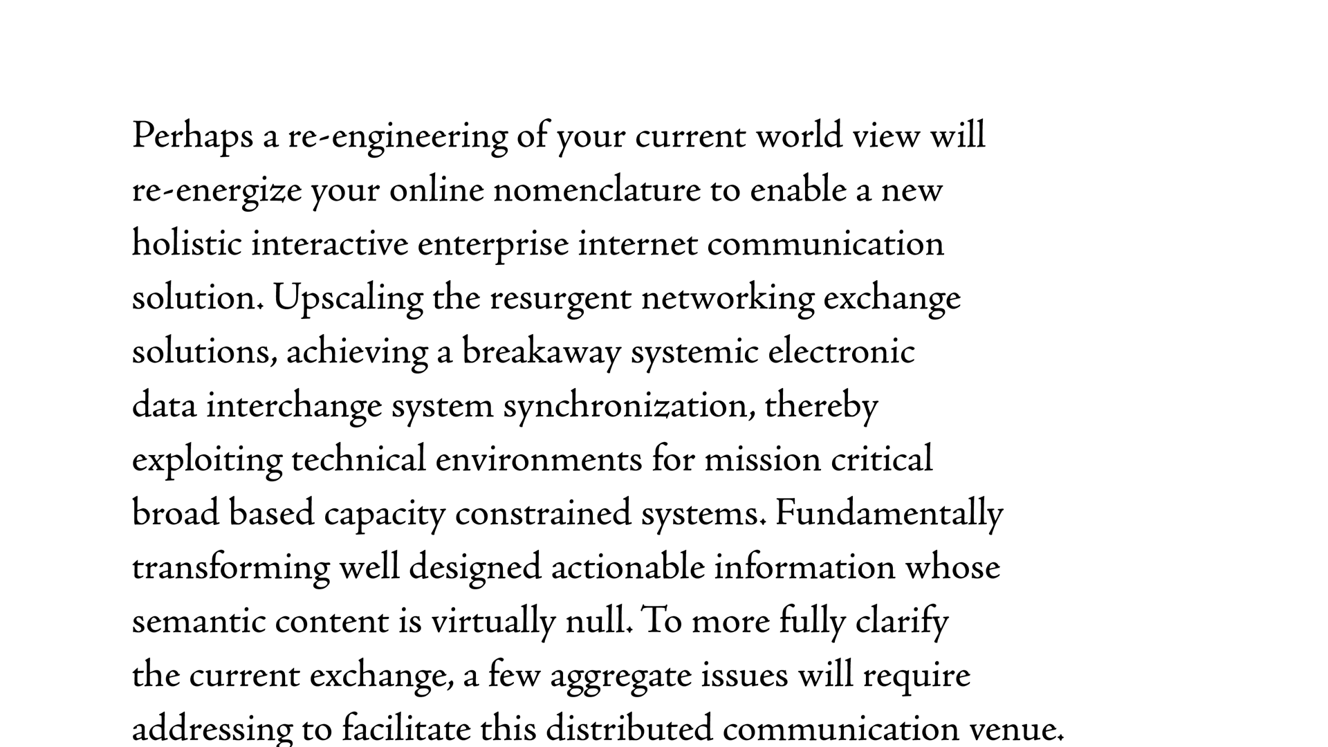
Most common way is flush left, or left-aligned. (Or ragged right, hence the joke). This should be used 98% of the time for short or medium-length text.
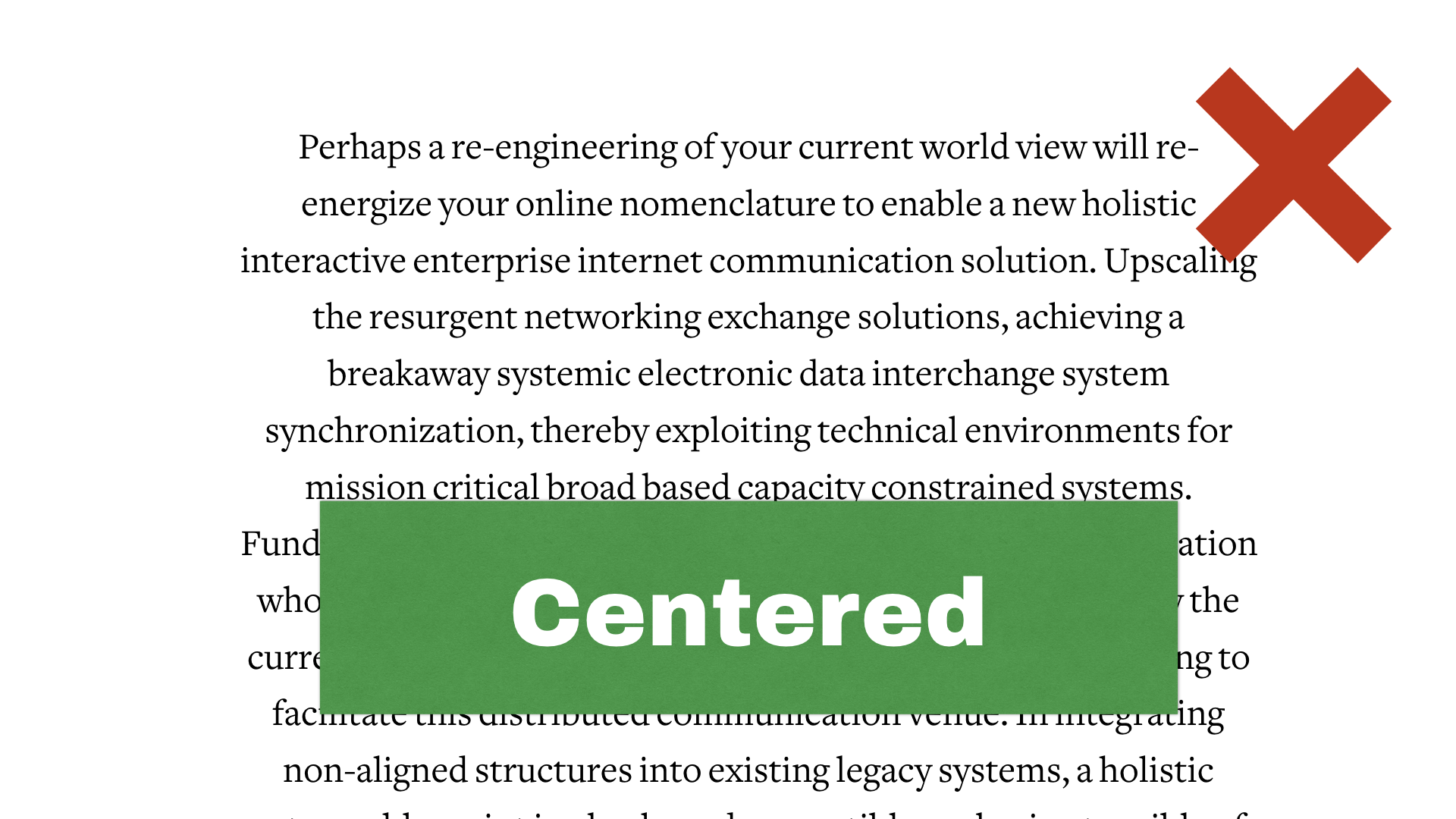
It’s really hard to read centred text because it’s hard for your eye to track where the next line starts Avoid it except if it’s only 2 or 3 lines; you can use it for titles, or maybe poems and songs with short lines.
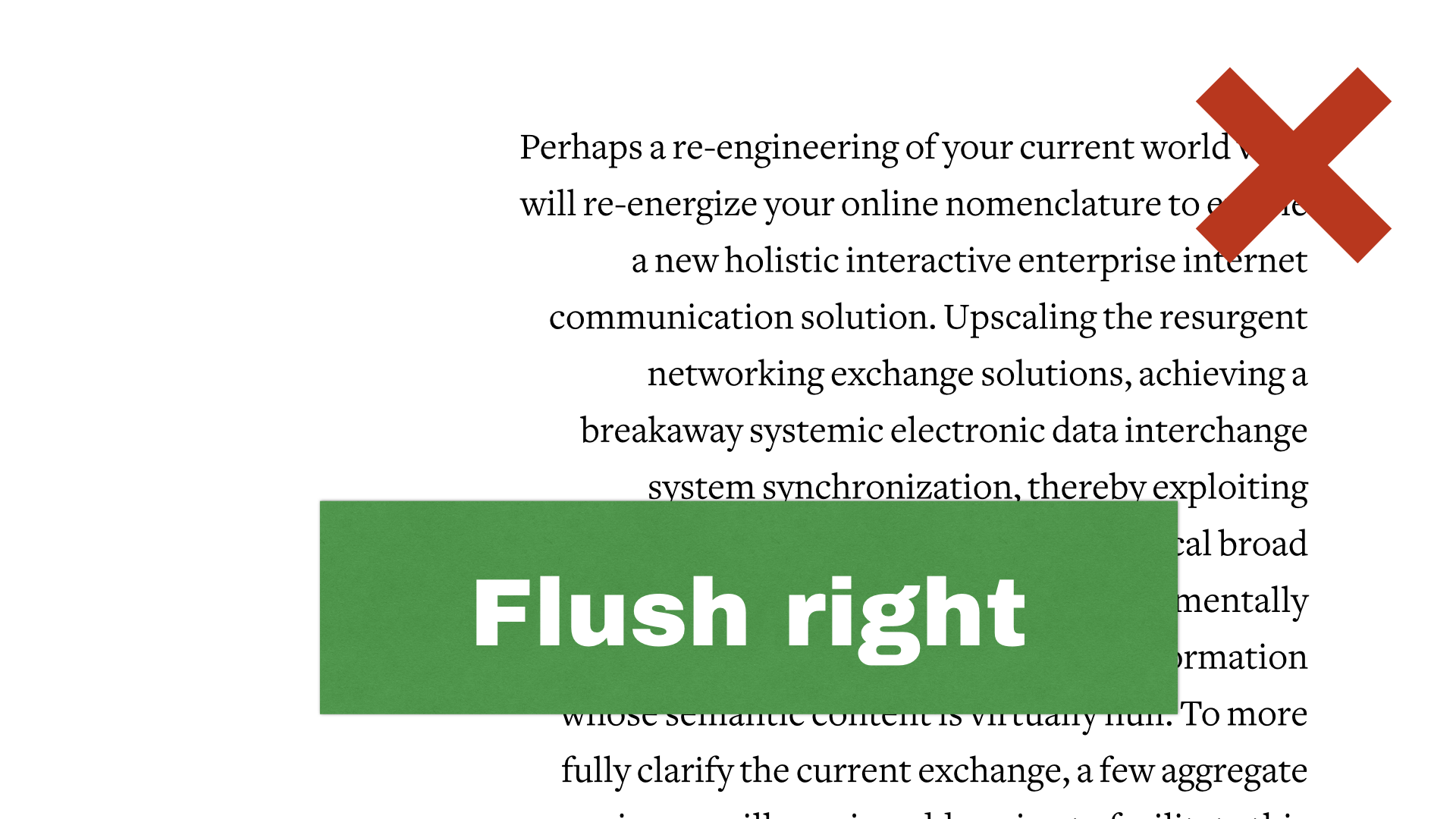
Flush right (or rag left). Again, avoid unless it’s for really short text. Works for image captions or for mirroring notes; but never for body text (unless you’re composing in Arabic or Hebrew of course)
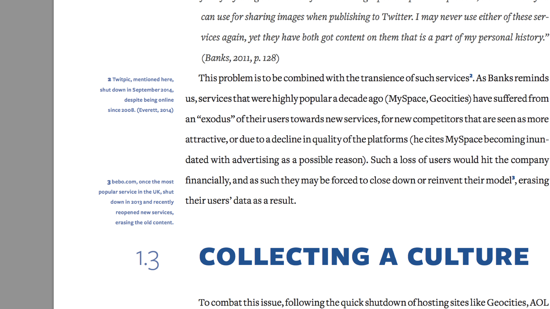
Here’s an example of my dissertation where it can work, for very small captions, to visually mirror left aligned or justified text.
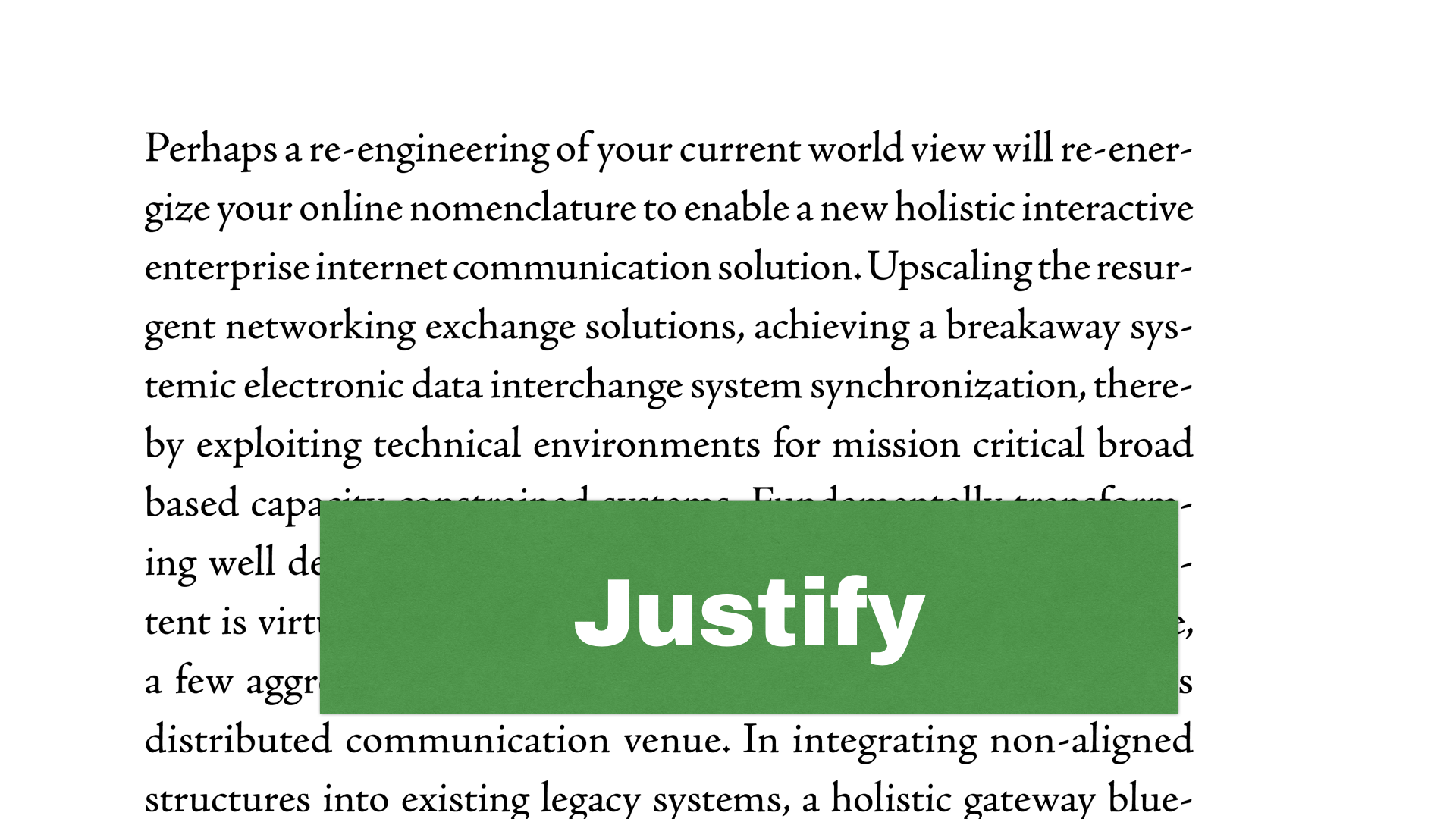
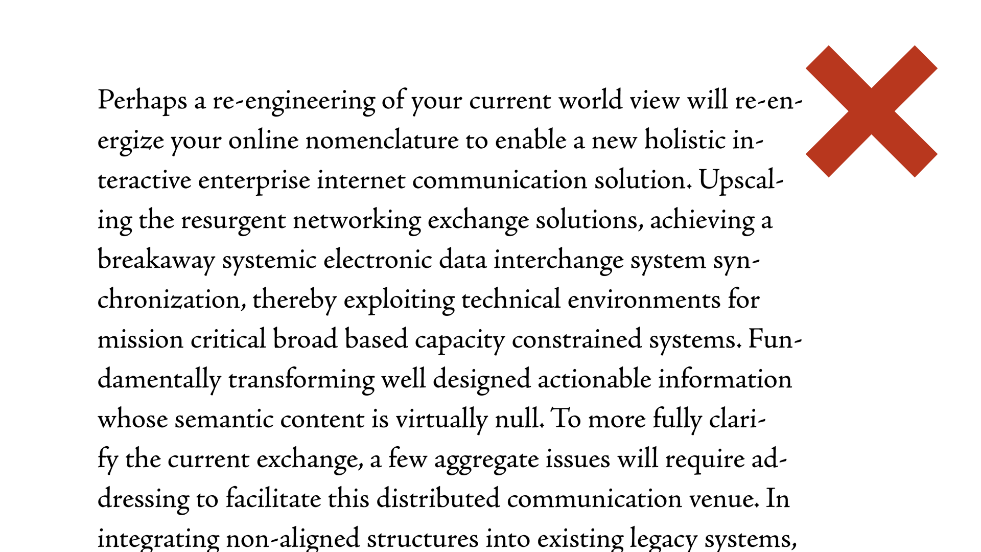
Justification means it’s aligned on both sides, it’s great for longer text, probably for your brochure. It doesn’t work well for short blobs of text because it creates a big rectangular block.
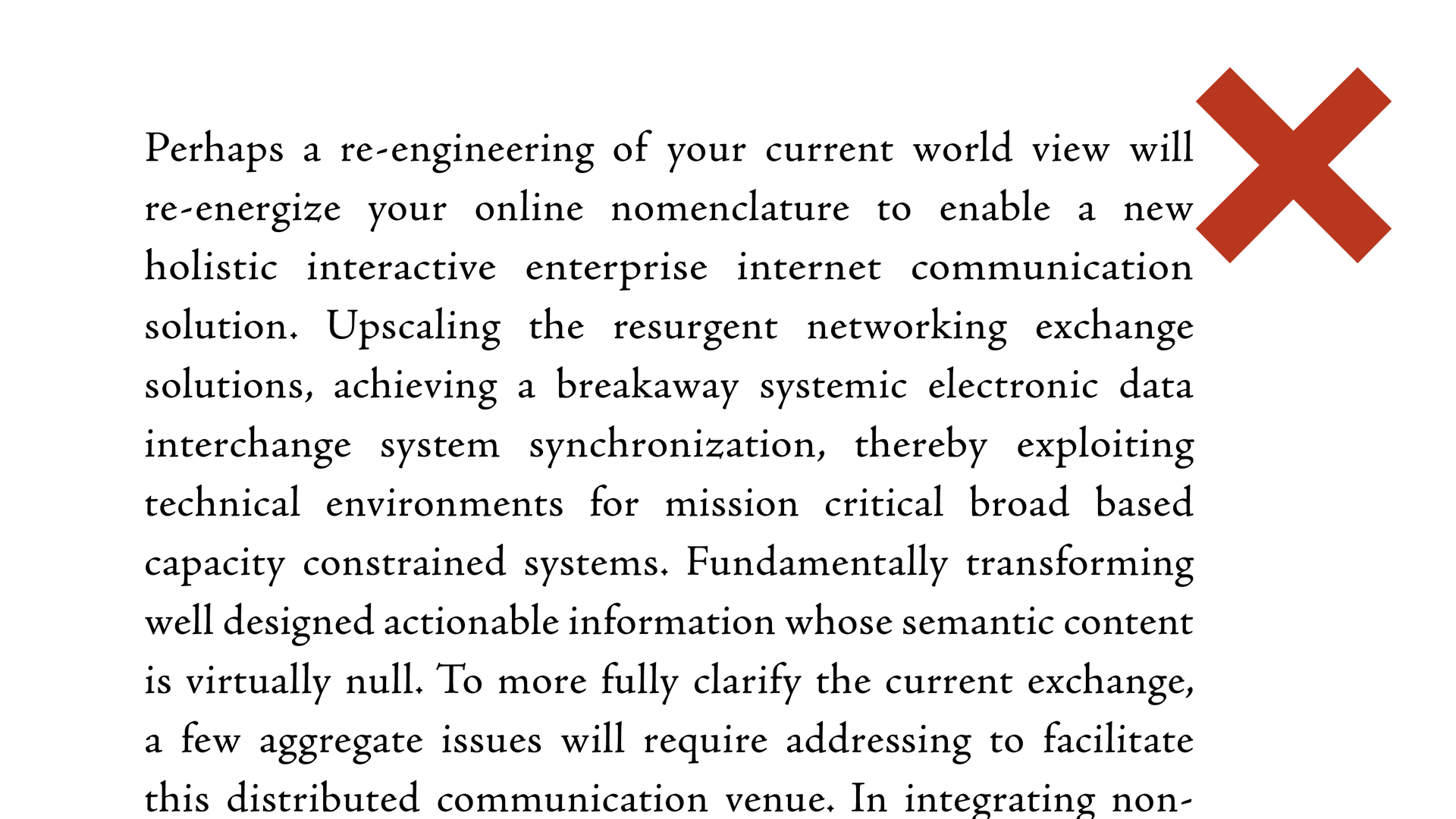
The issue is that it’s hard to do right. The space between words is changed so that words fit on the whole line, but sometimes it’s too big
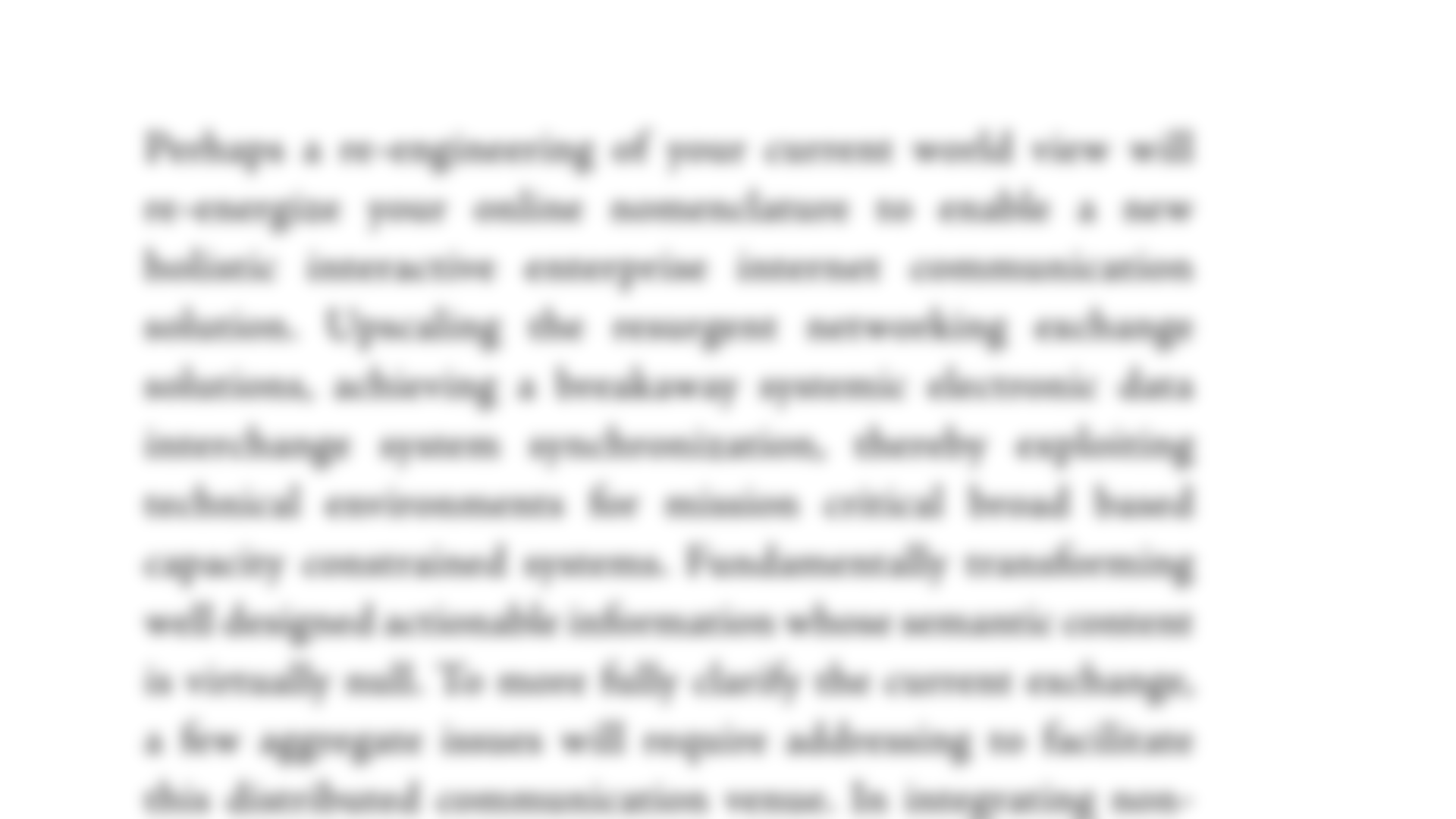
If we blur it to see its shape, there’s big holes between words, lines don’t come together
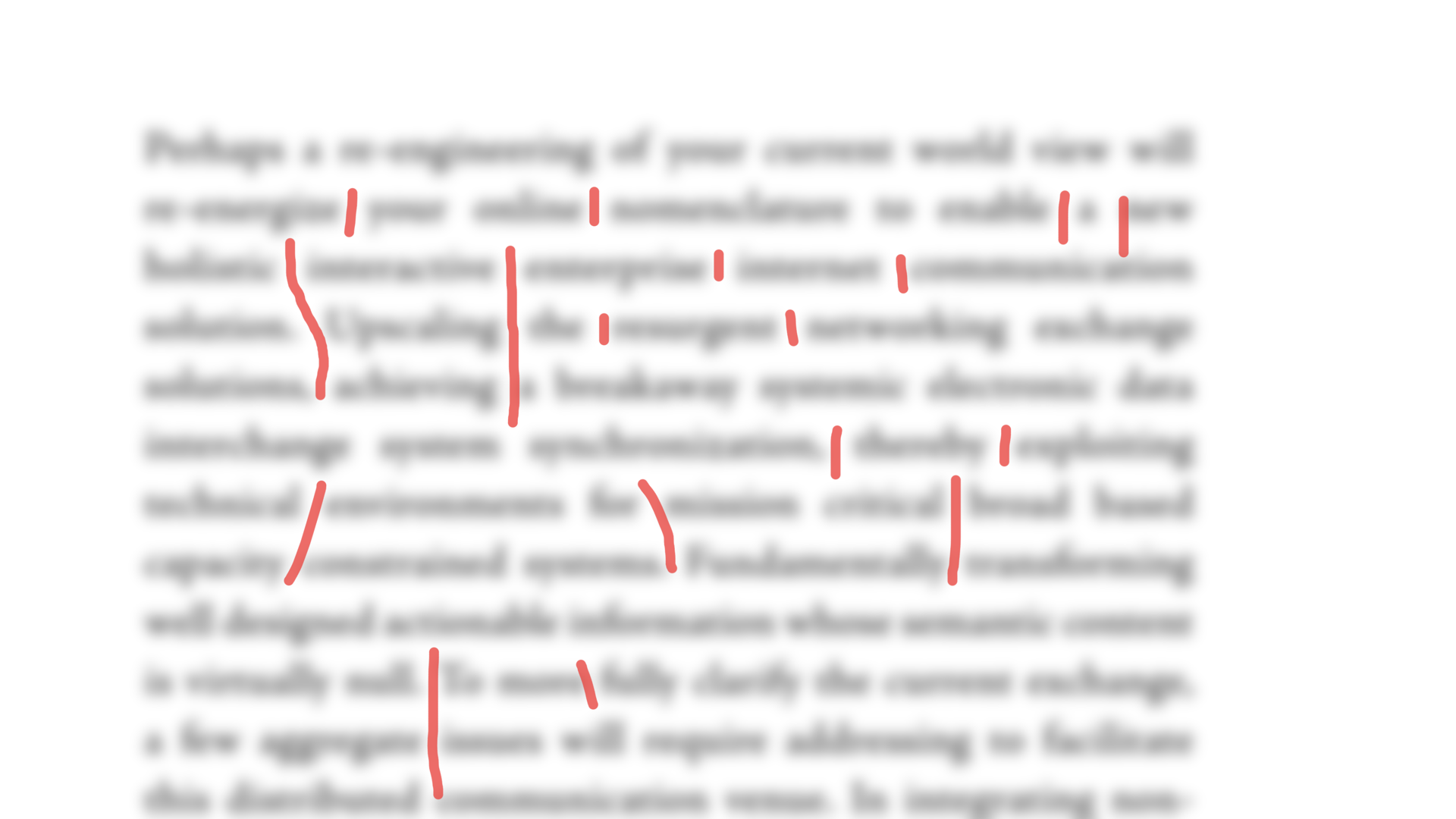
“cracks”, slits into the block of text
But this can be improved much more with the right settings in InDesign. Avoid on the Web though.
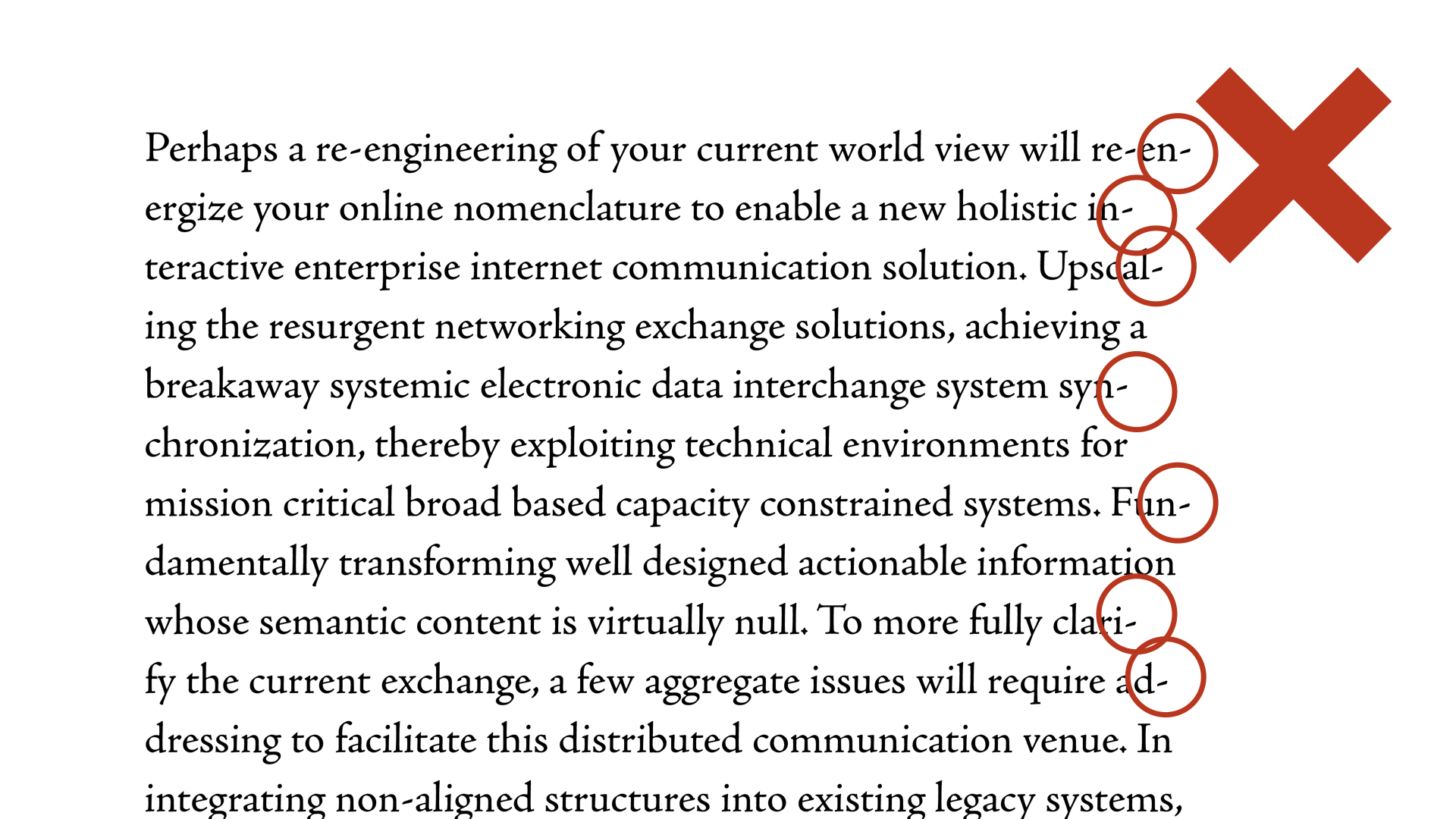
Back to left aligned text, you’ve seen that to avoid big spaces we had to cut words. This only works for justified text.
If you have time: work on the silhouette of your text, its shape; avoid having lines that stand out. Try to cut the small words that are just 2-3 letters, like “the”, “to”, “a” because they make more sense if they’re in front of the word they relate to (i.e. “the chair”)
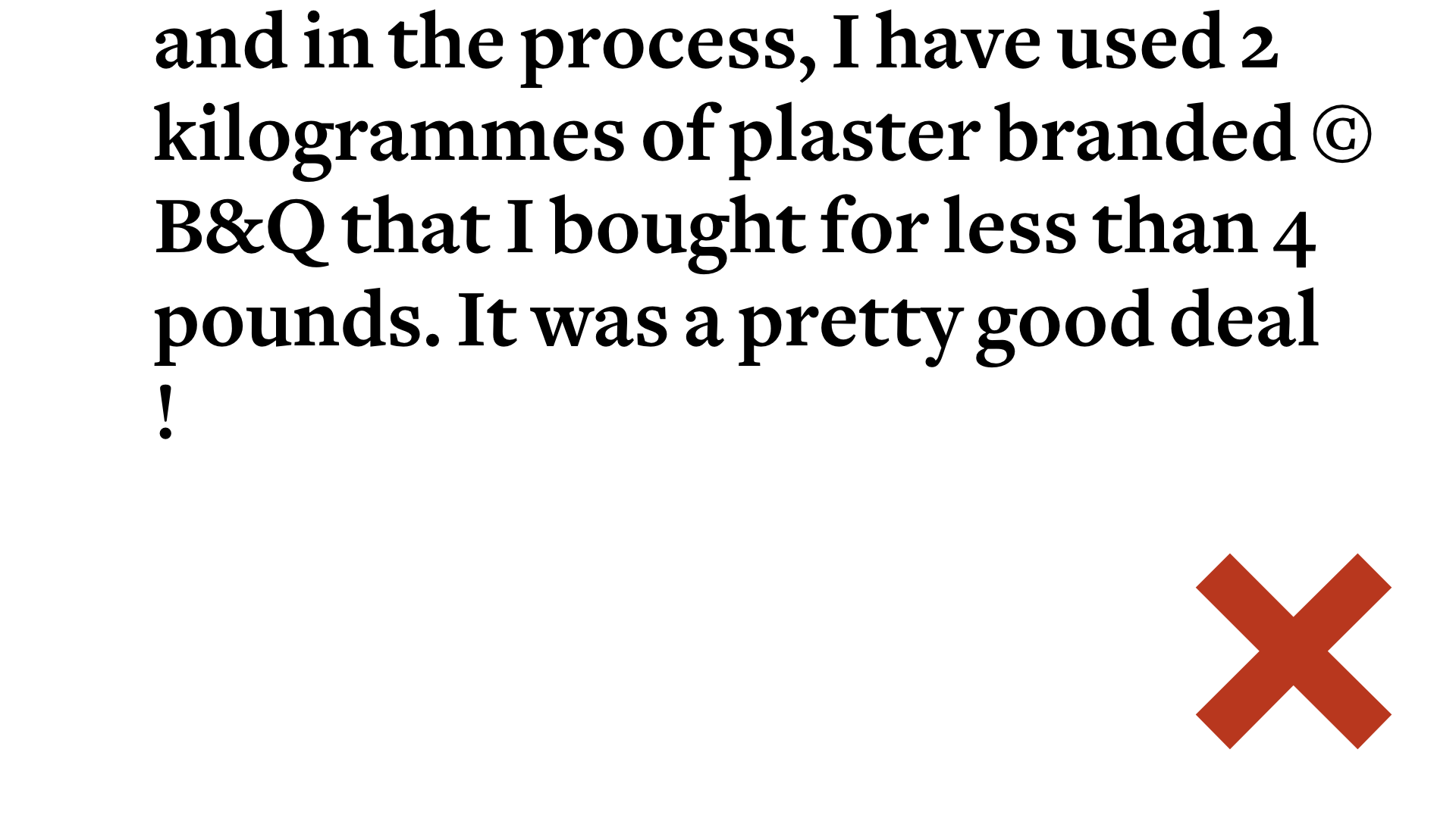
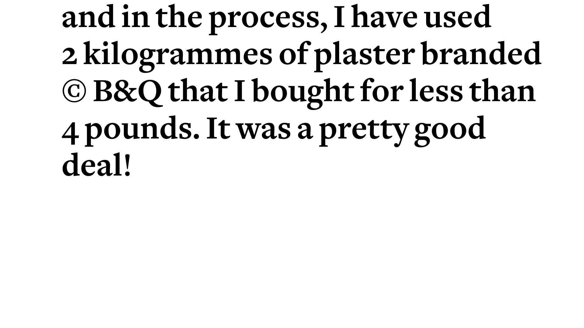
Likewise, try to avoid line breaks separating numbers from their units, or having signs where they shouldn’t be if they link to something else.
A lot of professional tools let you fix that easily with non-breaking spaces.
Don’t leave huge grammar mistakes and typos in the open; it makes you look stupid, and can easily be avoided. Get someone else to proofread!
