Installation
if (!"remotes" %in% installed.packages()) {
  install.packages("remotes")
}
remotes::install_github("thomas-neitmann/ggcharts")
Why ggcharts?
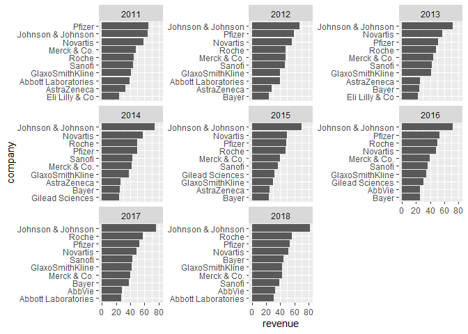
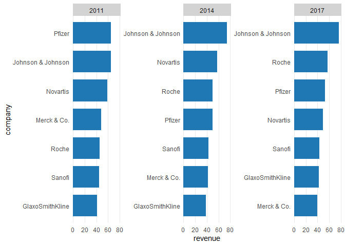
Thanks to ggplot2 you can create beautiful plots in R. However, it can often take quite a bit of effort to get from a data visualization idea to an actual plot. As an example, let's say you want to create a faceted bar chart displaying the top 10 within each facet ordered from highest to lowest. What sounds simple is actually pretty hard to achieve. Have a look:
library(dplyr)
library(ggplot2)
library(ggcharts)
data("biomedicalrevenue")

biomedicalrevenue %>%
  group_by(year) %>%
  top_n(10, revenue) %>%
  ungroup() %>%
  mutate(company = tidytext::reorder_within(company, revenue, year)) %>%
  ggplot(aes(company, revenue)) +
  geom_col() +
  coord_flip() +
  tidytext::scale_x_reordered() +
  facet_wrap(vars(year), scales = "free_y")
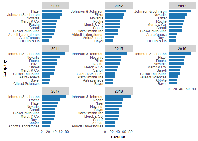
That's a lot of code! And you likely never heard of some of the functions involved. With ggcharts you can create the same plot (actually an even better looking one) in a single line of code.
bar_chart(biomedicalrevenue, company, revenue, facet = year, limit = 10)That's the beauty of ggcharts: shortening the distance between data visualization idea and actual plot as much as possible.
Usage
Basics
Let's start off by loading some data for plotting. ggcharts comes with the biomedicalrevenue dataset which contains annual revenues (in billion USD) of top biomedical companies from 2011 to 2018.
head(biomedicalrevenue, 10)## company year revenue
## 1 Johnson & Johnson 2018 81.60
## 2 Johnson & Johnson 2017 76.50
## 3 Johnson & Johnson 2016 71.89
## 4 Johnson & Johnson 2015 70.10
## 5 Johnson & Johnson 2014 74.30
## 6 Johnson & Johnson 2013 71.31
## 7 Johnson & Johnson 2012 67.20
## 8 Johnson & Johnson 2011 65.00
## 9 Roche 2018 56.86
## 10 Roche 2017 57.37
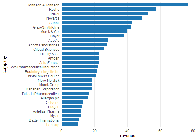
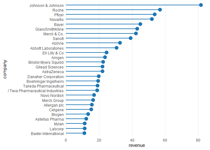
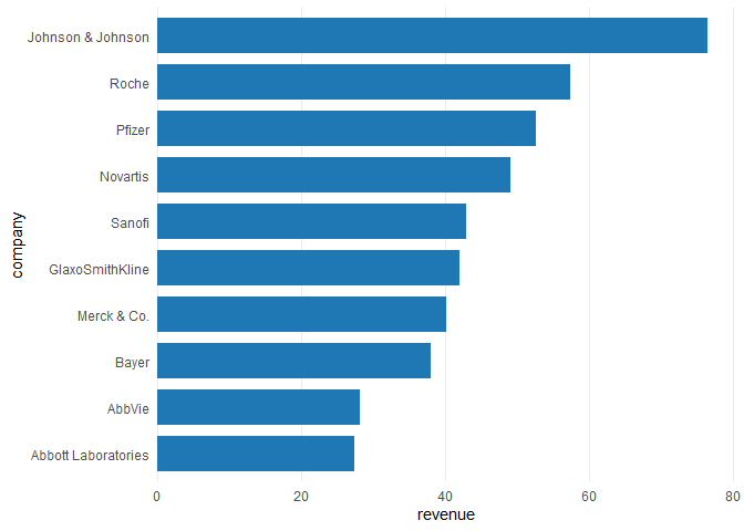
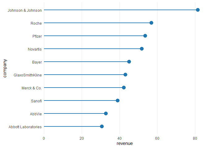
Now that we have our data let's create a basic bar_chart() and lollipop_chart().
biomedicalrevenue %>%
  filter(year == 2017) %>%
  bar_chart(company, revenue)

biomedicalrevenue %>%
  filter(year == 2018) %>%
  lollipop_chart(company, revenue)
From this little example you can already see some important features of ggcharts:
- the data is sorted prior to plotting without you having to take care of that; if that is not desireable set
sort = FALSE - the plot is horizontal by default; this can be changed by setting
horizontal = FALSE ggchartsusestheme_minimal()
Using the limit argument
The plots above contain data from all companies. What if you want to display only the top 10? That's easy, just set limit = 10.
biomedicalrevenue %>%
  filter(year == 2017) %>%
  bar_chart(company, revenue, limit = 10)

biomedicalrevenue %>%
  filter(year == 2018) %>%
  lollipop_chart(company, revenue, limit = 10)
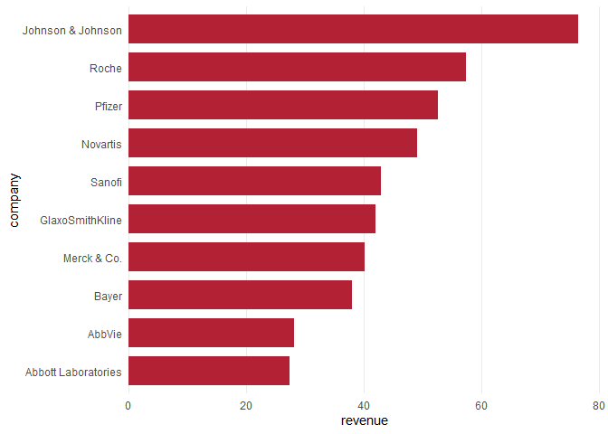
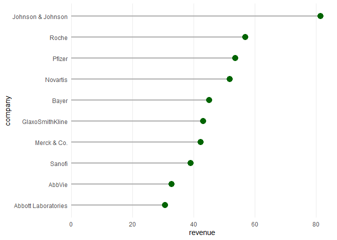
Changing colors
biomedicalrevenue %>%
  filter(year == 2017) %>%
  bar_chart(company, revenue, bar_color = "#b32134", limit = 10)

biomedicalrevenue %>%
  filter(year == 2018) %>%
  lollipop_chart(
    company, revenue,
    point_color = "darkgreen", line_color = "darkgray",
    limit = 10
  )
Highlighting
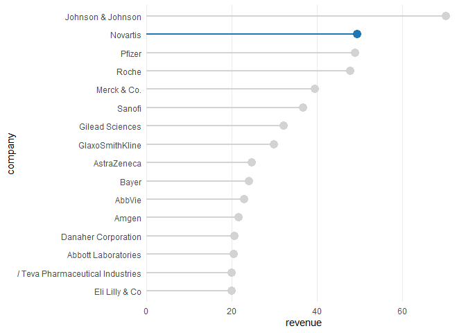
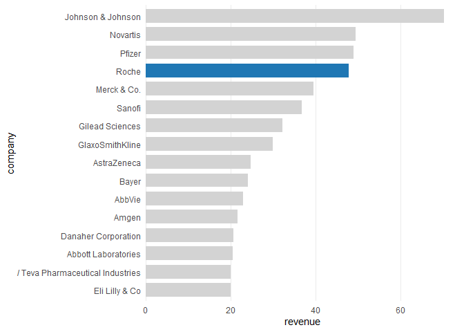
biomedicalrevenue %>%
  filter(year == 2015) %>%
  lollipop_chart(company, revenue, highlight = "Novartis", limit = 15)

biomedicalrevenue %>%
  filter(year == 2015) %>%
  bar_chart(company, revenue, highlight = "Roche", limit = 15)
Facetting
biomedicalrevenue %>%
  filter(year %in% c(2011, 2014, 2017)) %>%
  bar_chart(company, revenue, facet = year, limit = 7)