The purpose of creating this project is to sharpen my coding skill.
In this file I'm going to tell you everything, starting from tools that I used, and much more.
That's it for the introduction and happy reading!
My challenge is to build out this multi-page website and get it looking as close to the design as possible.
The users should be able to:
- View the optimal layout for each page depending on their device's screen size
- See hover states for all interactive elements throughout the site
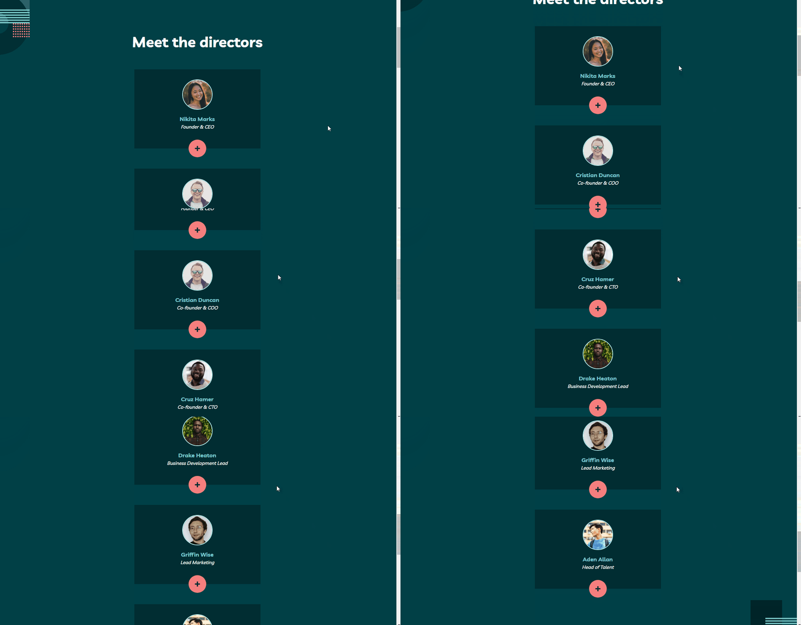
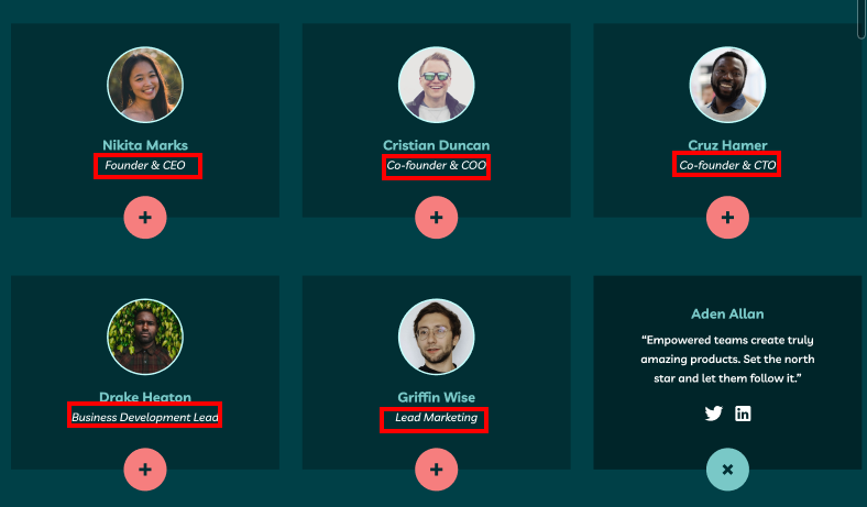
- See the correct content for each team member on the About page when the + icon is clicked
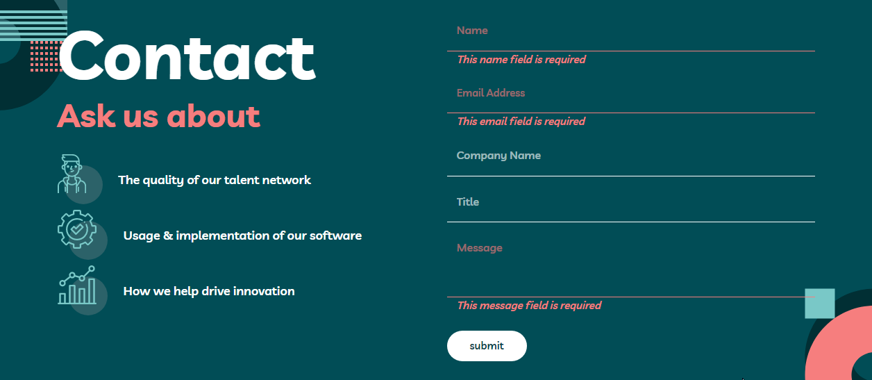
- Receive an error message when the contact form is submitted if:
- The Name, Email Address or Message fields are empty should show "This field is required"
- The Email Address is not formatted correctly should show "Please use a valid email address"
- See visible focus states for interactive elements when navigating by keyboard
- Understand and be able to navigate page content while using assistive technology
- Access the website without JavaScript
- HTML Semantic Tags
- BEM (Block, Element, Modifier)
- Sass
- JavaScript
- CSS Flexbox
- CSS Grid
- Modern CSS such as:
clamp(), custom properties (variables), etc. - Mobile-first workflow
- No-motion first approach
- instant.page - preload pages with
<link rel="prefetch" href="url">only when the users interact with the link. - scriptex/hover-media-query - a progressively enhanced "hover" media query.
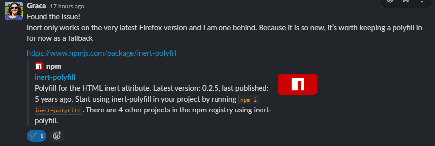
- GoogleChrome/inert-polyfill - polyfill for the HTML inert attribute.
This was the first time that I created a hamburger menu. So, I looked up Inclusive Components to help me create accessible menu component.
Here is the HTML markup.
<nav aria-labelledby="primary-navigation">
  <p id="primary-navigation" hidden>primary</p>
  <button
    type="button"
    aria-expanded="false"
    aria-controls="menu-list"
    aria-labelledby="menu-button-label"
  >
    <span id="menu-button-label" hidden>menu</span>
    <img
      src="/svg/icon-hamburger.svg"
      alt=""
      width="20"
      height="17"
      aria-hidden="true"
    />
  </button>
  <ul id="menu-list">
    <li>
      <a href="/">home</a>
    </li>
    <li>
      <a href="/about.html">about</a>
    </li>
    <li>
      <a href="/contact.html">contact us</a>
    </li>
  </ul>
  <button
    type="button"
    aria-expanded="true"
    aria-controls="menu-list"
    aria-labelledby="close-menu-button-label"
  >
    <span id="close-menu-button-label" hidden>close menu</span>
    <img
      src="/svg/icon-close.svg"
      alt=""
      width="18"
      height="17"
      aria-hidden="true"
    />
  </button>
</nav>
Let's discuss the HTML chunk by chunk.
The first chunk is this.
<nav aria-labelledby="primary-navigation">
  <p id="primary-navigation" hidden>primary</p>
</nav>
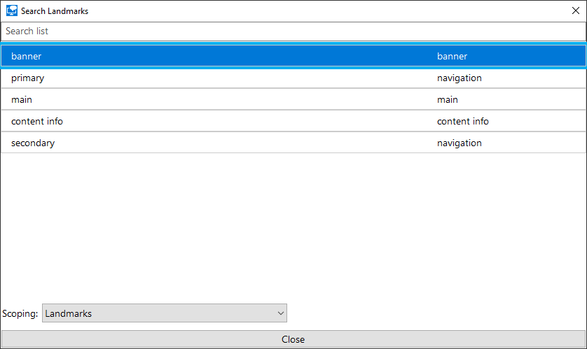
I label the nav because there are two nav elements.
This way, the screen reader users can differentiate them.
Why do I choose this technique to label the nav? It's because the translation API can translate the word primary and secondary. If I use aria-label then those labels probably won't get translated. But, I am not sure that translation API be able to translate hidden text. 😅
I needed to use aria-labelledby so that it can get the text content even though the p has hidden attribute.
Next, let me explain the hamburger menu button.
<button
  type="button"
  aria-expanded="false"
  aria-controls="menu-list"
  aria-labelledby="menu-button-label"
>
  <span id="menu-button-label" hidden>menu</span>
  <img
    src="/svg/icon-hamburger.svg"
    alt=""
    width="20"
    height="17"
    aria-hidden="true"
  />
</button>
Here are the reasons why the HTML markup needs to be like that.
button- to tell everyone that it is a button or an interactive element. As a side note, don't use non-interactive elements for something that has interactivity.type="button"- to prevent unexpected behavior. Reference: Checklist - The A11Y Project #use-the-button-element-for-buttonsaria-expanded- to tell the screen readers whether thebuttonis in "expanded" state or "collapsed" state. Or in other words, it is used to tell the screen reader whether the menu is opened or closed.aria-controls- to tell that this button is controlling the menu (ul).aria-labelledby- to give thebuttonan accessible name (menu). It's the same way as labeling thenavelements.
Lastly, for the close button.
<button
  type="button"
  aria-expanded="true"
  aria-controls="menu-list"
  aria-labelledby="close-menu-button-label"
>
  <span id="close-menu-button-label" hidden>close menu</span>
  <img
    src="/svg/icon-close.svg"
    alt=""
    width="18"
    height="17"
    aria-hidden="true"
  />
</button>
It's similar to the hamburger menu button.
button- to tell everyone that it is a button.type="button"- to prevent unexpected behavior.aria-expanded="true"- the close button is only available when the menu is opened. So, it always hastruevalue.aria-controls- to tell that this button is controlling the menu (ul).aria-labelledby- to give thebuttonan accessible name (close menu).
Then, for the JavaScript.
- Toggle the
aria-expandedstate of the hamburger menu button. - Toggle a CSS class on the
bodyfor the dark overlay (with pseudo-element) and prevent scrolling. - Trap the focus on the menu list by adding an
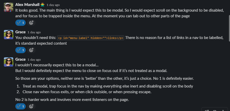
inertattribute to themain,footer, and other links in theheaderthat are outside the menu list. Otherwise, the users can navigate outside the menu either by using a screen reader or a keyboard (Tabkey).
- Friday, 21 October 2022 - VoiceOver doesn't pronounce the state of the hamburger menu. It's because the button is labeled using
aria-labelledby. So, I use visually hidden label instead (<span class="sr-only">menu</span>).
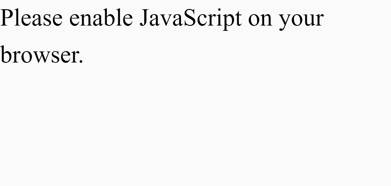
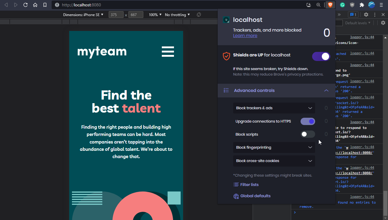
Usually, when the users turn off the JavaScript, I decided to give them only a message to turn on JavaScript.
Now, I try a different approach. I try to do the progressive enhancement. So, instead of telling the users to turn on JavaScript, I decided to provide a way for users to interact with the site without JavaScript.
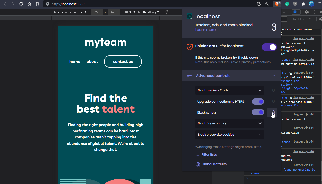
It only affects mobile users. So, when JavaScript is on they will get the hamburger menu.
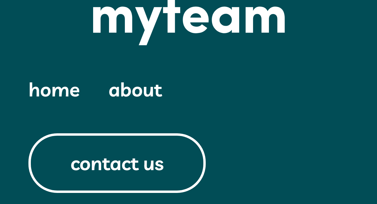
JavaScript off, the users will get horizontal menu.
By the way, it also fixes the hamburger menu issue that I mentioned. At 400% zoom level the users can access all the links easily.
So, by turning off JavaScript, the site becomes more accessible. 😆
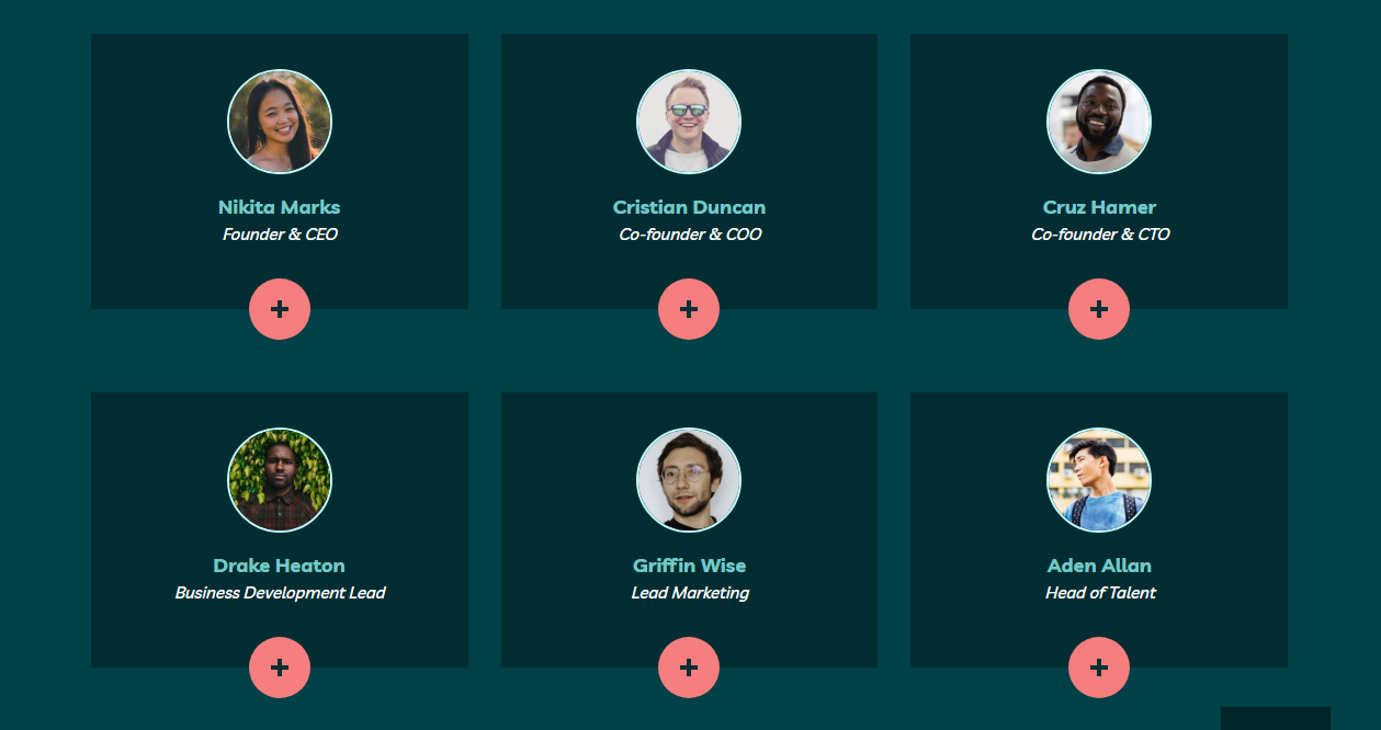
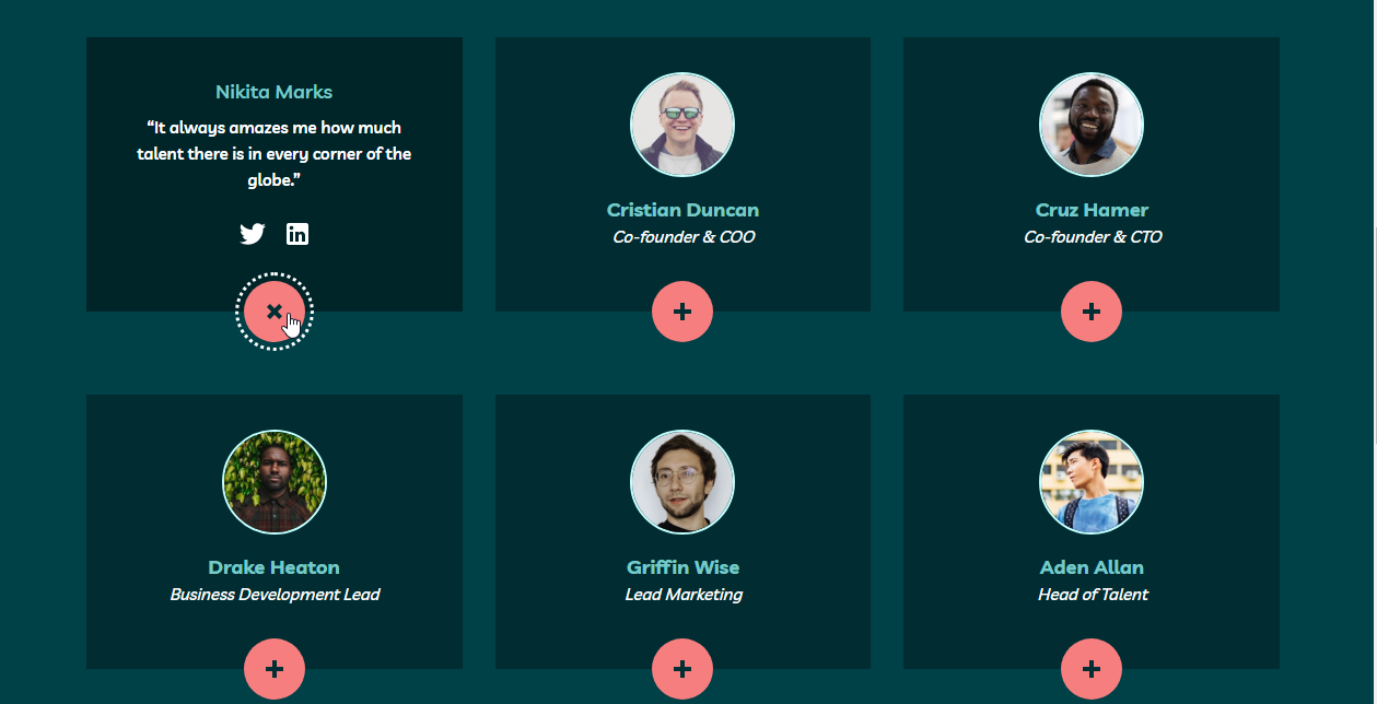
These cards need JavaScript to toggle the hidden content.
When you click the button, it opens the hidden content for the card.
When JavaScript is off, the users still be able to see the whole content.
When JavaScript is available, use custom form validation.
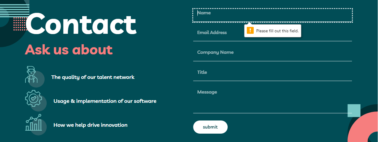
When JavaScript is not available, use native validation.
This was done by adding novalidate attribute to the form with JavaScript. This way, when JavaScript is not available the users will get native form validation instead.
Those cards are aligned with CSS Grid. It's responsive without media queries.
How does it work?
Here is the code snippet.
.grid {
  display: grid;
  grid-template-columns: repeat(auto-fit, minmax(min(17.5rem, 100%), 1fr));
  gap: 4.75rem 1.875rem;
}
I can use Flexbox for this type of layout. I use grid for that particular layout because of the magic function, minmax.
The minmax function allows me to set a minimum value and a maximum value for the size of each column. It also has a nested min function. The purpose of that is to allow the content to shrink on tiny devices. So, if the content needs to be smaller than 17.5rem, then the element is allowed to shrink based on the width of the parent element.
The 1fr is the maximum allowed size for the column. It means those cards will take the remaining space and then divide them equally into each column.
As a result, the column is automatically created once there's enough space. Starting from the mobile view, the users will get a one-column layout. Then as the screen is getting larger, the users get a two-column layout which finally becomes a three-column layout.
All of these things are done without media queries. I love it! 😍
The support for CSS Grid is around 96% by the time I write this. But, based on the analytics that I had on Heroku (my account is now deleted), some people view my website on Windows XP.
If those users are using Chromium browsers (Chromium v49), they won't be able to see the grid layout. So, I want to provide them with a good baseline experience (or minimum viable experience).
So for the browsers that don't support the @supports keyword and display: grid attribute, those browsers will apply this styling instead.
.grid > * + * {
  margin-top: 4rem;
}

.grid > * {
  margin-right: auto;
  margin-left: auto;
  max-width: 25rem;
}
Those users will get a one-column layout with max-width: 25rem. Also, some vertical spacing for each child element that has a sibling element.
I start knowing about web performance after watching some of the Harry Roberts talks. Here are some of his talks that I love.
- Harry Roberts - Get Your "head" Straight - Youtube
- FaCSSt: CSS & Performance. Harry Roberts. JS Fest 2018 - Youtube
- Harry Roberts - Why Fast Matters - Youtube
But, before you start watching them, I want to tell you how I optimize the performance of my site.
So, it's about Google Fonts. The site is using the "Livvic" font family. The site is required three different font weights, 700, 600, and 500.
The problem is the 500 font-weight is only used on a very little amount of content.
On the home page, it is used only on the highlighted content.
The same goes for the about page.
It is not used on the contact page.
So, I don't want my users to download another woff2 for almost nothing. I decided to use the Google Fonts CSS API. I used the text= URL parameter to input all the necessary text.
Reference: CSS API update | Google Fonts | Google Developers #optimizing_your_font_requests
There's no way to automate the process of typing all the text, so I typed all the text. Then, URL-encode those text using "Url Encoder - Online Tool".
Here's the URL.
Here's the result.
@font-face {
  font-family: 'Livvic';
  font-style: normal;
  font-weight: 500;
  font-display: swap;
  src: url(https://fonts.gstatic.com/l/font?kit=rnCq-x1S2hzjrlffm8Aet0_ead7nGzxFWtYxzI2kkH8XNeA2bF0mfE_6&skey=1ce7eacc326b4a17&v=v13) format('woff2');
}
Then, I decided to download the font file. The file size is only 6.25kb. If I import it normally the file size can be 39kb. So, it means that I managed to reduce the file size up to 80%.
- Menus & Menu Buttons | Inclusive Components - This is an amazing article that helped me create an accessible menu component. I'd recommend it to anyone that doing this challenge (or any other challenges that need a hamburger menu).
- Create a responsive grid layout - Piccalilli - This article is helping me to create a responsive grid layout without media queries. It also teaches me how to progressively enhance the CSS Grid. I recommend you read this to level up your CSS Grid!
- Frontend Mentor - @vanzasetia
- Twitter - @vanzasetia
- Code Newbie - @vanzasetia
- Want to see me on other platforms? Check my linktree!
Grace Snow and Alex Marshall helped me make the accessible menu component. They told me that the users should only be able to focus on the element inside the navigation.
Grace Snow also helped me test the menu with the VoiceOver screen reader.
Grace Snow told me about inert attribute and told me to add polyfill for inert attribute (since it is relatively new in October 2022).
Grace Snow told me about how list items and article can create unnecessary noises to screen reader users.
Grace Snow told me about capitalization can impact the way screen reader pronounces text.
Thank you both for helping me!
You can check out the full license
See the documentation.
