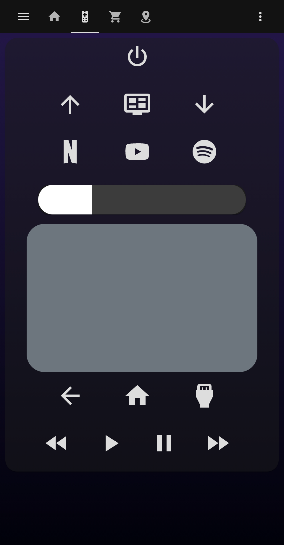
📦 This repo is a fork of tv-card and includes a bunch of new features and improvements, like:
- Fully functional touchpad for navigation (thanks to iablon's Touchpad Card) ❤️
- Slider for volume (thanks to AnthonMS's Slider Card) ❤️
- Supports ollo69's SamsungTV Smart Component
- Much easier setup
- Implements haptics feedback
- Customizable layout, you can choose the order of the rows and buttons
- All rows and buttons are optional, you can change whatever you (don't) like
| Name | Type | Requirement | Description |
|---|---|---|---|
| type | string | Required | custom:tv-card |
| entity | string | Required | The media_player entity to control |
| title | string | Optional | Card title for showing as header |
| enable_double_click | boolean | Optional | Whether a double click on the touchpad should send the key in double_click_keycode. Defaults to true. |
| double_click_keycode | string | Optional | The key for double clicks on the touchpad. Defaults to KEY_RETURN |
| enable_button_feedback | boolean | Optional | Shall clicks on the buttons return a vibration feedback? Defaults to true. |
| enable_slider_feedback | boolean | Optional | Shall the volume slider return a vibration feedback when you slide through it? Defaults to true. |
| slider_config | object | Optional | Custom configuration for the volume slider. See slider-card |
| custom_keys | object | Optional | Custom keys for the remote control. Each item is an object that should have icon and at least one of the following properties: key, source, service. |
| custom_sources | object | Optional | Custom sources for the remote control. Same object as above, but letting you split keys and sources. |
Using only these options you will get an empty card (or almost empty, if you set a title). In order to include the buttons, you need to specify in the config the rows you want and which buttons you want in it. You do it by declaring the rows as arrays and its buttons as values, like this:
power_row:
  - power
media_control_row:
  - rewind
  - play
  - pause
  - fast_forward
The available rows are power_row, channel_row, apps_row, source_row and media_control_row
There also volume_row and navigation_row, but these requires a string as value.
| Name | Type | Description |
|---|---|---|
| volume_row | string | Can be either slider or buttons. This defines the mode you want for setting the volume (you'll see them soon below). You need to have slider-card installed in order to use slider. |
| navigation_row | string | Can be either touchpad or buttons. This defines the mode you want for navigating around your tv (you'll also see them soon below). |
This card uses media_player.play_media to send keys to the TV.
This is the way ollo69's SamsungTV Smart Component (which i based this card on) works, but don't worry: if your TV is from another brand or simply the TV integration does not use media_player.play_media for sending keys, you can still use this card by setting custom buttons with services to send keys to your TV (or do whatever you want) in your way (just like the original tv-card).
If you want to add custom buttons to the remote control (of if you want to reconfigure the existing buttons), you can do it by adding an object to the custom_keys option:
custom_keys:
  input_tv:
    icon: mdi:television-box
    key: KEY_TV
  browser:
    icon: mdi:web
    source: browser
  toggle_light:
    icon: mdi:lightbulb
    service: light.toggle
    service_data:
      entity_id: light.bedroom
The custom_sources exists for the same purpose, but you can use it to split the keys and sources.
custom_keys:
  input_tv:
    icon: mdi:television-box
    key: KEY_TV
  toggle_light:
    icon: mdi:lightbulb
    service: light.toggle
    service_data:
      entity_id: light.bedroom
custom_sources:
  browser:
    icon: mdi:web
    source: browser
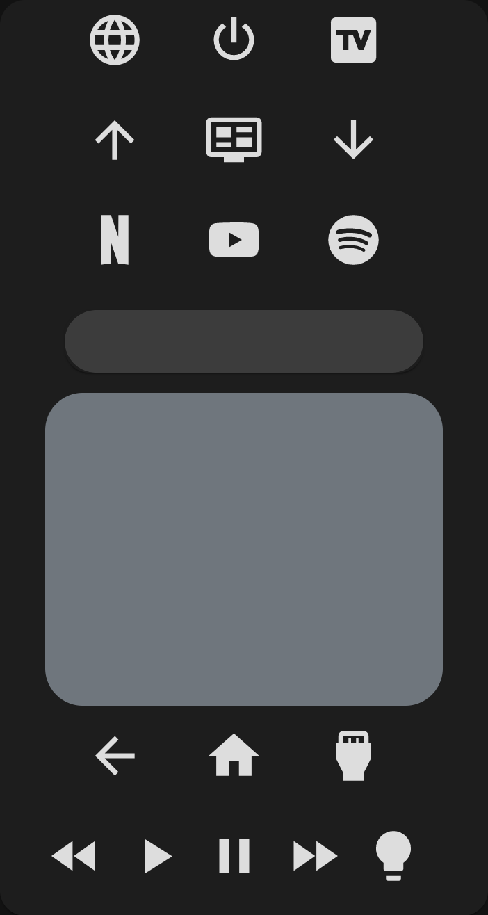
Then you can easily use these buttons in your card:
power_row:
  - browser
  - power
  - input_tv
media_control_row:
  - rewind
  - play
  - pause
  - fast_forward
  - toggle_light
With custom buttons you can override existing buttons for changing its icon or even its functionality. Here i do both:
custom_keys:
  power:
    icon: mdi:power-cycle
    service: media_player.toggle
    service_data:
      entity_id: media_player.tv
Inside each button you may define icon and either key, source or service, as you've seen.
| Option | internal function | Description |
|---|---|---|
| icon | The icon to show in the button. If empty, the button will be blank. | |
| key | media_player.play_media(media_content_id=key, media_content_type="send_key") |
The key to send to the TV via media_player.play_media |
| source | media_player.select_source(source=source) |
The source to switch to via media_player.select_source |
| service | _hass.callService(domain, service, service_data) |
A string representing service to call. Use the format domain.service, e.g. "light.turn_on" |
| service_data | passed with service |
The data to pass to the service. May be an object depending on the service you are using. |
You can customize any icon with a custom svg path using the custom_icons option.
Usage:
custom_icons:
  <button>: <svg_path>
Example:
custom_icons:
  hbo: >-
    M7.042 16.896H4.414v-3.754H2.708v3.754H.01L0
    7.22h2.708v3.6h1.706v-3.6h2.628zm12.043.046C21.795 16.94 24 14.689 24
    11.978a4.89 4.89 0 0 0-4.915-4.92c-2.707-.002-4.09 1.991-4.432
    2.795.003-1.207-1.187-2.632-2.58-2.634H7.59v9.674l4.181.001c1.686 0
    2.886-1.46 2.888-2.713.385.788 1.72 2.762 4.427 2.76zm-7.665-3.936c.387 0
    .692.382.692.817 0 .435-.305.817-.692.817h-1.33v-1.634zm.005-3.633c.387 0
    .692.382.692.817 0 .436-.305.818-.692.818h-1.33V9.373zm1.77
    2.607c.305-.039.813-.387.992-.61-.063.276-.068 1.074.006
    1.35-.204-.314-.688-.701-.998-.74zm3.43 0a2.462 2.462 0 1 1 4.924 0 2.462
    2.462 0 0 1-4.925 0zm2.462 1.936a1.936 1.936 0 1 0 0-3.872 1.936 1.936 0 0 0
    0 3.872Z
The svg path was copied from SimpleIcon. Although you can use this integration for using icons from SimpleIcons (there's also one for fontawesome).
Having defined the custom icon, you can use it on any custom button:
custom_sources:
  hbomax:
    icon: hbo
source: HBO MaxInstall using HACS or see this guide.
Add a custom element in your ui-lovelace.yaml
      - type: custom:tv-card
        entity: media_player.tv
        power_row:
          - power
        channel_row:
          - channel_up
          - info
          - channel_down
        apps_row:
          - netflix
          - youtube
          - spotify
        volume_row: slider
        navigation_row: touchpad
        source_row:
          - return
          - home
          - source
        media_control_row:
          - rewind
          - play
          - pause
- fast_forwardPlaying with order, moving and repeating buttons:
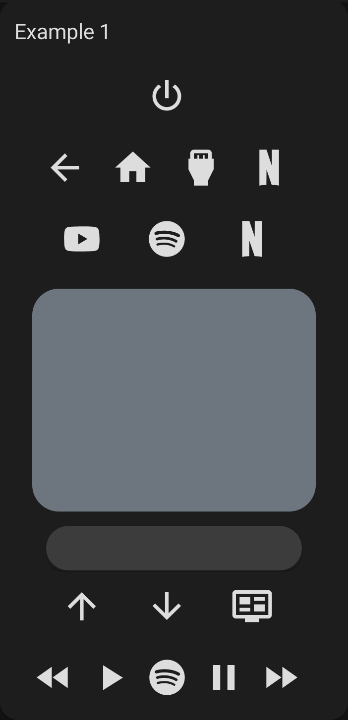
type: custom:tv-card
entity: media_player.tv
title: Example 1
power_row:
  - power
source_row:
  - return
  - home
  - source
  - netflix
apps_row:
  - youtube
  - spotify
  - netflix
navigation_row: touchpad
volume_row: slider
channel_row:
  - channel_up
  - channel_down
  - info
media_control_row:
  - rewind
  - play
  - spotify
  - pause
  - fast_forward
Result:
Buttons, buttons everywhere!
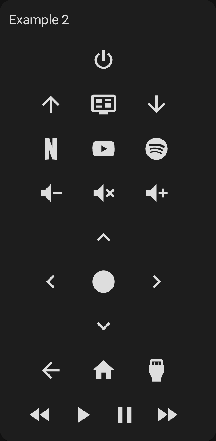
type: custom:tv-card
entity: media_player.tv
title: Example 2
power_row:
  - power
channel_row:
  - channel_up
  - info
  - channel_down
apps_row:
  - netflix
  - youtube
  - spotify
volume_row: buttons
navigation_row: buttons
source_row:
  - return
  - home
  - source
media_control_row:
  - rewind
  - play
  - pause
  - fast_forward
Result:
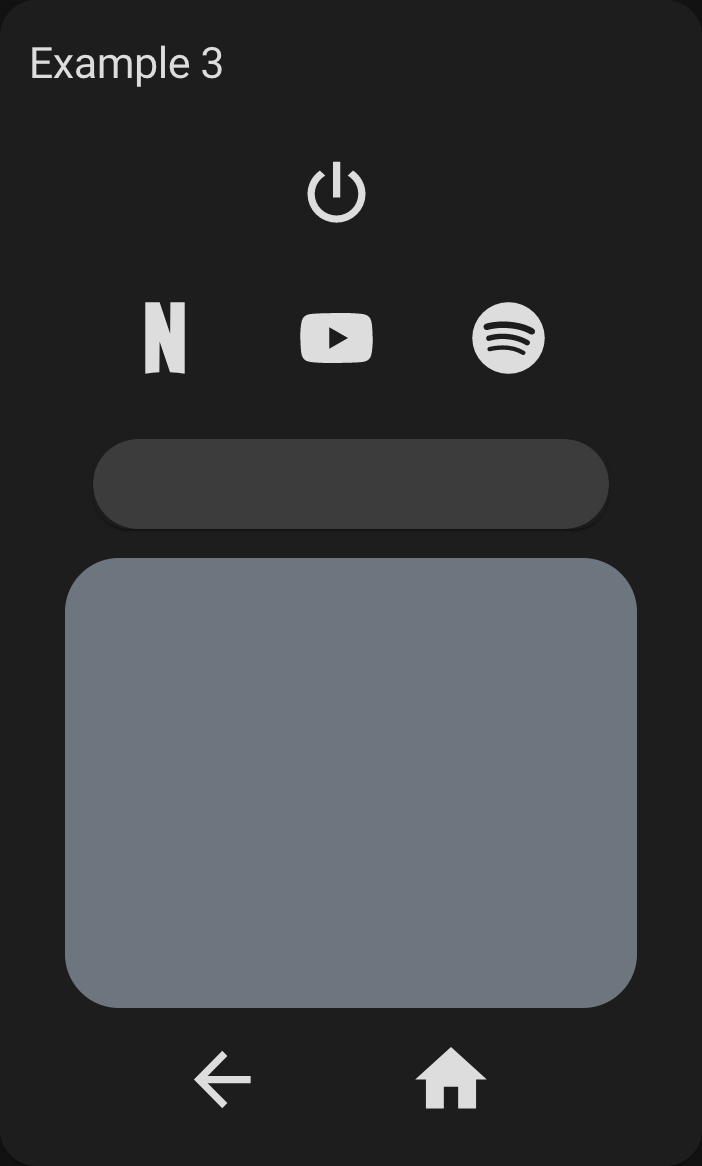
Using less
type: custom:tv-card
entity: media_player.tv
title: Example 3
power_row:
  - power
apps_row:
  - netflix
  - youtube
  - spotify
volume_row: slider
navigation_row: touchpad
source_row:
  - return
  - home
Result:
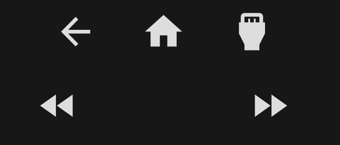
In any row, if you add an ampty item, there will be an empty/invisible button filling the space:
source_row:
  - return
  - home
  - source
media_control_row:
  - rewind
  -
  -
  - fast-forward


