This project attempts to simplify the process of extracting meaningful aggregate data from Experience API statements. It is composed of two parts. The first part, the Collection class, allows developers to run SQL-like queries, filters, and aggregations over xAPI data. The second part, the XAPIDashboard class, can generate numerous types of charts and visualizations based on that aggregated xAPI data.
If you'd rather learn by reference, we have a set of live demos at this repo's Github.io page.
Generating your first chart is easy. First, include the libraries:
<link rel="stylesheet" href="lib/nv.d3.css"></link>
<script type="text/javascript" src="dist/xapidashboard.min.js"></script>
<script type="text/javascript" src="dist/xapicollection.min.js"></script>
Next, you should fetch your data from an LRS. You can either retrieve them yourself, or use the convenience function provided by the dashboard object:
var wrapper = ADL.XAPIWrapper;
wrapper.changeConfig({"endpoint" : 'https://lrs.adlnet.gov/xAPI/'});
var dash = new ADL.XAPIDashboard();

window.onload = function(){
	// get all statements made in the last two weeks
	var query = {'since': new Date(Date.now() - 1000*60*60*24*30).toISOString()};
	dash.fetchAllStatements(query, fetchDoneCallback);
};
Now that your data is loaded, the real magic happens:
function fetchDoneCallback(){
	var chart = dash.createBarChart({
		container: '#graphContainer svg',
		groupBy: 'verb.id',
		aggregate: ADL.count(),
		customize: function(chart){
			chart.xAxis.rotateLabels(45);
			chart.xAxis.tickFormat(function(d){ return /[^\/]+$/.exec(d)[0]; });
		}
	});
	chart.draw();
}
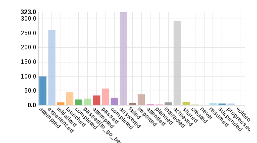
This generates a bar graph (dash.createBarChart), places it in a particular place in the DOM
('#graphContainer svg'), and populates it with your previously fetched data. Each bar
corresponds with a unique value of a specified section in the statements (in this example,
groupBy: 'verb.id'), and each bar's height is the number of statements with that value
(e.g. aggregate: ADL.count()).
An additional customize function is specified to format the graph labels. The customization
is all done via the NVD3 chart library. In this case, we tilt the labels 45 degress so they don't
overlap, and since we don't want the full verb id URIs, we strip off everything before the last
slash.
Finally, once the chart is configured, we call the draw() function to actually render the graph
to the document.
After all that effort, the final result was worth it:
It's still not perfect though. It would be nice if the bars were sorted by height. This is simple to do using the provided Collection methods.
This package includes the ADL.Collection object, a powerful statement processor. It comes in two forms, ADL.CollectionSync and ADL.CollectionAsync. They have the same API, and their usage is simple. Just load your statements into it automatically like we did above:
dash.fetchAllStatements(query, callback);Or manually:
var ret = ADL.XAPIWrapper.getStatements(...);
var statements = new ADL.Collection(ret.statements);
You can then run filters on the statements to produce useful and interesting summaries. For example, to get the list of activities performed in the set of statements, you could run:
var activities = statements
	// remove statements with duplicate object ids
	.groupBy('object.id')
	// and then pick out the ids
	.select('group');

// run the query, and what do you get?
activities.exec(function(data){
	console.log(data);
});
>>> [{group: 'act_id1'}, {group: 'act_id2'}]
And if you wanted a list of the top 10 highest-scoring actors, you could run:
var actors = statements
	// take all the statements for each actor
	.groupBy('actor.name')
	// get their best score
	.max('result.score.raw')
	// then sort the actors by those scores, high to low
	.orderBy('max', 'descending')
	// pick out only the first (highest) 10 scorers
	.slice(0,10)
	// and discard all the parts of the statements you won't be using
	.select('group, max');

// run the query, and what do you get?
actors.exec(function(data){
	console.log(data);
});
>>>
[{'group': 'James Bond', 'max': 94},
 {'group': 'Dr. No',     'max': 88},
 ...
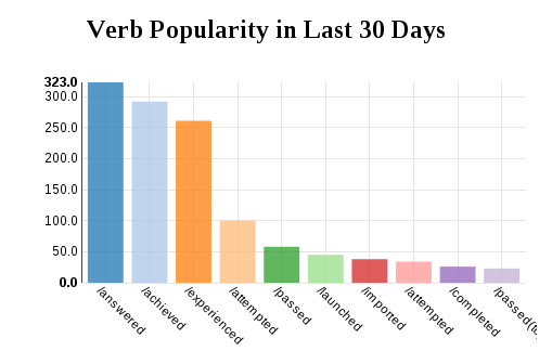
]So to finish our chart, we want to sort the bars by height, and for good measure limit the number
of bars to 10. We can do all of this by providing a post-format hook to our createBarChart call:
var chart = dash.createBarChart({
	container: '#graphContainer svg',
	groupBy: 'verb.id',
	post: function(data){
		data.orderBy('result.count', 'descending')
			.slice(0,10);
	},
	customize: function(chart){
		chart.xAxis.rotateLabels(45);
		chart.xAxis.tickFormat(function(d){ return /\/[^\/]+$/.exec(d)[0]; });
	}
});
chart.draw();
This function performs custom processing on the data before it is presented to the charting
software. First we sort the data by the result.count field, then filter the set down to 10
elements.
Throw a header on there, and we get this final result:

