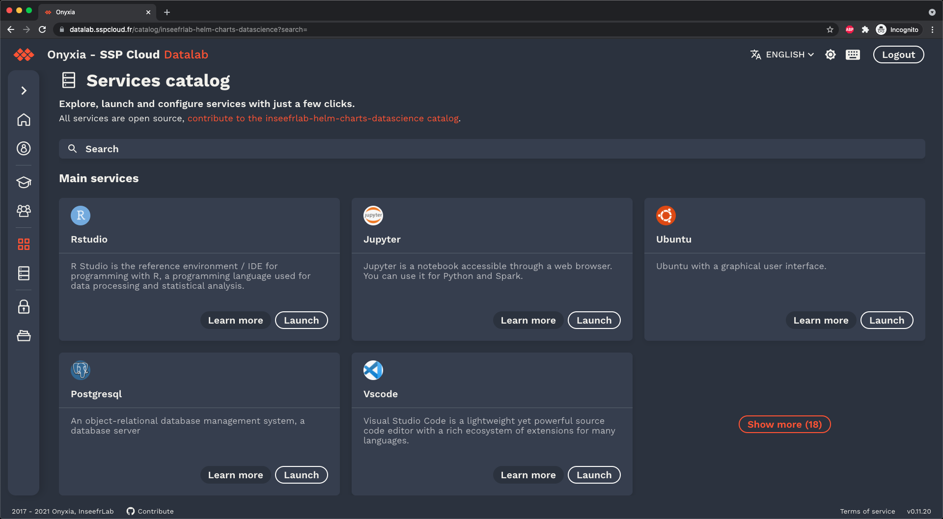
This project is a React UI toolkit that implement a design system created for Onyxia by Marc Hufschmitt.
This project provide some custom components but you can also use any MUI component they will be automatically styled to fit the design system.
- Optimized for typescript, theme customization without module augmentation.
- Built in support for the dark mode.
- If you want to diverge from the Onyxia Design system, the theme is customizable, you can for example change the fonts and the colors.
- Provide splash screen that hide the screen when needed.
Disclaimer: onyxia-ui is not SSR compatible.
A note about the integration of Onyxia and Onyxia-UI can be found here.
yarn add onyxia-ui @mui/material @emotion/react @emotion/styled

# If you plan on using icons from: https://mui.com/components/material-icons/
yarn add @mui/icons-material
The documentation is under the form of a very simple demo project.
The actual theme configuration happens here.
If you want to experiment with it you can run the demo app with:
NOTE for Storybook users: As of writing this lines storybook still uses by default emotion 10.
mui and TSS runs emotion 11 so there is some changes
to be made to your .storybook/main.js to make it uses emotion 11.
git clone https://github.com/garronej/onyxia-ui
cd onyxia-ui
yarn
yarn build
yarn startYou have to configure JEST so that it transpiled your module using "transformIgnorePatterns": [ "node_modules/(?!@onyxia-ui)" ]..


