More is a growing collection of (MIT licensed) Windows Forms Controls for .NET Core.
**2022-05-21** Documented the Navigator and the Listing.
**2022-02-06** Added the Navigator control.
**2022-02-05** Added the Listing control for displaying source code.
**2022-02-04** Created this Journal.
2022-07-01 Demo project, final version of More. 2022-06-01 Style templates and implementation of all TODO items.
- DocumentPreview Show document preview and paint it in native units.
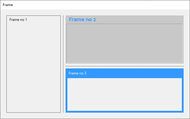
- Frame Structure and draw on the panel without affecting the content.
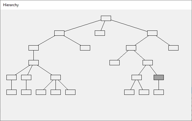
- Hierarchy Draw and manipulate trees.
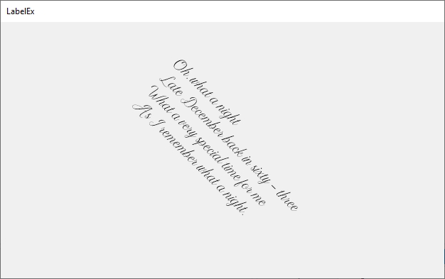
- LabelEx The label that can rotate text and supports transparency.
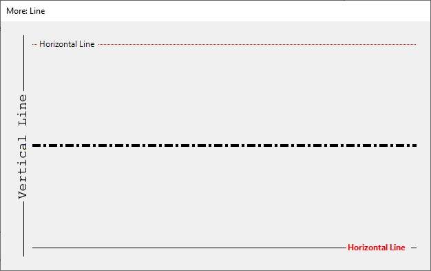
- Line Use a custom line as a separator or a decorator.
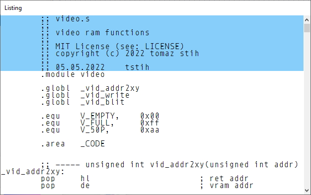
- Listing Program code listing. You can use it for emulators, disassemblers, etc.
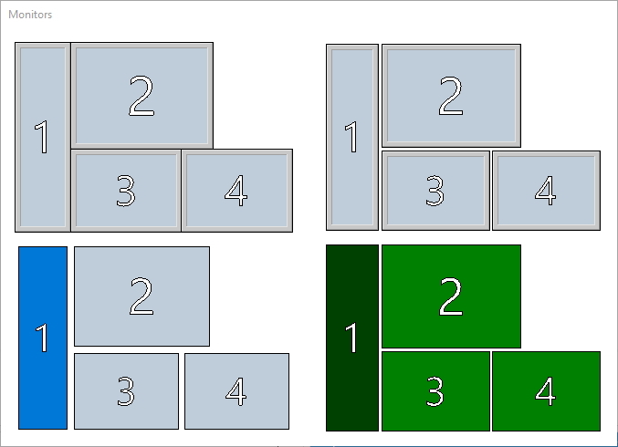
- Monitors Show multi-monitor setup and allow selecting one.
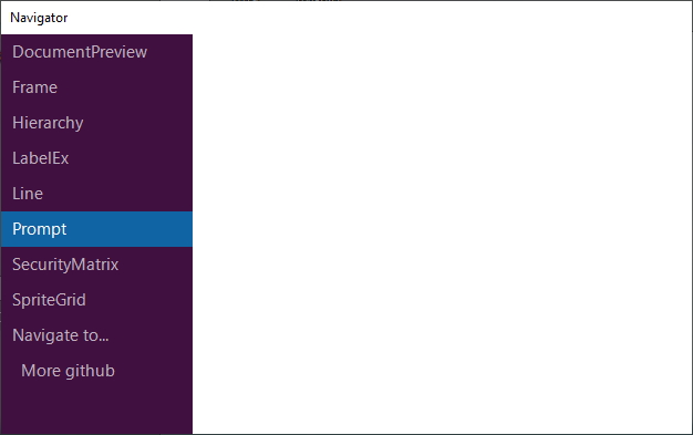
- Navigator Navigator is a vertical navigation bar with two levels.
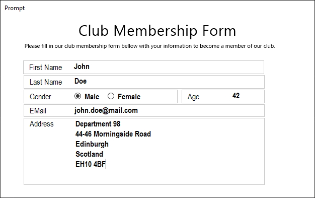
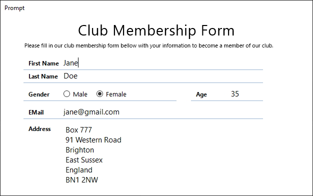
- Prompt The Prompt control is a panel with a label. You can use it for forms.
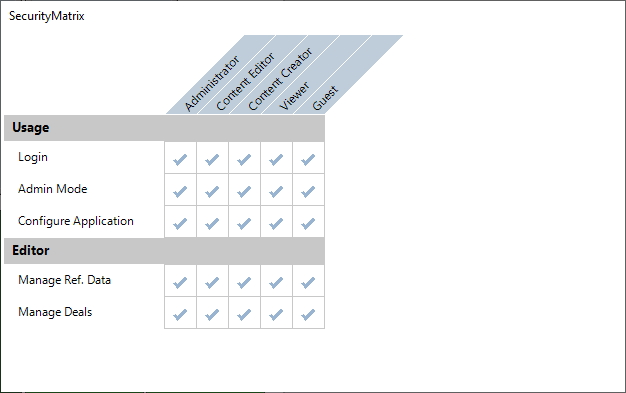
- SecurityMatrix SecurityMatrix is a classic permissions and roles grid.
- SpriteGrid Use sprite grid control to build a sprite editor.
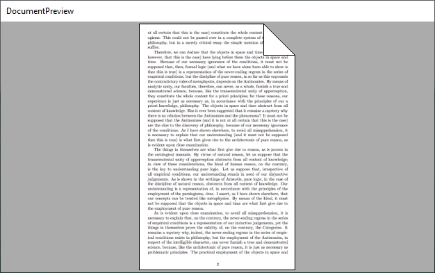
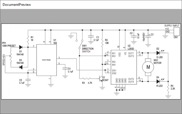
The DocumentPreview control paints the document background (the ornaments) and
allows painting inside it, using native units. When the document needs to be painted,
it triggers the paint event, and your job is to paint into provided graphics context
using native units.
Set the document size in native units through the DocumentSize property.
The default value is 210 x 297, which is the size of a standard DIN A4 document
(in millimetres).
When your document is an image, you can choose pixel as your unit and set the document size to bitmap size.
After setting the size of the document, subscribe to the OnDocumentDraw event.
When the document needs to be painted, the control will raise this event
and pass it to the Graphics. Use it to draw the document in native units,
inside rectangle (0,0,document width, document height). The control will
automatically perform scale and size to fit operations for you.
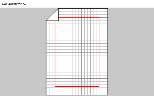
The following example shows how to draw grid lines and a red margin.
private void _doc_OnDocumentDraw(object sender, DocumentDrawEventArgs e)
{
    using (Pen gridPen = new Pen(Color.FromArgb(192, 192, 192)))
    using (Pen gridPenHigh=new Pen(Color.FromArgb(128, 128, 128)))
    {
        for (int x = 0; x < _doc.DocumentSize.Width; x+=10)
            e.Graphics.DrawLine(x%30==0?gridPenHigh:gridPen, x, 0, x, _doc.DocumentSize.Height);
        for (int y = 0; y < _doc.DocumentSize.Height; y += 10)
            e.Graphics.DrawLine(y%30 == 0 ? gridPenHigh : gridPen, 0, y, _doc.DocumentSize.Width,y);
    }
    using(Pen p=new Pen(Color.Red,2)) // Draw margin.
        e.Graphics.DrawRectangle(p, new Rectangle(30, 30, _doc.DocumentSize.Width - 60, _doc.DocumentSize.Height - 60));
}
And the result is:
You can also set the Shadow property, the PaperColor property, and
the BorderColor property for a more admirable effect. Finally, the background uses the BackColor property.
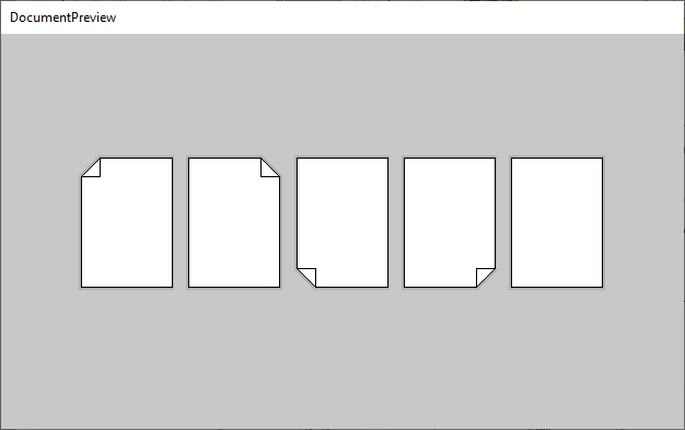
The document can have multiple folds. You can choose to display or hide folds by setting the
Fold property (top left, top right, bottom left, bottom right, or none). The size of the
fold is set via the FoldPercent property. A 50% value means the fold will span half of
the document.
The
Foldproperty is a flag. You may set more than one, and the control will show all.
The control will clip document content so that fold appears above it.
To understand the Frame control, you first need to understand its base control - the
PanelEx. This control enables you to create a non-client border around the PanelEx
and have WinForms respect it, for example, when docking children inside the PanelEx.
To create a new container control with a non-client area, derive it from PanelEx,
and set the Margin. The area outside will be the non-client area, and the area inside the margins
will be the client area.
For example, if you set all margins to 10 pixels, then a 10 pixels wide border around the control will be the non-client area and the rest client area.
You can use the client area just as you would use the standard panel control i.e.
you put controls inside, dock them, etc. If you want to paint on a non-client, override
the Decorate() function.
The functionality of PanelEx provides the glue required to implement various container
controls. Here are just a few possibilities:
- Frame controls,
- Collapsible controls,
- Prompt controls.
Here is the skeleton of the panel, derived from the PanelEx. Margin is set
in the constructor, and drawing on the non-client area should happen inside the
Decorate(). This function prepares everything for you: it creates the graphics
and calculates all rectangles that form the non-client border.
public class MyPanel : PanelEx
{
    public class MyPanel() {
        // Create a 5 pixel unified non client
        // area around the panel.
        Margin=new Padding(5,5,5,5);
    }

    protected override void Decorate(
        Graphics g,
        Rectangle lt, // Left top rectangle of NC area.
        Rectangle rt, // Right top rectangle of NC area.
        Rectangle lb, // Left bottom rectangle of NC area.
        Rectangle rb, // Right bottom rectangle of NC area.
        Rectangle l, // Left rectangle of NC area.
        Rectangle t, // Top rectangle of NC area.
        Rectangle r, // Right rectangle of NC area.
        Rectangle b) // Left top rectangle of NC area.
    {
        // Here you draw in nonclient area.
    }
}The Frame control has four areas.
- First (top) area is the title. You can set it via
the
Titleproperty. It uses theFontproperty. You can set values of theTitleBackColorandTitleFrontColor. The title is adjusted byTitleAlignment. If aligned left or right, theTitleOffsetis the indentation. Last but not least, you can increase or reduce (even hide!) title height by changing the value ofTitleHeight. - the Second area is the outer border. This border has
OuterBorderThickness,OuterBorderDarkColorandOuterBorderLightColor. By convention, the dark colour is used for the top and left edge, and the light colour for the bottom and right edge. For the inset effect, swap these colours. - the Third area is the inner border. This border has
InnerBorderThickness,InnerBorderDarkColorandInnerBorderLightColor. By default, the thickness is zero, so no inner border is shown. - Fourth area is the
BorderThickness(in pixels). This is simply the space between the outer border and the inner border. It can be zero, but it is tough to differentiate between inner and outer borders.
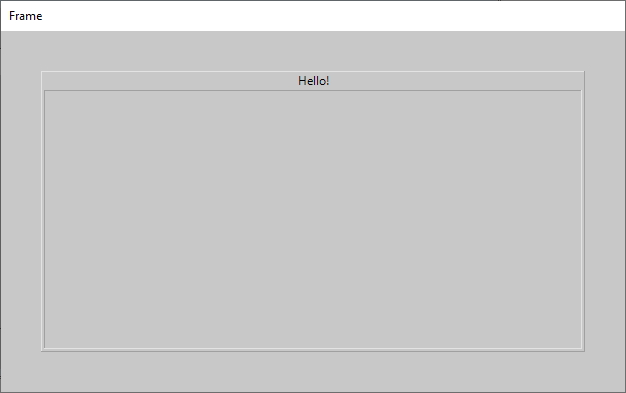
// First the title.
_frame.Title = "Hello!";
_frame.TitleAlignment = StringAlignment.Center;
_frame.TitleHeight = 16;
_frame.TitleBackColor = BackColor;
_frame.TitleForeColor = ForeColor;

// Outer border.
_frame.OuterBorderDarkColor = Color.FromKnownColor(KnownColor.ControlDark);
_frame.OuterBorderLightColor = Color.FromKnownColor(KnownColor.ControlLight);
_frame.OuterBorderThickness = 1;

// Inner border (replace dark and light).
_frame.InnerBorderDarkColor = Color.FromKnownColor(KnownColor.ControlLight);
_frame.InnerBorderLightColor = Color.FromKnownColor(KnownColor.ControlDark);
_frame.InnerBorderThickness = 1;

// Pixels between inner and outer color.
_frame.BorderThickness = 2;
The code above creates the frame below.
You can use the Hierarchy control to visualise trees. The control only manages the
layout; it expects your code to draw content inside events.
You set the tree direction by manipulating the Direction property.
The control can draw left to right, right to left, top to bottom, and bottom
to top trees.
Basic general node properties (shared between all nodes!) are: NodeWidth
and NodeHeight. The minimal space in pixels between two nodes is determined
by the NodeHorzSpacing and NodeVertSpacing properties.
You feed the data into the control by implementing a simple IHierarchyFeed
interface, and then passing it to the Hierarchy via the SetFeed() method.
Here is the interface.
public interface IHierarchyFeed
{
    IEnumerable<string> Query(string key=null);
}
It only has one function, which returns a collection of node keys (node identifiers).
Since your code is responsible for drawing nodes and edges, the control does not need to know more about the node. When it needs to draw the node it passes the node key and rectangle in an event and expect your code to do the rest.
The Query() function accepts a parent key parameter. If this parameter is null,
the function returns all root node keys (usually just one?); otherwise, it returns the child
nodes of provided parent node.
You can capture all standard control mouse events, and inside the mouse events translate
mouse coordinates to nodes key by calling NodeAt() function.
Here's a simple feed implementation for the file system.
public class FileSystemHierarchyFeed : IHierarchyFeed
{
    private string _rootDir;

    public FileSystemHierarchyFeed(string rootDir) { _rootDir = rootDir; }

    public IEnumerable<string> Query(string key = null)
    {
        if (key == null) return new string[] { _rootDir };
        else return Directory.EnumerateDirectories(key + @"\");
    }
}
The full path is used as a node key in the example above. If you wanted to draw organigram, you'd probably use the database identifier of a person as the key.
Disclaimer: Letting the above file feed scan your
c:drive is bad. Just sayin'.
You can subscribe to two events: the DrawEdge event to an edge, i.e. a line
connecting two nodes. And the DrawNode event to draw a node. Both events will pass you
the node key, node rectangle, and an instance of the Graphics for drawing.
But drawing nodes and edges is your job.
This sample demonstrates drawing inside both events.
private void _hierarchy_DrawEdge(object sender, DrawEdgeEventArgs e)
{
    // Calculate node centers.
    Point
        start = new Point(
            e.ParentRectangle.Left + e.ParentRectangle.Width / 2,
            e.ParentRectangle.Top + e.ParentRectangle.Height / 2),
        end = new Point(
            e.ChildRectangle.Left + e.ChildRectangle.Width / 2,
            e.ChildRectangle.Top + e.ChildRectangle.Height / 2);
    // And draw the line.
    using (Pen p = new Pen(ForeColor))
        e.Graphics.DrawLine(p,start,end);
}

private void _hierarchy_DrawNode(object sender, DrawNodeEventArgs e)
{
    // Extract directory name from the path.
    string dir= Path.GetFileName(Path.GetDirectoryName(e.Key+@"\"));

    // Draw the node.
    Graphics g = e.Graphics;
    using (Pen forePen = new Pen(ForeColor))
    using (Brush backBrush = new SolidBrush(BackColor),
        foreBrush = new SolidBrush(ForeColor))
    using(StringFormat sf=new StringFormat() {
        LineAlignment=StringAlignment.Center,
        Alignment=StringAlignment.Center})
    {
        g.FillRectangle(backBrush, e.Rectangle); // Border.
        g.DrawRectangle(forePen, e.Rectangle); // Rectangle.
        g.DrawString(dir, Font, foreBrush, e.Rectangle, sf); // Text.
    }
}You can subscribe to standard mouse events (clicks, moves, etc.) and use the NodeAt()
function to find out which node was clicked. For example, if you'd like to
highlight a node on click, subscribe to the MouseUp event, find out which node was
clicked, store its key, and call Refresh() to repaint the control.
private string _highlightedNodeKey;
private void _hierarchy_MouseUp(object sender, MouseEventArgs e)
{
    _highlightedNodeKey = _hierarchy.NodeAt(e.Location);
    _hierarchy.Refresh();
}
Then, in the DrawNode event, check the node key against the _highlightedNodeKey and
paint it accordingly.
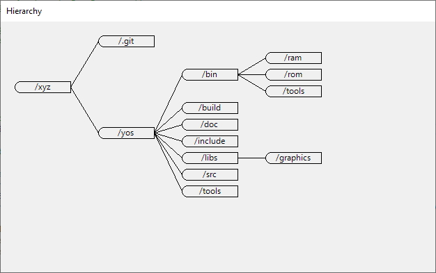
Because the DrawEdge event gives you both ends of the edge - the parent node and
You can choose how to draw your edge with the child node (with their coordinates).
It can be a line, a curve, etc. You may also start your edge at the end of the parent node.
(instead of the node centre) and draw it to the start of the other node. The following code does
just that; see the image for the result.
private void _hierarchy_DrawEdge(object sender, DrawEdgeEventArgs e)
{
    // Change start and end location of an edge.
    Point
        start = new Point(
            e.ParentRectangle.Right,
            e.ParentRectangle.Top + e.ParentRectangle.Height / 2),
        end = new Point(
            e.ChildRectangle.Left,
            e.ChildRectangle.Top + e.ChildRectangle.Height / 2);
    using (Pen p = new Pen(ForeColor))
        e.Graphics.DrawLine(p, start, end);
}
LabelEx is a label control with roration and transparency features.
Transparency is a pain in Windows Forms. This feature works well at runtime but behaves
naughty in the designer. The reason is that it avoids double buffering to implement
transparency. To make the label background transparent, set the Opacity property
from 0% to 100% (for a fully transparent label).
Rotate the label by setting the Angle. The unit is in degrees, and the rotation is clockwise.
Finally, you can align the rotated label to the bounding rectangle by assigning values to
properties HorzAlignment and VertAlignment.
_label.Text = "Oh, what a night\nLate December back in sixty - three\nWhat a very special time for me\nAs I remember what a night.";
_label.Angle = 45;
_label.HorzAlignment = StringAlignment.Center;
_label.VertAlignment = StringAlignment.Center;
And the result...
Use a custom line as a separator or a decorator.
Set the Orientation property to Horizontal or Vertical. Use line
Thickness to set the pen thickness. Set line Text,Font, and ForeColor
properties to control the appearance of the title. If empty, no title is shown.
TextAlignment tells where the title is shown (at the beginning, end or in the
middle of the line). If at the beginning or end, then TextOffset (in pixels) is
used to move the title away from the beginning/endpoint. BackColor controls line control
background, and LineColor is used for line color. DashValues is an array
of floats that tells the size of pixels and spaces. The default value of {1,0} means
a solid line (i.e. one pixel, followed by zero spaces). A value of {1,1} is
interpreted as a pixel followed by a space. The pattern can be of arbitrary
length, i.e. a value of {3,1,1,1} would be interpreted as three pixels,
followed by one space, followed by one pixel, followed by one space.
_line.Orientation = Orientation.Horizontal;
_line.Text = string.Empty; // Remove text.
_line.LineColor = Color.Khaki;
_line.BackColor = Color.DarkSeaGreen;
_line.Thickness = 6;
_line.DashValues = new float[] { 3,1,1,1 };Program code listing. You can use it for emulators, disassemblers, etc.
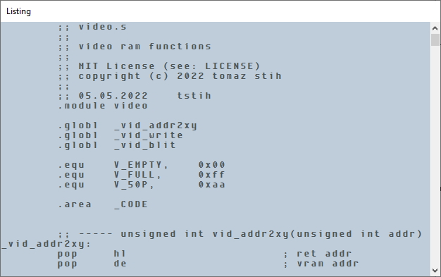
Set the standard properties for the listing, i.e. Font, BackColor, and ForeColor to whatever you wish. Then set the feeder using the SetFeed() method, and the control will draw the code and formatting provided by the feeder.
The Listing workspace is divided into rows, and each row is divided into cells. The height of each row can be configured using the RowHeight property and the width of each cell using the CellWidth property.
Each cell can have its background and foreground colour.
If not set on the lower level, colours are inherited, i.e. if you do not set colour for the row, the row inherits it from the control.
Cell content is obtained from the IListingFeed. This interface returns all rows.
public interface IListingFeed
{
    ListingRow QueryRow(int rowNo);
    int RowCount();
}
You can set the fore and back colours for each row. Each row also contains a collection of ListingCell objects.
public class ListingRow
{
    public ListingRow(string text, Color? foreColor = null, Color? backColor = null) {
        /* Create columns. */
        List<ListingCell> defaultRow = new List<ListingCell>();
        foreach(char character in text)
            defaultRow.Add(new ListingCell(character));
        Row = defaultRow.ToArray();
        /* Remember fore and back color. */
        ForeColor = foreColor;
        BackColor = backColor;
    }

    public ListingCell[] Row { get; set;  }

    public Color? BackColor { get; set; }
    public Color? ForeColor { get; set; }
}
The ListingCell contains background and foreground colour for the cell as well as character. If 'ForeColororBackColorproperties arenull`, values are inherited from the row.
public class ListingCell
{
    public ListingCell(char character, Color? foreColor=null, Color? backColor=null)
    {
        Character = character;
        ForeColor = foreColor;
        BackColor = backColor;
    }

    public char Character { get; set; }
    public Color? BackColor { get; set; }
    public Color? ForeColor { get; set; }
}This example of a feeder reads a text file and feeds it to the control.
public class TextFileFeed : IListingFeed
{
    ListingRow[] _rows;
    public TextFileFeed(string fname)
    {
        List<ListingRow>  rows = new List<ListingRow>();
        foreach(string row in File.ReadAllLines(fname))
            rows.Add(new ListingRow(row));
        _rows = rows.ToArray();
    }
    public ListingRow QueryRow(int rowNo) { return _rows[rowNo]; }
    public int RowCount() { return _rows.Length; }
}You can align cells' content by setting the CellAlign and CellLineAlign properties.
There is no standard scroll bar. Instead, you must implement scrolling yourself using a property called TopRow. This property tells the system which row is the first row on the screen. While scrollbars would be somehow inflexible, the top row approach enables synchronization of position inside multiple windows.
To implement a scrollbar, add it to your window, set its' min and max to the number of rows, and handle its Scroll event like this.
private void _scroll_Scroll(object sender, ScrollEventArgs e)
{
    _listing.TopRow = e.NewValue;
}With the Monitors control, you can show the user their multi-monitor configuration and enable them to select one. This feature is helpful in creating multi-monitor applications. You can let the user configure target monitors for these windows.
The control will automatically detect the size and placement of connected monitors.
Place the control on your window. All your monitors will be selected and drawn
in default colours. In addition, you can configure the Padding property to create space between
monitors. You can also set the Margin property for this control.
If you set the ShowNumber property - you will display numbers inside
monitors. You can toggle font for displaying numbers by setting the Font
property.
Numbers are displayed as outline text. The border colour for each number is configured
by setting MonitorTextForeColor, and the inner colour of the text is configured
via the MonitorTextBackColor.
Each monitor can be a square, or it can have a 3D border as real-life monitors
do. You must set the ShowEdge property if you'd like a border. You can
configure 3D colours by setting the EdgeLightColor and EdgeDarkColor.
The space between the outer border and the inner border is configured by setting
the EdgeThickness value.
When moving (hovering), the mouse over the monitors will be highlighted. To set the
colours of monitor under the mouse, use the ActiveMonitorBackColor and
ActiveMonitorBackColor properties.
You can manually activate a monitor (without a mouse over it) by setting the
Activate property to monitor number.
When clicking on a monitor, you select it, and an event called MonitorSelected
is raised.
You can also capture the
MonitorUnselectedevent to detect when a monitor is unselected.
You can set the selected monitor manually via the Selected numeric property.
PropertiesSelectedMonitorBackColor andSelectedMonitorForeColor configure the visual effects for selected monitor
Monitor only uses one colour, called the MonitorBackColor. Please set it to
whatever the standard back colour for the monitor should be.
Navigator is a vertical navigation bar with two levels.
Configure the navigator items by changing the standard ForeColor, BackColor,
and Font properties. Additional behaviour properties are> HoverBackColor,
HoverForeColor, SelectedBackColor, and SelectedForeColor.
You can configure item size and indent by setting the ItemHeight and
ItemIndent properties. Item layout also respects the Padding property.
Add the title by setting the Text property. Customize it by changing
TitleHeight, TitleFont, TitleSeparatorColor and the Title colour.
The title always uses the background colour of the control.
The navigator supports two levels of navigation and uses a feeder. You can
set the feeder by calling the SetRoot() method and passing it the
IEnumerable<NavigatorItemBase> collection.
You can pass any derivate class too. The Navigator supports the following
derivates:
public class NavigatorItemBase
{
    public string Text { get; set; }
    public Action Callback { get; set; }
    public string Key { get; set; }
    public bool Disabled { get; set; }
}

public class NavigatorItem : NavigatorItemBase
{
    public Image Glyph { get; set; }
}

public class NavigatorCategory : NavigatorItemBase
{
    public NavigatorCategory()
    { Children=new List<NavigatorItem>(); }
    public List<NavigatorItem> Children { get; }
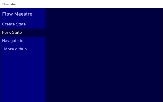
}To make your life easier, we have created a fluent interface
that you can use to create quick navigators. First, you need to call
the NavigatorBuilder.Fluent() function and fluently
add item texts, callback functions, glyphs and shortcut keys.
// Place the control on a window and call it _navigator.
// Then inside OnLoad Window event do this --
_navigator.SetRoot(
    NavigatorBuilder.Fluent()
        .Add("Create State", ()=>CreateState(), null, "Alt+C") // No image
        .Add("Fork State")
        .Begin("Navigate to...")
            .Add("More github")
        .End()
        .GetRoot()
);- Finish keyboard shortcuts, and
- add flexibility to the title separator.
The Prompt control helps you consistently align your controls on the form. It adds
a prompt and a glyph in front of them in a consistent way.
Add the Prompt control to your window. You can now place the content, i.e. the
control you'd like to host (such as a TextBox) on top of the Prompt control,
and dock it.
As the Prompt control derives from the Panel it will treat your TextBox
as a child, move and resize it correctly whenever you move the Prompt control.
You can customize the layout and the appearance of your Prompt control.
You may manage border thickness with four properties: LeftBorderThickness,
RightBorderThickness, TopBorderThickness, and BottomBorderThickness, and
set the border colour via the BorderColor property.
A value of 0 for border thickness means no border.
Standard control properties Font and BackColor are applied to the hosted
control (i.e. to the control you place on top of the Prompt control).
In addition, you can set the ContentMargin to create an extra margin inside
the content space.
This is useful when you want to separate your control and the prompt text with a few pixels.
Prompt text is controleld by the Text, PromptTextWidth, PromptForeColor,
PromptBackColor, PromptTextAlignment, PromptTextLineAlignment,and
PromptTextEdge properties. All properties are straightforward, except
the PromptTextEdge. This is used in combination with PromptTextAlignment.
If the latter is Left, then the PromptTextEdge is the number of pixels from
the edge of control (the absolute left) to the prompt text. If the PromptTextAlignment property
is right, it defines the number of pixels from the right prompt edge.
You can also set
PromptTooltip, which will be shown if you hover over the prompt text and is useful for showing field instructions to the user. An empty value will disable the tooltip.
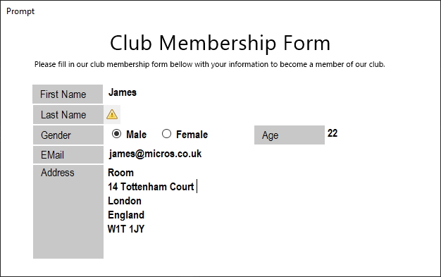
You can set a prompt glyph. It will be shown right of your prompt text. You may use this feature for validation alerts, etc.
Recommended glyph size is 16 x 16 pixels.
As long as the Glyph property is null, the space for glyph
will not be reserved within the control. Once you set the Glyph property,
it will not be shown until you set the GlyphVisible property to true.
This is how you can toggle validation alerts.
The glyph has its own back colour controlled by the GlyphBackColor. It also
has custom GlyphWidth (default:16), while the height equals Prompt control
height. Within this rectangle, you can align glyphs by setting the GlyphAlignment.
Last but not least, the glyph can also have an independent tooltip. You could use
this for explaining a validation error. You can toggle this on by setting the
GlyphTooltip to a non-empty value.
A highly configurable classic permissions and roles grid editor. It accepts a feed interface which must provide a list of roles, permission categories, and permissions. A demo feed implementation is part of the control.
You can configure fonts and colours of the control or implement custom drawing. Custom drawing is implemented by overriding the control's paint functions.
Place the SecurityMatrix on your window. It will show a demo matrix enabling you
to customize its' appearance.
Call the SetFeed() function to pass the data to it. Set angle for roles by setting
the RolesAngle property. Reserve space on top and the left for roles and categories
by setting the RolesHeight and CategoriesWidth properties. Set the tick cell
size by setting the property CellSize.
You can configure fore and front colours and fonts for matrix titles on the top
and left. You can also configure cells' fore and front colours. Finally, when the
mouse hovers over the cell, it will change colour if you set the PermissionActiveCellBackColor
property.
To implement the feed interface, you need to implement four functions.
public interface ISecurityMatrixFeed
{
    IEnumerable<SecurityRole> QueryRoles();
    IEnumerable<SecurityCategory> QueryCategories();
    IEnumerable<SecurityPermission> QueryPermissions(SecurityCategory category);
    bool this[SecurityRole r, SecurityCategory c, SecurityPermission p] { get; set; }
}
Functions accept parameters of types SecurityRole, SecurityPermission, and SecurityCategory
which are all derived from KeyNamePair and must contain two values:
- a display name, and
- a unique identifier.
public class KeyNamePair
{
    public string Id { get; set; }
    public string DisplayName { get; set; }
}
public class SecurityRole : KeyNamePair {}
public class SecurityCategory : KeyNamePair {}
public class SecurityPermission : KeyNamePair {}
Function QueryRoles() should return all roles that you'd like to have displayed
on top. Function QueryCategories() should return all categories into which you would
like to group permissions. Function QueryPermissions() takes a category object as a
parameter and returns all permissions of this category. And finally,
the indexer this[SecurityRole, SecurityCategory, SecurityPermission]is used to
access the ticks.
The indexer inside the feed can be connected to the database, updated on set and read from it on getting. Following is a naive implementation of the indexer as a list.
private class Check
{
    public SecurityRole SecurityRole { get; set; }
    public SecurityCategory SecurityCategory { get; set; }
    public SecurityPermission SecurityPermission { get; set; }
    public bool Value { get; set; }
}
// ...code omitted...
private List<Check> _checks;
// ...code omitted...
public bool this[SecurityRole r, SecurityCategory c, SecurityPermission p] {
    get {
        var chk = _checks.FirstOrDefault(chk =>
            chk.SecurityRole.Id.Equals(r.Id)
            && chk.SecurityCategory.Id.Equals(c.Id)
            && chk.SecurityPermission.Id.Equals(p.Id));
        if (chk == null) return false;
        else return chk.Value;
    }
    set
    {
        var chk = _checks.FirstOrDefault(chk =>
            chk.SecurityRole.Id.Equals(r.Id)
            && chk.SecurityCategory.Id.Equals(c.Id)
            && chk.SecurityPermission.Id.Equals(p.Id));
        if (chk != null)
            chk.Value = value;
        else
            _checks.Add(new Check() {
                SecurityRole=r, SecurityCategory=c, SecurityPermission=p, Value=value
            });
    }
} You can derive your control from the SecurityMatrix and implement custom
paint handlers for every aspect of the grid.
public class SecurityMatrixEx : SecurityMatrix
{
    protected override void DrawTick(Graphics g, Rectangle rect)
    {
        rect.Inflate(-12, -12);
        using (Pen tickPen = new Pen(Color.Black, 2))
        {
            g.DrawLine(tickPen, rect.Location, new Point(rect.Right, rect.Bottom));
            g.DrawLine(tickPen, new Point(rect.Right, rect.Top), new Point(rect.Left, rect.Bottom));
        }
    }

    protected override void DrawPermissionCellBackground(Graphics g, Rectangle rect, SecurityRole r, SecurityCategory c, SecurityPermission p)
    {
        rect.Inflate(-8, -8);
        g.DrawRectangle(Pens.Gray, rect);
    }

    protected override void DrawPermissionCellForeground(Graphics g, Rectangle rect, SecurityRole r, SecurityCategory c, SecurityPermission p)
    { // Don't draw rectangle around it!
    }
}
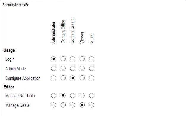
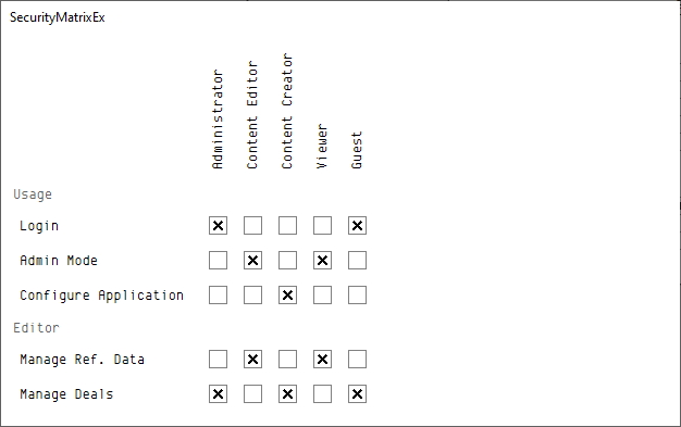
This code above changes ticks to squares, and produces the following output:
You can override the following paint functions.
void DrawRoleBackground(Graphics g, Point[] pts, SecurityRole role)
void DrawRoleForeground(Graphics g, Rectangle r, SecurityRole role)
void DrawPermissionBackground(
            Graphics g,
            Rectangle r,
            SecurityCategory category,
            SecurityPermission permission)
void DrawPermissionForeground(
            Graphics g,
            Rectangle r,
            SecurityCategory category,
            SecurityPermission permission)
void DrawTick(Graphics g, Rectangle rect)
void DrawPermissionCellBackground(
            Graphics g,
            Rectangle rect,
            SecurityRole r,
            SecurityCategory c,
            SecurityPermission p)
void DrawPermissionCellForeground(
            Graphics g,
            Rectangle rect,
            SecurityRole r,
            SecurityCategory c,
            SecurityPermission p)
void DrawCategoryForeground(Graphics g, Rectangle r, SecurityCategory category)
void DrawCategoryBackground(Graphics g, Rectangle r, SecurityCategory c)
void DrawCategoryCellBackground(Graphics g, Rectangle rect, SecurityRole r, SecurityCategory c)
void DrawCategoryCellForeground(Graphics g, Rectangle rect, SecurityRole r, SecurityCategory c)
The control implements all the sizing and rotation operations, so you don't have to worry about it, i.e. you don't need to draw rotated text for the role, and it is rotated and placed to the correct rectangle for you by the control.
Keyboard and focus handling.
Use sprite grid control to build a sprite editor.
Place the SpriteGrid control on your window. Set its SourceImage property to
the Bitmap you'd like to view or edit.
You can show or hide rulers using the ShowHorzRuler and ShowVertRuler properties.
You can customize rulers by manipulating properties: RulerHeight, RulerWidth,
RulesBackgroundColor, MinorTickSize, MajorTickSize, and 'MinorTicksPerMajorTick'.
You can customize grid appearance by manipulating properties GridEdgeLineColor,GridEdgeLineDashPattern,
GridTickLineColor, GridTickLineDashPattern.
BackColor is used to draw an empty grid, and ForeColor is used for all text (currently just
the ruler content).
You can pass the image to SpriteGrid by assigning the image to the SourceImage property.
_spriteGrid.SourceImage = Image.FromFile("pacman.png");SpriteGrid exposes basic mouse events and translates physical coordinates to logical
coordinates inside the sprite (i.e. row and column). To manipulate the sprite,
simply manipulate the underlying image and call the Refresh() function on
SpriteGrid.
public partial class MainWnd : Form
{
    // ... code omitted ...
    private Bitmap _sprite;

    private void MainWnd_Load(object sender, System.EventArgs e)
    {
        // Create new 16x16 sprite.
        _spriteGrid.SourceImage = _sprite = new Bitmap(16, 16);
    }

    private void _spriteGrid_CellMouseDown(object sender, CellMouseButtonArgs e)
    {
        // Set image pixel.
        _sprite.SetPixel(e.Column, e.Row, Color.Black);
        _spriteGrid.Refresh();
    }
    // ... code omitted ...
}SpriteGrid uses a mouse wheel for two purposes. Sprite is scrolled up and down
if the wheel is used without any control key. If, while using the mouse wheel,
you hold down the Ctrl key, then the ZoomIn and ZoomOut events are triggered.
You can use this to implement zoom.
The simplest implementation (which would not consider the current mouse position),
would be increasing and decreasing values or properties CellWidth and CellHeight.
private void _spriteGrid_ZoomIn(object sender, ZoomInArgs e)
{
    if (_spriteGrid.CellWidth < 32) _spriteGrid.CellWidth++;
    if (_spriteGrid.CellHeight < 32) _spriteGrid.CellHeight++;
}

private void _spriteGrid_ZoomOut(object sender, ZoomOutArgs e)
{
    if (_spriteGrid.CellWidth > 1) _spriteGrid.CellWidth--;
    if (_spriteGrid.CellHeight > 1) _spriteGrid.CellHeight--;
}
And here is the result.
Sometimes it makes sense to set a visible sprite margin (for example, to show where
the image will be cropped). Six properties controlling sprite margin: LeftMargin,
RightMargin, TopMargin, BottomMargin, MarginLineThickness, and
MarginColor.
Sprite margin is not the same as the control margin. Sprite margin is an area of the sprite that is visibly marked.
_spriteGrid.SourceImage = Image.FromFile("art.png");
_spriteGrid.LeftMargin = 40;
_spriteGrid.RightMargin = 40;
_spriteGrid.TopMargin = 30;
_spriteGrid.BottomMargin = 40;
_spriteGrid.MarginLineThickness = 4;
_spriteGrid.MarginColor = Color.Red;By responding to mouse events CellMouseDown, CellMouseUp, CellMouseMove` you
can detect select operation.
To differentiate between a select and a pixel click, you need to compare the mouse coordinates at
CellMouseDownevent with that ofCellMouseUp. If coordinates are the same, and there were noCellMouseMoveevents out o the cell, then it is a click. Otherwise, it is selected.
To make SpriteEdit draw a selection, you set the property GridSelection. GridSelection is a polygon and can be of any shape.
_spriteGrid.SourceImage = Image.FromFile("jetpac.png");
_spriteGrid.SetGridSelection(new GridSelection()
{
    LineColor = Color.White,
    LineWidth = 3,
    Poly = new Point[] {
        new Point(200,200),
        new Point(400, 200),
        new Point(400,400),
        new Point(200,400)}
});


