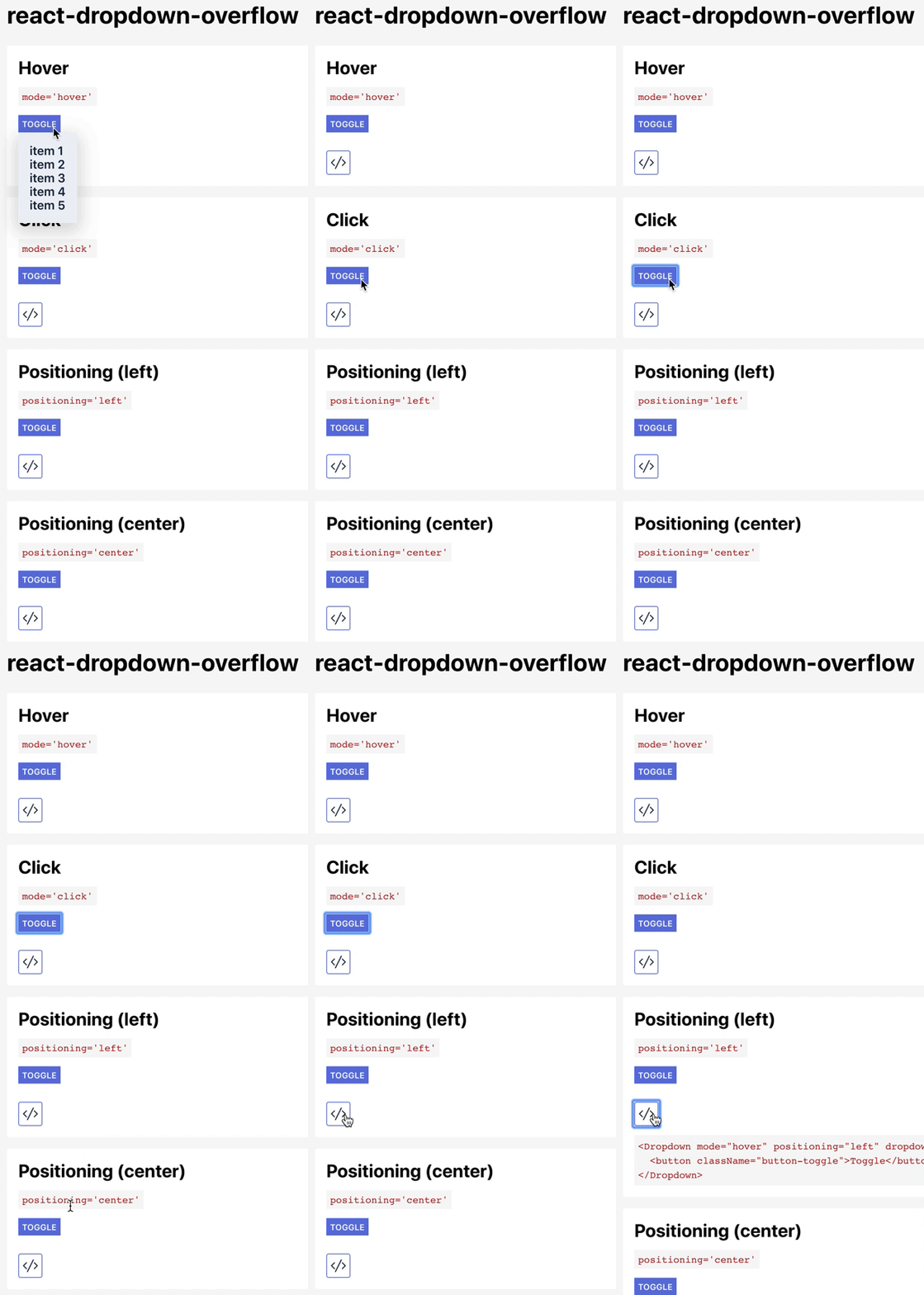
example: https://github.com/dydokamil/react-dropdown-example
demo: https://dydokamil.github.io/react-dropdown-example/
npm: https://www.npmjs.com/package/react-dropdown-overflow
yarn add react-dropdown-overflow
or
npm install react-dropdown-overflow
import Dropdown from 'react-dropdown-overflow'
import Dropdown from 'react-dropdown-overflow'

class MyComponent extends React.Component {
  render() {
    <Dropdown dropdown={
      <div className='dropdown-list'>
        <ul>
         <li>item1</li>
         <li>item2</li>
         <li>item3</li>
       </ul>
      </div>
    }>
      <button>Toggler</button>
    </Dropdown>
  }
}
Sets the behavior of the toggling element. Defaults to hover. Valid values are:
hover | click :: Whether the dropdown is triggered with a mouse click or on hover event.
A React component responsible for the toggling of the dropdown.
A React component to be displayed as a dropdown.
A string prop responsible for the positioning of the menu. Valid values are:
left | center | right :: The position of the dropdown menu.
A number specifying the z-index of the dropdown. Valid values are numbers.
A boolean prop specifying whether the dropdown should be closed when the mouse event is located outside of the entire component. Useful with click mode.
id of the newly created element wrapping the children prop.
Class name of the newly created element wrapping the dropdown.
id of the newly created element wrapping the dropdown.
A boolean prop responsible for the state of the component (closed/open). Valid values are:
true | false :: Whether the menu is visible.
WARNING: This changes the component from an uncontrolled to a controlled one.
