Requires JDK 11 or higher.
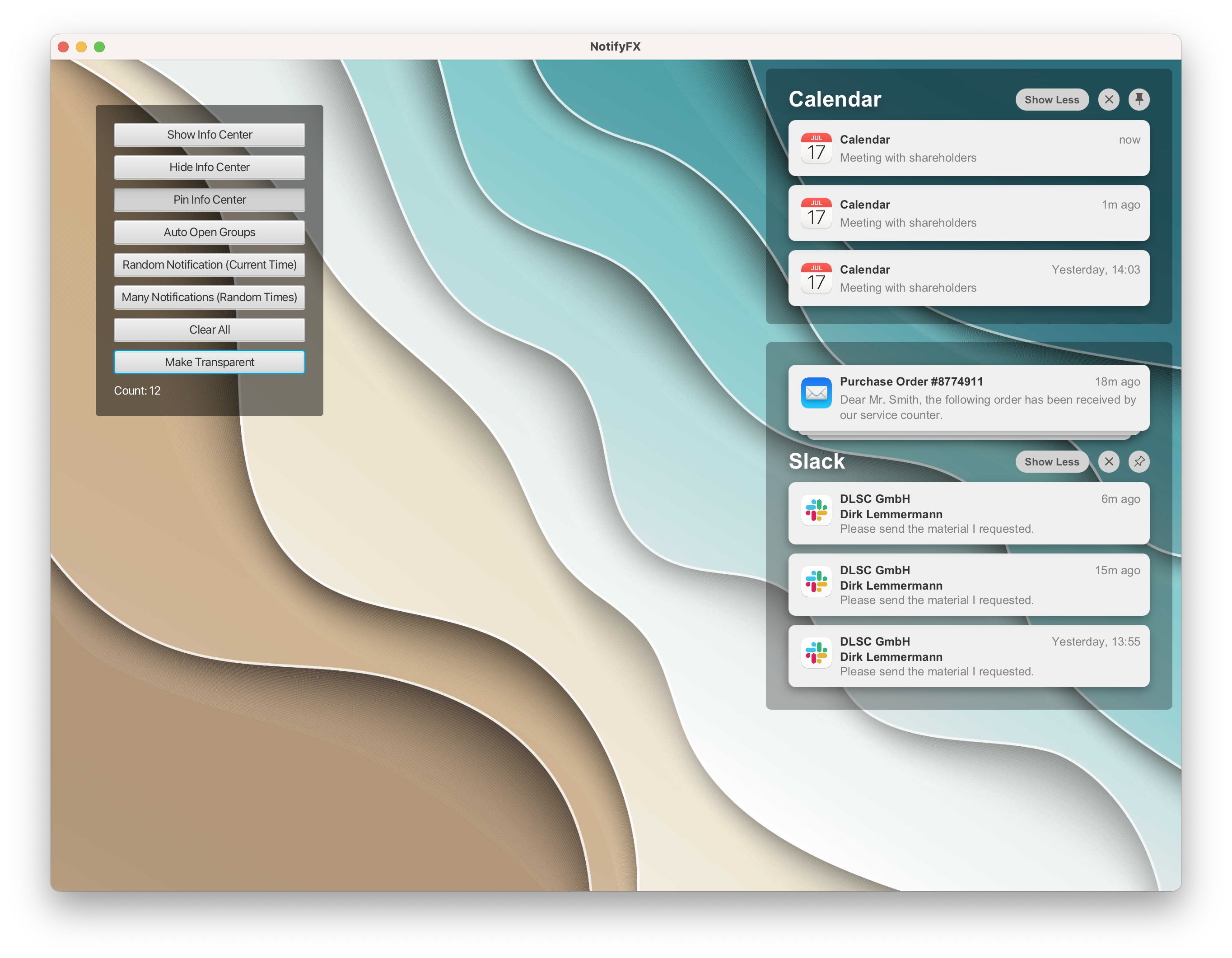
A view for displaying (groups of) notifications. Incoming / new notifications slide-in via an animation. Each group can have its own factory for the creation of notification views. A group with multiple notifications can be shown stacked or expanded. A threshold can be defined to determine the maximum number of notifications that can be shown. If the notifcation count is higher than the threshold then the user can switch to a list view showing them all. Groups can be pinned so that they always stay in the top position without being scrolled out of view.
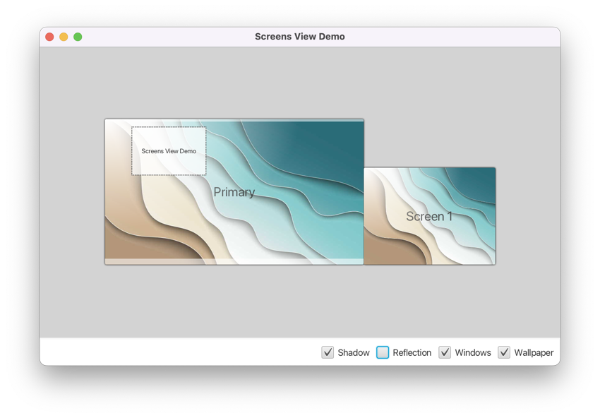
A small control that can be used to display the screen geometries as seen by the application. The view can also display the application's windows, and some arbitrary shapes (might be useful for debugging purposes).
The StageManager class is a utility class that keeps track of a stage's location and dimensions. These values
will be stored and used across user sessions via the java.util.prefs API.
The SessionManager class is a utility class that can be used to monitor observables and persist them across user
sessions. This can be useful, for example, for storing and restoring the position of the divider of a SplitPane.
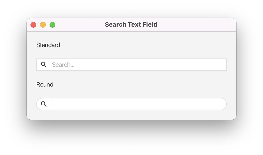
A textfield that has been nicely decorated to express that it is used for performing searches.
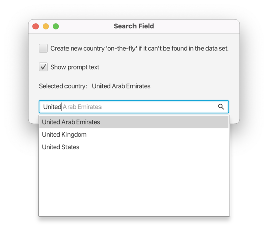
An auto-suggest text field with a behaviour similar to the spotlight search experience on Mac. While typing the field will automatically finish the entered text if it has a search result where the name starts with the exact typed text. At any time the typed text and the auto-completed text will be visually distinguishable. The field is also capable of creating a new object for the entered text if no result can be found. For detailed instructions read the WIKI page.
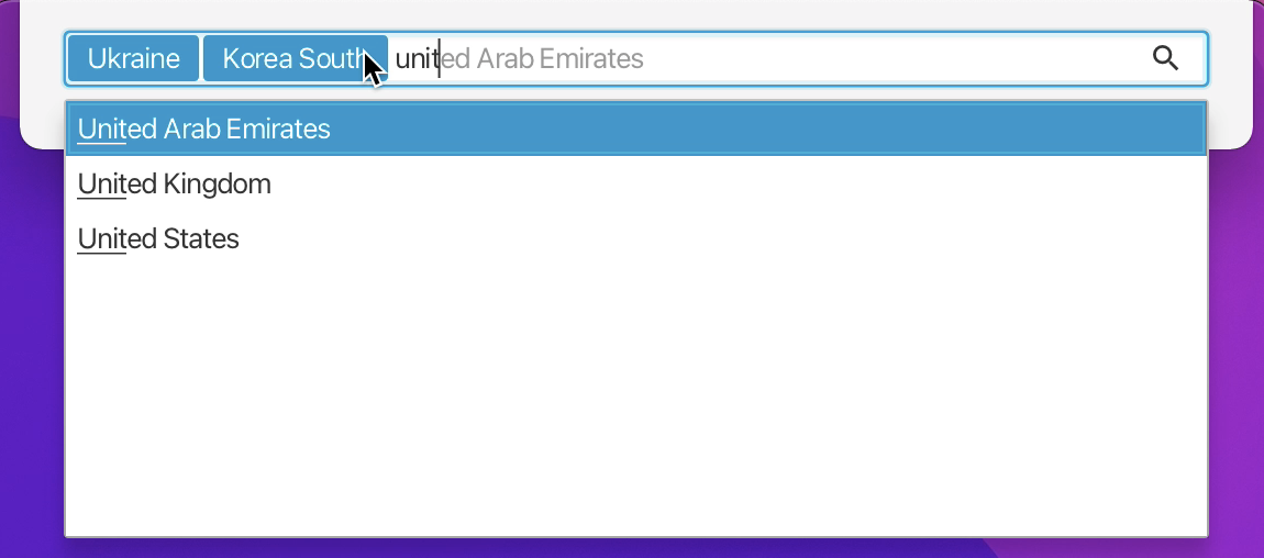
An extension of the SearchField control that supports the creation of tags. Selected values are converted into tags when the user hits enter, the right arrow key, or tab. The API of this control allows applications to retrieve the tags, or to monitor the selection state of the tags. The control uses a FlowPane for its layout, which allows the tags to span multiple rows.
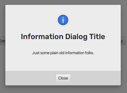
The class DialogPane can be used as a layer on top of any application. It offers various methods to display different types of dialogs.
- Information
- Warning
- Error
- Confirmation
- Node (any UI)
- Busy (spinning animation, indeterminate)
- Single line text input
- Multiple line text input
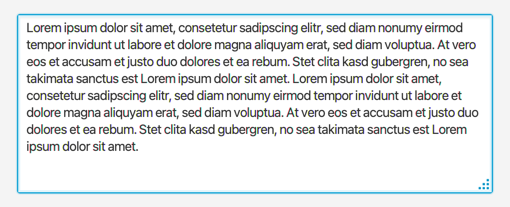
A custom control that wraps a text area and adds a resize handle to the lower right corner of it. The area can be configured to be resizable in vertical, horizontal, or both directions.
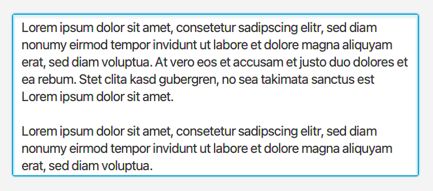
A customized text area that grows based on its text content. The text area will never show vertical or horizontal scrollbars.
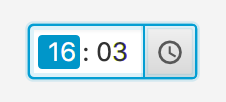
A small control used for entering a time. The control can be configured with a "step rate" for the minutes field (e.g. "15 minutes") that will be used when incrementing or decrementing the minutes field via the keyboard (arrow keys). The control can also be configured to only allow a time within the time range defined by an earliest and a latest time. A popup can be used to work with the mouse only. It is also possible to specify whether the fields should "roll over" or not when they reach their minimum or maximum value. For example: the minute field shows 59 minutes and the user wants to increase it via the arrow key. Then the new value will be "0" when rollover is enabled. If not the value will remain at 59. Rollover combined with "linking fields" will cause the hours field to get increased when the minute field rolls over from 59 to 0 or decreased when the minute field rolls over from 0 to 59.
A small control used for entering a duration. The control can be configured to only allow a duration within the range defined by a minimum and maximum duration. A popup can be used to work with the mouse only. It is also possible to specify whether the fields should "roll over" or not when they reach their minimum or maximum value. The control supports similar features as the time picker: rollover fields, keyboard support, linking fields, filling fields with leading zeros, etc..
A control for adding and editing a user profile photo (or whatever). The user can click on the control to choose an image file via a file chooser (replacable) or via drag and drop. Once added the user can move the image around and zoom in / out. As a convenience the view always provide a cropped version of the original image. This allows applications to store a smaller file on the server / in the database. The control supports some keyboard shortcuts. The file chooser can be activated by pressing SPACE or ENTER. The photo can be removed by pressing DELETE or BACK_SPACE.
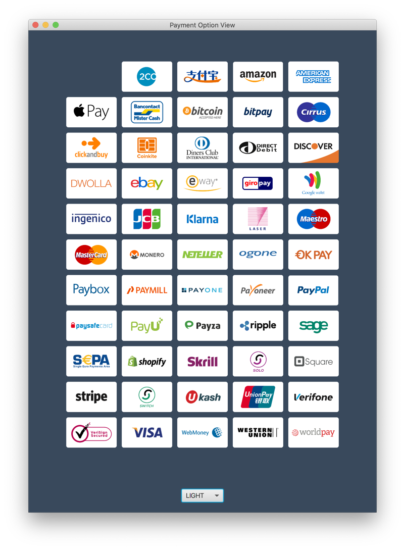
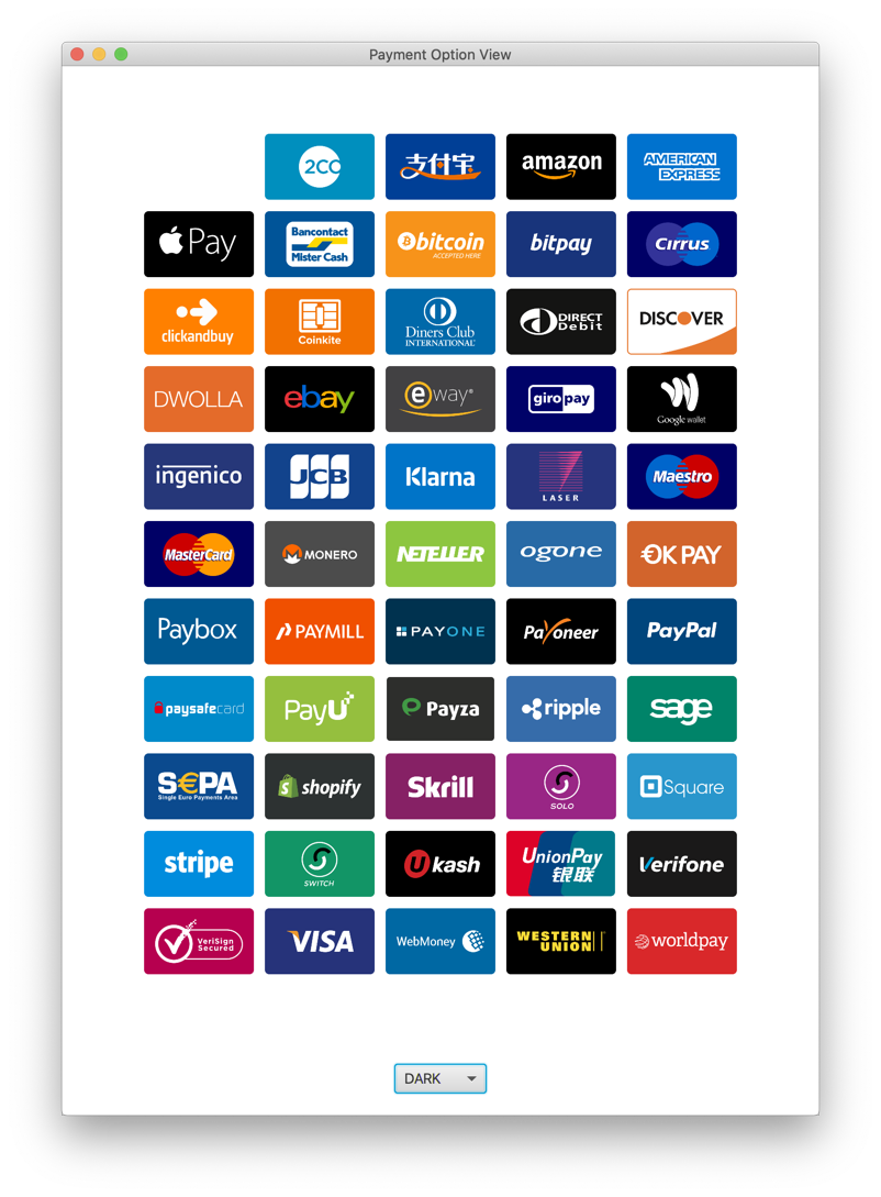
A specialized subclass of ImageView that can be used to display different graphics for different payment options. Graphics provided by Gregoire Segretain (https://www.sketchappsources.com/contributor/gregoiresgt)
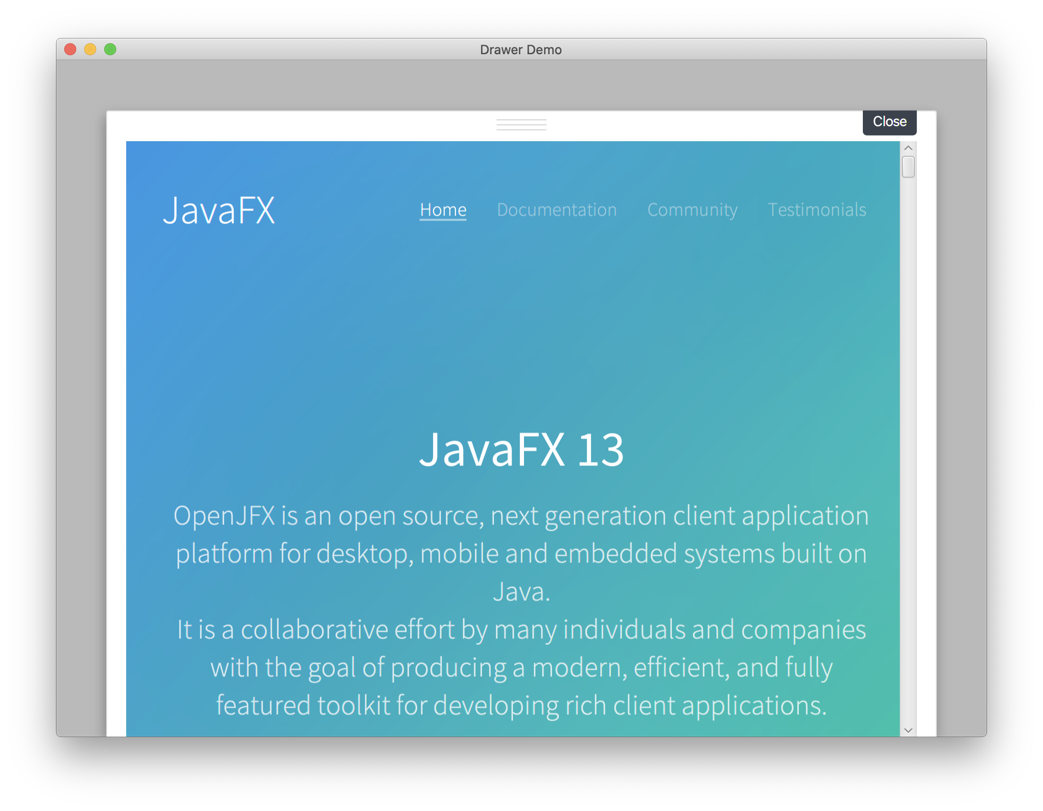
A stackpane with an optional node that can be shown inside a drawer. The drawer is animated and can slide in and out. When the drawer is showing a semi-transparent glass pane will cover the background. In addition the last height of the drawer can be persisted via the preferences API so that next time the drawer will show itself like in the last user session.
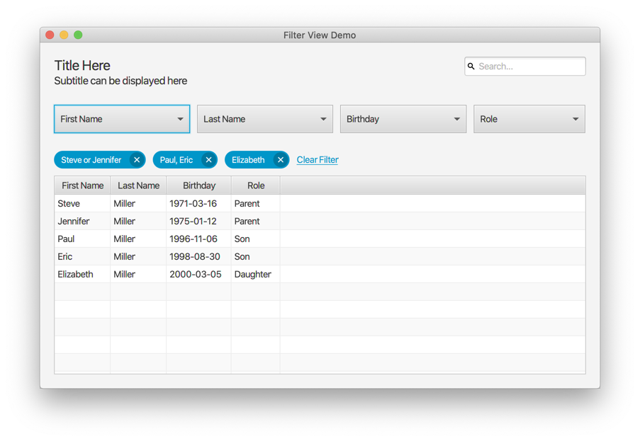
A control for filtering the content of an observable list. Works in combination with TableView, ListView, or any control that is based on observable lists.
You can run the demos using Maven by typing any of the following lines into your terminal:
mvn javafx:run -f gemsfx-demo/pom.xml -Dmain.class=com.dlsc.gemsfx.demo.DialogsApp
mvn javafx:run -f gemsfx-demo/pom.xml -Dmain.class=com.dlsc.gemsfx.demo.DrawerApp
mvn javafx:run -f gemsfx-demo/pom.xml -Dmain.class=com.dlsc.gemsfx.demo.DurationPickerApp
mvn javafx:run -f gemsfx-demo/pom.xml -Dmain.class=com.dlsc.gemsfx.demo.EmailFieldApp
mvn javafx:run -f gemsfx-demo/pom.xml -Dmain.class=com.dlsc.gemsfx.demo.EnhancedLabelApp
mvn javafx:run -f gemsfx-demo/pom.xml -Dmain.class=com.dlsc.gemsfx.demo.ExpandingTextAreaApp
mvn javafx:run -f gemsfx-demo/pom.xml -Dmain.class=com.dlsc.gemsfx.demo.FilterViewApp
mvn javafx:run -f gemsfx-demo/pom.xml -Dmain.class=com.dlsc.gemsfx.demo.InfoCenterApp
mvn javafx:run -f gemsfx-demo/pom.xml -Dmain.class=com.dlsc.gemsfx.demo.PaymentOptionApp
mvn javafx:run -f gemsfx-demo/pom.xml -Dmain.class=com.dlsc.gemsfx.demo.PaymentOptionTilesApp
mvn javafx:run -f gemsfx-demo/pom.xml -Dmain.class=com.dlsc.gemsfx.demo.PhotoViewApp
mvn javafx:run -f gemsfx-demo/pom.xml -Dmain.class=com.dlsc.gemsfx.demo.ResizableTextAreaApp
mvn javafx:run -f gemsfx-demo/pom.xml -Dmain.class=com.dlsc.gemsfx.demo.SearchFieldApp
mvn javafx:run -f gemsfx-demo/pom.xml -Dmain.class=com.dlsc.gemsfx.demo.SearchTextFieldApp
mvn javafx:run -f gemsfx-demo/pom.xml -Dmain.class=com.dlsc.gemsfx.demo.TagsFieldApp
mvn javafx:run -f gemsfx-demo/pom.xml -Dmain.class=com.dlsc.gemsfx.demo.TimePickerApp

