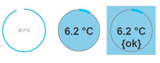
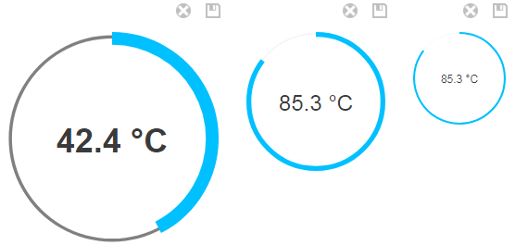
An example that integrates the ProgressBar JavaScript library into a bajaux Web Widget.
http://kimmobrunfeldt.github.io/progressbar.js/
http://progressbarjs.readthedocs.io/en/latest/
A 4.6 version of the bajaux-progressbar-example jar can be downloaded here.
This is an example module and as such is not supported by Tridium.
However, it can be used as is, or as a starting point to extend and develop other widget modules.
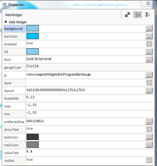
ProgressBar has a large range of parameters, a selection of which have been added as Widget properties:
background: the background colour of the widget.barColor: the colour of the gauge's bar. (color in the ProgressBar API)fill: the colour inside the guage. (fill)font: the font used by any text in the widget.font: the font used by any text in the widget.gaugeType: ProgressBar types - Line, Circle or SemiCircle.lineWidth: the width of the gauge line. (strokeWidth)min: the minimum gauge value, default 0.max: the maximum gauge value, default 100.showText: whether to show the widget's text.valueText: the widget's text.textColor: the colour of any text.trailColor: the colour of the trail behind the main bar. (trailColor)


