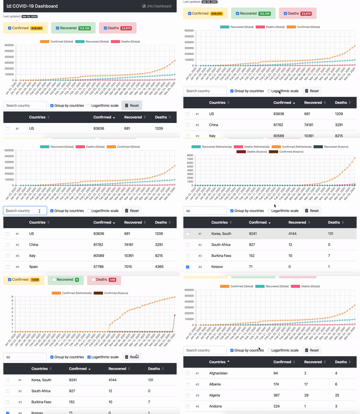
📈 Coronavirus (COVID-19) Dashboard shows the dynamics (the curvature of the graph) of Сoronavirus distribution per country.
The reason for creating a new dashboard was to complement the well-known JHU Dashboard (which is made by Johns Hopkins CSSE) with the feature of seeing the charts with the number of COVID-19 confirmed / recovered/ deaths use-cases per country.
Basically I personally had a question like: "What about the Netherlands/Ukraine?", "Is the virus spread (growth factor) slowing down?", "How I can compare the recovered/deaths dynamics per-country?", "Which countries are doing the proper things to slow down the growth-factor".
The dashboard is still raw but it provides a basic functionality of displaying the global and per-country data charts.
Here is how the main functionality looks like:
The dashboard is using COVID-19 (2019-nCoV) Data Repository by Johns Hopkins CSSE as a data source.
Front-end wise I've tried to make it as simple as possible, therefore the dashboard is using a pure React.js (without JSX transpiler or CreateReactApp starter). To draw the chart I've used Charts.js.
