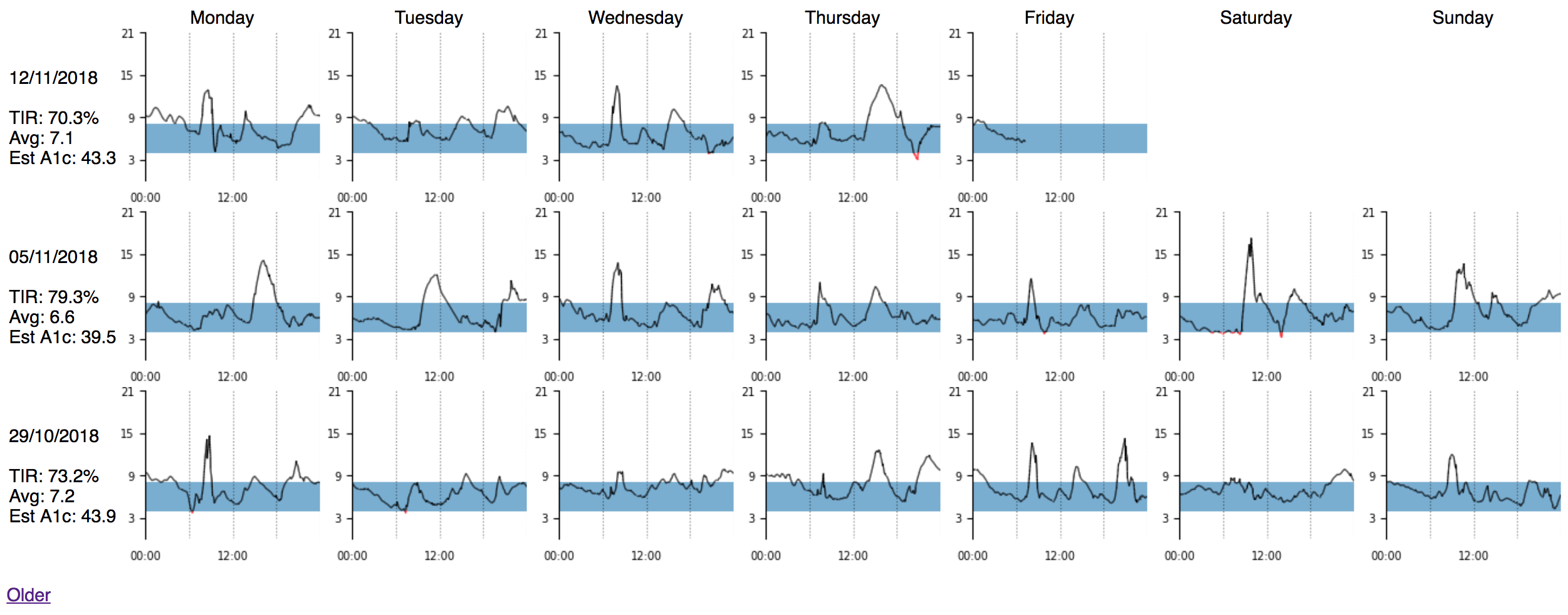
A dashboard for Type 1 Diabetes.
Visualize your historical blood glucose levels in a calendar-like view, with weekly summaries of a few key metrics.
Generated from data stored in Nightscout.
Install Python dependencies:
python3 -m venv venv
source venv/bin/activate
pip install -r requirements.txt
Export data from Nightscout
mongoexport -h <host> -d <database> -u <user> -p <password> \
  -c entries \
  --fields type,sgv,mbg,date,dateString \
  --type csv \
  -o /tmp/entries.csv
Publish locally
./dboard.py --bg_lower 3.9 --bg_upper 8 /tmp/entries.csv out
python3 -m http.server 8000
Then open http://localhost:8000/out in a browser.
Alternatively, publish to Google Cloud to keep a permanent record
export GOOGLE_APPLICATION_CREDENTIALS=... # see https://cloud.google.com/docs/authentication/production#obtaining_and_providing_service_account_credentials_manually
./dboard.py --bg_lower 3.9 --bg_upper 8 /tmp/entries.csv gs://<bucket>
Then open https://storage.googleapis.com/<bucket>/index.html in a browser.
There is a single web page, index.html, that has a small amount of JavaScript (no libraries) to load data from a metadata file, index.json and display the images for each day.
Here's a snippet of index.json:
[
    {
        "week_start": "03/09/2018",
        "plots": [
            "2018/09/03/plot.png",
            "2018/09/04/plot.png",
            "2018/09/05/plot.png",
            "2018/09/06/plot.png",
            "2018/09/07/plot.png",
            "2018/09/08/plot.png",
            "2018/09/09/plot.png"
        ],
        "range_low": 3.9,
        "range_high": 8.0,
        "tir": "81.0%",
        "average_bg": "6.7",
        "est_hba1c": "40.1"
    },
    {
        "week_start": "10/09/2018",
        "plots": [
            "2018/09/10/plot.png",
            "2018/09/11/plot.png",
            "2018/09/12/plot.png",
            "2018/09/13/plot.png",
            "2018/09/14/plot.png",
            "2018/09/15/plot.png",
            "2018/09/16/plot.png"
        ],
        "range_low": 3.9,
        "range_high": 8.0,
        "tir": "80.3%",
        "average_bg": "6.2",
        "est_hba1c": "37.0"
    }
]
The plots element contains paths to the images for each day in the week.
The JSON and PNG files are generated by the dboard Python package.
The traces library is used to interpolate BG values to every minute; this ensures that accurate statistics can be produced from the data (Time In Range, Average, Estimated HbA1c). For plotting, Matplotlib is used to render each daily plot.
There are a few other reports (daily carbs, insulin) that are produced separately.
mkdir -p reports
./dboard.py /tmp/treatments.csv reports
Then look in the reports directory.
pytestCoverage
pip install pytest-cov
pytest --cov-report html --cov=dboard
open htmlcov/index.html