
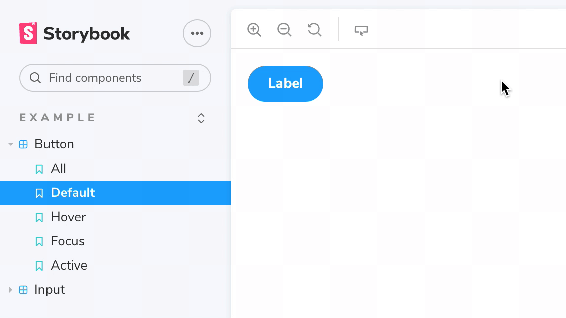
Toggle CSS pseudo states for your components in Storybook.
This addon attempts to "force" your components' pseudo states. It rewrites all document stylesheets to add a class name selector to any rules that target a pseudo-class (:hover, :focus, etc.). The tool then allows you to toggle these class names on the story container (#root). Additionally, you can set the pseudo property on your story parameters to set a default value for each pseudo class. This makes it possible to test such states with Chromatic.
Because this addon rewrites your stylesheets rather than toggle the actual browser behavior like DevTools does, it won't render any of the default user agent (browser) styles. Unfortunately there's no JavaScript API to toggle real pseudo states without using a browser extension.
This addon requires Storybook 6.1 or later. Install the latest with npx sb upgrade --prerelease
First, install the addon:
npm i -D storybook-addon-pseudo-statesThen, add "storybook-addon-pseudo-states" to the addons array in your .storybook/main.js:
module.exports = {
  addons: ["storybook-addon-pseudo-states"],
}You can have your stories automatically use a specific set of pseudo states, by setting the pseudo property on parameters:
export const Hover = () => <Button>Label</Button>
Hover.parameters = { pseudo: { hover: true } }
This is what enables snapshot testing your pseudo states in Chromatic.