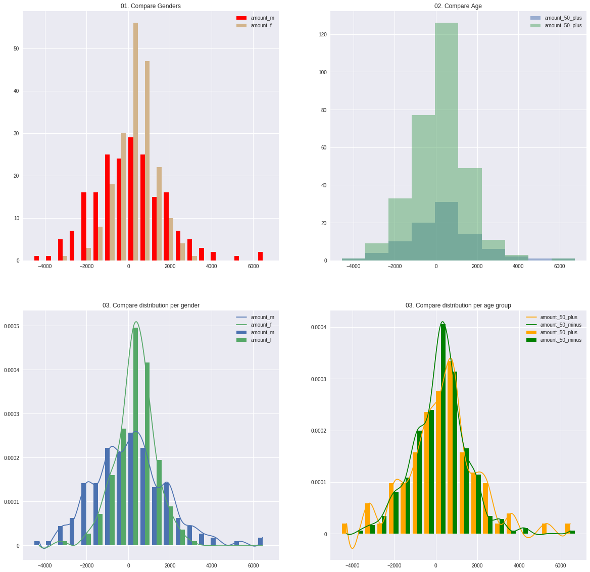
Pyspark_dist_explore is a plotting library to get quick insights on data in Spark DataFrames through histograms and density plots, where the heavy lifting is done in Spark.
Pypsark_dist_explore has two ways of working: there are 3 functions to create matplotlib graphs or pandas dataframes easily, and a class (Histogram) to do more advanced explorations while minimizing the amount of computation needed.
-
hist(ax, x, **kwargs). The hist function is almost exactly the same as the matplotlib hist function. See here for examples. The only two differences are:
- Instead of being a function of an Axes object, an Axes object is needed as input.
- Instead of having an numpy array, list of arrays, or matrix as input, the function works on Spark DataFrames with a single column, a list of single-column Spark DataFrames, or a SparkDataframe with multiple columns. All other keyword arguments of the Matplotlib hist function can be used.
-
distplot(ax, x, **kwargs). Combines a normalized histogram of each column in x with a density plot of the same column.
-
pandas_histogram(x, bins=None, range=None). Creates histograms for all columns in x and converts this to a Pandas DataFrame
Install from PyPi:
pip install pyspark_dist_explore
Or directly from github:
git clone https://github.com/Bergvca/pyspark_dist_explore.git
cd pyspark_dist_explore
pip install .
import pyspark
import pandas as pd
import numpy as np
import pyspark.sql.functions as F
import matplotlib.pyplot as plt
import seaborn as sns

from IPython.display import display, HTML, display_html #usefull to display wide tables
from pyspark_dist_explore import Histogram, hist, distplot, pandas_histogram
from pyspark.sql import Row

sc = pyspark.SparkContext()
sqlContext = pyspark.SQLContext(sc)
%matplotlib inline
# Create some data in a Spark DataFrame:
n_observations = 200
random_dist_1 = np.random.logistic(100, 1000, n_observations)
random_dist_2 = np.random.logistic(400, 500, n_observations)
age_dist_1 = 20 * np.random.randn(n_observations) + 40
age_dist_2 = 15 * np.random.randn(n_observations) + 30
list_male = [('M', rand_value, age_dist_1[i]) for i, rand_value in enumerate(random_dist_1)]
list_female = [('F', rand_value, age_dist_2[i]) for i, rand_value in enumerate(random_dist_2)]
list_male_female = list_male + list_female
rdd = sc.parallelize(list_male_female)
transactions = rdd.map(lambda x: Row(gender=x[0], amount=float(x[1]), age=float(x[2])))
transactions_df = sqlContext.createDataFrame(transactions)# Create some selections on this data
filtered_by_gender_m = transactions_df.filter(F.col('gender') == 'M').select(F.col('amount').alias('amount_m'))
filtered_by_gender_f = transactions_df.filter(F.col('gender') == 'F').select(F.col('amount').alias('amount_f') )
filtered_by_age_50_plus = transactions_df.filter(F.col('age') > 50).select(F.col('amount').alias('amount_50_plus'))
filtered_by_age_50_minus = transactions_df.filter(F.col('age') <= 50).select(F.col('amount').alias('amount_50_minus'))
# Create the plots
fig, axes = plt.subplots(nrows=2, ncols=2)
fig.set_size_inches(20, 20)
# Use the hist function to plot histograms on the Axes
hist(axes[0, 0], [filtered_by_gender_m, filtered_by_gender_f], bins = 20, color=['red', 'tan'])
axes[0, 0].set_title('01. Compare Genders')
axes[0, 0].legend()
hist(axes[0, 1], [filtered_by_age_50_plus, filtered_by_age_50_minus], overlapping=True)
axes[0, 1].set_title('02. Compare Age')
axes[0, 1].legend()
# Use the distplot function to plot (scaled) histograms + density plots on the Axes
distplot(axes[1, 0], [filtered_by_gender_m, filtered_by_gender_f], bins=20)
axes[1, 0].set_title('03. Compare distribution per gender')
axes[1, 0].legend()
distplot(axes[1, 1], [filtered_by_age_50_plus, filtered_by_age_50_minus], bins=20, color=['orange', 'green'])
axes[1, 1].set_title('03. Compare distribution per age group')
_ = axes[1, 1].legend()# Convert Histograms of the 4 datasets to a pandas dataframe
# Put the outliers in seperate bins:
bins = [-6000, -3000] + [bin_range for bin_range in range(-2500, 4000, 500)] + [6000]
compare_all_df = pandas_histogram([filtered_by_gender_m,
filtered_by_gender_f,
filtered_by_age_50_plus,
filtered_by_age_50_minus],
bins=bins, range=(-4000, 4000))
display(compare_all_df)| amount_50_minus | amount_50_plus | amount_f | amount_m | |
|---|---|---|---|---|
| -6000.00 - -3000.00 | 4 | 2 | 1 | 5 |
| -3000.00 - -2500.00 | 4 | 2 | 0 | 6 |
| -2500.00 - -2000.00 | 11 | 3 | 1 | 13 |
| -2000.00 - -1500.00 | 10 | 5 | 4 | 11 |
| -1500.00 - -1000.00 | 21 | 6 | 9 | 18 |
| -1000.00 - -500.00 | 32 | 9 | 16 | 25 |
| -500.00 - 0.00 | 39 | 8 | 30 | 17 |
| 0.00 - 500.00 | 68 | 13 | 52 | 29 |
| 500.00 - 1000.00 | 46 | 17 | 43 | 20 |
| 1000.00 - 1500.00 | 29 | 4 | 22 | 11 |
| 1500.00 - 2000.00 | 24 | 9 | 13 | 20 |
| 2000.00 - 2500.00 | 10 | 5 | 6 | 9 |
| 2500.00 - 3000.00 | 4 | 3 | 2 | 5 |
| 3000.00 - 3500.00 | 5 | 0 | 1 | 4 |
| 3500.00 - 6000.00 | 2 | 3 | 0 | 5 |
Next to running the functions as above to get results quickly, the pyspark_dist_explore library contains a Histogram class. The advantage of using this class is that it retains state, so if the histogram is build once, multiple actions can be done withouth recalculating the bin values.
age_hist = Histogram(range=(-4000, 4000), bins=15)

# Create a histogram for different age groups
for age in range(0, 90, 10):
    age_hist.add_data(
        transactions_df.
        filter((F.col('age') > age) & (F.col('age') <= age+10)).
        select(F.col('amount').alias('amount_%d_%d' % (age, age+10)))
    )

fig, axes = plt.subplots(nrows=2)
fig.set_size_inches(20, 10)

age_hist.plot_hist(axes[0], histtype='step', linewidth=2.0, fill=False, cumulative=True) # The Histogram is build here
age_hist.plot_density(axes[1]) # The density plot is created from the already build histogram

# Set the legends
axes[0].legend(loc = 'upper left' )
axes[0].set_title('Cumulative Histogram')
axes[1].legend()
axes[1].set_title('Kernel Density Plot')

age_hist_pd_df = age_hist.to_pandas() # Again the histograms don't need to be recalculated.

# Create a heatmap from the Pandas Dataframe

fig, axes = plt.subplots()
fig.set_size_inches(10, 10)
ax = sns.heatmap(age_hist_pd_df, annot=True, ax=axes)
_ = ax.set_title('Heatmap')