

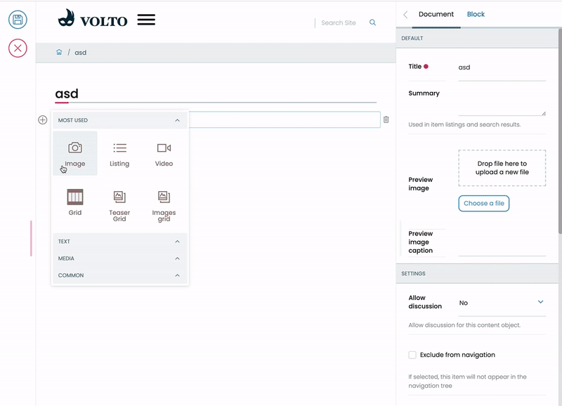
This package includes blocks for building unidimensional (x-axis) grids in Volto.
grids.mov
At kitconcept, we think that providing a full featured, two dimensional free will layout (eg. Plone Mosaic-ish like) experience to users is often overwhelming for them, specially if these users are not technical or power users. Providing a proper and comprehensive UX for this kind of layouts are often hard and counter intuitive, specially when dealing with behaviors in responsive layouts. Our experience is that allowing that also enables an easy path to craft "ugly layouts" way out of the (most probably) existing site style guide.
By providing a mean to restrict the users to unidimensional layouts (and still enabling them to build with them 2D layouts) are better than an UX that allows you to arbitrary position blocks in a 2D space.
Also, unidimensional grids are also more in line of the current design trends in modern web, where we can often find these unified one rowed sections, specially in landing pages.
This block can contain any registered block in the application. By default, it's
restricted to Image, Text, Teaser and Listing. More can be customized via the
block config gridAllowedBlocks key:
  __grid: {
    id: '__grid',
...
    gridAllowedBlocks: ['teaser', 'image', 'listing', 'text'],
},This block is restricted by default to contain Teaser block type.
This block is restricted by default to contain Image block type.
You can craft your personalized grid types by restricting the block types allowed inside
by creating a new block type and using the gridAllowedBlocks key:
import {
  GridViewBlock,
  GridEditBlock,
  TeaserViewBlock,
  TeaserEditBlock,
} from './components';

...
  teaserGrid: {
    id: 'teaserGrid',
    title: 'Teaser Grid',
    icon: imagesSVG,
    group: 'teasers',
    view: GridViewBlock,
    edit: GridEditBlock,
    restricted: false,
    mostUsed: true,
    sidebarTab: 1,
    security: {
      addPermission: [],
      view: [],
    },
    gridAllowedBlocks: ['teaser'],
  },
    teaser: {
    id: 'teaser',
    title: 'Teaser',
    icon: imagesSVG,
    group: 'common',
    view: TeaserViewBlock,
    edit: TeaserEditBlock,
    restricted: true,
    mostUsed: true,
    sidebarTab: 1,
    security: {
      addPermission: [],
      view: [],
    },
    imageScale: 'teaser'
  },
any registered block types are allowed.
For convenience, this package includes a "teaser" block that allows you to pull content from a source content object and brings in to a block (title, description, preview_image fields).
You'll find the preview_image field in kitconcept.volto add-on, or use your own definition of it in your Volto integration package.
It includes a configuration option imageScale (see above example) that allows you to use an specific scale for the preview_image.
2.0.0 -> Volto 12.14.0 or above 1.0.0 -> Anything lower
You can try other similar products developed by some of our fellow community members and companies.
If you already have a Volto project, just update package.json:
"addons": [
    "@kitconcept/volto-blocks-grid"
],

"dependencies": {
    "@kitconcept/volto-blocks-grid": "*"
}
If not, create one:
npm install -g yo @plone/generator-volto
yo @plone/volto my-volto-project --addon @kitconcept/volto-blocks-grid
cd my-volto-project
Install new add-on and restart Volto:
yarn install
yarn start
Go to http://localhost:3000