NB. There is a bug with the readme format that means internal links won't work if the headers they link to are capitalised hence the use of all lowercase headers throughout this document.
- Introduction
- UX Design
- Technologies Used
- Initial build, Testing
- Bug fixes and feedback changes
- Validation and Evaluation
- Deployment
- Credits
- Possible future expansions
This is my second milestone project as part of a Level 5 Diploma in Web Application Development offered through the Code Institute and accredited through The College of West Anglia. The project builds on the HTML & CSS knowledge from the first milestone project and adds Javascript which increases the interactivity potential of a frontend web development. Outlined in this document is the process that was taken to design and code the project, the issues that have had to be overcome both expected and unexpected throughout its development and its final deployment to Github and Github Pages.
The project has been guided throughout by the five elements of UX design first laid down by Jesse James Garrett in their book 'The Elements of User Experience' and a condensed version of this was used which can be viewed through the link provided below.
The five planes are as follows:
Moving from the most abstract plane, strategy through to the most concrete plane, surface. These planes provided the framework for the successful development and deployment of this site.
There were essentially two stories to be considered during the design of this project. They were the creator's story and the user's story.
As the creator I want the site to be as intuitive as possible. Navigation should be clear and obvious. From the off the purpose should be clear.
As the creator I want the site to be consistent in terms of features such as the button design, the text colour and background and the font used.
As the creator I want the site to engage the user both visually and audibly. However I want the user to be able to toggle the sound effects/music on/off.
As the creator I want the site to have an app like feel on mobile/tablet screens but one that will scale appropriately when viewed on larger displays.
As the creator I want a persistent high score to encourage repeat visits to the site and increased engagement from the users.
As the creator I want to be able to easily update/change the questions to keep the quiz fresh over time.
As the creator I want to provide a Dr. Who feel to the site without encountering any copyright/licensing issues.
As the creator and a Doctor Who fan I want the site to demonstrate an in depth knowledge of the subject material as I feel this will engage other Doctor Who fans.
As a first time user I want the site to be visually appealing but not cluttered or too busy. I want the site to engage me and make me want to play the quiz.
As a first time user I want an easy explanation of the rules. I do not want to be confused about how to play.
As a first time user I want the site to be as intuitive as possible. There should be no confusion over navigation or purpose.
As a returning user I want to be able to try to beat my previous high score. I don't want to have to start again each time I return.
Doctor Who as a show has a near sixty year history from its first television broadcast on 23rd November 1963 to its continuing adventures right now in 2023. The stories now span multiple media types from TV broadcasts, DVD & Bluray releases, digital purchases, audiobooks, books, graphic novels and magazines. The decision was taken to create a quiz that focused on the classic era of TV shows that began in 1963 and ran until 1989. This narrowed scope was deemed necessary to enable a better overall structure for the quiz.
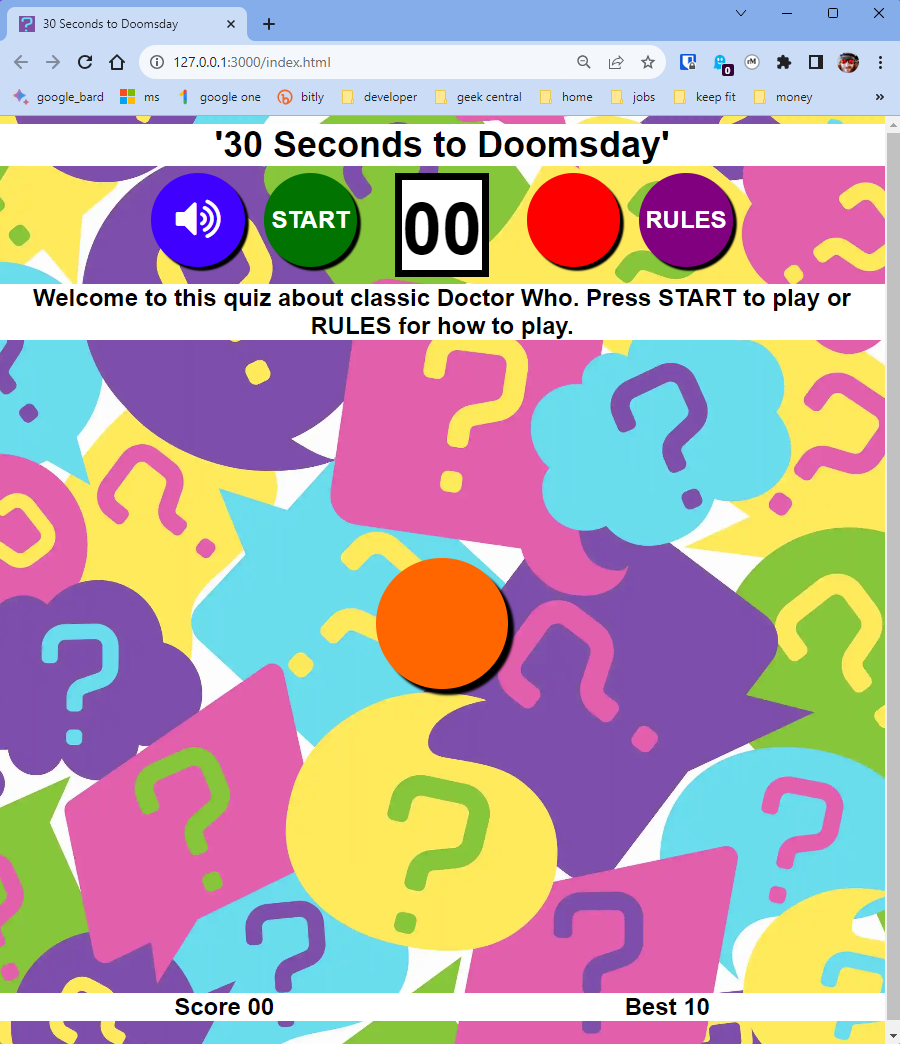
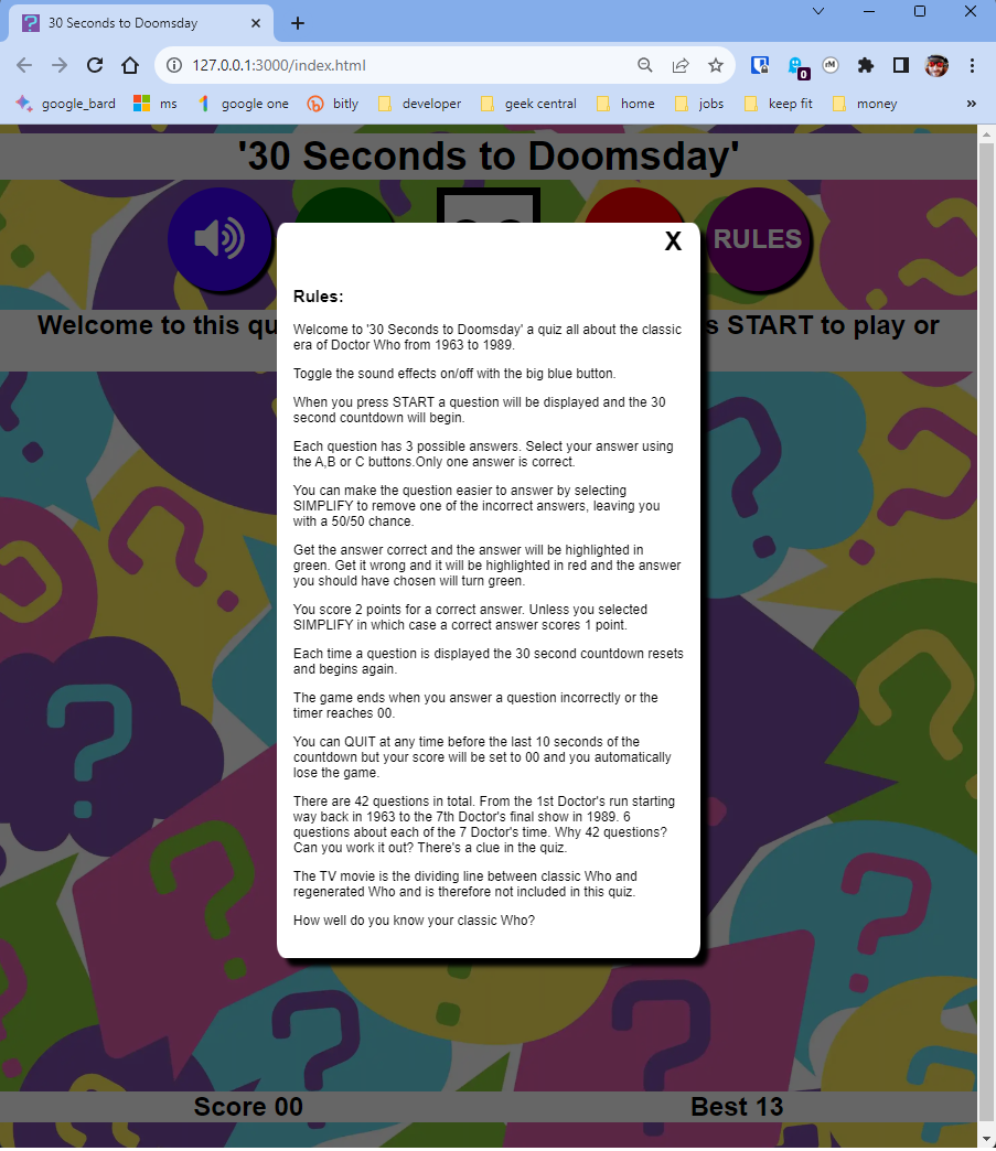
With the scope set on classic Who the structure of the quiz site could be laid down. It had to be a single page. The focus must never drift from the essentials of question and answer presentation. This then required that the rules also appear on that single page hence the use of a modal to display them. The features that enable the game to be played ie. the buttons must all be clearly labelled with no ambiguity about their purpose. Hence very obvious labelling such as 'START', 'RULES' etc. The background needs to say 'quiz' but at the same time not be too distracting.
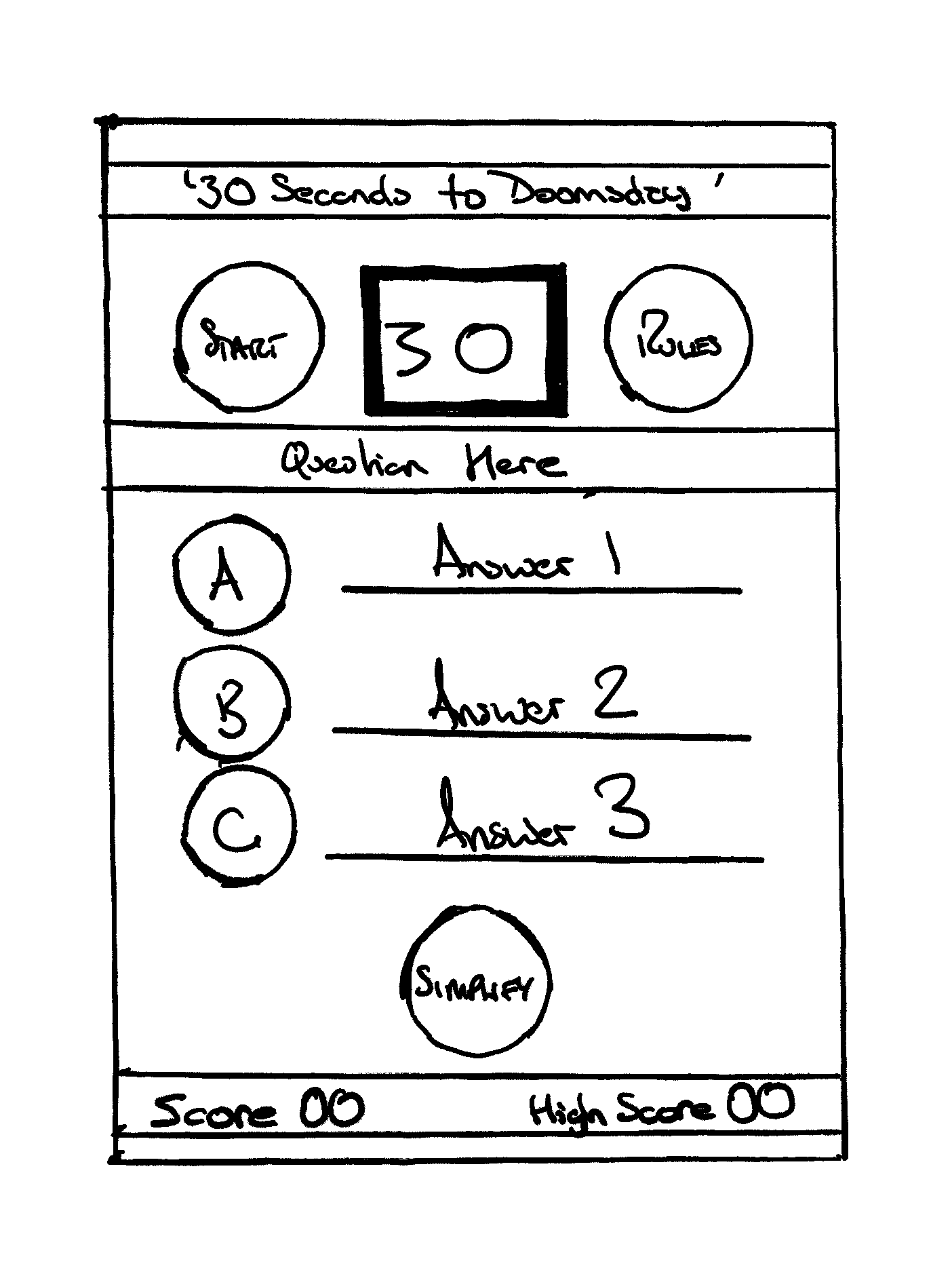
A wireframe of the proposed layout was drawn on the reMarkable 2 e-ink tablet and is presented here to show how the initial design of the site was imagined.
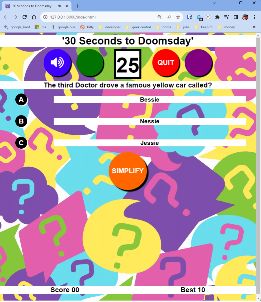
The look needs to engage straight from when the site is first loaded so a background of question marks in bright but not overpowering colours was purchased (see credits). Question marks formed part of the fifth, sixth and seven Doctor's outfits so suggest Dr. Who without any licensing issues. The font used is Roboto as it is a modern font that fits the look of the site perfectly, and as the site is one page no other fonts were deemed necessary. The text is presented in black on a white background to keep the title, scores, questions and answers clear against the colourful background. The answer buttons reverse this with black buttons and white text and the five other buttons, the volume toggle button, 'START', 'QUIT', 'RULES' and 'SIMPLIFY' employ a bright colour scheme that along with the button shadows ensure that they contrast well with the background wallpaper.
HTML : Used to provide the basic structure of the quiz website.
CSS : Used to provide the colour and styling elements of the quiz website.
Javascript : Used to provide the interactivite elements of the website.
Google Fonts : As the subject matter of the quiz is a popular science fiction show I felt that a clean modern font was needed to best compliment the look of the site and Roboto fulfills that role.
Font Awesome 4.7 : Two icons were required for the sound on/off button.
mixkit : Used to provide royalty/copyright free sound effects.
Chrome Dev Tools : Used as the primary source for debugging the code and testing the sites responsiveness during the initial and subsequent site builds.
Github & Git : Used to store and log the development of the site from its initial state through to completion.
Visual Studio Code : Used as the primary integrated development environment.
Stackblitz : Used as a cloud based alternative to VS Code.
reMarkable 2 : Used to generate the initial wireframe during the design process.
W3C Markup Validation service : Used to ensure that both the HTML & CSS meet modern web requirements.
JS Lint : Used to ensure that the Javascript used meets modern web requirements.
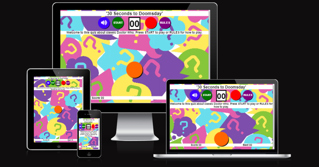
amiresponsive : Used to ensure that the site is responsive across different screen formats.
Once the wireframe design had been completed and the basic site layout confirmed the first part of the build was getting the boilerplate HTML coded. Using placeholder text where necessary this gave an opportunity to visualise the game and ensure that basic design elements were all present and correct. After the HTML was in place the preliminary CSS was written and this added styling aspects including the background image, the size, colour and placement of the buttons, the positioning of the title banner, score banner, question banner and answer banners. Once the basic layout was complete tweaks were made to colours and opacity to improve the readability of the text. Right from the start the decision was taken to not use libraries such as Bootstrap for CSS or Jquery for Javascript. This has ensured that all the code is 'vanilla' allowing me to demonstrate a fundamental understanding of how the languages HTML, CSS & Javascript work.
Initially the decision was to develop the various Javascript modules of the game separately using Stackblitz and then import them after testing into VS Code for the final build. However after a few hours it became obvious that the logic flow of the game was flawed and I was unable to get the game to work without 'breaking' the code I was using. Using Chrome dev tools it was possible to ascertain that the issue was one of recursion with the main game loop repeatedly calling itself which meant that the event listeners used to detect button presses multiplied and this eventually crashed the game. The decision was taken to completely remove the Javascript and start again. Some of the Javascript was repurposed such as the code used to create the initial question array, displaying the answers and the end game function.
The rebuilding of the code started with putting the event listeners for button presses into place and then adding the other functions in a modular style giving the opportunity to progressively test the build with liberal use of console.log statements within Chrome dev tools to track individual variables through each of the functions and ensure that the code behaved in the manner that was expected. This second build resulted in a game that whilst requiring refinements worked as it should.
The build takes care to avoid allowing people to play the quiz and answer correctly on the basis of a learned pattern. In the Json file the first answer is always the correct one. To avoid any obvious patterns the quiz starts with a random question from 1 to 42. The 3 possible answers are then randomised in how they are displayed and if the player simplifies the questions by removing one this is also randomised thus ensuring that no two games should be the same in terms of displayed answers or overall game behaviour. Each correct answer results in that question being removed from the question array and a new question is selected at random from the remaining questions. This is repeated until either the timer runs down to zero, a question is answered incorrectly or there are no more questions left to ask.
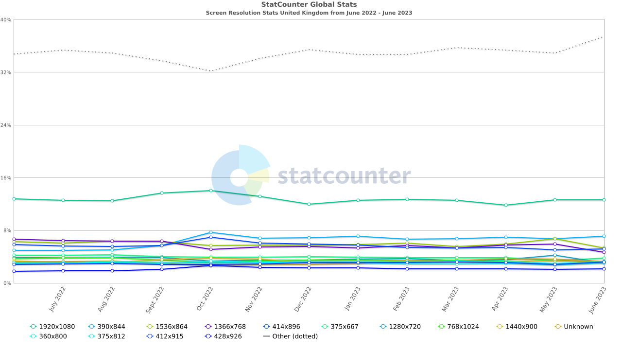
Statcounter UK was used as a reference for the most commonly used screen sizes.
From this information and given the layout of the quiz a mobile first UX was designed whilst ensuring that it scales appropriately for larger screens.
Given the subject of this project the decision was taken to not perform any automated tests. Whilst acknowledging the usefulness of an automated test environment such as Jest it was deemed unnecessary in this instance. The structure of an automated testing environment is such that you would build each module setting parameters that need to be met and then testing against them gradually building a module that met the design requirements. For this build it was felt that automated testing would not be appropriate as the in depth testing required is when the quiz site is up and running and that manual testing ie. repeated gameplays was the best way to highlight, identify and resolve any gameplay bugs and that these bugs would not necessarily have been picked up by the automated tests. Even with automation manual testing would still have been required and therefore was a better use of the available testing time. It was also decided that another person would be essential at this point as a tester as they would bring a fresh opinion and a new perspective.
The manual testing had two objectives. Does the game play the way it should and secondly can the game be crashed. To do this buttons were pressed at varying speeds and at random times during gameplay. This was to see if inappropriate button presses caused unexpected actions from the code. Pressing buttons quickly at the start of the timer countdown and at the very end of the countdown ie. at 30 seconds and 1 second on the timer to see if this resulted in unexpected behaviour. Playing lots of games in very quick succession to see if any unusual behaviour manifested itself. Trying different combinations of correct answering, simplifying and getting answers wrong to see if this caused any issues. Also scoring a maximum score as this is handled slightly differently by the code. Any unexpected behaviour was then followed in the Console in Chrome devtools enabling an analysis of exactly how the site was performing and exactly where any errors lay. This repeated playing of the quiz resulted in the following bugs being detected and resolved.
Also to be noted is the fact that if an id or class was used in the Javascript the naming convention used was camelcase. This made it easier to see which elements were being used by the Javascript when inspecting the CSS or HTML parts of the site.
-
There was an issue encountered during initial testing of the finished build that meant the 'SIMPLIFY' button intermittently didn't register a click. To debug this the Javascript was checked by utilising Console in devtools and then the HTML and CSS was inspected using Elements. It became apparent that the 'SIMPLIFY' button was being pushed further down the screen and behind a div when a longer question was being asked. This div then partially obscured the button thus preventing the click detection required to activate the button. To resolve this issue the z-index of the button was set to 1 ensuring that it stayed on top of all other HTML elements and worked as expected.
-
There was an issue that meant if you answered a question with only a second left on the timer the games countdown would continue down past 0 and continue into negative numbers rather than resetting to 30 preventing the game from triggering the endGame function and resetting for a new game. To overcome this a small delay was introduced to the calling of the endGame function allowing the games other functions to complete first ensuring that the game resets/restarts correctly.
-
Occasionally the game would crash unexpectedly with an error stating that the question didn't exist in the question array. By following the console.log traces of the questionsLeft variable it was discovered that the question array was not being rebuilt at the end of each game so rather than the game starting with 42 questions it could be less than this. This caused an issue that when starting a new game the random question to be asked could be of a higher value than the number of questions in the array causing an undefined question array error in the Console and the game would crash. The building of the question array was moved into a small function called createQuestionArray and this was then called during the endGame function ensuring that the game always started with 42 questions. The function to build the question array had an error function built into it so that any error during the build would be reported to the console.
-
The game handles getting all the questions right without simplifying any a little differently to any other high score and there was an issue where the maximum score of 84 was not being saved so that when reloading the site the previous high score was displayed. This was traced to the maximum score not being written to the cookie and a couple of lines of code were introduced to correct this.
-
There was also an issue of the game very occasionally not ending correctly and getting stuck in a 0 score end of game loop where the lose game sound effect would sound every few seconds and no new game could be started. This was traced to a misspelling of the 'playingGame' variable as 'playGame' meaning that the 'playingGame' variable remained in a True state rather than being reset to False meaning that the game tried to continue and got stuck in a infinite loop.
-
Another issue that needed addressing was that there was a slight delay of 1 second from when a question was asked to the timer starting to countdown. This meant that the player was getting 31 seconds to answer a question rather than 30. A 1 second delay was introduced to the displaying of a question to resolve this issue and ensure that the displaying of a question and the start of the countdown synchronised correctly.
-
Played on a mobile device the hover effect in CSS used to change the colour of the button being hovered over would activate if the button was tapped but would then become stuck until a different button was tapped. The CSS was rewritten so that the hover effect is not present on mobile devices.
-
Following feedback from my mentor a volume toggle button was introduced and this unfortunately introduced an asymmetry into the button layout at the top of the site which I felt spoiled the look of the game. As my mentor had also suggested an option to quit the quiz I introduced a 'QUIT' button restoring the symmetry to the button layout. The 'START' and 'QUIT' buttons were altered to only display their text when appropriate in the game.
-
The 'QUIT' button introduced a bug where if you had a high score and quit your score would be reset to 0 and you lose but the high score would remain. A new variable of previousHighScore was introduced to enable the highScore variable to be reset to its previous value under these conditions.
-
My mentor also suggested hiding the answer buttons and answer spans when a game was not being played. The simple addition of either hiding the answerButtonPos div or making the div visible at appropriate points in the game gave the required effect.
-
Whilst testing further it became apparent that unwanted button presses from the three answer buttons A, B and C could be triggered by rapid button presses. The introduction of a button pressed flag allowed these buttons to only be triggered once. When the simplify option is selected the appropriate answer button is now hidden along with the randomly chosen answer. The behaviour of the 'SIMPLIFY' button wasn't consistent when being hidden so the text for the button is now permanently visible ensuring it behaves as it should.
-
A custom 404 error page was added to handle incorrect urls. As Github pages uses an Apache server a .htaccess file was added and a '404.html' page using a combination of HTML and inline CSS built. This page has a link that returns the user to the correct 'index.html' gamepage.
I tested the site on the following browsers, Google Chrome Version 119.0.6045.106 (Official Build) (64-bit), Microsoft Edge Version 119.0.2151.44 (Official build) (64-bit), Mozilla Firefox 119.0 (64-bit) and Mobile Safari on iOS17.1. My tester John also checked on these browsers too. The site worked without issues on all tested browsers whilst acknowledging that there are many more browsers available. These are amongst the most popular and therefore it is likely that most users of the site would be using one of these options. It is also noted that there are devices in use that have unusual screen resolutions but again the site has been tested using the options built into Chrome dev tools that enable a screen size to be set and see how the site behaves. For the most common screen resolutions the site works well.
Once the testing had been completed then the code was put through it's required validations and evaluations.
The HTML passed its validation on the w3c site with no errors:
The CSS passed its validation on the w3c with no errors:
The Javascript was evaluated on jslint with none of the warnings considered detrimental to the performance of the site so they were acknowledged but no remedial action was taken.
Screenshot of jslint evaluation
The site passed all relevant Google Lighthouse tests with no score less than 99/100.
Screenshot of Google Lighthouse test results
The site was deployed to GitHub Pages. The steps to deploy were as follows:
- In the GitHub repository, navigate to the Settings tab.
- Then select Pages from the left hand menu list.
- From the Source section drop-down menu, select Deploy from a branch.
- From the Branch section drop-down menus select main and /root.
The quiz can be played here 30 Seconds to Doomsday
The Github repository can be found here - thespamster/dr_who_quiz
iStock by Getty Images : paid for question mark background image.
Image by storyset on Freepik. 404 error jpg.
mixkit : free sound effects and other assets.
Stackoverflow : An online resource for getting answers to coding issues from fellow coders.
codecademy : An online resource that teaches coding.
w3schools : An online resource that teaches coding.
Koko (seun_mentor) : My code institute mentor. As ever offered excellent feedback and advice during this build.
John : A long time friend and someone with great attention to detail. A perfect person to employ as a tester.
Given the fact that the question array is a Json file held separately to the main game and that the quiz site itself is not just designed for classic Doctor Who it is entirely possible to write other 42 question quiz files covering other aspects of the Whoniverse. This would enable the site to be refreshed periodically with entirely new questions. Other topics could be DVD releases, Big Finish audio releases or indeed any from a multitude of possibilities. Minor adjustments to the displayed text in the HTML/CSS/Javascript would be required but a whole new quiz could be developed for very little additional work.
It maybe a good idea to introduce a menu allowing different quizzes to be selected rather than replacing one quiz file with another.
