Well, well, well… it seems you’ve found this package for plotting: wells.
The goal of {ggplateplot} is to extend {ggplot2} to make it easier to make plots resembling cell culture microwell plates. This packages takes care of some of the layouts, relying on the flexibility of {ggplot2} and extensions to add layers, scales, theme adjustments et cetera.
You can install the development version of {ggplateplot} like so:
# install.packages("remotes")
remotes::install_github("teunbrand/ggplateplot")This is a terse example of how one could make a plot from a matrix of
values.
library(ggplot2)
library(ggplateplot)

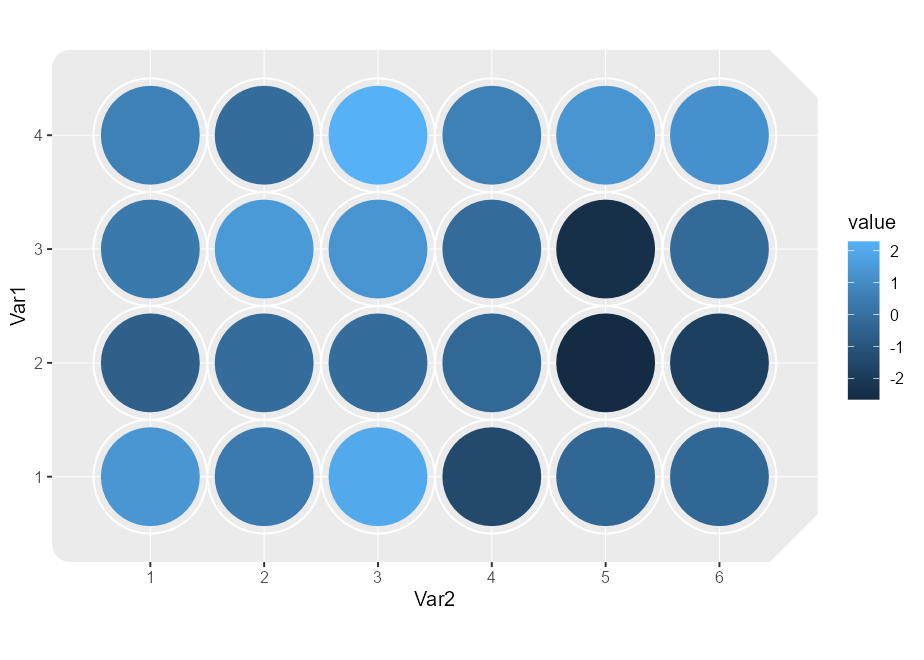
plate <- matrix(rnorm(24), nrow = 4, ncol = 6)

ggplateplot(plate, aes(fill = value)) +
  geom_well()
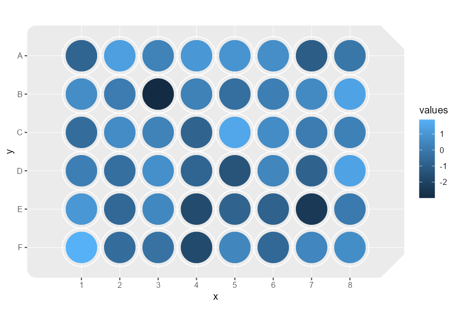
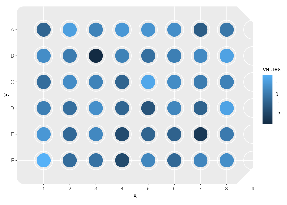
Instead of providing a matrix, we can also provide long-format data.
It should automatically detect an appropriate layout for the plate based
on the number of rows in the data argument, when it has 6, 12, 24, 48,
96 or 384 rows.
df <- expand.grid(
  x = 1:8,
  y = LETTERS[1:6]
)
df$values <- rnorm(nrow(df))

ggplateplot(df, aes(x, y, fill = values)) +
geom_well()This package is not a package that instantly makes your plots prettier or easier. It is a formatting tool for a very particular kind of plot, of microwell shaped data, in {ggplot2}’s ecosystem.
The ggplateplot() function above is a thin wrapper around the
ggplot() function. It does a few automated things to make your plots
look more like cell culture plates.
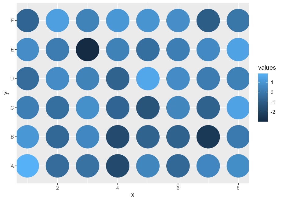
First off, the {ggplateplot} package has a specialised layer (geom) for
drawing wells. This isn’t a particularly exciting layer as it just draws
circles as you would with geom_point(). A small bit of magic comes
from combining this geom with coord_plate(), in that the size
aesthetic is synced with the diameter of wells.
p <- ggplot(df, aes(x, y, fill = values)) +
  geom_well()
pThe crux of {ggplateplot} is coord_plate(), which modifies how several
panel components of a plot are drawn.
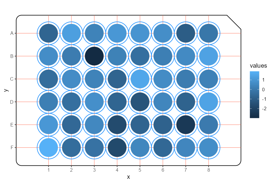
The following adjustments to the theming of a plot are made.
- The
panel.backgroundandpanel.borderfollow the shape of a microwell plate. Corners are rounded a little bit and you can ‘bite’ off some corners with thecornerargument to resemble a microwell plate better. - The
panel.grid.majornow draws circles around the wells. - The
panel.grid.minorperforms the role of the major panel grid.
p + coord_plate(corner = "topright", spec = 48) +
  theme(
    panel.grid.major = element_line(colour = "dodgerblue"),
    panel.grid.minor = element_line(colour = "tomato"),
    panel.background = element_rect(colour = "black", fill = "white")
)The coord_plate() function has a specs argument that takes a
description of a well plate. We’ve included descriptions for 6, 12, 24,
48, 96 and 384-well plates in the package. If we mismatch the number of
datapoints with the layout, we might get inappropriate layouts. In the
example below, we’re purposfully giving the wrong layout for the shape
of the data to demonstrate that, among other things, the spacing of
wells is off.
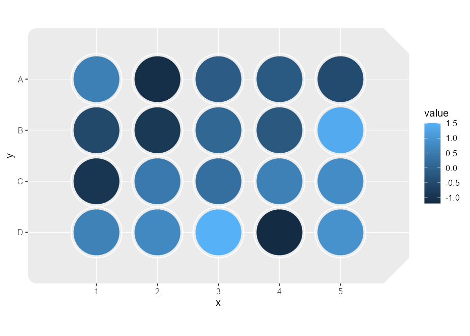
p + coord_plate(specs = 96)To offer slightly more flexibility than the standard layouts, you can
set a custom layout with custom_plate_spec().
df <- data.frame(
  x = rep(1:5, each = 4),
  y = rep(LETTERS[1:4], 5),
  value = rnorm(20)
)

ggplot(df, aes(x, y, fill = value)) +
  geom_well() +
  coord_plate(spec = custom_plate_spec(ncol = 5, nrow = 4))
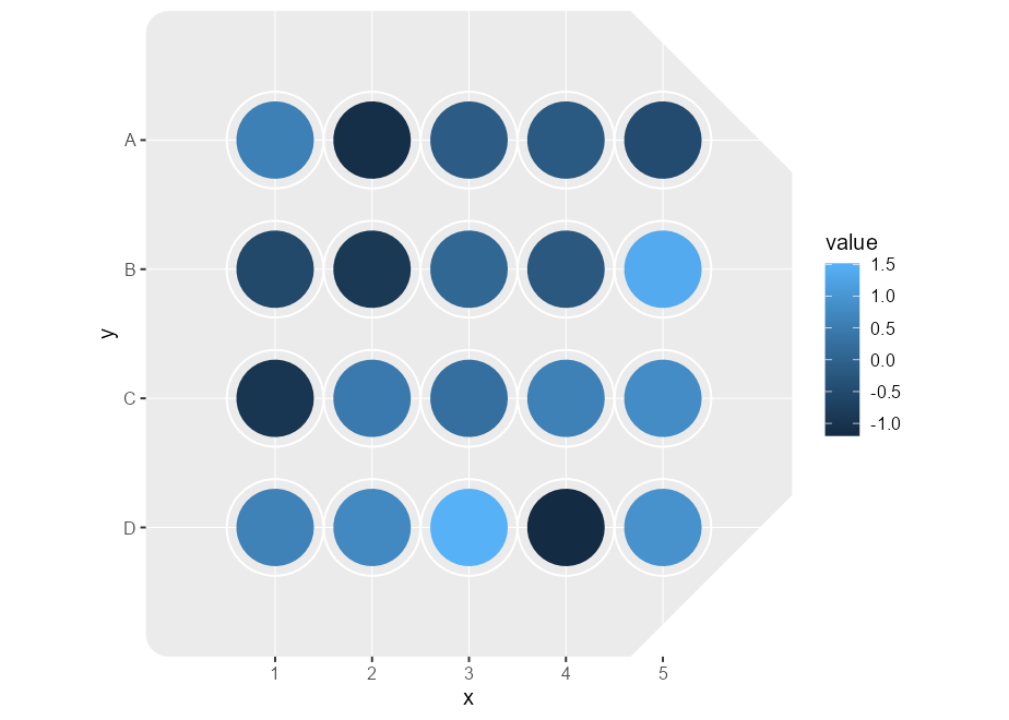
If you want to even further customise the layout, you can use
new_plate_spec() to control even more parameters of the layout.
spec <- new_plate_spec(
  width = 100, height = 100,
  hor_spacing = 15,
  ver_spacing = 20,
  well_diameter = 12,
  ncol = 5, nrow = 4,
  corner_size = 25
)

ggplot(df, aes(x, y, fill = value)) +
  geom_well() +
coord_plate(spec = spec)So what does ggplateplot() do exactly? Well, it just tries to
automatically match the shape of your data to an appropriate setting for
coord_plate(). If you have data that doesn’t match the dimensions of
one of the standard plates, we recommend that you simply use
ggplot() + coord_plate() instead, and customise from there. For
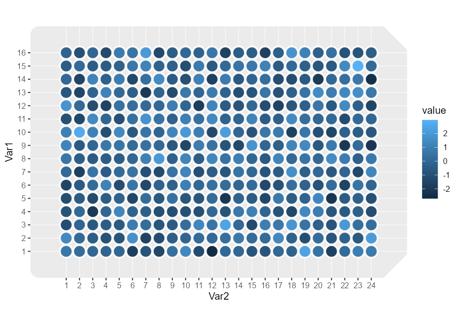
matrix input, it additionally converts it to long format and
automatically sets x and y aesthetics. The values in the matrix are
converted to a value column.
plate <- matrix(rnorm(384), ncol = 24, nrow = 16)

ggplateplot(plate, aes(fill = value)) +
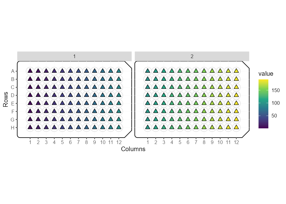
geom_well()While {ggplateplot} makes it easier to make plots of plates, it still
requires some familiarity with the ggplot2 package. The ggplateplot()
functions return regular ggplot objects, so they can be combined with
the usual functions one can use to manipulate plots. Below is an example
of combining it with other {ggplot2} functions. We can use an array
instead of matrix input to make variable out of the 3rd dimension, which
we can use to create facets.
m <- array(1:192, dim = c(8, 12, 2))

ggplateplot(m, aes(fill = value)) +
  geom_point(shape = 24, size = 2.5) +
  scale_fill_viridis_c() +
  scale_y_reverse(name = "Rows", labels = LETTERS[1:8]) +
  facet_wrap(~ Var3) +
  theme(
    panel.background = element_rect(colour = "black", fill = NA),
    panel.grid.major = element_line(colour = "grey90"),
    panel.grid.minor = element_line(colour = "grey97")
  ) +
  labs(x = "Columns")
