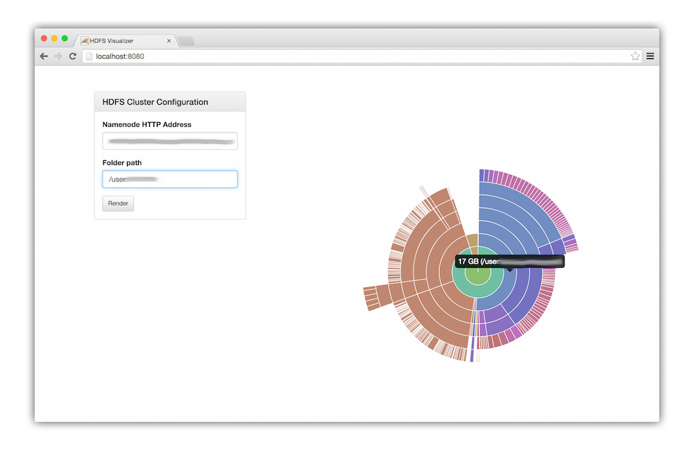
Visual disk usage tool for easily getting a sense of what is consuming disk space on your HDFS 2.0 cluster. The filesystem is represented as a layered pie chart or "sunburst" where each nested segment is a subdirectory or file. Hovering over each segment will display the disk usage and full path.
The application is completely client-side, using Chart.js and Web Workers for rendering.
Credit to twitter/hdfs-du for the inspiration!
Because the project is entirely implemented on the client side, you just need to run a little HTTP web server to serve the content. The built in bin/www script can do this for you.
- Python 2.7+
- Bower
$ bower install
$ PORT=1234 bin/www
The application is all client-side and uses the WebHDFS API built into HDFS 2.0+ so you'll need to make sure that is enabled.
