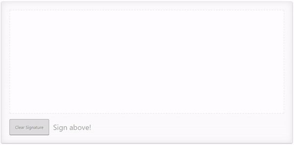
This project provides components and utils for digital signatures. Use it to draw smooth signatures based on HTML5 canvas and uses variable width Bézier curve interpolation. SignaturePad is used as the vanilla implementation.
// app.component.html
<signature-pad [config]="{penColor:red}" #sP></signature-pad>
<button (click)="sp.clear()">CLEAR</button>- Load library
$ npm install angular-signature-pad --save- Import module
// src/app/app.module.ts
...
// IMPORT YOUR LIBRARY
import { AngularSignaturePadModule } from 'angular-signature-pad';

@NgModule({
  imports: [
    ...
    AngularSignaturePadModule.forRoot()
  ]
  ...
})
export class AppModule { }- Use Component
// src/app/app.component.html
<signature-pad #sigPad></signature-pad>

<b>value:</b>
<pre>
  {{sigPad.value | json}}
</pre>

<button (click)="sigPad.clear()">Clear</button>To apply the default styles just import the styles.scss file from the node_modules/angular-signature-pad folder.
// src/styles.scss

@import "../node_modules/angular-signature-pad/styles";The SignaturePadCard and SignaturePadCardGroup component have a default styling set over the [theme] property.
It is applied over the .raised class internally.
To create your own theme create a class i.e. .my-theme and combine
it with the default class of the signature pad. .signature-pad-card.my-theme.
Apply it to the component over the [theme] property binding.
- Create styles
.signature-pad-card.my-theme {
  ...

  .signature-pad {
    ...
  }

  .signature-pad-canvas {
    ...
  }

  .actions {
    ...
    .clear {
     ...
    }
  }

  .feedback {
   ...
  }
}
- Apply styles to the theme property binding
<signature-pad-card [theme]="'my-theme'" ></signature-pad-card>