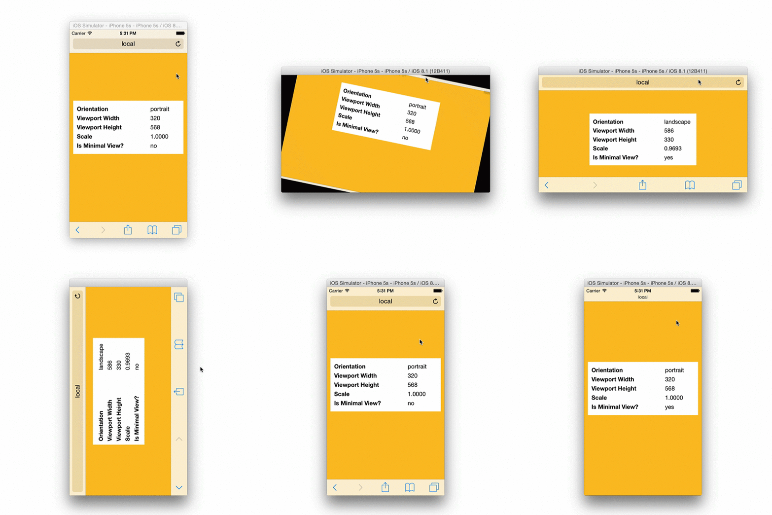
Dynamic viewport management for mobile.
- Manage
viewportin different states of device orientation. - Scale document to fit viewport.
- Calculate the dimensions of the "minimal" iOS 8 view relative to your viewport width.
Configure dimensions of the viewport at the time of the initialization:
var scream = Scream({
    width: {
        portrait: 320,
        landscape: 640
    }
});
Scream generates the viewport meta tag to reflect the present orientation and in response to the orientationchangeend event.
<meta name="viewport" content="width={width},initial-scale={scale},minimum-scale={scale},maximum-scale={scale},user-scale=0">{width}the width set in the configuration for the current orientation.{scale}calculated scale needed to fit the document in the screen.
| Name | Description | Default |
|---|---|---|
width.portrait |
Viewport width in the portrait orientation. | screen.width (device-width) |
width.landscape |
Viewport width in the landscape orientation. | screen.width (device-width) |
The
orientationchangeendevent is fired when the orientation of the device has changed and the associated rotation animation has been complete.
– https://github.com/gajus/orientationchangeend
This is proxy for your convenience to perform operations that must follow the change of the device orientation and in the context of updated viewport tag. This is required when determining the view state.
scream.on('orientationchangeend', function () {
    // Invoked after the orientation change and the associated animation (iOS) has been completed.
});Invoked on page load and when view changes.
scream.on('viewchange', function (e) {
    // @var {String} 'full', 'minimal'
    e.viewName;
});/**
* @return {String} portrait|landscape
*/
scream.getOrientation();
/**
* Screen width relative to the device orientation.
*
* @return {Number}
*/
scream.getScreenWidth();
/**
* Screen width relative to the device orientation.
*
* @return {Number}
*/
scream.getScreenHeight();/**
* Viewport width relative to the device orientation.
*
* @return {Number}
*/
scream.getViewportWidth();
/**
* Viewport height relative to the device orientation and to scale with the viewport width.
*
* @return {Number}
*/
scream.getViewportHeight();
/**
* The ratio between screen width and viewport width.
*
* @return {Number}
*/
scream.getScale();This functionality is iOS 8 specific. It has been developed as part of Brim to bring back the minimal-ui.
/**
 * Returns dimensions of the usable viewport in the minimal view relative to the current viewport width and orientation.
 *
 * @return {Object} dimensions
 * @return {Number} dimensions.width
 * @return {Number} dimensions.height
 */
scream.getMinimalViewSize();

/**
 * Returns true if screen is in "minimal" UI.
 *
 * iOS 8 has removed the minimal-ui viewport property.
 * Nevertheless, user can enter minimal-ui using touch-drag-down gesture.
 * This method is used to detect if user is in minimal-ui view.
 *
 * In case of orientation change, the state of the view can be accurately
 * determined only after orientationchangeend event.
 *
 * @return {Boolean}
 */
scream.isMinimalView();Using Bower:
bower install screamUsing NPM:
npm install screamThe old-fashioned way, download either of the following files:


