This repo maintains a collection of recipes for machine learning, graph analysis, finance, and more. It uses the powerful machinery of Plots and RecipesBase to turn simple transformations into flexible visualizations.
PlotRecipes also exports the recipes in StatPlots.jl, which is a collection of statistics recipes, including functionality for DataFrames and Distributions.
using PlotRecipes
n = 15
A = Float64[(rand()<0.5 ? 0 : rand()) for i=1:n,j=1:n]
for i=1:n
    A[i,1:i-1] = A[1:i-1,i]
end
node_weights = 1:n

graphplot(A,
    node_weights = 1:n,
    marker = (:heat, :rect),
    line = (3, 0.5, :blues),
    marker_z = 1:n,
    names = 1:n
)graphplot(A,
node_weights = 1:n,
dim = 3,
line = (3, 0.5, :blues),
marker_z = 1:n
)using PlotRecipes
adjmat = Symmetric(sparse(rand(0:1,8,8)));
plot(
graphplot(adjmat, method=:chorddiagram),
graphplot(adjmat, method=:arcdiagram, markersize=3)
)using PlotRecipes
pyplot(ma=0.8,lc=:white,mc=:white,size=(1000,800))
theme(:dark)
code = :(
function transform!{T}(act::Activation{:softmax,T})
val = forward!(act.input)
out = act.output.val
for i=1:act.n
out[i] = exp(val[i])
end
s = one(T) / sum(out)
for i=1:act.n
out[i] *= s
end
out
end
)
plot(code, fontsize=11, shorten=0.2, axis_buffer=0.05)using PlotRecipes, Learn
pyplot(size=(800,500))
theme(:dark)
plot(Learnable, method=:tree)using PlotRecipes, Shapefile
dir = "https://github.com/nvkelso/natural-earth-vector/raw/master/110m_physical/"
fn = "ne_110m_land.shp"
run(`wget $dir/$fn -P /tmp/`)
shp = open("/tmp/$fn") do fd
read(fd, Shapefile.Handle)
end
plot(shp)using PlotRecipes
tickers = ["IBM", "Google", "Apple", "Intel"]
N = 10
D = length(tickers)
weights = rand(N,D)
weights ./= sum(weights, 2)
returns = sort!((1:N) + D*randn(N))
portfoliocomposition(weights, returns, labels = tickers')using PlotRecipes
M = randn(1000,4)
M[:,2] += 0.8sqrt(abs(M[:,1])) - 0.5M[:,3] + 5
M[:,3] -= 0.7M[:,1].^2 + 2
corrplot(M, label = ["x$i" for i=1:4])using PlotRecipes, Distributions
n = 1000
x = rand(Gamma(2), n)
y = -0.5x + randn(n)
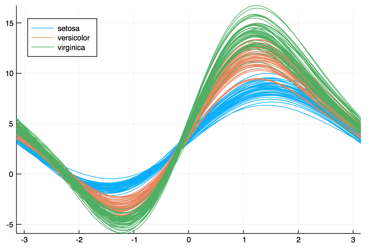
marginalhist(x, y, fc=:plasma, bins=40)AndrewsPlots are a way to visualize structure in high-dimensional data by depicting each row of an array or table as a line that varies with the values in columns. https://en.wikipedia.org/wiki/Andrews_plot
using RDatasets, PlotRecipes
iris = dataset("datasets", "iris")
@df iris andrewsplot(:Species, cols(1:4), legend = :topleft)


