@angular-material-extensions/password-strength - Material password strength meter to indicate how secure is the provided password - Angular V7 supported


This project has been transferred from ngx-material-password-strength to @angular-material-extensions/password-strength
Do you have any question or suggestion ? Please do not hesitate to contact us! Alternatively, provide a PR | open an appropriate issue here
If did you like this project, support angular-material-extensions by starring ⭐ and sharing it 📢
- Demo
- Components
- Dependencies
- Peer Dependencies
- Additional Requirements - material (Include a theme)
- Additional Requirements - material icons
- Installation
- API
- Usage
- Documentation
- Run Demo App Locally
- Development
- Other Angular Libraries
- Support
- License
View all the directives and components in action at https://angular-material-extensions.github.io/password-strength
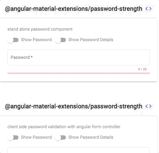
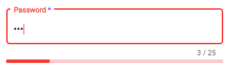
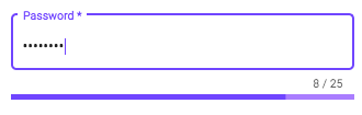
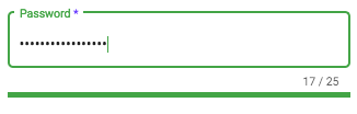
<mat-password-strength>used to calculate and display the strength of a provided password
- strength score <= 20%
- strength score <= 80%
- strength score > 80%
<mat-password-strength-info>used to display more information about the strength of a provided password
- Angular developed and tested with
7.0.2
npm i @angular/cdk @angular/material @angular/animations @angular/forms or use angular schematics like e.g:
ng add @angular/material Additional Requirements - Import the material design icons learn more
- The easiest way to import material design icons is to provide a link in your
index.htmlfile like below:
<link href="https://fonts.googleapis.com/icon?family=Material+Icons" rel="stylesheet">- alternative solution:
- Install of the official npm module of the material design icons
npm i -s material-design-icons- Import them in your
angular.jsonfile
"styles": [
        "styles.css",
        "../node_modules/material-design-icons/iconfont/material-icons.css"
],Install above dependencies via npm.
Now install @angular-material-extensions/password-strength via:
npm install --save @angular-material-extensions/password-strengthNote:If you are using
SystemJS, you should adjust your configuration to point to the UMD bundle. In your systemjs config file,mapneeds to tell the System loader where to look for@angular-material-extensions/password-strength:
map: {
  '@angular-material-extensions/password-strength': 'node_modules/@angular-material-extensions/password-strength/bundles/@angular-material-extensions/password-strength.umd.js',
}
Once installed you need to import the main module:
import { MatPasswordStrengthModule } from '@angular-material-extensions/password-strength';The only remaining part is to list the imported module in your application module. The exact method will be slightly
different for the root (top-level) module for which you should end up with the code similar to (notice MatPasswordStrengthModule .forRoot()):
import { MatPasswordStrengthModule } from '@angular-material-extensions/password-strength';

@NgModule({
  declarations: [AppComponent, ...],
  imports: [MatPasswordStrengthModule.forRoot(), ...],
  bootstrap: [AppComponent]
})
export class AppModule {
}
Other modules in your application can simply import MatPasswordStrengthModule:
import { MatPasswordStrengthModule } from '@angular-material-extensions/password-strength';

@NgModule({
  declarations: [OtherComponent, ...],
  imports: [MatPasswordStrengthModule, ...],
})
export class OtherModule {
}| option | bind | type | default | description |
|---|---|---|---|---|
| password | Input() | string | - | the password to calculate its strength |
| validators | Input() | Criteria[] | see inside the class ;) | custom form validator used to validate the password |
| externalError | Input() | boolean | false | used to change the color of the password to warn if an external error occurs |
| enableLengthRule | Input() | boolean | true | whether to validate the length of the password |
| enableLowerCaseLetterRule | Input() | boolean | true | whether a lowercase letter is optional |
| enableUpperCaseLetterRule | Input() | boolean | true | whether a uppercase letter is optional |
| enableDigitRule | Input() | boolean | true | whether a digit char is optional |
| enableSpecialCharRule | Input() | boolean | true | whether a special char is optional |
| min | Input() | number | 8 | the minimum length of the password |
| max | Input() | number | 30 | the maximum length of the password |
| onStrengthChanged | Output() | number | - | emits the strength of the provided password in % e.g: 20%, 40%, 60%, 80% or 100% |
<mat-password-strength-info> used to display more information about the strength of a provided password
| option | bind | type | default | description |
|---|---|---|---|---|
| passwordComponent | Input() | PasswordStrengthComponent | - | the password component used in the template in order to display more info related to the provided password |
| enableScoreInfo | Input() | boolean | false | whether to show the password's score in % |
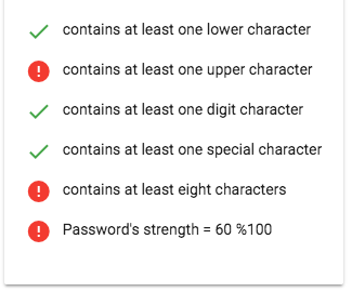
| lowerCaseCriteriaMsg | Input() | string | contains at least one lower character | an appropriate msg for the lower case % |
| upperCaseCriteriaMsg | Input() | string | contains at least one upper character | an appropriate msg for the upper case % |
| digitsCriteriaMsg | Input() | string | contains at least one digit character | an appropriate msg for the digit case % |
| specialCharsCriteriaMsg | Input() | string | contains at least one special character | an appropriate msg for the special case % |
| minCharsCriteriaMsg | Input() | string | contains at least ${this.passwordComponent.min} characters | an appropriate msg for the minimum number of chars % |
add the @angular-material-extensions/password-strength element to your template:
<mat-password-strength [password]="password.value">
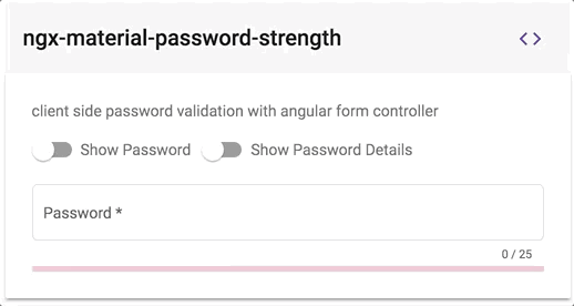
</mat-password-strength>This will display only the material password strength meter in form of a progress without any input fields or similar.
In the following example, we integration a material input container with @angular-material-extensions/password-strength 's component.
NOTE: In order to repaint the mat-form-field correctly after changing the value of the password's strength, please consider to change the detection strategy for the parent component -->
import {ChangeDetectionStrategy, Component, OnInit, ViewEncapsulation} from '@angular/core';
import {Title} from '@angular/platform-browser';
import {MatSlideToggleChange} from '@angular/material';
import {MatPasswordStrengthComponent} from '@angular-material-extensions/password-strength';

@Component({
  selector: 'app-home',
  templateUrl: './home.component.html',
  styleUrls: ['./home.component.scss'],
  encapsulation: ViewEncapsulation.None,
  changeDetection: ChangeDetectionStrategy.OnPush
})
export class HomeComponent implements OnInit {}<div>
<mat-form-field appearance="outline" style="width: 100%" [color]="passwordComponent.color">
<mat-label>Password</mat-label>
<input matInput #password
[type]="inputType"
required
placeholder="Password">
<mat-hint align="end" aria-live="polite">
{{password.value.length}} / 25
</mat-hint>
</mat-form-field>
<mat-password-strength #passwordComponent
(onStrengthChanged)="onStrengthChanged($event)"
[password]="password.value">
</mat-password-strength>
</div>learn more about mat-form-field
<div fxLayout="row" fxLayoutGap="10px">
   <div *ngIf="passwordComponent.strength === 100; then done else error">
   </div>
   <ng-template #done>
     <mat-icon color="primary">done</mat-icon>
   </ng-template>
   <ng-template #error>
     <mat-icon color="warn">error</mat-icon>
   </ng-template>
   <div>
     <p>Password's strength = {{passwordComponent.strength}} %100</p>
   </div>
</div>- add an input element to your template with an appropriate @angular-material-extensions/password-strength's component
- hold a reference of the @angular-material-extensions/password-strength's component by adding
passwordComponentWithValidation(or whatever you want) inside the element
e.g:
 <mat-password-strength #passwordComponentWithValidation
                       [password]="passwordWithValidation.value">
</mat-password-strength>- bind the form controller of the mat-password-strength to the input element
- you can access the form controller of @angular-material-extensions/password-strength using the chile view -->
passwordComponentWithValidation.passwordFormControl - bind the form controller to an input element -->
[formControl]="passwordComponentWithValidation.passwordFormControl"
- Full example - see below
<div>
  <mat-form-field appearance="outline" style="width: 100%">
    <mat-label>Password</mat-label>
    <input matInput #passwordWithValidation
           [type]="inputType"
           required
           [formControl]="passwordComponentWithValidation.passwordFormControl"
           placeholder="Password">
    <mat-hint align="end" aria-live="polite">
      {{passwordWithValidation.value.length}} / 25
    </mat-hint>
    <mat-error *ngIf="passwordComponentWithValidation.passwordFormControl.hasError('required')">
      Password is required
    </mat-error>
    <mat-error *ngIf="passwordComponentWithValidation.passwordFormControl.hasError('pattern')">
      Password is not valid
    </mat-error>
  </mat-form-field>
  <mat-password-strength #passwordComponentWithValidation
                                  (onStrengthChanged)="onStrengthChanged($event)"
                                  [password]="passwordWithValidation.value">
  </mat-password-strength>
  <!--Password's strength info-->
  <mat-password-strength-info
    [passwordComponent]="passwordComponentWithValidation">
  </mat-password-strength-info>
</div>
this will looks like -->
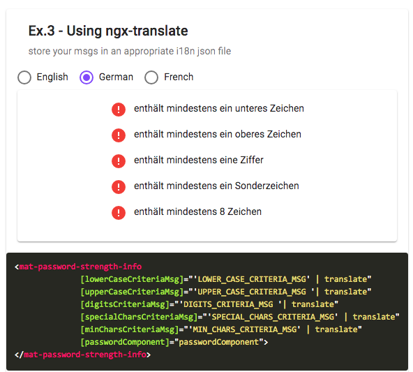
Supporting custom messages and ngx-translate for the info component please check the example demo here
for more examples please visit this URL : [(https://angular-material-extensions.github.io/password-strength/examples]((https://angular-material-extensions.github.io/password-strength/examples)
Please checkout the full documentation here or follow the official tutorial
- clone this repo by running
$ git clone https://github.com/angular-material-extensions/password-strength.git- link the @angular-material-extensions/password-strength package
$ gulp link- navigate to the demo app directory
$ cd demo- install the dependencies
$ npm i- run/start/serve the app
$ npm run startor
$ ng serve --open- the app is now hosted by
http://localhost:4200/
- clone this repo
- Install the dependencies by running
npm i - build the library
npm run buildorgulp build - Link the library
gulp link - Navigate to the demo app's directory
cd demo_npm i_npm start
- ngx-auth-firebaseui
- ngx-linkifyjs
- @firebaseui/ng-bootstrap
- @angular-material-extensions/link-preview
- @angular-material-extensions/google-maps-autocomplete
- @angular-material-extensions/pages
- @angular-material-extensions/contacts
- @angular-material-extensions/faq
- @angular-material-extensions/combination-generator
- Drop an email to: Anthony Nahas
- or open an appropriate issue
- let us chat on Gitter
Built by and for developers ❤️ we will help you 👊

This project is supported by jetbrains with 1 ALL PRODUCTS PACK OS LICENSE incl. webstorm
Copyright (c) 2018 Anthony Nahas. Licensed under the MIT License (MIT)