


xy-ui是一套使用原生Web Components规范开发的跨框架UI组件库。查看文档
-
xy-slider在vertical属性下支持动态样式修改
-
xy-slider新增vertical、prefix属性
-
xy-layout新增grid栅格布局xy-button新增danger类型- 修复
xy-slider在火狐上的input触发问题 - 其他
bug修复
-
- 新增
xy-text组件
- 新增
-
- 新增
xy-table组件 xy-checkbox新增indeterminate状态- 修复
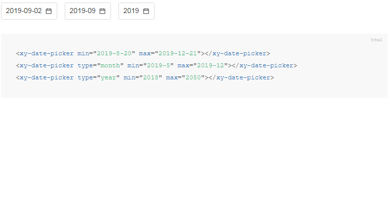
xy-date-picker在1月份选取去年12月份的bug - 修复
xy-color-pane在空白处触发change的bug
- 新增
-
- 优化
xy-color-picker和xy-date-picker初始化逻辑 - 其他
bug修复
- 优化
-
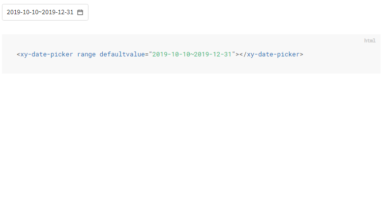
- 新增
xy-date-picker组件
- 优化
xy-icon的图标加载方式,不会再阻塞页面渲染了~ - 主题配置新增
--themeBackground - 其他
bug修复
- 新增


- 跨框架。无论是
react、vue还是原生项目均可使用。 - 组件化。
shadow dom真正意义上实现了样式和功能的组件化。 - 类原生。一个组件就像使用一个
div标签一样。 - 无依赖。纯原生,无需任何预处理器编译。
- 无障碍。支持键盘访问。
现代浏览器。
包括移动端,不支持IE。
IE不支持原生customElements,webcomponentsjs可以实现对IE的兼容,不过很多CSS特性仍然无效,所以放弃
- npm
npm i xy-ui- cdn
<script type="module">
    import 'https://unpkg.com/xy-ui';

    import 'https://unpkg.com/xy-ui@1.4.1';//指定版本号
</script>

<!--or-->

<script type="module" src="https://unpkg.com/xy-ui"></script>- 直接在
github上获取最新文件。
目录如下:
.
└── xy-ui
    ├── components //功能组件
    |   ├── xy-icon.js
    |   └── ...
    └── iconfont //图标库
        └── icon.svg
将整个文件夹放入项目当中。
<script type="module">
    import './node_modules/xy-ui/index.js'; //推荐
    //如需单独使用,文档中都是单独使用的情况,推荐全部引用,即第一种方式。
    import './node_modules/xy-ui/components/xy-button.js';
</script>
<xy-button>button</xy-button>
现代浏览器支持原生
import语法,不过需要注意script的类型type="module"。
import 'xy-ui';//推荐
//如需单独使用
import 'xy-ui/components/xy-button.js';
ReactDOM.render(<xy-button>button</xy-button>, document.body);关于
react中使用Web Components的注意细节可参考https://react.docschina.org/docs/web-components.html
与原生类似,暂无研究。
大部分情况下,可以把组件当成普通的html标签,
比如给<xy-button>button</xy-button>添加事件,有以下几种方式
<xy-button onclick="alert(5)">button</xy-button>btn.onclick = function(){
alert(5)
}
btn.addEventListener('click',function(){
alert(5)
})自定义事件只能通过
addEventListener绑定
比如元素的获取,完全符合html规则
<xy-tab>
    <xy-tab-content label="tab1">tab1</xy-tab-content>
    <xy-tab-content label="tab2">tab2</xy-tab-content>
    <xy-tab-content label="tab3" id="tab3">tab3</xy-tab-content>
</xy-tab>
const tab3 = document.getElementById('tab3');
tab3.parentNode;//xy-tab组件的布尔类型的属性也遵从原生规范(添加和移除属性),比如
<xy-dialog show></xy-dialog> <!-- 显示 -->
<xy-dialog></xy-dialog> <!-- 隐藏 -->
<xy-button loading>button</xy-button> <!-- 加载中 -->
<xy-button>button</xy-button> <!-- 正常 -->总之,大部分情况下把它当成普通的html标签(不用关注shadow dom的结构)就好了,以前怎么做现在仍然怎么做,只是新增了方法而已。