Congratulations on your new job! As the new lead analyst for the New York Citi Bike Program, you are now responsible for overseeing the largest bike-sharing program in the United States. In your new role, you will be expected to generate regular reports for city officials looking to publicize and improve the city program.
Since 2013, the Citi Bike Program has implemented a robust infrastructure for collecting data on the program's utilization. Each month, bike data is collected, organized, and made public on the Citi Bike Data webpage.
However, while the data has been regularly updated, the team has yet to implement a dashboard or sophisticated reporting process. City officials have questions about the program, so your first task on the job is to build a set of data reports to provide the answers.
The key focal point of this analysis is to investigate the effect of lockdown restrictions while using the data to drill-down further to analyse; user types, age groups, habits prior, during and once restrictions began to ease.
- How much of an impact did lockdown have on the usage of Citi Bikes?
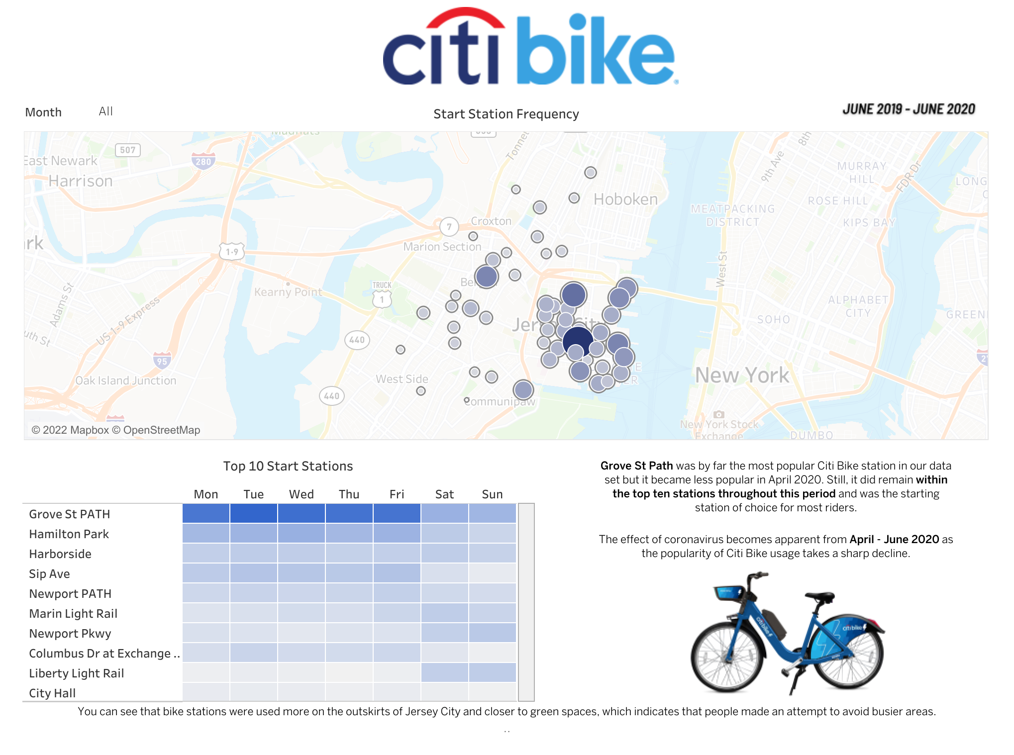
- What were the most popular start stations?
- What were the most popular end stations?
- Is there a correlation between station popularity and location?
- Is there a significant change between station popularity during lockdown?
- Which bikes was more frequently used by customers and subscribers?
- Which bikes took the longest trip durations?
- Did lockdown impact age range of Citi Bike users?
- Can I identify the most popular month?
- Can I identify the least popular month?
- Are there any significant differences between June 2019 (prior to lockdown) and June 2020 (post lockdown)?
- Does gender of users show any significant findings?
Click here to interactive with dashboard.
Click here to interactive with dashboard.
Click here to interactive with dashboard.
Click here to interactive with dashboard.
The dataset provides an insight to the Citi Bike service prior to the pandemic, during the lockdown and once lockdown restrictions began to ease, and therefore I decided to use data from June 2019 - June 2020.
Start stations and end stations are visually mapped using geographical latitude and longitude data with additional markers to display the frequently of these stations by users, it was noticeably clear start stations are located in and around Jersey, whereas end stations are pinpointed in and around New York as well as Jersey.
Due to lockdown the usage of Citi Bikes decreased as people were working from home, and abiding to lockdown restrictions. However, the most popular station Grove St. Path fell from first place as behaviour patterns changed we notice a higher usage of start and end stations closer to green spaces and parks. This provides an interesting insight to user behaviour patters during the pandemic which could suggest more people were looking to explore open spaces, rather than be in public spaces since lockdown restrictions would not permit them to do so.
When we turn our attention to different user types and service popularity, as it is fascinating to observe the most popular month was September 2019 and not to our surprise, April 2020 was the least popular month. Clearly, the pandemic was the reason why April was the least popular month but the data shows a gradual increase in usage especially towards the end of June 2020. In fact, we can see an increase in “Unknown” users toward the end of lockdown, by default these visualisations compare data from the previous year (June ‘19) as “Unknown” users more than doubled their usage. Female users increased their usage in comparison to the previous year, which decreased how much Males equate for in the data. Even with this observation, Males account for at least half of data and are the gender that use the service the most.
Lastly, I performed analysis on age range to see if the pandemic significantly impacted the age of users. Fascinatingly, there doesn’t seem to be any significant impact in this area of analysis. Overall, the service tends to most popular with customers born in 1969 and subscribers born in 1989. The only thing to draw from this, on average there is a 20 year age gap between the most frequently used age groups.
To conclude, the pandemic clearly had a significant impact on the Citi Bike service, the user type variance, bike hire frequency and station popularity.


.png)
.png)
.png)