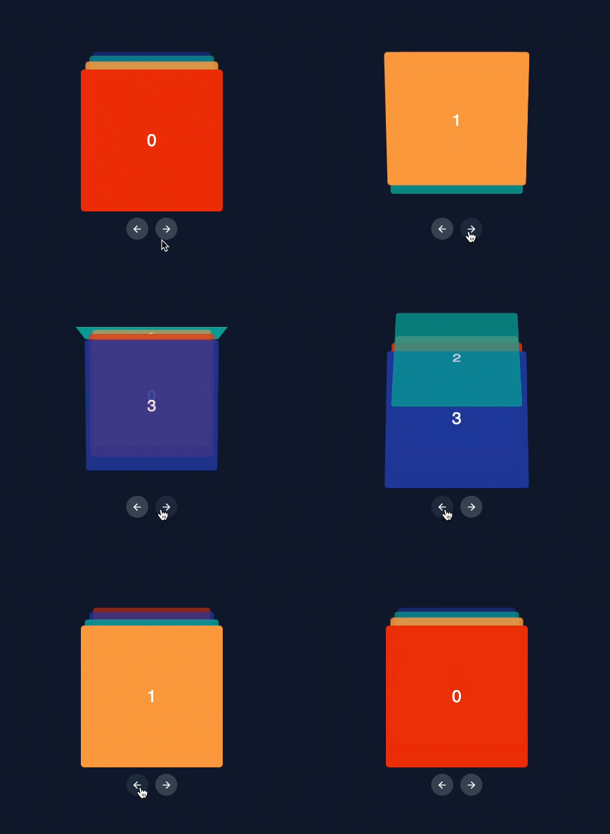
Stacked card carousal component with configurable 3D transition effect.
npm i react-card-stack-carousel

# OR

yarn add react-card-stack-carousel// import base styles at the top of your component
import "react-card-stack-carousel/styles/styles.css";NOTE: StackedCarousel requires a height property to be specified
import React from "react";
import { StackedCarousel } from "react-card-stack-carousel";
import "react-card-stack-carousel/styles/styles.css"; // import base styles

export default function App() {
    // specify container height
    const containerHeight = 250;

    return (
        <main className="container">
            <StackedCarousel height={containerHeight}>
                <div className="sample-card bg-color-1">0</div>
                <div className="sample-card bg-color-2">1</div>
                <div className="sample-card bg-color-3">2</div>
            </StackedCarousel>
        </main>
    );
}Height prop supports Tailwind CSS based breakpoint system to accommodate responsive design. To specify a height at a certain breakpoint, prefix the breakpoint name, followed by the ":" character.
<!-- 200px on mobile (default), 500px on medium screens and 750px on large screens -->
<StackedCarousel height="200 md:500 lg:750">{...}</StackedCarousel>
Visit responsive-design for the exhaustive list of supported breakpoints.
| Prop | Type | Default | Required | Description |
|---|---|---|---|---|
height |
number or string | - | Yes | Height of the carousel. |
children |
ReactNode | - | Yes | Children nodes of the carousel. |
autoplay |
boolean | false | No | Automatically transition between items. |
autoplayInterval |
number | 4000 | No | Interval between automatic transitions. |
easingFunction |
string | cubic-bezier(0.93, 0.01, 0.39, 1.01) | No | Easing function to use for the transitions. |
onNext |
function | - | No | Callback function on moving to the next item. |
onPrevious |
function | - | No | Callback function on moving to the previous item. |
styleOverrides |
object | - | No | Override default styles of the carousel |
scaleFactor |
number | 0.9 | No | Scale factor for the carousel items. |
startIndex |
number | 0 | No | Index of the item to start on. |
transitionDuration |
number | 400 | No | Duration of the transitions in milliseconds. |
verticalOffset |
number | 10 | No | % vertical offset for the carousel items. |
- Clone the repo and install the dependencies. In the repo's root, run
# using NPM
npm install

# using yarn
yarn install- Switch to the playground folder
cd ./playground- Start the development server
# start the Vite development server
yarn dev- Auto compute the container height based on height of the active card
- Support touch/drag gesture based navigation
- Plugin system to enable custom transition styles

