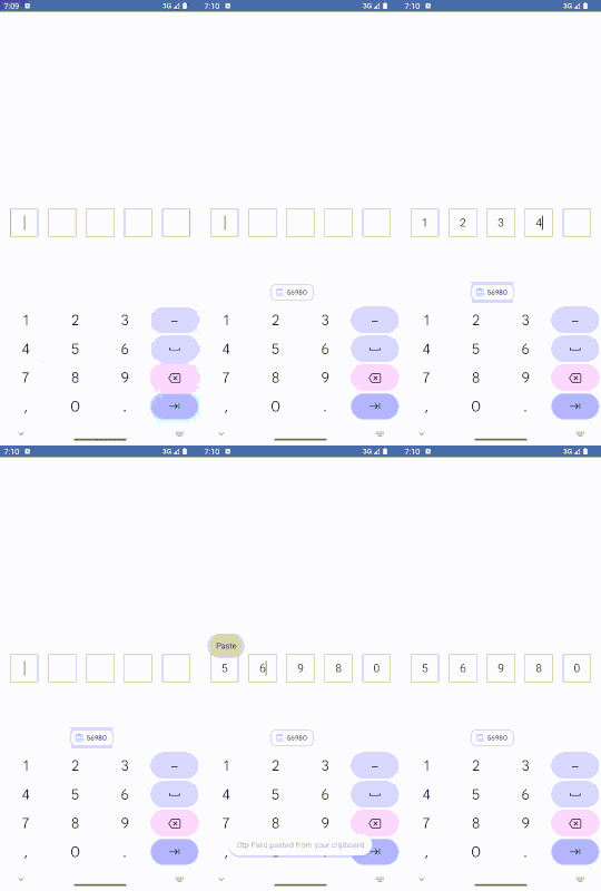
The OTP Field component is a flexible and customizable one-time password input solution designed specifically for Android apps using Jetpack Compose. It supports various customizations, enabling developers to tailor the appearance and functionality to match different application needs effectively.
- Customizable Number of Fields: Configure any number of OTP boxes.
- Visual Customization: Extensive support for modifiers allows for complete control over the appearance of each OTP box.
- Automatic Focus Management: Focus automatically transitions from one field to the next to enhance user experience.
- Secure Input: Supports masking for sensitive input, making it suitable for PINs or password entries.
- Adaptive Layout: Automatically adjusts the size and arrangement of OTP boxes based on the device's screen width.
Include the OTP Field component into your Jetpack Compose setup by integrating the provided code into your Compose UI project. Ensure you have the latest version of Compose in your project.
To integrate the OTP Field component, instantiate it within your Compose layout by setting up the necessary state and configuration:
@Composable
fun ExampleOtpScreen() {
    val otpValue = remember { mutableStateOf("") }

    OtpInputField(
        otp = otpValue,
        count = 4,
        otpBoxModifier = Modifier
            .border(3.pxToDp(), Color.Black)
            .background(Color.White),
        otpTextType = KeyboardType.Number
    )
}Enable character masking for enhanced security, suitable for PINs or passwords:
OtpInputField(
    otp = otpValue,
    count = 4,
    otpTextType = KeyboardType.NumberPassword,
    otpBoxModifier = Modifier
        .border(3.pxToDp(), Color.Gray)
        .background(Color.White)
)For a boxy design where each OTP character box appears as a distinct element:
OtpInputField(
    otp = otpValue,
    count = 5,
    textColor = Color.White,
    otpBoxModifier = Modifier
        .border(7.pxToDp(), Color(0xFF277F51), shape = RoundedCornerShape(12.pxToDp()))
)For a minimalist design featuring only an underline for each OTP box:
OtpInputField(
    otp = otpValue,
    count = 5,
    otpBoxModifier = Modifier
        .bottomStroke(color = Color.DarkGray, strokeWidth = 6.pxToDp())
)-
otp: A
MutableState<String>that holds the entire OTP value. This is a reactive state that triggers UI updates when the OTP value changes, ensuring that the UI is always in sync with the latest value. -
count: An
Intthat specifies the number of OTP boxes to be displayed. This allows customization of the OTP field length according to specific requirements, such as different OTP lengths for different authentication processes. -
otpBoxModifier: A
Modifierapplied to each OTP box for styling. This parameter allows developers to apply custom styles such as borders, backgrounds, sizes, and shapes to individual OTP boxes, enhancing the flexibility and aesthetic appeal of the OTP input field. -
otpTextType: A
KeyboardTypethat specifies the type of keyboard to show when a field is focused. This can be set toKeyboardType.Numberfor numeric OTPs orKeyboardType.Textfor alphanumeric OTPs, depending on the security requirements of the application. -
textColor: A
Colorused to set the text color within each OTP box. This parameter provides the ability to customize the color of the text inside the OTP boxes, allowing for better integration with the overall design theme of the application.
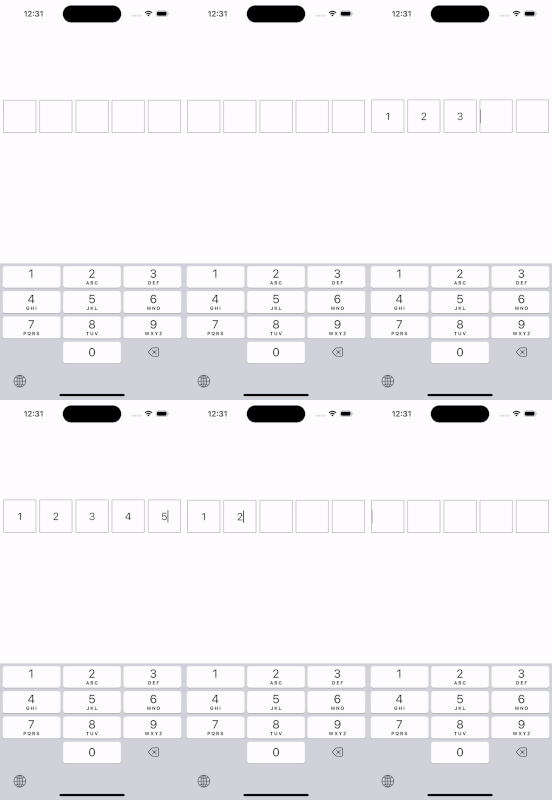
The OTP Field component was initially designed for Android using Jetpack Compose, but with an eye toward compatibility and ease of adaptation for Kotlin Multiplatform Mobile (KMM) projects. This foresight influenced the decision to use pxToDp instead of directly using .dp. The approach was chosen to ensure that the component could be ported to KMM projects with minimal changes, accommodating the unique rendering behaviors on different platforms, especially iOS.
While .dp (density-independent pixels) is effective for scaling UI elements appropriately on Android, it often leads to inconsistent sizing on iOS devices within KMM projects. This discrepancy occurs because .dp units do not automatically adjust to the screen densities of iOS devices, leading to UI elements that do not appear as intended when shared between Android and iOS.
To address these challenges and ensure a seamless user experience across both platforms, the pxToDp function was implemented. This custom function calculates density-independent pixels by explicitly considering the screen density at runtime, ensuring that dimensions remain consistent and visually proportionate across all devices.
@Composable
fun Dp.dpToPx() = with(LocalDensity.current) { this@dpToPx.toPx() }

@Composable
fun Int.pxToDp() = with(LocalDensity.current) { this@pxToDp.toDp() }
The adoption of pxToDp in the OTP Field component thus addresses a critical challenge in multiplatform development by ensuring that all users, regardless of their device, experience the UI as designed.
The OTP Field component, while initially designed for Android, can be adapted for use in Kotlin Multiplatform Mobile projects with some specific modifications. This ensures that the widget is functional and visually consistent on both Android and iOS platforms.
To effectively port the OTP Field component to KMM, a key modification involves replacing LocalConfiguration.current.screenWidthDp with LocalWindowInfo.current.containerSize.width. This change ensures that dimensions are calculated based on the actual container size, which is critical for proper scaling on different devices:
val screenWidth = LocalWindowInfo.current.containerSize.widthThere is a recognized issue with the BasicTextField on iOS, where the cursor in an empty BasicTextField aligns only to the left side (start). This issue can affect the user experience on iOS, particularly in scenarios where text alignment is crucial. The problem is documented in the JetBrains Compose Multiplatform repository:
- Similar Issue Link: GitHub Issue #4611


