This project shows a very basic example of how to connect a web component (generated with Stencil) with a basic angular project.
The following steps explain what I've done to get this working.
The idea is to have a web component that can be data-bound via properties and return its changes by custom events.
For this example I've picked nothing special but a simple slider component. The following code shows the @Component decorator. This decorator adds meta-information to you component like its selector tag. Our slider should use the custom element selector tag fwt-slider (so we can use <fwt-slider> later in the DOM).
import { Component } from '@stencil/core';

@Component({
  tag: 'fwt-slider'
})
export class SliderComponent {
  ...
}
Stencil components are very similar to react components. They have the same lifecycle methods and of course they also need a render function. So let's add one:
import { Component } from '@stencil/core';

@Component({
  tag: 'fwt-slider'
})
export class SliderComponent {

  render() {
    return (
      <div class="slider-container">
        ...
      </div>
    )
  }
}Our slider will have a min and a max property and an initial value property. Adding a property to a stencil component is very easy. All you have to do is to use the @Prop decorator:
import { Component, Prop } from '@stencil/core';

@Component({
  tag: 'fwt-slider'
})
export class SliderComponent {

  @Prop() min: number;
  @Prop() max: number;
  @Prop() value: number;

  render() {
    return (
      <div class="slider-container">
        <input type="range" min={this.min} max={this.max} value={this.value} class="slider">
        </input>
      </div>
    )
  }
}Ok so far so good.
How about emitting an event when the value has been changed? That's actually a good idea. For this purpose we only have to use another decorator called @Event. This decorator is used in combination with the EventEmitter interface. This will create a custom event that is called like the event property. You can change the name and other event properties by passing EventOptions to the @Event decorator but for our example we keep things simple.
In this example I'm listening to changes by the range input and pass the current value via the EventEmitter using its emit function.
I've also added some style to our slider by setting the styleUrl (Stencil supports scss and css) in the @Component decorator.
import { Component, Prop, Event, EventEmitter } from '@stencil/core';

@Component({
  tag: 'fwt-slider',
  styleUrl: 'slider.scss'
})
export class SliderComponent {

  @Prop() min: number;
  @Prop() max: number;
  @Prop() value: number;

  @Event() valueChanged: EventEmitter;

  valueChangedHandler(event: any) {
    this.valueChanged.emit(event.target.value);
  }

  render() {
    return (
      <div class="slider-container">
        <input type="range" min={this.min} max={this.max} value={this.value} class="slider"
               onChange={(event) => this.valueChangedHandler(event)}>
        </input>
      </div>
    );
  }
}fwt-slider {
.slider-container {
width: 100%;
.slider {
-webkit-appearance: none;
appearance: none;
width: 100%;
height: 15px;
border-radius: 5px;
background: #d3d3d3;
outline: none;
opacity: 0.7;
transition: opacity .2s;
&:hover {
opacity: 1;
}
&::-webkit-slider-thumb {
-webkit-appearance: none;
appearance: none;
width: 25px;
height: 25px;
border-radius: 50%;
background: #4CAF50;
cursor: pointer;
}
&::-moz-range-thumb {
width: 25px;
height: 25px;
border-radius: 50%;
background: #4CAF50;
cursor: pointer;
}
}
}
}I'm going to add the build output of stencil to www/assets/build because later I will copy this output into the assets folder of a angular-cli project.
Normally the build output will be put to www/build but this can be changed in the stencil.config.js.
I also register my fwt-slider component there.
exports.config = {
  bundles: [
    { components: ['fwt-slider'] }
  ],
  buildDir: 'assets/build',
  collections: [
  ]
};

exports.devServer = {
  root: 'www',
  watchGlob: '**/**'
}
Ok let's start the build with npm run build inside the stencil dir.
After the build is done you must copy the whole build dir from /stencil/www/assets/ to /angular/src/assets/.
Our angular project only has one basic app module containing only one simple app component.
To enable the use of web components we must add the CUSTOM_ELEMENTS_SCHEMA from the @angular/core module to our app module.
import { BrowserModule } from '@angular/platform-browser';
import { NgModule, CUSTOM_ELEMENTS_SCHEMA } from '@angular/core';

import { AppComponent } from './app.component';

@NgModule({
  declarations: [
    AppComponent
  ],
  imports: [
    BrowserModule
  ],
  providers: [],
  schemas: [
    CUSTOM_ELEMENTS_SCHEMA
  ],
  bootstrap: [AppComponent]
})
export class AppModule { }Next we need to add the generated javascript of our stencil project to our angular project. To do this we add a script tag somewhere in the head of the index.html of our angular project:
<script src="assets/build/app.js"></script>An even better way would be to add your additional web component scripts to the .angular-cli.json config file as explained here.
We said that our slider component has three properties (min, max, value). So let's establish angular data-binding to these properties in our app component.
import { Component } from '@angular/core';

@Component({
  selector: 'app-root',
  templateUrl: './app.component.html',
  styleUrls: ['./app.component.css']
})
export class AppComponent {
  min = 0;
  max = 100;
  value = 50;
}
And in the app.component.html we are adding our slider web component like this:
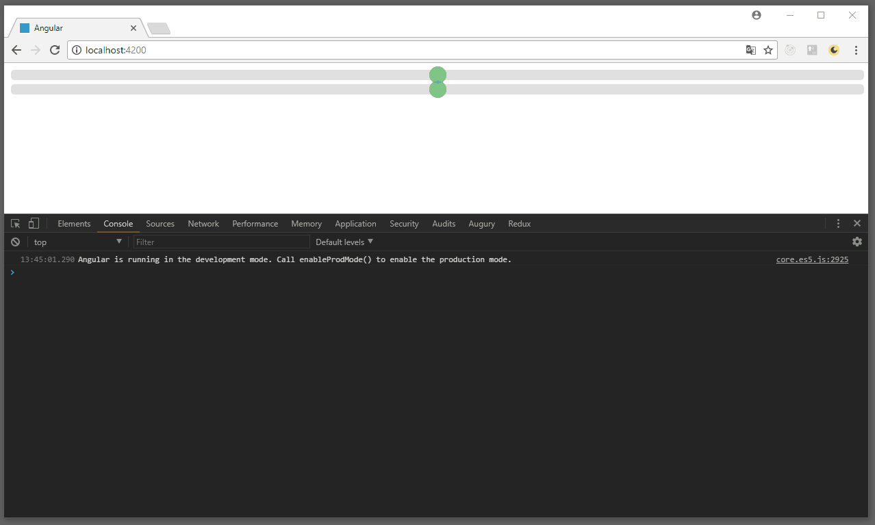
<fwt-slider [min]="min" [max]="max" [value]="value"></fwt-slider>One last thing I want to show is how we can listen to the custom events and use them to update the data-bound properties. So let's add another slider with its own value and two event handlers that set the value property of the other slider component ('yeah I know, very clever example').
import { Component } from '@angular/core';

@Component({
  selector: 'app-root',
  templateUrl: './app.component.html',
  styleUrls: ['./app.component.css']
})
export class AppComponent {
  min = 0;
  max = 100;
  value1 = 50;
  value2 = 50;

  onValue1Changed(event: CustomEvent) {
    console.log(event.detail);
    this.value2 = event.detail;
  }

  onValue2Changed(event: CustomEvent) {
    console.log(event.detail);
    this.value1 = event.detail;
  }
}<fwt-slider [min]="min" [max]="max" [value]="value1"
(valueChanged)="onValue1Changed($event)">
</fwt-slider>
<fwt-slider [min]="min" [max]="max" [value]="value2"
(valueChanged)="onValue2Changed($event)">
</fwt-slider>See what we have done by running npm start inside the angular directory.