Note: This library is not currently being maintained.
The simplot library supports a variety of plot styles, including:
- data
- points (scatter)
- line
- line with points (default)
- curve
- curve with points
The library also has built in support for client-side websockets as a way to transfer data from a server to a browser window for plotting.
Currently, the library does not handle numbers with a large number of significant digits very well. If you are working with data with more than about four significant digits, it is recommended that you scale the data before plotting.
Add the following to your pubspec.yaml:
simplot:
  git: git://github.com/scribeGriff/simplot.git
Then import the library to your app:
import 'package:simplot/simplot.dart';An example of the simplest usage of the library would be:
var data = [1, 3, 2, 5, 6.3, 17, 4];
var dataPlot = plot(data);
An array of data of type List is the only required parameter. However, the plot() command has a number of optional named parameters:
- xdata: an array of type
List. If xdata is not defined, the x axis is automatically generated as a vector from 1:n where n is the length of the required input array parameter. - y2: an array of type
List. Additional data to be plotted on same axes. - y3: an array of type
List. Additional data to be plotted on same axes. - y4: an array of type
List. Additional data to be plotted on same axes. - style1: a
Stringdefining the type of plot (line, curve, etc) for the first set of data. Default value is linepts. - style2: a
Stringdefining the type of plot (line, curve, etc) for the second set of data. Default value is style1. - style3: a
Stringdefining the type of plot (line, curve, etc) for the third set of data. Default value is style1. - style4: a
Stringdefining the type of plot (line, curve, etc) for the fourth set of data. Default value is style1. - color1: a
Stringdefining the color of the plot for the first set of data. Default value is black. - color2: a
Stringdefining the color of the plot for the second set of data. Default value is ForestGreen. - color3: a
Stringdefining the color of the plot for the third set of data. Default value is Navy. - color4: a
Stringdefining the color of the plot for the fourth set of data. Default value is FireBrick. - linewidth: an integer that specifies the stroke width of the lines used to draw the plots. Default value is 2.
- range: an
intthat specifies how many total graphs are intended on the canvas. The only effect is to scale each plotted graph. Default value is 1 for a single graph. - index: an
intthat should be between 1 and range. For example, if index = 1, the plot is assigned an id of simPlot1. The default value is 1. - container: a
Stringvalue indicating the id of the container holding the plot canvases. The id defaults to #simPlotQuad.
Along with the top level plot() command, there are a number of configurable methods available including:
grid()xlabel()ylabel()title()date()legend()xmarker()ymarker()save()
The library also contains two top level functions, saveAll() and requestDataWS(). The saveAll() command accepts an array of plots and generates a PNG image of the plots arranged in either a quad or linear format. The requestDataWS() receives an array of data from a websocket and plots it to a browser window. We'll look at an example of using requestDataWS() near the end of this README file.
An example of saving a quad layout of plots using the saveAll() function is shown below:
Most methods contain required and optional named parameters to control a variety of display properties.
xlabel():
- String xlabelName (required)
- String color: Default = 'DarkSlateGray' (optional)
- String font: Default = '11pt Verdana' (optional)
ylabel()
- String ylabelName (required)
- String color: Default = 'DarkSlateGray' (optional)
- String font: Default = '11pt Verdana' (optional)
title()
- String title (required)
- String color: Default = 'DarkSlateGray' (optional)
- String font: Default = '13pt Verdana' (optional)
legend()
- String l1: Default = 'y1' (optional)
- String l2: Default = 'y2' (optional)
- String l3: Default = 'y3' (optional)
- String l4: Default = 'y4' (optional)
- String font: Default = 'bold 12px Tahoma' (optional)
- bool top: Default = true (optional)
xmarker()
- num xval (required)
- bool annotate: Default = false (optional)
- String color: Default = 'rgb(85, 98, 112)' (optional)
- var width: Default = 1 (optional)
ymarker()
- num yval (required)
- String color: Default = 'rgb(85, 98, 112)' (optional)
- var width: Default = 1 (optional)
save()
- String name: Default = 'plotWindow' (optional)
The date() method accepts a single optional positional parameter:
date()
- bool short: Default = false (optional)
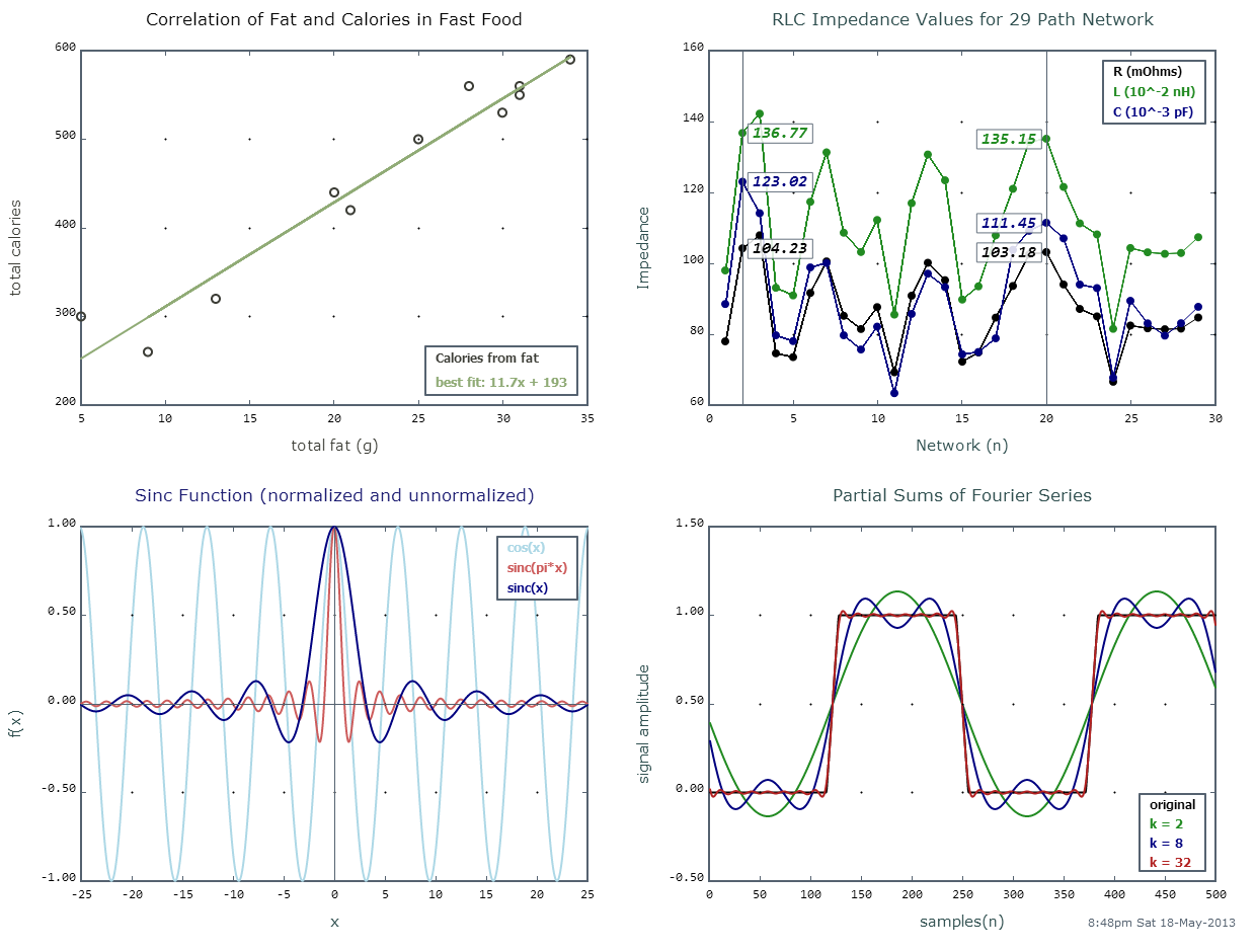
Referring to the graph image above, let's look at the code to create each of the plots.
Let's assume we have some data that is grouped as pairs of x and y values. We can map each set of values to its own list and then create a plot instance using a point style. We can then calculate the best fit and plot it using the line style.
var allPlots = new List();

// Plot #1: Scatter plot example.
var fat_calories = [[9, 260],
                    [13, 320],
                    [21, 420],
                    [30, 530],
                    [31, 560],
                    [31, 550],
                    [34, 590],
                    [25, 500],
                    [28, 560],
                    [20, 440],
                    [5, 300]];
// Best fit line for the above data: y = 11.7313x + 193.852
// Create the x and y scatter data.
var xscatter = fat_calories.map((x) => x.elementAt(0)).toList();
var yscatter = fat_calories.map((y) => y.elementAt(1)).toList();
var bestFit = xscatter.map((x) => (11.7313 * x) + 193.852).toList();

// Plot data as an xy plot of points.
var myScatter = plot(yscatter, xdata:xscatter, style1:'points', color1:'#3C3D36', y2:bestFit,
   style2:'line', color2:'#90AB76', range:4, index:1);
myScatter
  ..grid()
  ..xlabel('total fat (g)', color: '#3C3D36')
  ..ylabel('total calories', color: '#3C3D36')
  ..legend(l1: 'Calories from fat', l2: 'best fit: 11.7x + 193', top:false)
  ..title('Correlation of Fat and Calories in Fast Food', color: 'black');
// Add scatter plot to the allPlots array.
allPlots.add(myScatter);The next example plots multiple sets of data in the linepts style. Note that the x axis, if not specified explicitly, is defined according to the first parameter passed to the plot() function, in this case, the List resistance. The data lists are not required to be the same length, although subsequent sets of data may be truncated if they are longer than the first set. In this example, we use two xmarker()s with annotation enabled.
//Plot #2: Plotting sample data with a line graph.
var resistance = [77.98, 104.23, 107.9, 74.61, 73.54, 91.63, 100.54, 85.19,
                  81.46, 87.64, 69.26, 90.86, 100.15, 95.24, 72.26, 74.86,
                  84.68, 93.61, 102.54, 103.18, 94.03, 87.13, 85.03, 66.59,
                  82.45, 81.66, 81.4, 81.58, 84.71];

var inductance = [97.993, 136.77, 142.215, 93.1, 90.956, 117.34, 131.299,
                  108.633, 103.196, 112.219, 85.533, 116.96, 130.688,
                  123.414, 89.781, 93.508, 107.893, 121.004, 134.263, 135.15,
                  121.547, 111.277, 108.154, 81.526, 104.312, 103.11, 102.674,
                  102.915, 107.367];

var capacitance = [88.52, 123.02, 114.13, 79.69, 78.06, 98.84, 100.09, 79.69,
                   75.69, 82.13, 63.36, 85.74, 97.07, 93.29, 74.33, 74.98,
                   78.84, 103.8, 109.18, 111.45, 107.04, 94.02, 93.01, 67.72,
                   89.42, 83.06, 79.6, 83.1, 87.73];

var myLines = plot(resistance, y2:inductance, y3:capacitance, linewidth:1, range:4, index:2);
myLines
  ..grid()
  ..xlabel('Network (n)')
  ..ylabel('Impedance')
  ..title('RLC Impedance Values for 29 Path Network')
  ..legend(l1:'R (mOhms)', l2:'L (10^-2 nH)', l3: 'C (10^-3 pF)')
  ..xmarker(2, annotate:true)
  ..xmarker(20, annotate:true);
allPlots.add(myLines);Our third example shows the use of the curve style to plot data of a continuous time signal. Here we are using the xmarker() and ymarker() with annotations disabled to act as axes through the origin.
// Plot #3: Sinc Function
var x = new List.generate(501, (var index) => (index - 250) / 10, growable:false);
var sincx = new List(x.length);
var sincpix = new List(x.length);
var cosx = new List(x.length);
for (var i = 0; i < x.length; i++) {
  if (x[i] != 0) {
    sincx[i] = sin(x[i]) / x[i];
    sincpix[i] = sin(x[i] * PI) / (x[i] * PI);
    cosx[i] = cos(x[i]);
  } else {
    sincx[i] = 1;
    sincpix[i] = 1;
    cosx[i] = cos(x[i]);
  }
}
var myCurve = plot(cosx, xdata:x, y2:sincpix, y3:sincx, color1: 'LightBlue', color2: 'IndianRed',
    style1:'curve', range:4, index:3);
myCurve
  ..grid()
  ..xlabel('x')
  ..ylabel('f(x)')
  ..xmarker(0)
  ..ymarker(0)
  ..legend(l1:'cos(x)', l2:'sinc(pi*x)', l3:'sinc(x)')
  ..title('Sinc Function (normalized and unnormalized)', color:'MidnightBlue');
allPlots.add(myCurve);For the final plot, we add a date stamp with date() and then call the library's top level function saveAll(allPlots) to send the final result to a browser window as a PNG image.
// Plot #4: Partial sums of Fourier series.
List waveform = square(2);
List kvals = [2, 8, 32];
var fourier = fsps(waveform, kvals);
var shortWaveform = waveform.sublist(0, 500);
var f0 = fourier.psums[kvals[0]].map((x) => x.real).toList();
var f1 = fourier.psums[kvals[1]].map((x) => x.real).toList();
var f2 = fourier.psums[kvals[2]].map((x) => x.real).toList();
var my2ndCurve = plot(shortWaveform, y2:f0, y3:f1, y4:f2, style1:'curve', range:4, index:4);
my2ndCurve
  ..grid()
  ..title('Partial Sums of Fourier Series', color:'DarkSlateGray')
  ..legend(l1:'original', l2:'k = 2', l3:'k = 8', l4:'k = 32', top:false)
  ..xlabel('samples(n)')
  ..ylabel('signal amplitude')
  ..date();
allPlots.add(my2ndCurve);
// Print all plots.
WindowBase myPlotWindow = saveAll(allPlots);Displaying the plots in a web browser is left largely up to the user. All that is needed at a minimum is a div with either an ID of #simPlotQuad (the default value of the optional container parameter), or an ID of the user's choosing that is passed as the container parameter to plot() and a class called .simPlot. A simple example might look like the following:
<!DOCTYPE html>

<html>
  <head>
    <meta charset="utf-8">
    <title>A Simple Plot Example</title>
    <link rel="stylesheet" href="simple_plot.css">
  </head>
  <body>
    <h1>SimPlot</h1>
    <p>A 2D canvas plotting tool in Dart.</p>
    <div id="container">
      <div id="simPlotQuad"></div>
    </div>
    <script type="application/dart" src="simple_plot.dart"></script>
    <script src="packages/browser/dart.js"></script>
  </body>
</html>body {
background-color: #F8F8F8;
font-family: 'Open Sans', sans-serif;
font-size: 14px;
font-weight: normal;
line-height: 1.2em;
margin: 15px;
}
#container {
width: 100%;
position: relative;
border: 1px solid #ccc;
background-color: #fff;
overflow:hidden;
}
#simPlotQuad {
width: 1400px;
margin: 0 auto;
overflow: hidden;
}
.simPlot {
margin: 30px;
float: left;
}This example will place multiple plots in a quad arrangement as in the example image above.
The simplot library contains a top level function, requestDataWS(), which interacts with a server to retrieve data for plotting. Implementing this capability requires that you set up a script like the one below to read a file on a server (or local machine) and transfer the data to a websocket:
import 'dart:async';
import 'dart:io';
import 'dart:convert';

void main() {
  //Path to external file.
  String filename = '../../lib/external/data/sound4.txt';
  var host = 'local';
  var port = 8080;
  List data = [];
  Stream stream = new File(filename).openRead();
  stream
      .transform(UTF8.decoder)
      .transform(new LineSplitter())
      .listen((String line) {
        if (line.isNotEmpty) {
          data.add(double.parse(line.trim()));
        }
      },
      onDone: () {
        //connect with ws://localhost:8080/ws
        if (host == 'local') host = '127.0.0.1';
        HttpServer.bind(host, port).then((server) {
          print('Opening connection at $host:$port');
          server.transform(new WebSocketTransformer()).listen((WebSocket webSocket) {
          webSocket.listen((message) {
            var msg = JSON.decode(message);
            print("Received the following message: \n"
            "${msg["request"]}\n${msg["date"]}");
            webSocket.add(JSON.encode(data));
          },
          onDone: () {
            print('Connection closed by client: Status - ${webSocket.closeCode}'
            ' : Reason - ${webSocket.closeReason}');
            server.close();
          });
        });
      });
    },
    onError: (e) {
      print('There was an error: $e');
    });
  }
Once the data has been added to the websocket by the server, use the requestDataWS() function from the simplot library to retrieve it for plotting:
import 'dart:html';
import 'dart:async';
import 'package:simplot/simplot.dart';

void main() {
  String host = 'local';
  int port = 8080;
  var myDisplay = query('#console');
  var myMessage = 'Send data request';
  Future reqData = requestDataWS(host, port, message:myMessage, display:myDisplay);
  reqData.then((data) {
    var sndLength = data.length;
    var sndRate = 22050;
    var sndSample = sndLength / sndRate * 1e3;
    var xtime = new List.generate(sndLength, (var index) =>
        index / sndRate * 1e3, growable:false);

    var wsCurve = plot(data, xdata:xtime, style1:'curve', color1:'green', linewidth:3);
    wsCurve
      ..grid()
      ..title('Sound Sample from Server')
      ..xlabel('time (ms)')
      ..ylabel('amplitude')
      ..save();
  });
}Richard Griffith
scribeGriff Studios
The BSD 2-Clause License
http://www.opensource.org/licenses/bsd-license.php
Copyright (c) 2013, Richard Griffith
All rights reserved.
Redistribution and use in source and binary forms, with or without modification, are permitted provided that the following conditions are met:
- Redistributions of source code must retain the above copyright notice, this list of conditions and the following disclaimer.
- Redistributions in binary form must reproduce the above copyright notice, this list of conditions and the following disclaimer in the documentation and/or other materials provided with the distribution.
THIS SOFTWARE IS PROVIDED BY THE COPYRIGHT HOLDERS AND CONTRIBUTORS "AS IS" AND ANY EXPRESS OR IMPLIED WARRANTIES, INCLUDING, BUT NOT LIMITED TO, THE IMPLIED WARRANTIES OF MERCHANTABILITY AND FITNESS FOR A PARTICULAR PURPOSE ARE DISCLAIMED. IN NO EVENT SHALL THE COPYRIGHT OWNER OR CONTRIBUTORS BE LIABLE FOR ANY DIRECT, INDIRECT, INCIDENTAL, SPECIAL, EXEMPLARY, OR CONSEQUENTIAL DAMAGES (INCLUDING, BUT NOT LIMITED TO, PROCUREMENT OF SUBSTITUTE GOODS OR SERVICES; LOSS OF USE, DATA, OR PROFITS; OR BUSINESS INTERRUPTION) HOWEVER CAUSED AND ON ANY THEORY OF LIABILITY, WHETHER IN CONTRACT, STRICT LIABILITY, OR TORT (INCLUDING NEGLIGENCE OR OTHERWISE) ARISING IN ANY WAY OUT OF THE USE OF THIS SOFTWARE, EVEN IF ADVISED OF THE POSSIBILITY OF SUCH DAMAGE.
The views and conclusions contained in the software and documentation are those of the author and should not be interpreted as representing official policies, either expressed or implied, of the FreeBSD Project.